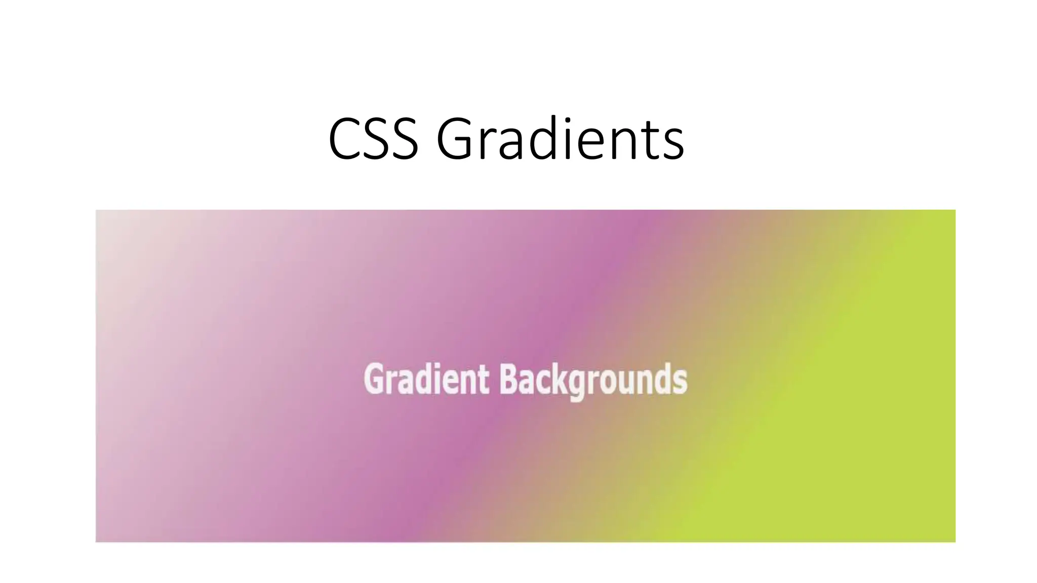
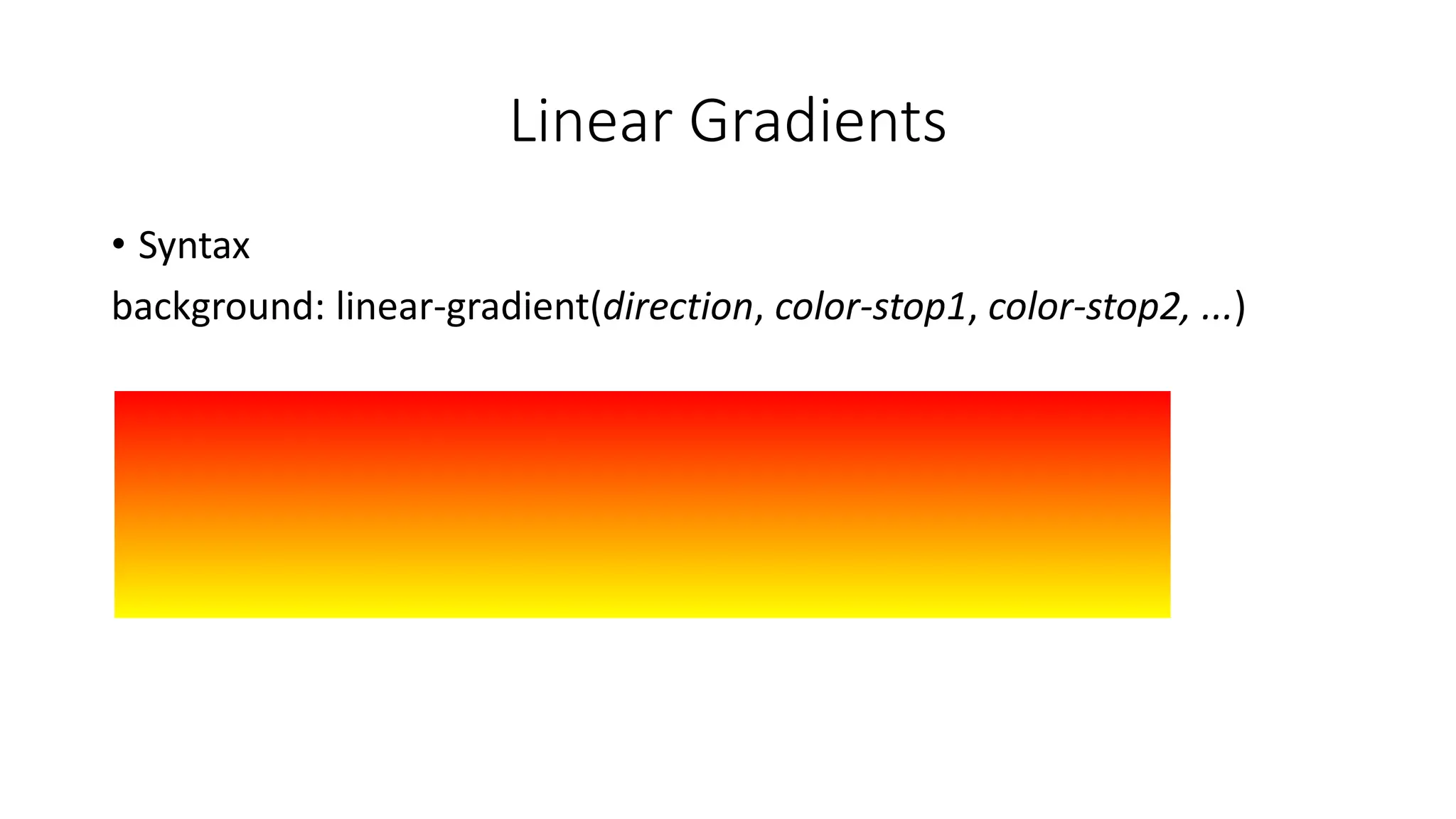
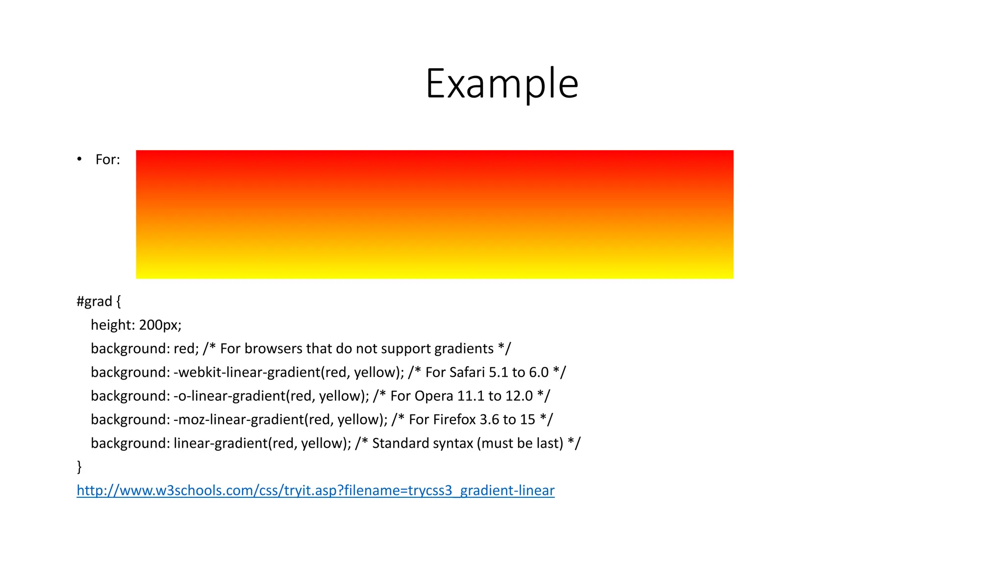
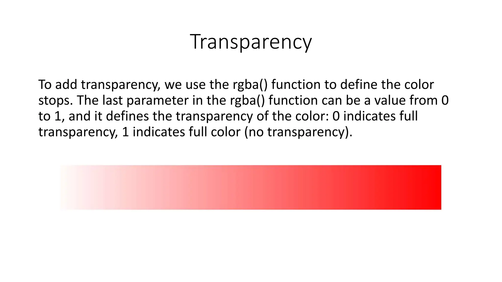
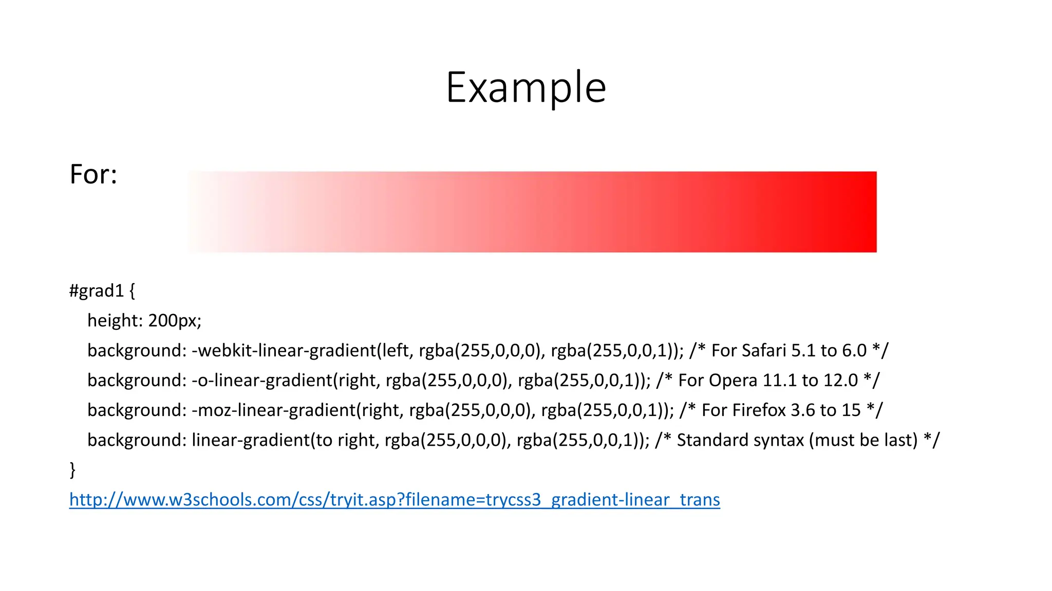
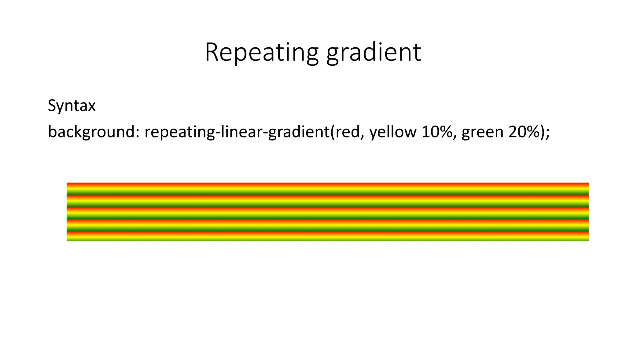
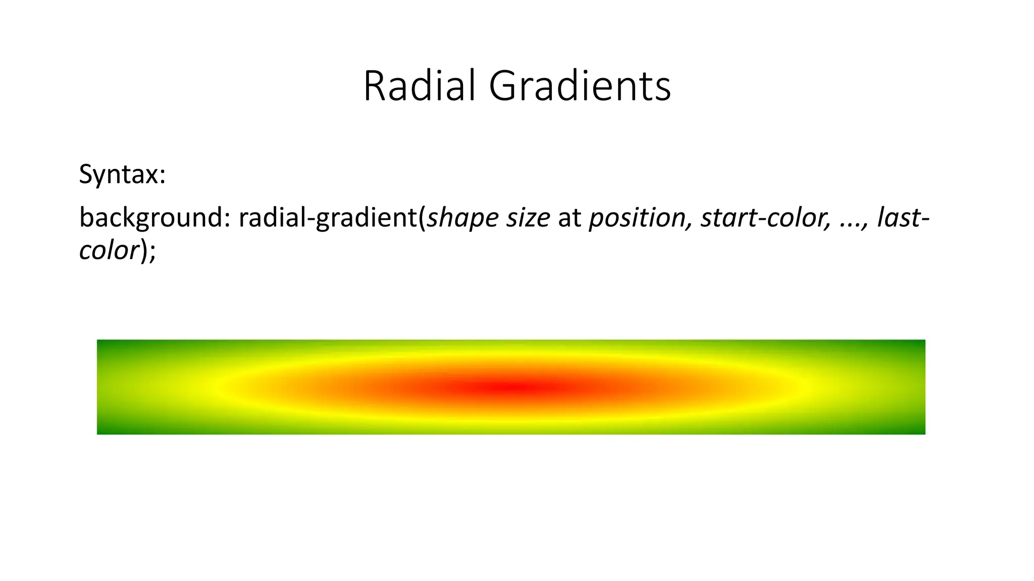
2. What is Gradients
• gradients let you display smooth transitions between two or more
specified colors
• using CSS gradients you can reduce download time and bandwidth
usage. In addition, elements with gradients look better when zoomed,
because the gradient is generated by the browser
4. Example
• For:
#grad {
height: 200px;
background: red; /* For browsers that do not support gradients */
background: -webkit-linear-gradient(red, yellow); /* For Safari 5.1 to 6.0 */
background: -o-linear-gradient(red, yellow); /* For Opera 11.1 to 12.0 */
background: -moz-linear-gradient(red, yellow); /* For Firefox 3.6 to 15 */
background: linear-gradient(red, yellow); /* Standard syntax (must be last) */
}
http://www.w3schools.com/css/tryit.asp?filename=trycss3_gradient-linear
6. Example
• For:
#grad {
height: 100px;
background: red; /* For browsers that do not support gradients */
background: -webkit-linear-gradient(90deg, red, yellow); /* For Safari 5.1 to 6.0 */
background: -o-linear-gradient(90deg, red, yellow); /* For Opera 11.1 to 12.0 */
background: -moz-linear-gradient(90deg, red, yellow); /* For Firefox 3.6 to 15 */
background: linear-gradient(90deg, red, yellow); /* Standard syntax (must be last) */
}
http://www.w3schools.com/css/tryit.asp?filename=trycss3_gradient-linear_angles
7. Multiple Colors
• You can use the syntax
background: linear-gradient(direction, color, color, color ...);
without the direction it will go from top to bottom but it can be from
left to right or right to left.
Also you can put a percent next to the color to make the spacing.
8. Example
• For
#grad {
height: 200px;
background: -webkit-linear-gradient(red 10%, green 85%, blue 90%); /* For Safari 5.1 to 6.0 */
background: -o-linear-gradient(red 10%, green 85%, blue 90%); /* For Opera 11.1 to 12.0 */
background: -moz-linear-gradient(red 10%, green 85%, blue 90%); /* For Firefox 3.6 to 15 */
background: linear-gradient(red 10%, green 85%, blue 90%); /* Standard syntax (must be last) */
}
http://www.w3schools.com/css/tryit.asp?filename=trycss3_gradient-linear_cs
9. Transparency
To add transparency, we use the rgba() function to define the color
stops. The last parameter in the rgba() function can be a value from 0
to 1, and it defines the transparency of the color: 0 indicates full
transparency, 1 indicates full color (no transparency).
10. Example
For:
#grad1 {
height: 200px;
background: -webkit-linear-gradient(left, rgba(255,0,0,0), rgba(255,0,0,1)); /* For Safari 5.1 to 6.0 */
background: -o-linear-gradient(right, rgba(255,0,0,0), rgba(255,0,0,1)); /* For Opera 11.1 to 12.0 */
background: -moz-linear-gradient(right, rgba(255,0,0,0), rgba(255,0,0,1)); /* For Firefox 3.6 to 15 */
background: linear-gradient(to right, rgba(255,0,0,0), rgba(255,0,0,1)); /* Standard syntax (must be last) */
}
http://www.w3schools.com/css/tryit.asp?filename=trycss3_gradient-linear_trans
13. Example
This is with different spacing:
#grad {
background: red; /* For browsers that do not support gradients */
background: -webkit-radial-gradient(red 5%, yellow 15%, green 60%); /* Safari 5.1-6.0 */
background: -o-radial-gradient(red 5%, yellow 15%, green 60%); /* For Opera 11.6-12.0 */
background: -moz-radial-gradient(red 5%, yellow 15%, green 60%); /* For Firefox 3.6-15 */
background: radial-gradient(red 5%, yellow 15%, green 60%); /* Standard syntax */
}
http://www.w3schools.com/css/tryit.asp?filename=trycss3_gradient-radial2
14. The different radical gradients
The size parameter defines the size of the
gradient. It can take four values:
•closest-side
•farthest-side
•closest-corner
•farthest-corner
16. • Conic Gradient [explore time]
A conic gradient is a gradient with color transitions rotated
around a center point. To create a conic gradient you must
define at least two colors
• Syntax
• background-image: conic-gradient([from angle] [at position,] color [degree], color
[degree], …)