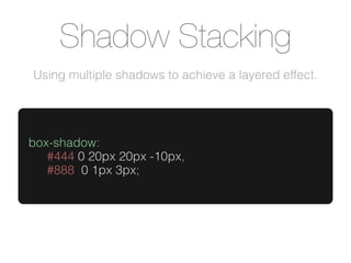
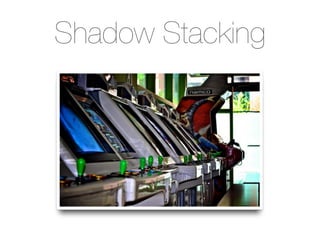
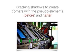
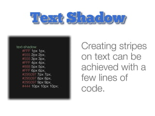
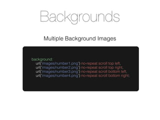
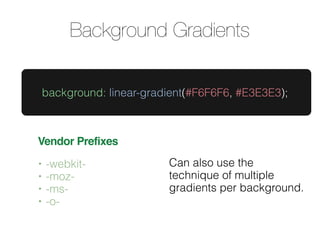
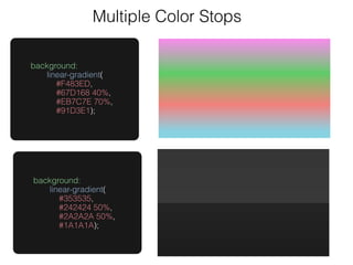
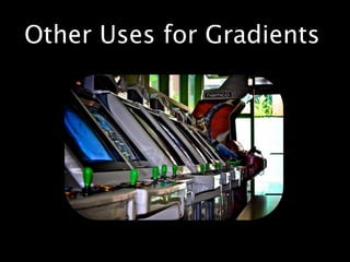
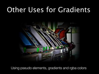
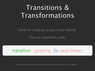
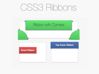
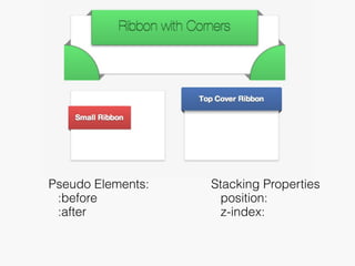
CSS3
Using advanced CSS to speed up development.
Browser Support
     Most of todays techniques
are supported by modern browsers.
Shadow Stacking
Using multiple shadows to achieve a layered effect.


box-shadow:
   #444 0 20px 20px -10px,
   #888 0 1px 3px;
Shadow Stacking
Stacking shadows to create
corners with the pseudo elements
       ‘:before’ and ‘:after’
text-shadow:
    #FFF 1px 1px,
                           Creating stripes
    #555 2px 2px,
    #555 3px 3px,
    #FFF 4px 4px,
                           on text can be
    #888 5px 5px,
    #FFF 6px 6px,          achieved with a
    #295097 7px 7px,
    #295097 8px 8px,
    #295097 9px 9px,
                           few lines of
    #444 10px 10px 10px;
                           code.
text-shadow:
    #888 4px 4px 18px,
                         Layered text
    #BBB 1px 1px,
    #BBB 2px 2px,
                         makes great
    #BBB 3px 3px,
    #BBB 4px 4px,
                         headlines.
    #BBB 5px 5px,
    #BBB 6px 6px,
    #BBB 7px 7px,
    #BBB 8px 8px,
    #BBB 9px 9px,
    #000 9px 9px 10px;
Backgrounds
       Multiple Background Images


background:
  url('images/number1.png') no-repeat scroll top left,
  url('images/number2.png') no-repeat scroll top right,
  url('images/number3.png') no-repeat scroll bottom left,
  url('images/number4.png') no-repeat scroll bottom right;
Background Gradients

    background: linear-gradient(#F6F6F6, #E3E3E3);


Vendor Prefixes
•   -webkit-               Can also use the
•   -moz-                  technique of multiple
•   -ms-                   gradients per background.
•   -o-
background: #88779F;
background: -webkit-linear-gradient (#88779F, #685B79);
background: -moz-linear-gradient (#88779F, #685B79);
background: -ms-linear-gradient (#88779F, #685B79);
background: -o-linear-gradient (#88779F, #685B79);
background: linear-gradient(#88779F, #685B79);


        USING VENDOR PREFIXES
Multiple Color Stops

background:
   linear-gradient(
      #F483ED,
      #67D168 40%,
      #EB7C7E 70%,
      #91D3E1);


background:
   linear-gradient(
      #353535,
      #242424 50%,
      #2A2A2A 50%,
      #1A1A1A);
Other Uses for Gradients


 Using pseudo elements, gradients and rgba colors
Transitions &
Transformations
Transitions &
Transformations
Transitions &
Transformations
Transitions &
     Transformations

   Great for creating unique hover effects.

             Easy to implement code:


transition: property .2s ease/linear;

 Must use vendor prefixes here and can be used on any state.
CSS3 Ribbons
Pseudo Elements:   Stacking Properties
 :before             position:
 :after              z-index:
CSS3
Using advanced CSS to speed up development.

Advanced CSS Techniques

  • 1.
    CSS3 Using advanced CSSto speed up development.
  • 2.
    Browser Support Most of todays techniques are supported by modern browsers.
  • 3.
    Shadow Stacking Using multipleshadows to achieve a layered effect. box-shadow: #444 0 20px 20px -10px, #888 0 1px 3px;
  • 4.
  • 5.
    Stacking shadows tocreate corners with the pseudo elements ‘:before’ and ‘:after’
  • 6.
    text-shadow: #FFF 1px 1px, Creating stripes #555 2px 2px, #555 3px 3px, #FFF 4px 4px, on text can be #888 5px 5px, #FFF 6px 6px, achieved with a #295097 7px 7px, #295097 8px 8px, #295097 9px 9px, few lines of #444 10px 10px 10px; code.
  • 7.
    text-shadow: #888 4px 4px 18px, Layered text #BBB 1px 1px, #BBB 2px 2px, makes great #BBB 3px 3px, #BBB 4px 4px, headlines. #BBB 5px 5px, #BBB 6px 6px, #BBB 7px 7px, #BBB 8px 8px, #BBB 9px 9px, #000 9px 9px 10px;
  • 8.
    Backgrounds Multiple Background Images background: url('images/number1.png') no-repeat scroll top left, url('images/number2.png') no-repeat scroll top right, url('images/number3.png') no-repeat scroll bottom left, url('images/number4.png') no-repeat scroll bottom right;
  • 9.
    Background Gradients background: linear-gradient(#F6F6F6, #E3E3E3); Vendor Prefixes • -webkit- Can also use the • -moz- technique of multiple • -ms- gradients per background. • -o-
  • 10.
    background: #88779F; background: -webkit-linear-gradient(#88779F, #685B79); background: -moz-linear-gradient (#88779F, #685B79); background: -ms-linear-gradient (#88779F, #685B79); background: -o-linear-gradient (#88779F, #685B79); background: linear-gradient(#88779F, #685B79); USING VENDOR PREFIXES
  • 11.
    Multiple Color Stops background: linear-gradient( #F483ED, #67D168 40%, #EB7C7E 70%, #91D3E1); background: linear-gradient( #353535, #242424 50%, #2A2A2A 50%, #1A1A1A);
  • 12.
    Other Uses forGradients
  • 13.
    Other Uses forGradients Using pseudo elements, gradients and rgba colors
  • 14.
  • 15.
  • 16.
  • 17.
    Transitions & Transformations Great for creating unique hover effects. Easy to implement code: transition: property .2s ease/linear; Must use vendor prefixes here and can be used on any state.
  • 18.
  • 19.
    Pseudo Elements: Stacking Properties :before position: :after z-index:
  • 20.
    CSS3 Using advanced CSSto speed up development.

Editor's Notes