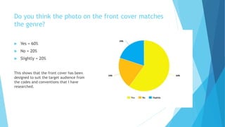
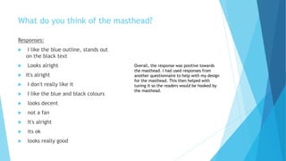
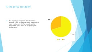
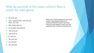
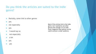
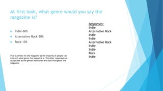
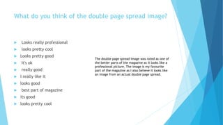
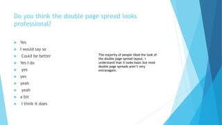
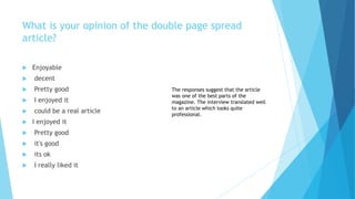
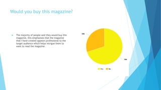
Audience Feedback
Results
Do you think the photo on the front cover matches
the genre?
 Yes = 60%
 No = 20%
 Slightly = 20%
This shows that the front cover has been
designed to suit the target audience from
the codes and conventions that I have
researched.
What do you think of the masthead?
Responses:
 I like the blue outline, stands out
on the black text
 Looks alright
 It's alright
 I don't really like it
 I like the blue and black colours
 looks decent
 not a fan
 It's alright
 its ok
 looks really good
Overall, the response was positive towards
the masthead. I had used responses from
another questionnaire to help with my design
for the masthead. This then helped with
tuning it so the readers would be hooked by
the masthead.
Is the price suitable?
 The majority of people say that the price is
suitable. I used various other music magazines to
make a judgement of what price to set the
magazine at which would be accepted by the
demographic.
 Yes and yes
 I do, would prefer red and not
blue, but yes
 Not really and no
 It's alright and kind of
 Yes and yes
 yes and no
 no and no
 Yes and yes
 no and yes
 Yes and yes
What do you think of the colour scheme? Does it
match the indie genre?
Do you think the articles are suited to the indie
genre?
 Partially, some link to other genres
 yes
 not especially
 yes
 I would say so
 not especially
 a bit
 yes
 yes
Most of the articles link to the indie
genre, but I wanted to use other
genres even though it is an indie
music magazine other genres can be
used to attract a wider audience.
At first look, what genre would you say the
magazine is?
 Indie-60%
 Alternative Rock-30%
 Rock-10%
Responses:
Indie
Alternative Rock
Indie
Indie
Alternative Rock
Indie
Indie
Rock
IndieThis is perfect for the magazine as the majority of people can
interpret what genre the magazine is. The other responses are
acceptable as the genres mentioned are used throughout the
magazine.
What do you think of the double page spread image?
 Looks really professional
 looks pretty cool
 Looks pretty good
 It's ok
 really good
 I really like it
 looks good
 best part of magazine
 its good
 looks pretty cool
The double page spread image was rated as one of
the better parts of the magazine as it looks like a
professional picture. The image is my favourite
part of the magazine as I also believe it looks like
an image from an actual double page spread.
Do you think the double page spread looks
professional?
 Yes
 I would say so
 Could be better
 Yes I do
 yes
 yes
 yeah
 yeah
 a bit
 I think it does
The majority of people liked the look of
the double page spread layout. I
understand that it looks basic but most
double page spreads aren’t very
extravagant.
What is your opinion of the double page spread
article?
 Enjoyable
 decent
 Pretty good
 I enjoyed it
 could be a real article
 I enjoyed it
 Pretty good
 it's good
 its ok
 I really liked it
The responses suggest that the article
was one of the best parts of the
magazine. The interview translated well
to an article which looks quite
professional.
Would you buy this magazine?
 The majority of people said they would buy this
magazine, this emphasises that the magazine
that I have created appears professional to the
target audience which helps intrigue them to
want to read the magazine.

Audience feedback results

  • 1.
  • 2.
    Do you thinkthe photo on the front cover matches the genre?  Yes = 60%  No = 20%  Slightly = 20% This shows that the front cover has been designed to suit the target audience from the codes and conventions that I have researched.
  • 3.
    What do youthink of the masthead? Responses:  I like the blue outline, stands out on the black text  Looks alright  It's alright  I don't really like it  I like the blue and black colours  looks decent  not a fan  It's alright  its ok  looks really good Overall, the response was positive towards the masthead. I had used responses from another questionnaire to help with my design for the masthead. This then helped with tuning it so the readers would be hooked by the masthead.
  • 4.
    Is the pricesuitable?  The majority of people say that the price is suitable. I used various other music magazines to make a judgement of what price to set the magazine at which would be accepted by the demographic.
  • 5.
     Yes andyes  I do, would prefer red and not blue, but yes  Not really and no  It's alright and kind of  Yes and yes  yes and no  no and no  Yes and yes  no and yes  Yes and yes What do you think of the colour scheme? Does it match the indie genre?
  • 6.
    Do you thinkthe articles are suited to the indie genre?  Partially, some link to other genres  yes  not especially  yes  I would say so  not especially  a bit  yes  yes Most of the articles link to the indie genre, but I wanted to use other genres even though it is an indie music magazine other genres can be used to attract a wider audience.
  • 7.
    At first look,what genre would you say the magazine is?  Indie-60%  Alternative Rock-30%  Rock-10% Responses: Indie Alternative Rock Indie Indie Alternative Rock Indie Indie Rock IndieThis is perfect for the magazine as the majority of people can interpret what genre the magazine is. The other responses are acceptable as the genres mentioned are used throughout the magazine.
  • 8.
    What do youthink of the double page spread image?  Looks really professional  looks pretty cool  Looks pretty good  It's ok  really good  I really like it  looks good  best part of magazine  its good  looks pretty cool The double page spread image was rated as one of the better parts of the magazine as it looks like a professional picture. The image is my favourite part of the magazine as I also believe it looks like an image from an actual double page spread.
  • 9.
    Do you thinkthe double page spread looks professional?  Yes  I would say so  Could be better  Yes I do  yes  yes  yeah  yeah  a bit  I think it does The majority of people liked the look of the double page spread layout. I understand that it looks basic but most double page spreads aren’t very extravagant.
  • 10.
    What is youropinion of the double page spread article?  Enjoyable  decent  Pretty good  I enjoyed it  could be a real article  I enjoyed it  Pretty good  it's good  its ok  I really liked it The responses suggest that the article was one of the best parts of the magazine. The interview translated well to an article which looks quite professional.
  • 11.
    Would you buythis magazine?  The majority of people said they would buy this magazine, this emphasises that the magazine that I have created appears professional to the target audience which helps intrigue them to want to read the magazine.