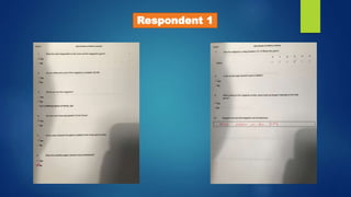
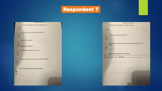
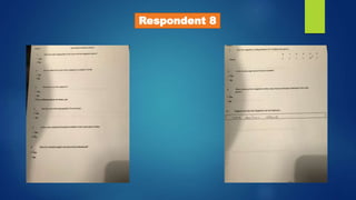
Respondent 1
Respondent 2
Respondent 3
Respondent 4
Respondent 5
Respondent 6
Respondent 7
Respondent 8
Respondent 9
Respondent 10
Question 1: Does the main image/artist on the
cover suit the magazine’s genre
9/10 Respondents answered ‘Yes’ to this question which shows that front cover image suited
the audience’s preferences. During my production, I actually changed my front cover photo
to one which I originally planned to be on my contents page, so these results suggest that I
made the right call.
These answers show that the front cover image is one of the best parts of the production.
Meaning that I used Photoshop effectively, whilst also taking a good image and suitable to
the indie genre.
Question 2: Do you believe the price of the
magazine is suitable? (£2.99)
The slight majority of respondents actually answered ‘No’ to this question and disagreed with
my price for the music magazine. 6/10 respondents voted no.
To me, this is surprising as when I completed the previous questionnaire, the majority of
respondents voted that £2.99 was the most ideal price for a music magazine. However, this
was only just voted slightly more times than £1.99 so it maybe shouldn’t come as that much
of a surprise.
Question 3: Would you buy this magazine?
With this question, I offered three different answers, As well as; Yes or No, I also included the
option of ticking ‘For a different genre of music, Yes’. This turned out to be the most voted
option on par with ‘Yes’. This feedback shows positive things about the magazine itself and
tells me that the magazine was more of a success than anything else. Unfortunately, the
respondents must not favour the indie genre as much as my first questionnaire’s respondents,
but I could count that as a good thing when analysing some of the results from this
questionnaire, and use this as a reason to why some respondents disagree with parts of the
magazine.
Question 4: Are the cover lines appropriate (Front
Cover)
This question was dominated with the answer ‘Yes’. Every respondent ticked the positive
answer to this question, which shows that my planning and research around the indie genre
before my production was used effectively, implying that I included effective cover lines which
relate to the right news around the indie world and attract the targeted audience and people
in general.
Question 5: Is the colour scheme throughout
suitable to the music genre?
This question was also answered pretty heavily in favour to ‘Yes’. 9/10 respondents replied by
agreeing to the colour scheme I used throughout my production – which was the dark red,
black and white. This is positive feedback and suggests that I put together a good colour
scheme following effective research of other indie music magazine covers, contents and
double page spreads.
Question 6: Does the Contents Page’s structure
look professional?
This question was also dominated with the positive answer. All respondents voted that my
contents page was certainly a strong point about my work.
This also shows that my research of similar music magazines worked effectively and I took on
the codes and conventions which should be used and thought of when creating a contents
page. I also believe that the contents page was a big strong point of my final production.
Question 7: Give the magazine a rating between
0-5 (5 Being Very Good).
My finished magazine was voted a positive 4/5. Of course, people’s value judgements may
differ but I strongly believe that 4/5 is a good rating for a beginner’s music magazine
product. This feedback gives me confidence with my music magazine work and shows that
my skills around producing a magazine have improved dramatically in contrast to when I
created my preliminary task.
Question 8: Is the double page spread’s layout
suitable?
This also received a 10/10 for ’Yes’. Very positive feedback is given on my structure and layout
of music magazines yet again which shows that my researched was carried out very
successfully. It also probably helped that I found the creation of the double page spread the
easiest part of the production, and therefore I was confident when I built the DPS and knew it
would turn out professional like other music magazines.
Question 9: When looking at the magazine at
first, does it look as though it belongs to the indie
genre?
The vast majority of respondents also voted ‘Yes’ for this question. This feedback shows that
my completed product links heavily with the indie genre and I have followed the codes and
conventions very closely when linking the magazine to the chosen music genre. During my
planning, I would think of ideas of how to make my magazine look like it belongs to the indie
genre, so this feedback also suggests that my planning production really helped with my
completed work.
Question 10: Suggest one way this magazine can
be improved…
This final question was answered in several ways.
The most common answer was adding more colour, although I believe I used the right
colours which most of the respondent’s answers would agree to (Question 5), and used them
effectively without making the production look as though it lacked colour or needed more to
look real.
However, maybe using brighter colours would appeal more to the female gender of my
targeted audience.

Questionnaire Results

  • 1.
  • 2.
  • 3.
  • 4.
  • 5.
  • 6.
  • 7.
  • 8.
  • 9.
  • 10.
  • 11.
    Question 1: Doesthe main image/artist on the cover suit the magazine’s genre 9/10 Respondents answered ‘Yes’ to this question which shows that front cover image suited the audience’s preferences. During my production, I actually changed my front cover photo to one which I originally planned to be on my contents page, so these results suggest that I made the right call. These answers show that the front cover image is one of the best parts of the production. Meaning that I used Photoshop effectively, whilst also taking a good image and suitable to the indie genre.
  • 12.
    Question 2: Doyou believe the price of the magazine is suitable? (£2.99) The slight majority of respondents actually answered ‘No’ to this question and disagreed with my price for the music magazine. 6/10 respondents voted no. To me, this is surprising as when I completed the previous questionnaire, the majority of respondents voted that £2.99 was the most ideal price for a music magazine. However, this was only just voted slightly more times than £1.99 so it maybe shouldn’t come as that much of a surprise.
  • 13.
    Question 3: Wouldyou buy this magazine? With this question, I offered three different answers, As well as; Yes or No, I also included the option of ticking ‘For a different genre of music, Yes’. This turned out to be the most voted option on par with ‘Yes’. This feedback shows positive things about the magazine itself and tells me that the magazine was more of a success than anything else. Unfortunately, the respondents must not favour the indie genre as much as my first questionnaire’s respondents, but I could count that as a good thing when analysing some of the results from this questionnaire, and use this as a reason to why some respondents disagree with parts of the magazine.
  • 14.
    Question 4: Arethe cover lines appropriate (Front Cover) This question was dominated with the answer ‘Yes’. Every respondent ticked the positive answer to this question, which shows that my planning and research around the indie genre before my production was used effectively, implying that I included effective cover lines which relate to the right news around the indie world and attract the targeted audience and people in general.
  • 15.
    Question 5: Isthe colour scheme throughout suitable to the music genre? This question was also answered pretty heavily in favour to ‘Yes’. 9/10 respondents replied by agreeing to the colour scheme I used throughout my production – which was the dark red, black and white. This is positive feedback and suggests that I put together a good colour scheme following effective research of other indie music magazine covers, contents and double page spreads.
  • 16.
    Question 6: Doesthe Contents Page’s structure look professional? This question was also dominated with the positive answer. All respondents voted that my contents page was certainly a strong point about my work. This also shows that my research of similar music magazines worked effectively and I took on the codes and conventions which should be used and thought of when creating a contents page. I also believe that the contents page was a big strong point of my final production.
  • 17.
    Question 7: Givethe magazine a rating between 0-5 (5 Being Very Good). My finished magazine was voted a positive 4/5. Of course, people’s value judgements may differ but I strongly believe that 4/5 is a good rating for a beginner’s music magazine product. This feedback gives me confidence with my music magazine work and shows that my skills around producing a magazine have improved dramatically in contrast to when I created my preliminary task.
  • 18.
    Question 8: Isthe double page spread’s layout suitable? This also received a 10/10 for ’Yes’. Very positive feedback is given on my structure and layout of music magazines yet again which shows that my researched was carried out very successfully. It also probably helped that I found the creation of the double page spread the easiest part of the production, and therefore I was confident when I built the DPS and knew it would turn out professional like other music magazines.
  • 19.
    Question 9: Whenlooking at the magazine at first, does it look as though it belongs to the indie genre? The vast majority of respondents also voted ‘Yes’ for this question. This feedback shows that my completed product links heavily with the indie genre and I have followed the codes and conventions very closely when linking the magazine to the chosen music genre. During my planning, I would think of ideas of how to make my magazine look like it belongs to the indie genre, so this feedback also suggests that my planning production really helped with my completed work.
  • 20.
    Question 10: Suggestone way this magazine can be improved… This final question was answered in several ways. The most common answer was adding more colour, although I believe I used the right colours which most of the respondent’s answers would agree to (Question 5), and used them effectively without making the production look as though it lacked colour or needed more to look real. However, maybe using brighter colours would appeal more to the female gender of my targeted audience.