Download to read offline

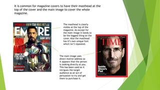
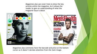
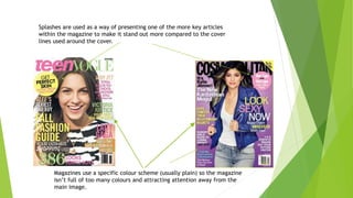
Magazine covers typically follow certain conventions: the masthead is prominently displayed at the top in a unique font, the main image takes up most of the cover and uses direct address to intrigue readers, and cover lines, price, and barcodes are placed unobtrusively to not distract from the main image while still providing information about the magazine's contents.


