The document summarizes feedback from a survey about a draft music magazine. Key findings include:
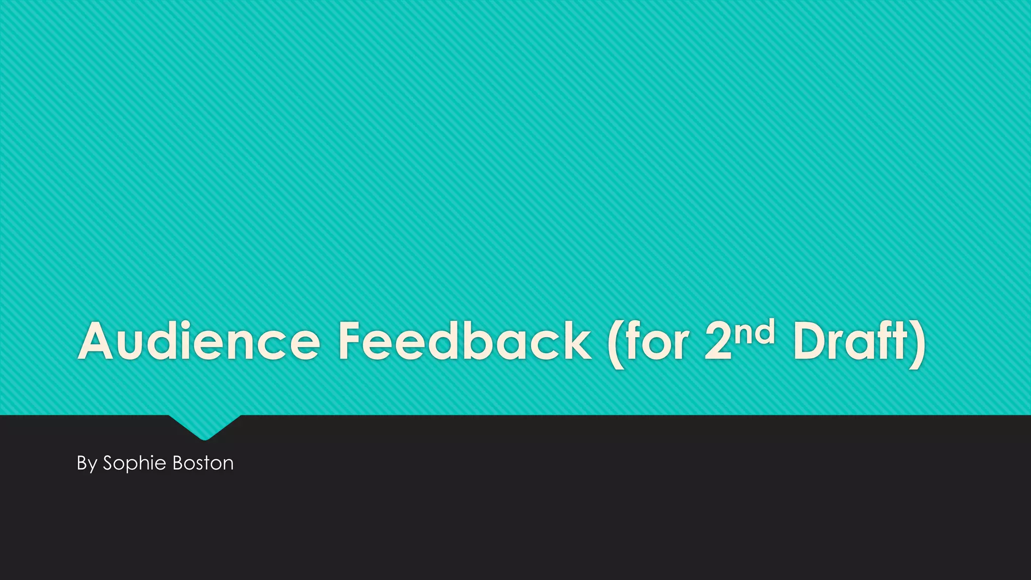
- Respondents said the most important magazine features are good colors, an appealing front cover image, and being informative.
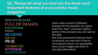
- Colors and band listings appealed most to the front cover, while the logo, font and price appealed least.
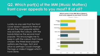
- Most agreed the £3 price was reasonable, though some suggested lowering it slightly.
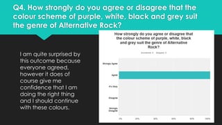
- All agreed the color scheme suited alternative rock music.
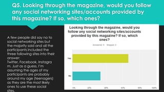
- Most would follow the magazine's social media accounts, especially Twitter, Facebook, and Instagram.
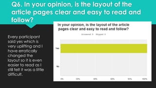
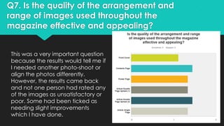
- Layout and readability and image quality received positive feedback, though some images needed minor improvements.
-