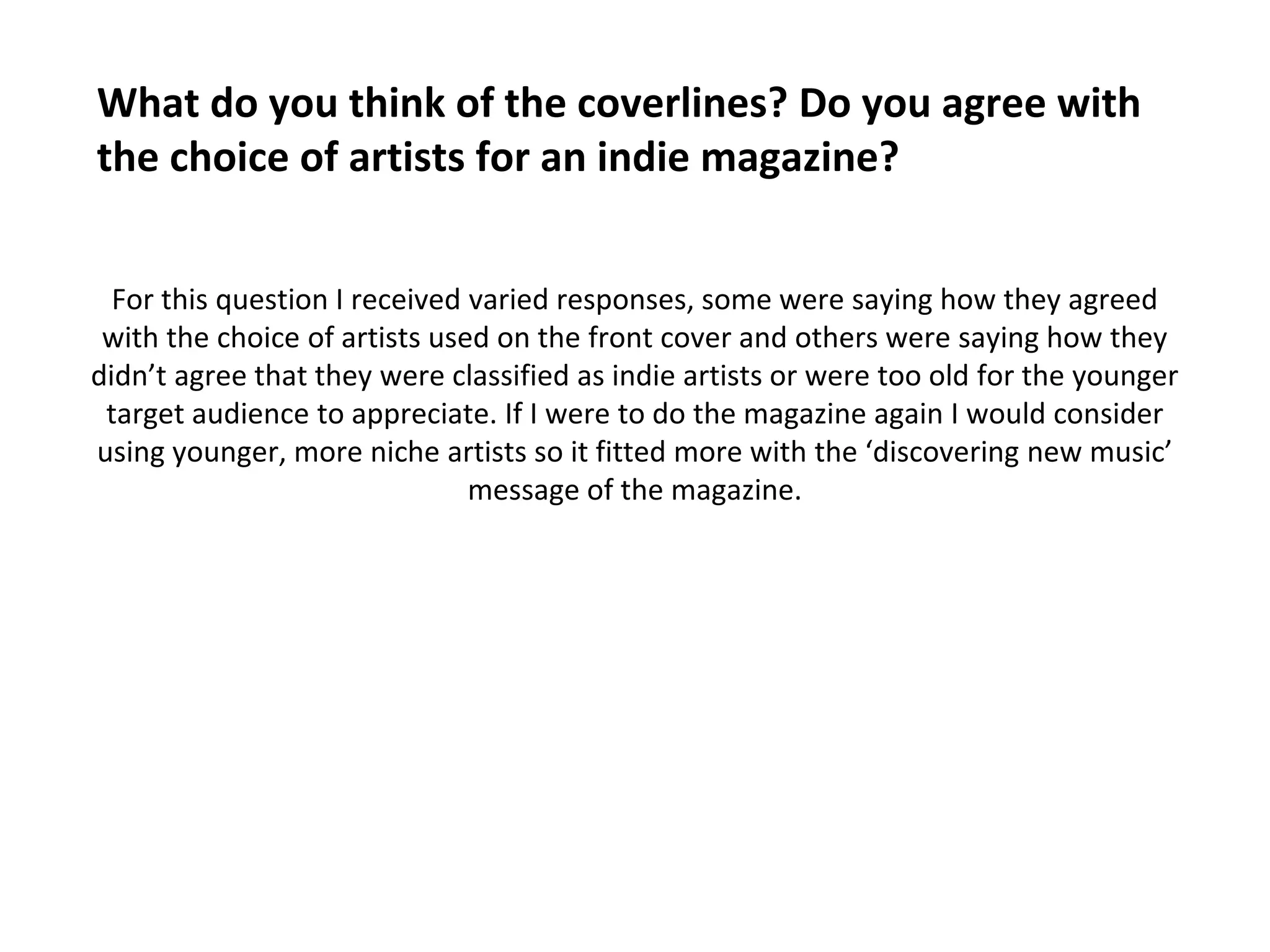
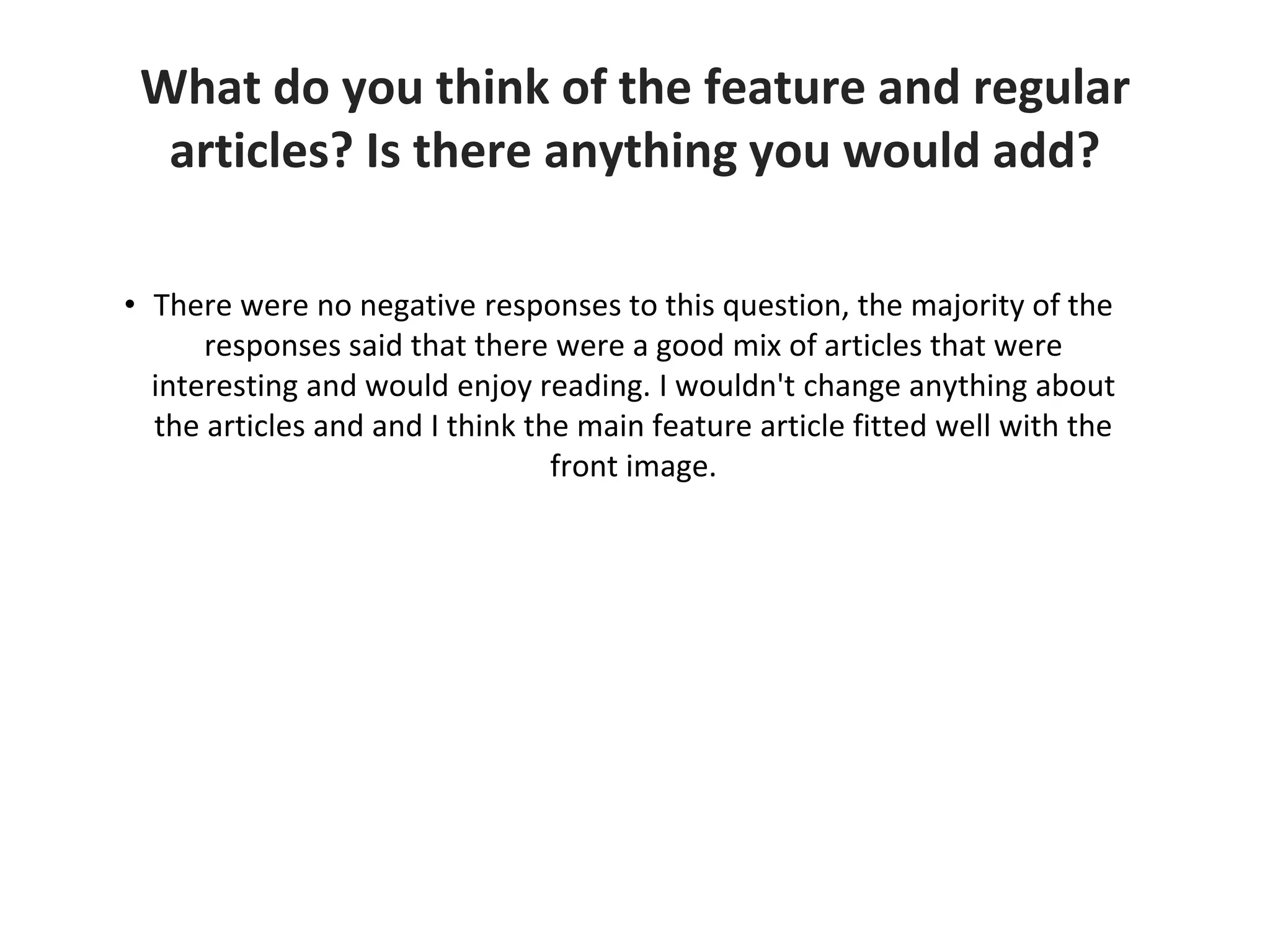
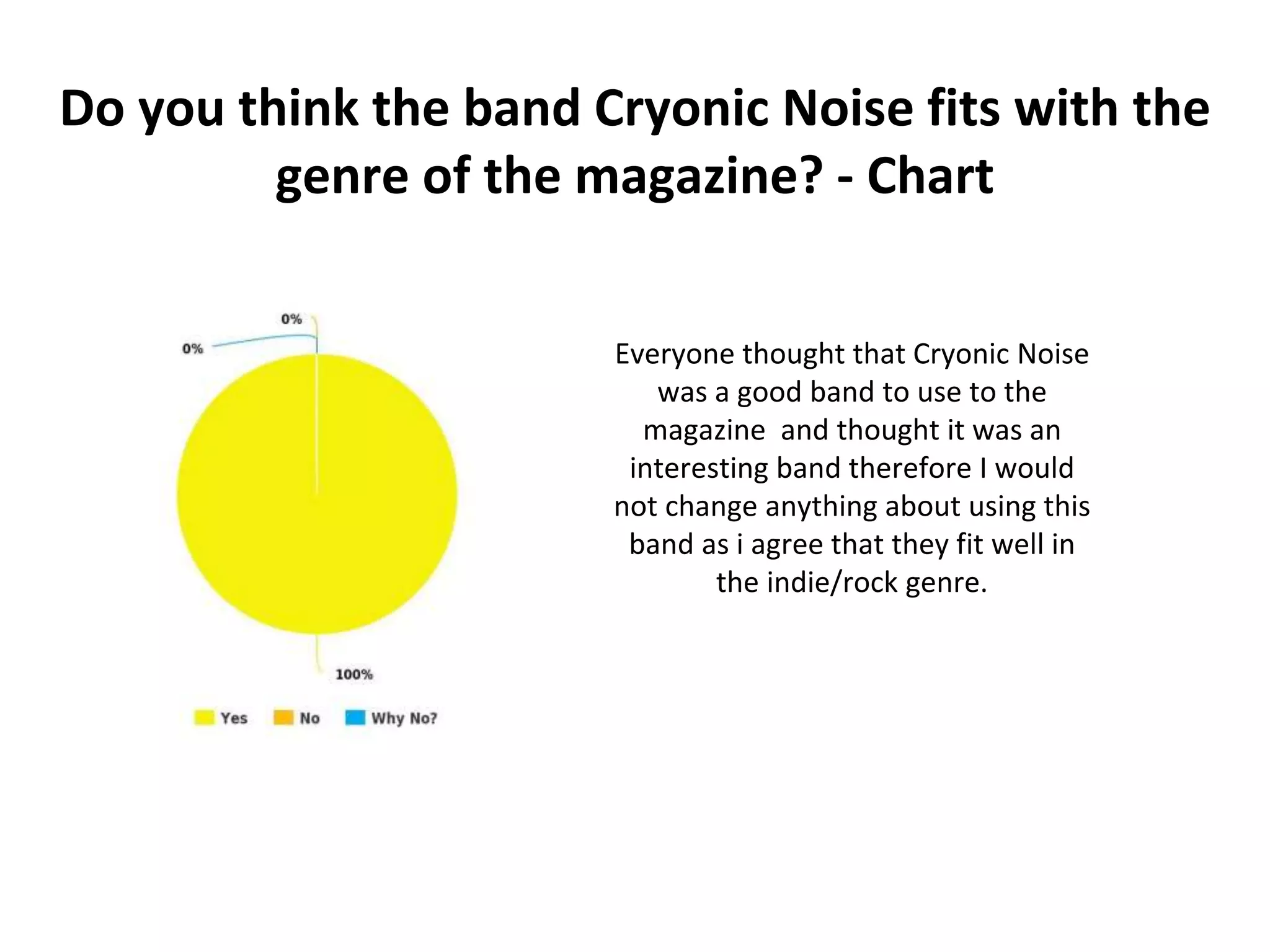
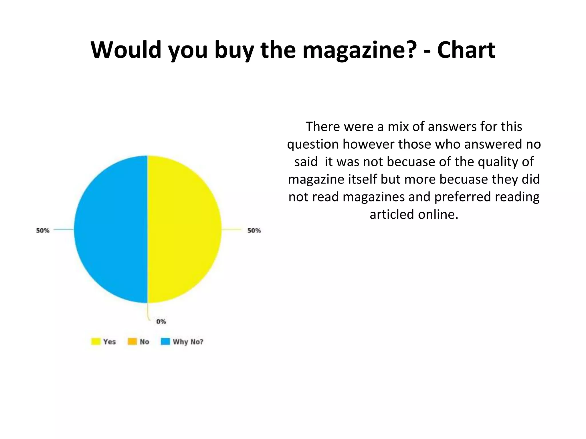
Audience Feedback
Do you like the name 'Intune' for the magazine? If
no why not? - Chart
The target audience all liked the name
‘Intune' as the name of the magazine
which shows the magazine would appeal
to my chosen target audience.
Do you think the model and camera angle of the
image suit the genre of the magazine? - Chart
If I could ask this question again I would ask
it in written form as opposed to checkbox
answers so I could find out why they liked
the angles and why they thought it suited
the magazine. However, 90% of the
respondents said that they liked it so I would
not change anything in terms of the
magazine itself.
What do you think of the coverlines? Do you agree with
the choice of artists for an indie magazine?
For this question I received varied responses, some were saying how they agreed
with the choice of artists used on the front cover and others were saying how they
didn’t agree that they were classified as indie artists or were too old for the younger
target audience to appreciate. If I were to do the magazine again I would consider
using younger, more niche artists so it fitted more with the ‘discovering new music’
message of the magazine.
What do you think of the feature and regular
articles? Is there anything you would add?
• There were no negative responses to this question, the majority of the
responses said that there were a good mix of articles that were
interesting and would enjoy reading. I wouldn't change anything about
the articles and and I think the main feature article fitted well with the
front image.
Do you think the pictures used in the contents page are
appropriate for the content of the magazine?
• All except one response was positive saying how they thought the picture in
the contents was set out nicely and they related to the content of the
magazine well. One response said that they thought that the images could be
more creative. If I did it again and had more time I would take a picture that
related to on of the more unique topics for example the article about music
healing and used my photography skills to create a unique and creative image
to draw the reader in.
Do you like the article in the double page spread? Does
it fit with the style of the magazine?
• The double page spread had mixed reviews, some of the responses said that the
article was interesting and liked the layout of the page and others said that they
would like to hear more about the background of the band and more details
about their lives. If I were to do it again I would spend more time researching the
band and find out the type questions the audience wanted to hear before I took
the interview.
Do you think the band Cryonic Noise fits with the
genre of the magazine? - Chart
Everyone thought that Cryonic Noise
was a good band to use to the
magazine and thought it was an
interesting band therefore I would
not change anything about using this
band as i agree that they fit well in
the indie/rock genre.
What would you change about the magazine?
• The main complaint about the magazine was the colour scheme as people
thought there was a lack colour diversity however I would not change this
as I deliberately used a house style to bring continuity into the magazine
and make it identifiable to readers. I also think the colours match the indie
genre so fits well with the theme of the magazine.
Would you buy the magazine? - Chart
There were a mix of answers for this
question however those who answered no
said it was not becuase of the quality of
magazine itself but more becuase they did
not read magazines and preferred reading
articled online.
Would you pay £3.75 for the magazine? - Chart
Some people said that £3.75 was too high a price
to pay for a new magazine that had not ‘earned
its stripes’ in the industry yet. Next time I would
consider reducing the price however 50% of the
respondents said that they thought that it was a
fair price to pay and would pay it for the
magazine.

Audience feedback ppt

  • 1.
  • 2.
    Do you likethe name 'Intune' for the magazine? If no why not? - Chart The target audience all liked the name ‘Intune' as the name of the magazine which shows the magazine would appeal to my chosen target audience.
  • 3.
    Do you thinkthe model and camera angle of the image suit the genre of the magazine? - Chart If I could ask this question again I would ask it in written form as opposed to checkbox answers so I could find out why they liked the angles and why they thought it suited the magazine. However, 90% of the respondents said that they liked it so I would not change anything in terms of the magazine itself.
  • 4.
    What do youthink of the coverlines? Do you agree with the choice of artists for an indie magazine? For this question I received varied responses, some were saying how they agreed with the choice of artists used on the front cover and others were saying how they didn’t agree that they were classified as indie artists or were too old for the younger target audience to appreciate. If I were to do the magazine again I would consider using younger, more niche artists so it fitted more with the ‘discovering new music’ message of the magazine.
  • 5.
    What do youthink of the feature and regular articles? Is there anything you would add? • There were no negative responses to this question, the majority of the responses said that there were a good mix of articles that were interesting and would enjoy reading. I wouldn't change anything about the articles and and I think the main feature article fitted well with the front image.
  • 6.
    Do you thinkthe pictures used in the contents page are appropriate for the content of the magazine? • All except one response was positive saying how they thought the picture in the contents was set out nicely and they related to the content of the magazine well. One response said that they thought that the images could be more creative. If I did it again and had more time I would take a picture that related to on of the more unique topics for example the article about music healing and used my photography skills to create a unique and creative image to draw the reader in.
  • 7.
    Do you likethe article in the double page spread? Does it fit with the style of the magazine? • The double page spread had mixed reviews, some of the responses said that the article was interesting and liked the layout of the page and others said that they would like to hear more about the background of the band and more details about their lives. If I were to do it again I would spend more time researching the band and find out the type questions the audience wanted to hear before I took the interview.
  • 8.
    Do you thinkthe band Cryonic Noise fits with the genre of the magazine? - Chart Everyone thought that Cryonic Noise was a good band to use to the magazine and thought it was an interesting band therefore I would not change anything about using this band as i agree that they fit well in the indie/rock genre.
  • 9.
    What would youchange about the magazine? • The main complaint about the magazine was the colour scheme as people thought there was a lack colour diversity however I would not change this as I deliberately used a house style to bring continuity into the magazine and make it identifiable to readers. I also think the colours match the indie genre so fits well with the theme of the magazine.
  • 10.
    Would you buythe magazine? - Chart There were a mix of answers for this question however those who answered no said it was not becuase of the quality of magazine itself but more becuase they did not read magazines and preferred reading articled online.
  • 11.
    Would you pay£3.75 for the magazine? - Chart Some people said that £3.75 was too high a price to pay for a new magazine that had not ‘earned its stripes’ in the industry yet. Next time I would consider reducing the price however 50% of the respondents said that they thought that it was a fair price to pay and would pay it for the magazine.