
Recommended
More Related Content
What's hot
What's hot (18)
Similar to Textual Analysis
Similar to Textual Analysis (20)
Recently uploaded
Recently uploaded (9)
Textual Analysis
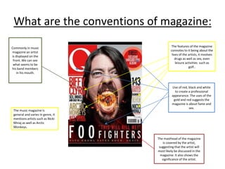
- 1. What are the conventions of magazine: The features of the magazine connotes to it being about the lives of the artists, it involves drugs as well as sex, even leisure activities such as golf.. The music magazine is general and varies in genre, it mentions artists such as Nicki Minaj as well as Arctic Monkeys. Use of red, black and white to create a professional appearance. The uses of the gold and red suggests the magazine is about fame and sex. The masthead of the magazine is covered by the artist, suggesting that the artist will most likely be discussed in the magazine. It also shows the significance of the artist. Commonly in music magazine an artist is displayed on the front. We can see what seems to be his band members in his mouth.
- 2. Masthead uses the colour gold. It could do this to contrast with the blue background or signify riches and wealth. A list of rock bands which signifies that the magazine is about the rock genre. A picture of what seems like an artist from a rock band. The magazine is aimed at mainstream readers who are ranged from the ages of 15 - 25 Rock magazine. The incomplete sentence can create curiosity The use of the colours turquoise, gold and dark blue create a visually pleasing experience.
- 3. The font of the magazine looks old, this therefore creates the impression that the magazine is more established and well known. The picture has been edited to seem like it is older, this could mean that it is one of the artists mentioned on the list. The target audience is hard to determine as there is mentions of artists such as Jay-Z and other rock artists. This appears to look like a generic magazine of artists who are currently popular. The names of people who have fame will attract more people to read/buy the magazine. The magazine is influenced by rock.
- 4. The issue number clearly shows that there is a constant audience for the magazine, this can be seen as an index for readers of Q. The mixture of pictures with the page number as well as written features in the article is done purposely to make the contents page looks more interesting and less plain. The use of red, white as well as black make the magazine seem more formal. The magazine has artists who are of older ages. This can suggest that the magazine is for a target audience between the ages of 30-50. The use of headers make the contents page feel far more clear and structured.
- 5. The contents page appears to be more subtle as it isn’t highlighted in the magazine. The music magazine has a great focus on the artist which could make it seem as if the magazine is centred around him. The use of dark and light grey could be used to create the idea that the magazine is about technology and metal music.
- 6. The picture of the woman taking up a large portion of the available space in the magazine suggests that she is significant. The red title “Lily Allen” is able to show that she is important and relevant to the music magazine. The use of typography that is made to deliberately look like newspaper cut outs to catch the attention of the reader, the typography matches the women’s flashy dress. The women presumably being Lily Aleen The colour of scheme of red, black and white may be used to ensure that the picture stands out but also matches the attire the woman wears, making the music magazine seem more formal and tidy.
- 7. The J in the centre of the writing could be used to highlight the the importance of Jay Z the artist. The picture of the black male is has two sets of lighting on the two halves of his face. What he is wearing makes it seem as if he has wealth. The quote is in red so it suits the colour scheme of the magazine, it is also used to stand out. The bold capital letters is there to ensure that the reader has constant focus on the text and continues to read.
- 8. The picture of the woman is large and takes up a large amount of the space, this suggests that she is relatively important to the magazine. The size of the writing and the positioning of the text suggests that it is Alexandra Burke, and that she is the main focus in the story. The use of pink is able to add some funk to the magazine and stands out. It is also used throughout the magazine. The use of the black and white colours shows that it is there to preserve the formality of the magazine. The page numbers are there to make the magazine more functional and usable. It also makes it seem more professional
- 9. The date of the magazine conflicts with the layout of the magazine because it says it was published in 2002, but the nature of the things on the contents page say otherwise. This is most likely because the creators of the contents page for Mojo wanted to recreate the feeling of a music magazine which was written 20 to 30 years ago. The use of the bold red text is used to make the boxes stand out. The use of gold is complementary to the red text. The way in which the people who made Mojo’s content page placed the images, makes the contents page for more interesting for the reader to look at, but not too complex to detract from the importance of a summary of what will be found in the magazine, and on which pages. The typography used in the contents page for the titles of the articles contradicts the creative way in which images were presented on the contents page, with very formal and what one might deem uncreative writing.