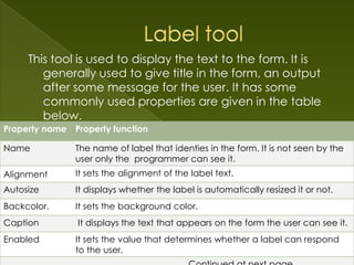
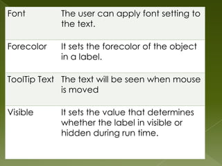
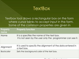
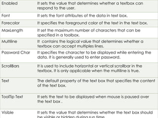
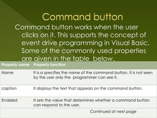
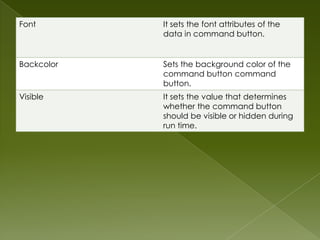
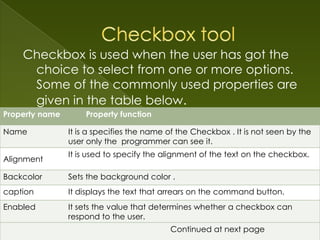
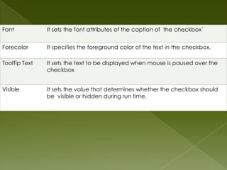
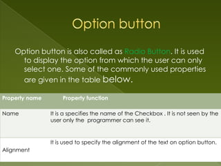
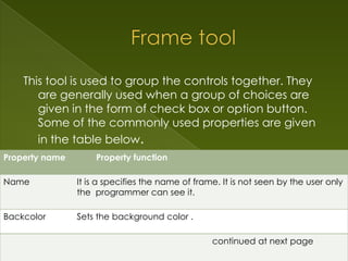
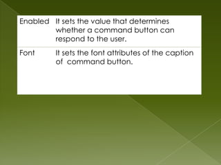
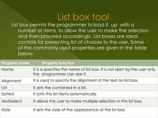
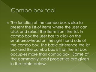
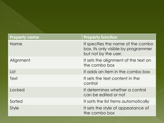
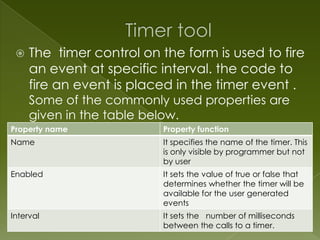
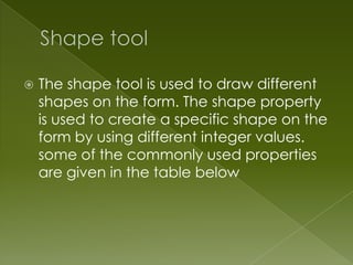
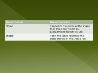
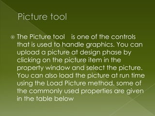
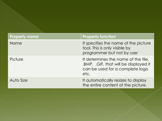
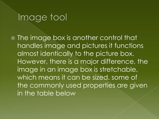
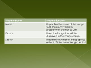
Injustice - Developers Among Us (SciFiDevCon 2024)
UI Controls Guide
1.
2. Follow these steps to design the user interface:
1.Create a form.
2. Choose the object that you want to draw form
the toolbox.
3.Draw the object on the form.
4.Change its property in the Property window.
I will tell you about some commonly used controls
that can be interested in the form to it
interactive.
4. This tool is used to select the object.
Whenever any tool is selected then
mouse pointer changes to a ‘+’sign. By
using this tool you can draw an object
on the form. To get the mouse pointer
back, click on the Pointer tool. It has no
properties.
Note: Pointer tool is also the default tool of
the toolbox.
5. This tool is used to display the text to the form. It is
generally used to give title in the form, an output
after some message for the user. It has some
commonly used properties are given in the table
below.
Property name Property function
Name The name of label that identies in the form. It is not seen by the
user only the programmer can see it.
Alignment It sets the alignment of the label text.
Autosize It displays whether the label is automatically resized it or not.
Backcolor. It sets the background color.
Caption It displays the text that appears on the form the user can see it.
Enabled It sets the value that determines whether a label can respond
to the user.
6. Font The user can apply font setting to
the text.
Forecolor It sets the forecolor of the object
in a label.
ToolTip Text The text will be seen when mouse
is moved
Visible It sets the value that determines
whether the label in visible or
hidden during run time.
7. Textbox tool draws a rectangular box on the form
where cursor blinks to accept input in the form.
Some of the common properties are given in
the table below.
Property Property function
name
Name It is a specifies the name of the text box.
It is not seen by the user only the programmer can see it.
It is used to specify the alignment of the data entered in
Alignment
a text box.
Backcolor
Backcolor Sets the background color of the text box.
Sets the background color .
8. Enabled It sets the value that determines whether a textbox can
respond to the user.
Font It sets the font attributes of the data in text box.
Forecolor It specifies the foreground color of the text in the text box.
MaxLength It set the maximum number of characters that can be
specified in a toolbox.
Multiline It contains the logical value that determines whether a
textbox can accept multiples lines.
Password Char It specifies the character to be displayed while entering the
data. It is generally used to enter password.
ScrollBars It is used to include horizontal or vertical scrollbar in the
textbox. It is only applicable when the multiline is true.
Text The default property of the text box that specifies the content
of the text box.
ToolTip Text It sets the text to be displayed when mouse is paused over
the text box .
Visible It sets the value that determines whether the text box should
9. Command button works when the user
clicks on it. This supports the concept of
event drive programming in Visual Basic.
Some of the commonly used properties
are given in the table below.
Property name Property function
Name It is a specifies the name of the command button. It is not seen
by the user only the programmer can see it.
caption It displays the text that appears on the command button.
Enabled It sets the value that determines whether a command button
can respond to the user.
Font It sets the font attributes of theContinued at next page
caption of command button.
10. Font It sets the font attributes of the
data in command button.
Backcolor Sets the background color of the
command button command
button.
Visible It sets the value that determines
whether the command button
should be visible or hidden during
run time.
11. Checkbox is used when the user has got the
choice to select from one or more options.
Some of the commonly used properties are
given in the table below.
Property name Property function
Name It is a specifies the name of the Checkbox . It is not seen by the
user only the programmer can see it.
It is used to specify the alignment of the text on the checkbox.
Alignment
Backcolor Sets the background color .
caption It displays the text that arrears on the command button.
Enabled It sets the value that determines whether a checkbox can
respond to the user.
Continued at next page
12. Font It sets the font attributes of the caption of the checkbox`
Forecolor It specifies the foreground color of the text in the checkbox.
ToolTip Text It sets the text to be displayed when mouse is paused over the
checkbox
Visible It sets the value that determines whether the checkbox should
be visible or hidden during run time.
13. Option button is also called as Radio Button. It is used
to display the option from which the user can only
select one. Some of the commonly used properties
are given in the table below.
Property name Property function
Name It is a specifies the name of the Checkbox . It is not seen by the
user only the programmer can see it.
It is used to specify the alignment of the text on option button.
Alignment
14. This tool is used to group the controls together. They
are generally used when a group of choices are
given in the form of check box or option button.
Some of the commonly used properties are given
in the table below.
Property name Property function
Name It is a specifies the name of frame. It is not seen by the user only
the programmer can see it.
Backcolor Sets the background color .
caption It displays the text that arrears on the command button.
continued at next page
15. Enabled It sets the value that determines
whether a command button can
respond to the user.
Font It sets the font attributes of the caption
of command button.
16. List box permits the programmer to load it up with a
number of items, to allow the user to make the selection
and then proceed accordingly. List boxes are ideal
controls for presenting list of choices to the user. Some
of the commonly used properties are given in the table
below.
Property name Property function
Name It is a specifies the name of list box. It is not seen by the user only
the programmer can see it.
Alignment It is used to specify the alignment of the text on list box.
List It sets the contained in a list.
Sorted It sorts the list items automatically.
Multiselect It allows the user to make multiple selection in the list box.
Style It sets the style of the appearance of the list box
17. The function of the combo box is also to
present the list of items where the user can
click and select the items from the list. In
combo box the user has to click on the
small arrowhead on the right hand side of
the combo box. The basic difference the list
box and the combo box is that the list box
occupies more than combo box . Some of
the commonly used properties are given
in the table below.
18. Property name Property function
Name It specifies the name of the combo
box. Its only visible by programmer
but not by the user.
Alignment It sets the alignment of the text on
the combo box
List It adds an item in the combo box
Text It sets the text content in the
control
Locked It determines whether a control
can be edited or not
Sorted It sorts the list items automatically
Style It sets the style of appearance of
the combo box
19. The timer control on the form is used to fire
an event at specific interval. the code to
fire an event is placed in the timer event .
Some of the commonly used properties are
given in the table below.
Property name Property function
Name It specifies the name of the timer. This
is only visible by programmer but not
by user
Enabled It sets the value of true or false that
determines whether the timer will be
available for the user generated
events
Interval It sets the number of milliseconds
between the calls to a timer.
20. The shape tool is used to draw different
shapes on the form. The shape property
is used to create a specific shape on the
form by using different integer values.
some of the commonly used properties
are given in the table below
21. Property name Property function
Name It specifies the name of the shape
tool. This is only visible by
programmer but not by user
Shape It sets the value returning the
appearance of the shape tool
22. The Picture tool is one of the controls
that is used to handle graphics. You can
upload a picture at design phase by
clicking on the picture item in the
property window and select the picture.
You can also load the picture at run time
using the Load Picture method. some of
the commonly used properties are given
in the table below
23. Property name Property function
Name It specifies the name of the picture
tool. This is only visible by
programmer but not by user
Picture It determines the name of the file,
.BMP, .GIF, that will be displayed it
can be used for a complete logo
etc.
Auto Size It automatically resizes to display
the entire content of the picture.
24. The image box is another control that
handles image and pictures it functions
almost identically to the picture box.
However, there is a major difference, the
image in an image box is stretchable,
which means it can be sized. some of
the commonly used properties are given
in the table below
25. Property name Property function
Name It specifies the name of the image
tool. This is only visible by
programmer but not by user
Picture It sets the image that will be
displayed in the image control
Stretch It determines whether the graphics
resize to fit the size of image control