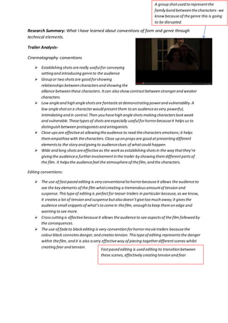
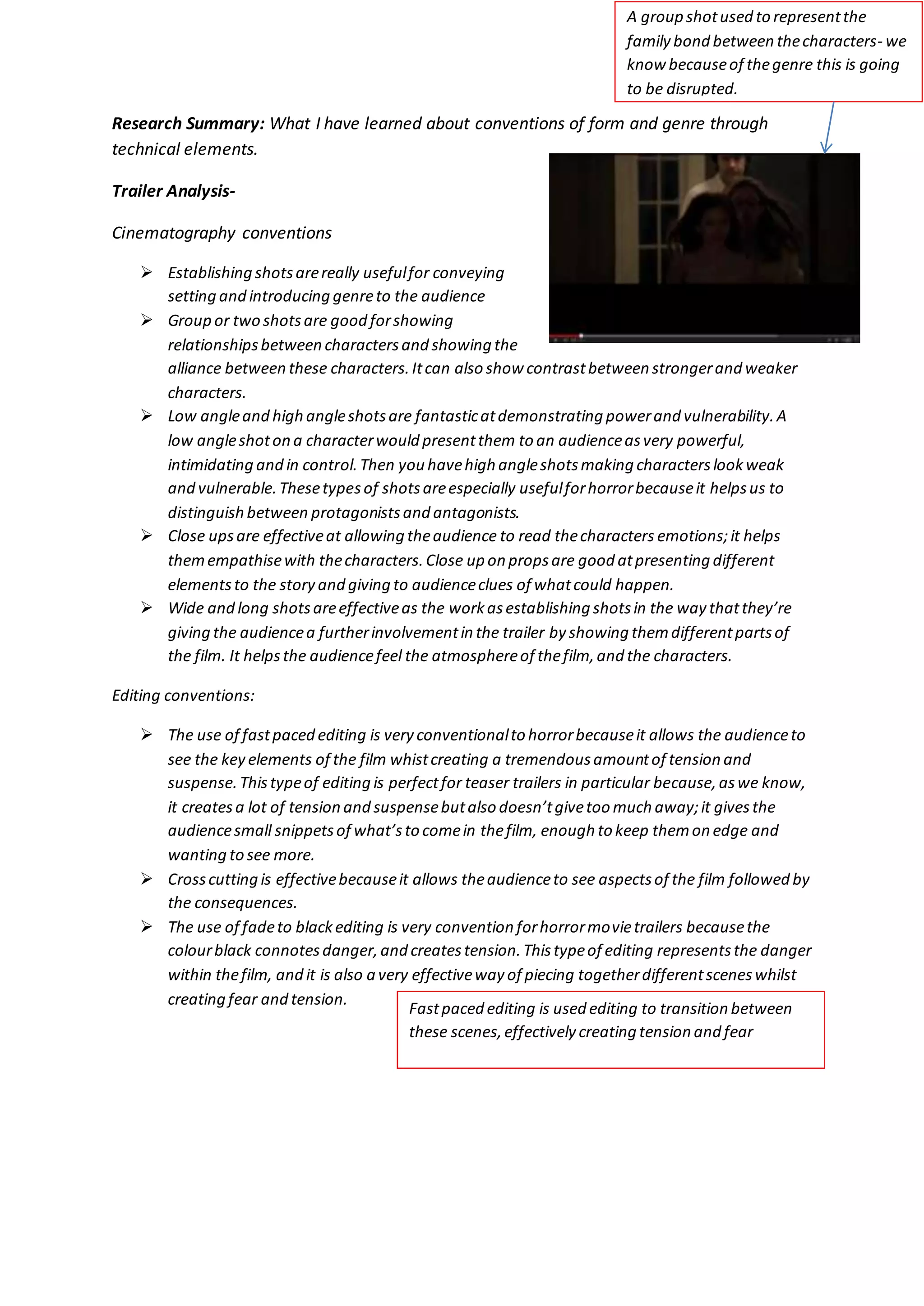
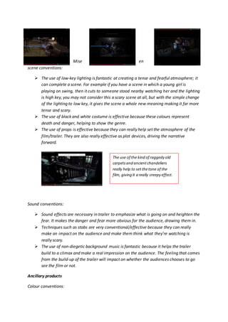
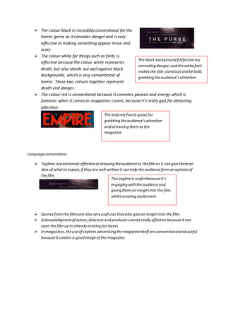
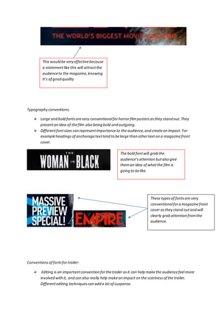
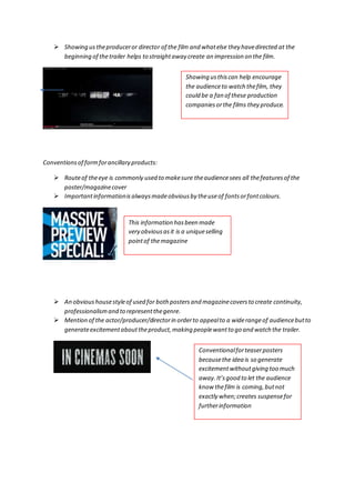
A group shot used to represent the 
family bond between the characters- we 
know because of the genre this is going 
to be disrupted. 
Research Summary: What I have learned about conventions of form and genre through 
technical elements. 
Trailer Analysis- 
Cinematography conventions 
 Establishing shots are really useful for conveying 
setting and introducing genre to the audience 
 Group or two shots are good for showing 
relationships between characters and showing the 
alliance between these characters. It can also show contrast between stronger and weaker 
characters. 
 Low angle and high angle shots are fantastic at demonstrating power and vulnerability. A 
low angle shot on a character would present them to an audience as very powerful, 
intimidating and in control. Then you have high angle shots making characters look weak 
and vulnerable. These types of shots are especially useful for horror because it helps us to 
distinguish between protagonists and antagonists. 
 Close ups are effective at allowing the audience to read the characters emotions; it helps 
them empathise with the characters. Close up on props are good at presenting different 
elements to the story and giving to audience clues of what could happen. 
 Wide and long shots are effective as the work as establishing shots in the way that they’re 
giving the audience a further involvement in the trailer by showing them different parts of 
the film. It helps the audience feel the atmosphere of the film, and the characters. 
Editing conventions: 
 The use of fast paced editing is very conventional to horror because it allows the audience to 
see the key elements of the film whist creating a tremendous amount of tension and 
suspense. This type of editing is perfect for teaser trailers in particular because, as we know, 
it creates a lot of tension and suspense but also doesn’t give too much away; it gives the 
audience small snippets of what’s to come in the film, enough to keep them on edge and 
wanting to see more. 
 Cross cutting is effective because it allows the audience to see aspects of the film followed by 
the consequences. 
 The use of fade to black editing is very convention for horror movie trailers because the 
colour black connotes danger, and creates tension. This type of editing represents the danger 
within the film, and it is also a very effective way of piecing together different scenes whilst 
creating fear and tension. 
Fast paced editing is used editing to transition between 
these scenes, effectively creating tension and fear
Mise en 
scene conventions: 
 The use of low-key lighting is fantastic at creating a tense and fearful atmosphere; it 
can complete a scene. For example if you have a scene in which a young girl is 
playing on swing, then it cuts to someone stood nearby watching her and the lighting 
is high key, you may not consider this a scary scene at all, but with the simple change 
of the lighting to low key, it gives the scene a whole new meaning making it far more 
tense and scary. 
 The use of black and white costume is effective because these colours represent 
death and danger, helping to show the genre. 
 The use of props is effective because they can really help set the atmosphere of the 
film/trailer. They are also really effective as plot devices, driving the narrative 
forward. 
Sound conventions: 
 Sound effects are necessary in trailer to emphasize what is going on and heighten the 
fear. It makes the danger and fear more obvious for the audience, drawing them in. 
 Techniques such as stabs are very conventional/effective because they can really 
make an impact on the audience and make them think what they’re watching is 
really scary. 
 The use of non-diegetic background music is fantastic because it helps the trailer 
build to a climax and make a real impression on the audience. The feeling that comes 
from the build-up of the trailer will impact on whether the audiences chooses to go 
see the film or not. 
Ancillary products 
Colour conventions: 
The use of the kind of raggedy old 
carpets and ancient chandeliers 
really help to set the tone of the 
film, giving it a really creepy effect.
 The colour black in incredibly conventional for the 
horror genre as it connotes danger and is very 
effective at making something appear tense and 
scary 
 The colour white for things such as fonts is 
effective because the colour white represents 
death, but also stands out well against black 
backgrounds, which is very conventional of 
horror. These two colours together represent 
death and danger. 
 The colour red is conventional because it connotes passion and energy which is 
fantastic when it comes to magazines covers, because it’s really god for attracting 
attention. 
Language conventions: 
 Taglines are extremely effective at drawing the audience to the film as it can give them an 
idea of what to expect, if they are well written it can help the audience form an opinion of 
the film. 
 Quotes from the films are also very useful as they also give an insight into the film. 
 Acknowledgment of actors, directors and producers can be really effective because it can 
open the film up to already existing fan bases. 
 In magazines, the use of skylines advertising the magazine itself are conventional and useful 
because it creates a good image of the magazine. 
The black background if effective my 
connoting danger, and the white font 
makes the title stand out and be bold, 
grabbing the audience’s attention 
The bold red font is great for 
grabbing the audience’s attention 
and attracting them to the 
magazine 
This tagline is useful because it’s 
engaging with the audience and 
giving them an insight into the film, 
whilst creating excitement
This would be very effective because 
a statement like this will attract the 
audience to the magazine, knowing 
it’s of good quality 
Typography conventions: 
 Large and bold fonts are very conventional for horror film posters as they stand out. They 
present an idea of the film also being bold and outgoing. 
 Different font sizes can represent importance to the audience, and create an impact. For 
example headings of anchorage text tend to be large than other text on a magazine front 
cover. 
Conventions of form for trailer: 
The bold font will grab the 
audience’s attention but also give 
them an idea of what the film is 
going to be like. 
These types of fonts are very 
conventional for a magazine front 
cover as they stand out and will 
clearly grab attention from the 
audience. 
 Editing is an important convention for the trailer as it can help make the audience feel more 
involved with it, and can also really help make an impact on the scariness of the trailer. 
Different editing techniques can add a lot of suspense.
 Showing us the producer or director of the film and what else they have directed at the 
beginning of the trailer helps to straight away create an impression on the film. 
Conventions of form for ancillary products: 
Showing us this can help encourage 
the audience to watch the film, they 
could be a fan of these production 
companies or the films they produce. 
 Route of the eye is commonly used to make sure the audience sees all the features of the 
poster/magazine cover 
 Important information is always made obvious by the use of fonts or font colours. 
This information has been made 
very obvious as it is a unique selling 
point of the magazine 
 An obvious house style of used for both posters and magazine covers to create continuity, 
professionalism and to represent the genre. 
 Mention of the actor/producer/director in order to appeal to a wide range of audience but to 
generate excitement about the product, making people want to go and watch the trailer. 
Conventional for teaser posters 
because the idea is so generate 
excitement without giving too much 
away. It’s good to let the audience 
know the film is coming, but not 
exactly when; creates suspense for 
further information
Conventions of genre for trailer: 
 A consistent use of cinematography, mise en scene, sound and editing to make the genre 
obvious to the audience and also make them feel more engaged with the trailer. It is also 
obviously used to add tension and fear to the trailer and make it more gripping. It helps the 
audience understand the emotions of the characters. 
Conventions of genre for ancillary products: 
 A consistent house style to create a brand identity, such as red, white and black. 
 The main image is a very important factor of both teaser posters and magazine covers, they 
give the audience a very first look into the film and can encourage 
them to go and see the film. The main image is always consistent with 
the genre of the film. 
It 
Both of these images represent the 
genre of the film. They introduce us 
to the characters and are giving us 
an idea of what to expect within the 
actual film. 
introduces us to characters within the film.

Research summary

  • 1.
    A group shotused to represent the family bond between the characters- we know because of the genre this is going to be disrupted. Research Summary: What I have learned about conventions of form and genre through technical elements. Trailer Analysis- Cinematography conventions  Establishing shots are really useful for conveying setting and introducing genre to the audience  Group or two shots are good for showing relationships between characters and showing the alliance between these characters. It can also show contrast between stronger and weaker characters.  Low angle and high angle shots are fantastic at demonstrating power and vulnerability. A low angle shot on a character would present them to an audience as very powerful, intimidating and in control. Then you have high angle shots making characters look weak and vulnerable. These types of shots are especially useful for horror because it helps us to distinguish between protagonists and antagonists.  Close ups are effective at allowing the audience to read the characters emotions; it helps them empathise with the characters. Close up on props are good at presenting different elements to the story and giving to audience clues of what could happen.  Wide and long shots are effective as the work as establishing shots in the way that they’re giving the audience a further involvement in the trailer by showing them different parts of the film. It helps the audience feel the atmosphere of the film, and the characters. Editing conventions:  The use of fast paced editing is very conventional to horror because it allows the audience to see the key elements of the film whist creating a tremendous amount of tension and suspense. This type of editing is perfect for teaser trailers in particular because, as we know, it creates a lot of tension and suspense but also doesn’t give too much away; it gives the audience small snippets of what’s to come in the film, enough to keep them on edge and wanting to see more.  Cross cutting is effective because it allows the audience to see aspects of the film followed by the consequences.  The use of fade to black editing is very convention for horror movie trailers because the colour black connotes danger, and creates tension. This type of editing represents the danger within the film, and it is also a very effective way of piecing together different scenes whilst creating fear and tension. Fast paced editing is used editing to transition between these scenes, effectively creating tension and fear
  • 2.
    Mise en sceneconventions:  The use of low-key lighting is fantastic at creating a tense and fearful atmosphere; it can complete a scene. For example if you have a scene in which a young girl is playing on swing, then it cuts to someone stood nearby watching her and the lighting is high key, you may not consider this a scary scene at all, but with the simple change of the lighting to low key, it gives the scene a whole new meaning making it far more tense and scary.  The use of black and white costume is effective because these colours represent death and danger, helping to show the genre.  The use of props is effective because they can really help set the atmosphere of the film/trailer. They are also really effective as plot devices, driving the narrative forward. Sound conventions:  Sound effects are necessary in trailer to emphasize what is going on and heighten the fear. It makes the danger and fear more obvious for the audience, drawing them in.  Techniques such as stabs are very conventional/effective because they can really make an impact on the audience and make them think what they’re watching is really scary.  The use of non-diegetic background music is fantastic because it helps the trailer build to a climax and make a real impression on the audience. The feeling that comes from the build-up of the trailer will impact on whether the audiences chooses to go see the film or not. Ancillary products Colour conventions: The use of the kind of raggedy old carpets and ancient chandeliers really help to set the tone of the film, giving it a really creepy effect.
  • 3.
     The colourblack in incredibly conventional for the horror genre as it connotes danger and is very effective at making something appear tense and scary  The colour white for things such as fonts is effective because the colour white represents death, but also stands out well against black backgrounds, which is very conventional of horror. These two colours together represent death and danger.  The colour red is conventional because it connotes passion and energy which is fantastic when it comes to magazines covers, because it’s really god for attracting attention. Language conventions:  Taglines are extremely effective at drawing the audience to the film as it can give them an idea of what to expect, if they are well written it can help the audience form an opinion of the film.  Quotes from the films are also very useful as they also give an insight into the film.  Acknowledgment of actors, directors and producers can be really effective because it can open the film up to already existing fan bases.  In magazines, the use of skylines advertising the magazine itself are conventional and useful because it creates a good image of the magazine. The black background if effective my connoting danger, and the white font makes the title stand out and be bold, grabbing the audience’s attention The bold red font is great for grabbing the audience’s attention and attracting them to the magazine This tagline is useful because it’s engaging with the audience and giving them an insight into the film, whilst creating excitement
  • 4.
    This would bevery effective because a statement like this will attract the audience to the magazine, knowing it’s of good quality Typography conventions:  Large and bold fonts are very conventional for horror film posters as they stand out. They present an idea of the film also being bold and outgoing.  Different font sizes can represent importance to the audience, and create an impact. For example headings of anchorage text tend to be large than other text on a magazine front cover. Conventions of form for trailer: The bold font will grab the audience’s attention but also give them an idea of what the film is going to be like. These types of fonts are very conventional for a magazine front cover as they stand out and will clearly grab attention from the audience.  Editing is an important convention for the trailer as it can help make the audience feel more involved with it, and can also really help make an impact on the scariness of the trailer. Different editing techniques can add a lot of suspense.
  • 5.
     Showing usthe producer or director of the film and what else they have directed at the beginning of the trailer helps to straight away create an impression on the film. Conventions of form for ancillary products: Showing us this can help encourage the audience to watch the film, they could be a fan of these production companies or the films they produce.  Route of the eye is commonly used to make sure the audience sees all the features of the poster/magazine cover  Important information is always made obvious by the use of fonts or font colours. This information has been made very obvious as it is a unique selling point of the magazine  An obvious house style of used for both posters and magazine covers to create continuity, professionalism and to represent the genre.  Mention of the actor/producer/director in order to appeal to a wide range of audience but to generate excitement about the product, making people want to go and watch the trailer. Conventional for teaser posters because the idea is so generate excitement without giving too much away. It’s good to let the audience know the film is coming, but not exactly when; creates suspense for further information
  • 6.
    Conventions of genrefor trailer:  A consistent use of cinematography, mise en scene, sound and editing to make the genre obvious to the audience and also make them feel more engaged with the trailer. It is also obviously used to add tension and fear to the trailer and make it more gripping. It helps the audience understand the emotions of the characters. Conventions of genre for ancillary products:  A consistent house style to create a brand identity, such as red, white and black.  The main image is a very important factor of both teaser posters and magazine covers, they give the audience a very first look into the film and can encourage them to go and see the film. The main image is always consistent with the genre of the film. It Both of these images represent the genre of the film. They introduce us to the characters and are giving us an idea of what to expect within the actual film. introduces us to characters within the film.