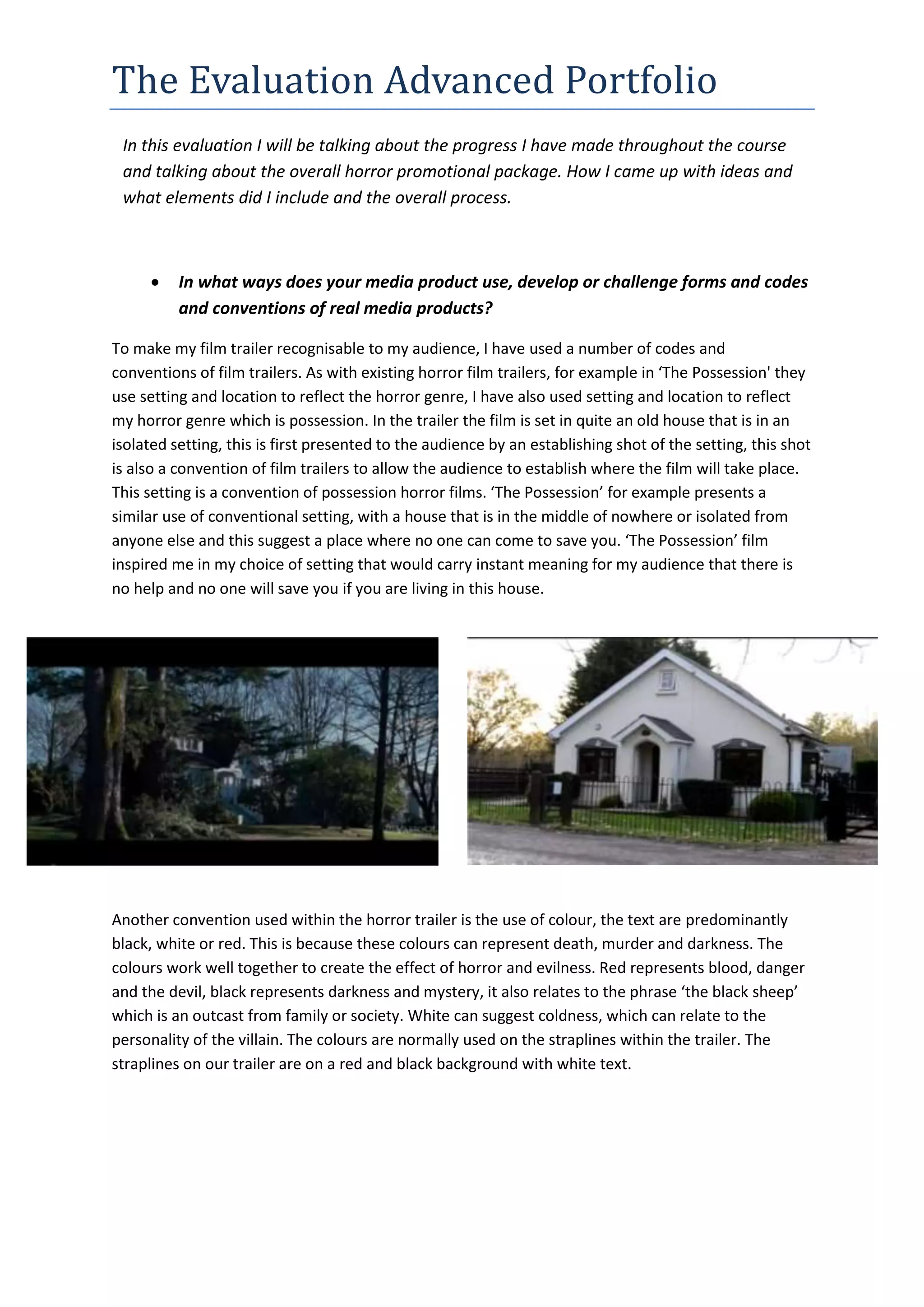
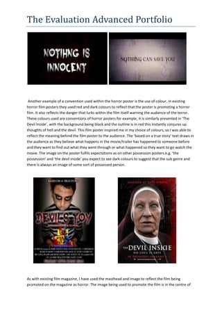
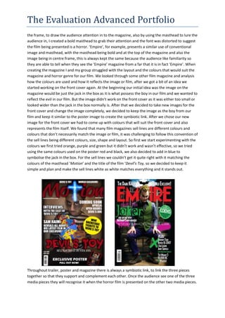
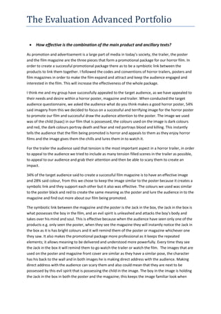
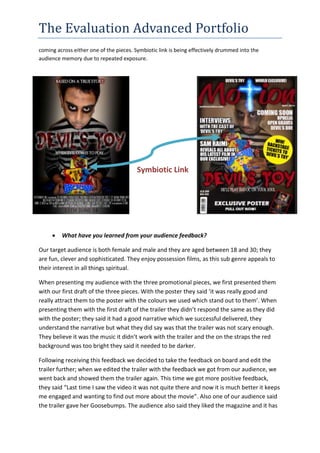
The document discusses the evaluation of a horror promotional package including a trailer, poster, and magazine. It describes how the package uses conventions of real media products in the horror genre. Color, imagery, text, and layout were employed to effectively convey horror and tension. Feedback from the target audience confirmed the package was generally successful in attracting their attention and interest through its use of scary imagery and a consistent symbolic link between pieces. Minor revisions to the trailer and a date on the poster were suggested based on audience responses.