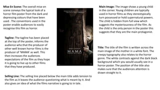
1. Mise En Scene: The overall mise en
scene conveys the typical look of a
horror film poster from the dark and
depressing colours that have been
used . The conventions used in the
poster enable audiences to easily
recognise this film as horror.
Tagline: The tagline has been placed
at the top of the poster, informs the
audience who that the producer of
other well known horror films is the
producer of ‘MAMA’ as well. This
then increases the audiences
expectations of the film as they hope
it is going to live up to other films
that they have produced.
Title: The title of the film is written across the
main image of the mother in a white font. The
creepy typography also relates to the horror
genre. The white contrasts against the dark black
background which you would usually see in a
horror poster. The position of the title also
makes sure that the audiences attention is
drawn straight to it.
Main Image: The image shows a young child
in the corner. Young children are typically
used in horror films as they stereotypically
turn possessed or hold supernatural powers.
The child is hidden from full view which
suggests the mysteriousness of the film. As
the child is the only person in the poster this
suggests that they are the main protagonist.
Selling Line: The selling line placed below the main title adds tension to
the film as it leaves the audience questioning what is meant by it. And
also gives an idea of what the films narrative is going to in tale.
2. Title: The title of the film is placed
below the main image. The typography
used connotes with the horror genre
and white font contrasts with the black
background which will catch the readers
eye. The title ‘Devil Inside’ will leave the
audience wanting to know more as it
conveys the genre of supernatural and
horror effectively.
Colour Scheme: The use of black, red and
white are traditionally used in horror posters
as they are typical colours associated with
the supernatural being. This allows the
audience to recognise the film as horror.
Main Image: Unlike the previous poster I
analysed the main image is giving direct mode
of address which will draw the attention to
the audience. The main image of the nun sub
verges the stereotype of characters that
would be associated with the horror genre.
Which will leave the audience questioning
why. Both posters that I have analysed have
both included the main image as one
character which could suggest that they are
the main protagonist within the film.
Tagline: The tagline is placed at the top of the poster and informs the
audience that the film is based on true events. This makes the film intriguing
as they will want to know what the film is about. The colour red is associated
with the horror genre and stand out from the black background.
Website: The website has been
included to encourage people to go
onto the website to find out more
about the film and when it will be out.
The method of cross media marketing
will make the people feel involved.