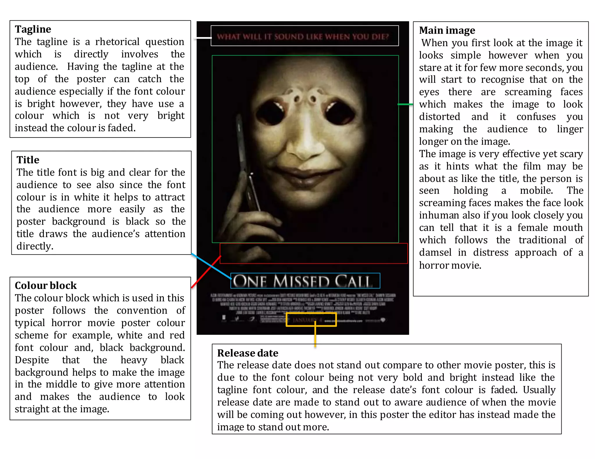
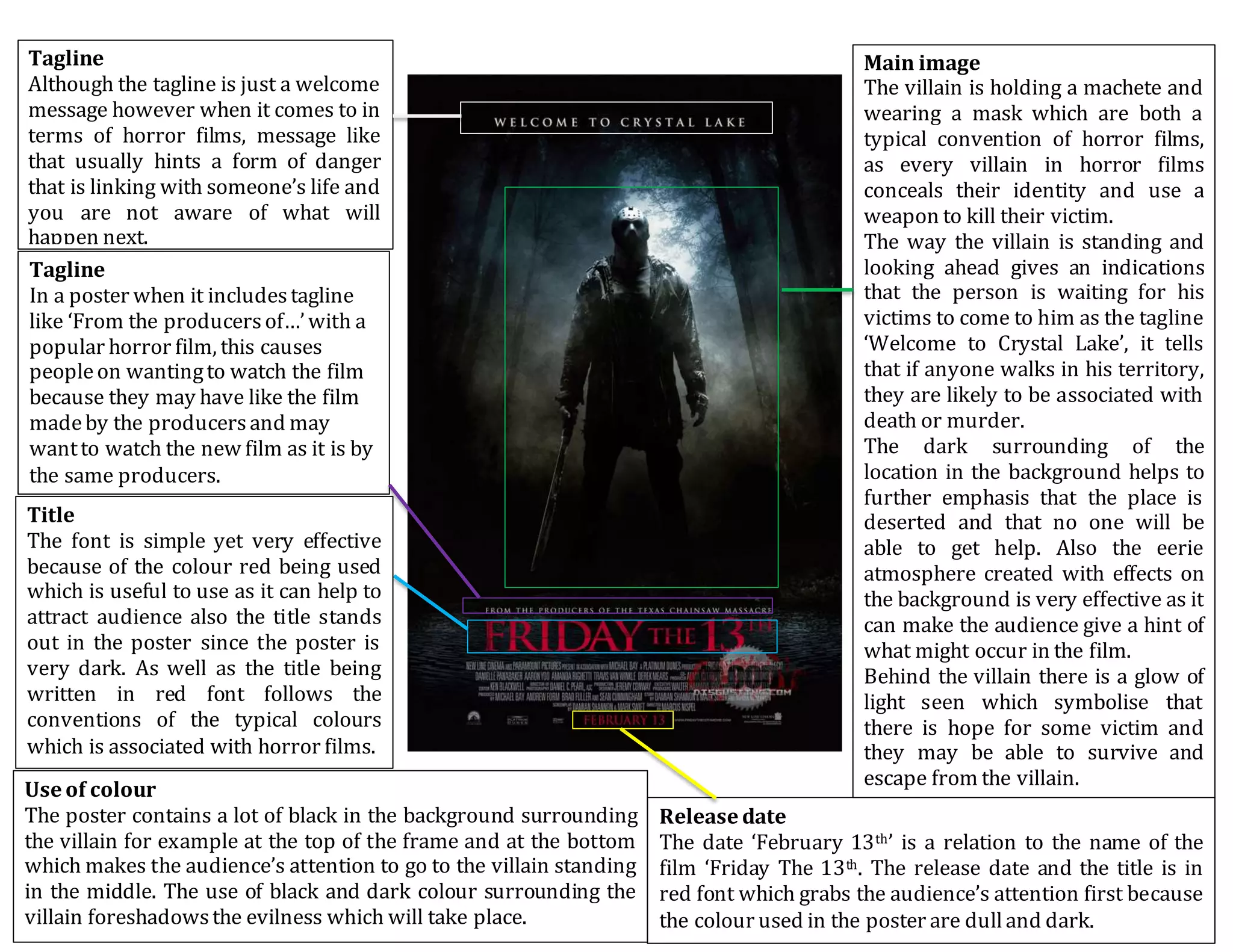
Tagline
‘Based on a true story’ tagline like
this is used on poster by the produces
to scare the audience and give them a
sense of the film being realistic. It
allows the audience to feel that it may
be possible for them to be possessed
by seeing an image. Also, the purpose
of the tagline can be used to attract
more audience as they will believe
that the story is based upon a person
who experienced what the character
wentthrough.
Main image
The poster follows the convention of
a typical horror movie for example
it includes dark/dull colour and has
dark lighting which helps to create a
fear of the unknown. The close up
middle shot image which is used in
the poster is very effective because
like the title, the image focuses on
the concept of ‘possession’. For
example the image showcase the
physical possession as another
person’s hand is seen crawling out
of a woman’s throat and covering
her eyes.
Also, the way the hand is heavily
edited with effects makes the poster
more visually effective and makes
the audience jolt. As well as. the
strong grip on the woman’s face
indicates how much control the
person has over the woman which
follows the typical horror movie
convention as the female character
is always seen as the victim and is
portrayed asa weak character.
Title
The font of the title looks like it has
been scratched out, suggesting
someone is attempting to hide a
secret. Also, by using the white font
as a title when the poster has dull
colour, helps to stand out.
Tagline
‘Darknesslives inside’is referenced
to the film and by lookingat the
image on the poster; the audienceare
able to have a clue as to what will
happen in the actual film.
Release date
The red colour is being used to highlight the date of when the
movie is coming out in the cinema. However, the date is
placed at the bottom of the poster who shows how the
producer wants the audience to be attracted to the main
image more than when it is being premiered.
Credit block
Out of the whole thing in the poster, the credit block section
is the only bit which has small fonts which indicates that the
credit block section is less important in the poster. However,
the purpose of credit block to credit all those involved in the
production of the film.
Tagline
The tagline is a rhetorical question
which is directly involves the
audience. Having the tagline at the
top of the poster can catch the
audience especially if the font colour
is bright however, they have use a
colour which is not very bright
instead the colour is faded.
Main image
When you first look at the image it
looks simple however when you
stare at it for few more seconds, you
will start to recognise that on the
eyes there are screaming faces
which makes the image to look
distorted and it confuses you
making the audience to linger
longer on the image.
The image is very effective yet scary
as it hints what the film may be
about as like the title, the person is
seen holding a mobile. The
screaming faces makes the face look
inhuman also if you look closely you
can tell that it is a female mouth
which follows the traditional of
damsel in distress approach of a
horror movie.
Title
The title font is big and clear for the
audience to see also since the font
colour is in white it helps to attract
the audience more easily as the
poster background is black so the
title draws the audience’s attention
directly.
Colour block
The colour block which is used in this
poster follows the convention of
typical horror movie poster colour
scheme for example, white and red
font colour and, black background.
Despite that the heavy black
background helps to make the image
in the middle to give more attention
and makes the audience to look
straight at the image.
Release date
The release date does not stand out compare to other movie poster, this is
due to the font colour being not very bold and bright instead like the
tagline font colour, and the release date’s font colour is faded. Usually
release date are made to stand out to aware audience of when the movie
will be coming out however, in this poster the editor has instead made the
image to stand out more.
Tagline
Although the tagline is just a welcome
message however when it comes to in
terms of horror films, message like
that usually hints a form of danger
that is linking with someone’s life and
you are not aware of what will
happen next.
Main image
The villain is holding a machete and
wearing a mask which are both a
typical convention of horror films,
as every villain in horror films
conceals their identity and use a
weapon to kill their victim.
The way the villain is standing and
looking ahead gives an indications
that the person is waiting for his
victims to come to him as the tagline
‘Welcome to Crystal Lake’, it tells
that if anyone walks in his territory,
they are likely to be associated with
death or murder.
The dark surrounding of the
location in the background helps to
further emphasis that the place is
deserted and that no one will be
able to get help. Also the eerie
atmosphere created with effects on
the background is very effective as it
can make the audience give a hint of
what might occur in the film.
Behind the villain there is a glow of
light seen which symbolise that
there is hope for some victim and
they may be able to survive and
escape from the villain.
Release date
The date ‘February 13th’ is a relation to the name of the
film ‘Friday The 13th. The release date and the title is in
red font which grabs the audience’s attention first because
the colour used in the poster are dulland dark.
Tagline
In a poster when it includestagline
like ‘From the producersof…’with a
popular horror film, this causes
peopleon wantingto watch the film
because they may have like the film
madeby the producersand may
wantto watch the new film as it is by
the same producers.
Use of colour
The poster contains a lot of black in the background surrounding
the villain for example at the top of the frame and at the bottom
which makes the audience’s attention to go to the villain standing
in the middle. The use of black and dark colour surrounding the
villain foreshadowsthe evilness which will take place.
Title
The font is simple yet very effective
because of the colour red being used
which is useful to use as it can help to
attract audience also the title stands
out in the poster since the poster is
very dark. As well as the title being
written in red font follows the
conventions of the typical colours
which is associated with horror films.

Horror Movies Posters Analysis

  • 1.
    Tagline ‘Based on atrue story’ tagline like this is used on poster by the produces to scare the audience and give them a sense of the film being realistic. It allows the audience to feel that it may be possible for them to be possessed by seeing an image. Also, the purpose of the tagline can be used to attract more audience as they will believe that the story is based upon a person who experienced what the character wentthrough. Main image The poster follows the convention of a typical horror movie for example it includes dark/dull colour and has dark lighting which helps to create a fear of the unknown. The close up middle shot image which is used in the poster is very effective because like the title, the image focuses on the concept of ‘possession’. For example the image showcase the physical possession as another person’s hand is seen crawling out of a woman’s throat and covering her eyes. Also, the way the hand is heavily edited with effects makes the poster more visually effective and makes the audience jolt. As well as. the strong grip on the woman’s face indicates how much control the person has over the woman which follows the typical horror movie convention as the female character is always seen as the victim and is portrayed asa weak character. Title The font of the title looks like it has been scratched out, suggesting someone is attempting to hide a secret. Also, by using the white font as a title when the poster has dull colour, helps to stand out. Tagline ‘Darknesslives inside’is referenced to the film and by lookingat the image on the poster; the audienceare able to have a clue as to what will happen in the actual film. Release date The red colour is being used to highlight the date of when the movie is coming out in the cinema. However, the date is placed at the bottom of the poster who shows how the producer wants the audience to be attracted to the main image more than when it is being premiered. Credit block Out of the whole thing in the poster, the credit block section is the only bit which has small fonts which indicates that the credit block section is less important in the poster. However, the purpose of credit block to credit all those involved in the production of the film.
  • 2.
    Tagline The tagline isa rhetorical question which is directly involves the audience. Having the tagline at the top of the poster can catch the audience especially if the font colour is bright however, they have use a colour which is not very bright instead the colour is faded. Main image When you first look at the image it looks simple however when you stare at it for few more seconds, you will start to recognise that on the eyes there are screaming faces which makes the image to look distorted and it confuses you making the audience to linger longer on the image. The image is very effective yet scary as it hints what the film may be about as like the title, the person is seen holding a mobile. The screaming faces makes the face look inhuman also if you look closely you can tell that it is a female mouth which follows the traditional of damsel in distress approach of a horror movie. Title The title font is big and clear for the audience to see also since the font colour is in white it helps to attract the audience more easily as the poster background is black so the title draws the audience’s attention directly. Colour block The colour block which is used in this poster follows the convention of typical horror movie poster colour scheme for example, white and red font colour and, black background. Despite that the heavy black background helps to make the image in the middle to give more attention and makes the audience to look straight at the image. Release date The release date does not stand out compare to other movie poster, this is due to the font colour being not very bold and bright instead like the tagline font colour, and the release date’s font colour is faded. Usually release date are made to stand out to aware audience of when the movie will be coming out however, in this poster the editor has instead made the image to stand out more.
  • 3.
    Tagline Although the taglineis just a welcome message however when it comes to in terms of horror films, message like that usually hints a form of danger that is linking with someone’s life and you are not aware of what will happen next. Main image The villain is holding a machete and wearing a mask which are both a typical convention of horror films, as every villain in horror films conceals their identity and use a weapon to kill their victim. The way the villain is standing and looking ahead gives an indications that the person is waiting for his victims to come to him as the tagline ‘Welcome to Crystal Lake’, it tells that if anyone walks in his territory, they are likely to be associated with death or murder. The dark surrounding of the location in the background helps to further emphasis that the place is deserted and that no one will be able to get help. Also the eerie atmosphere created with effects on the background is very effective as it can make the audience give a hint of what might occur in the film. Behind the villain there is a glow of light seen which symbolise that there is hope for some victim and they may be able to survive and escape from the villain. Release date The date ‘February 13th’ is a relation to the name of the film ‘Friday The 13th. The release date and the title is in red font which grabs the audience’s attention first because the colour used in the poster are dulland dark. Tagline In a poster when it includestagline like ‘From the producersof…’with a popular horror film, this causes peopleon wantingto watch the film because they may have like the film madeby the producersand may wantto watch the new film as it is by the same producers. Use of colour The poster contains a lot of black in the background surrounding the villain for example at the top of the frame and at the bottom which makes the audience’s attention to go to the villain standing in the middle. The use of black and dark colour surrounding the villain foreshadowsthe evilness which will take place. Title The font is simple yet very effective because of the colour red being used which is useful to use as it can help to attract audience also the title stands out in the poster since the poster is very dark. As well as the title being written in red font follows the conventions of the typical colours which is associated with horror films.