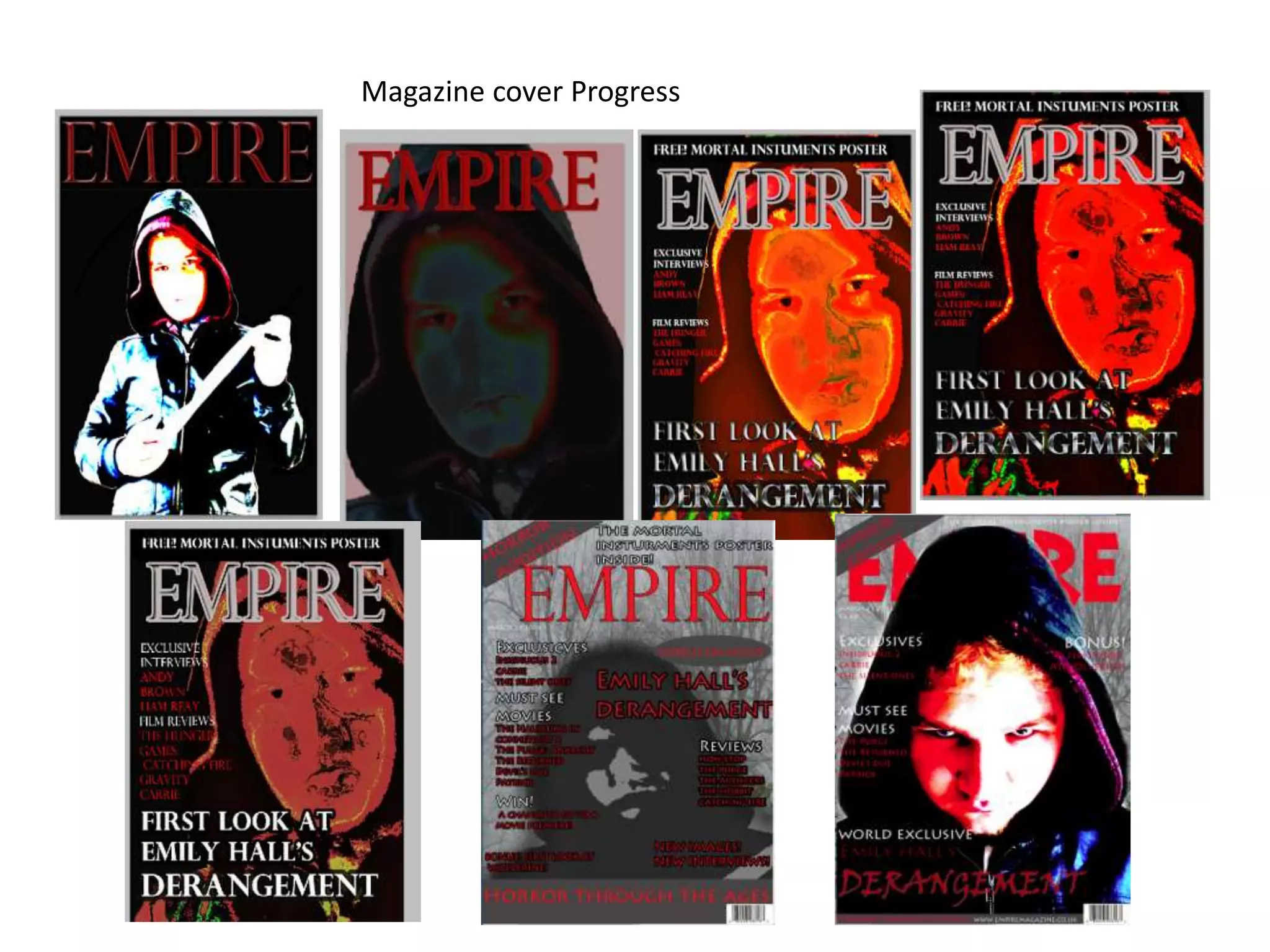
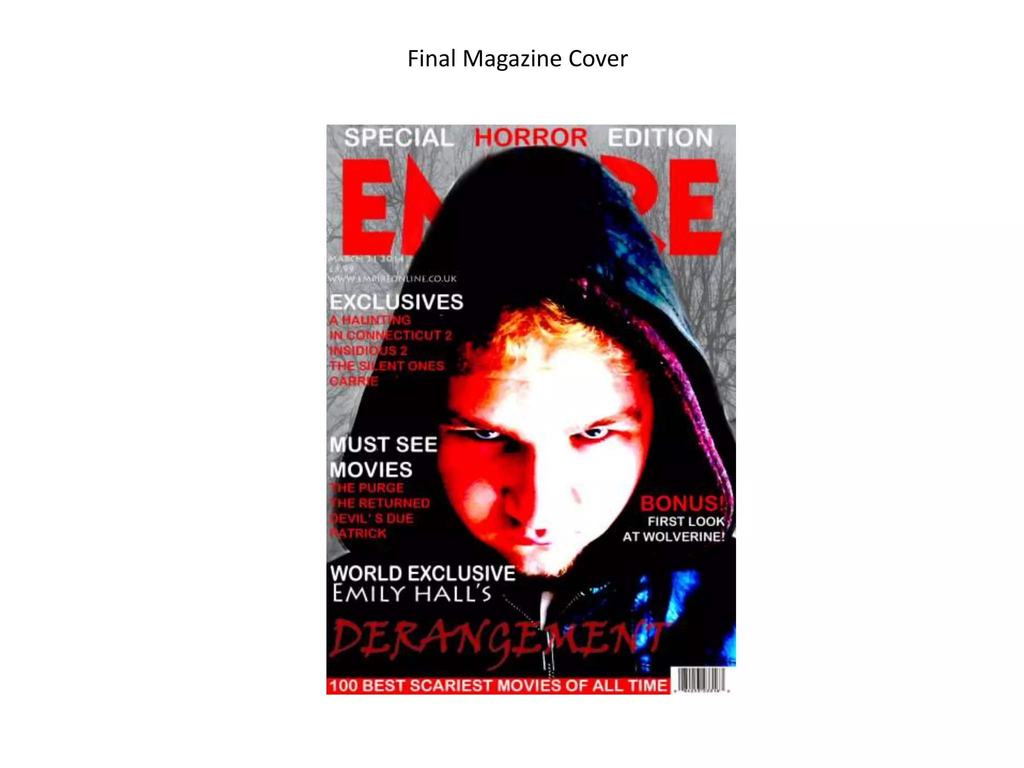
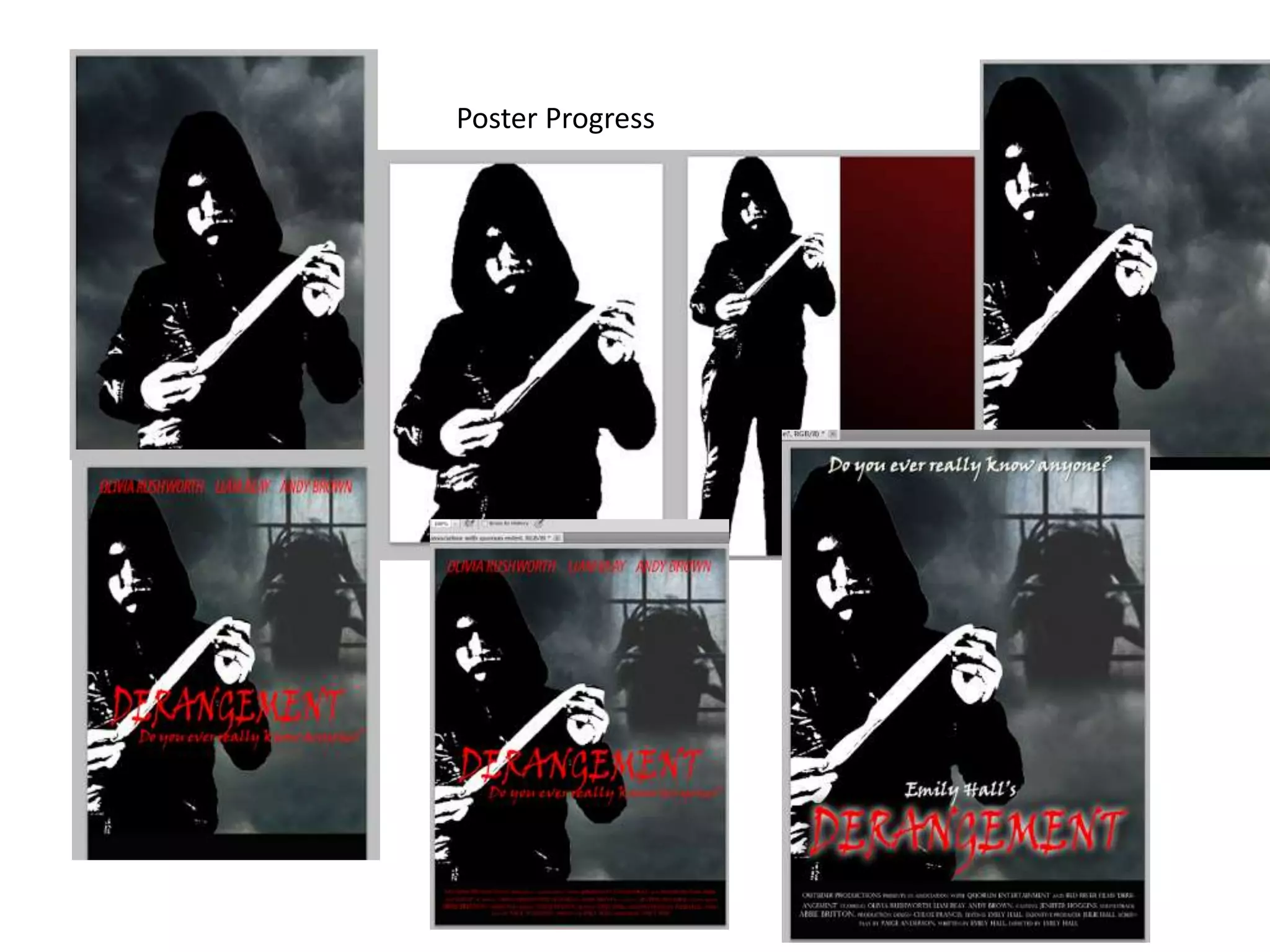
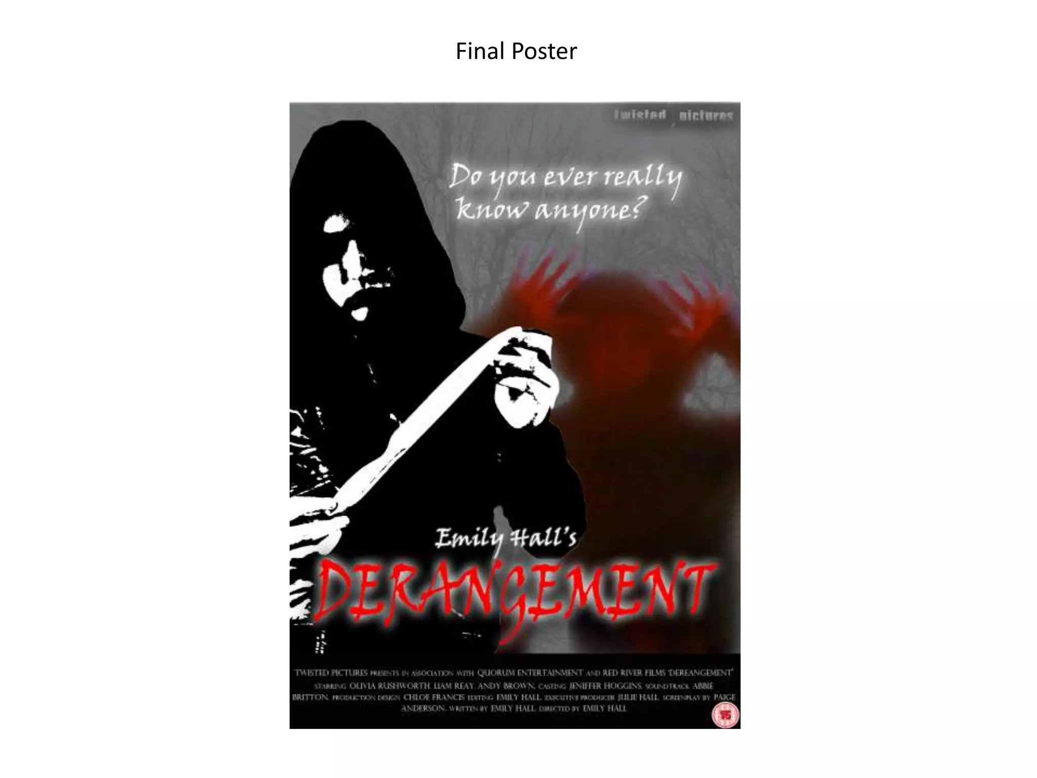
The document discusses promotional materials created for a horror film, including a trailer, magazine cover, and poster. It analyzes how each component was designed to fit within a consistent "house style" to signal the film's genre and create a cohesive promotional package. Dark color palettes, masked or obscured villain imagery, and fonts that convey danger or sharpness were used across all pieces to identify the film as a horror project. Feedback is provided on iteration of the magazine cover and poster designs to refine the masked villain imagery and balance visibility with mystery.