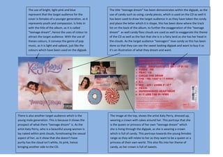
1. The use of bright, light pink and blue The title “teenage dream” has been demonstrates within the digipak, as the
represent that the target audience for the use of candy such as using; candy pieces, which is used on the CD as well it
cover is females of a younger generation, as it has been used to draw the target audience in as they have taken the candy
represents youth and compassion. Is links in and place the letter which it is shape, this has been done where the track
with the title of the album, as it is called list on the back of the album, to further the exaggeration of the “teenage
“teenage dream”, hence the uses of colour to dream” as well candy floss clouds are used as well to exaggerate the theme
attract the target audience. With the use of of the CD as well as the fact that she is in a fairy land as she has her head in
theses colours, it conveys the genre of pop the clouds. As the target audience “teenagers” love candy so this has been
music, as it is light and upbeat, just like the done so that they can see the sweet looking digipak and want to buy it as
colours which have been used on the digipak. it’s an illustration of what they dream and want.
There is also another target audience which is the The image at the top, shows the artist Katy Perry, dressed up,
young male generation. This is because it shows the wearing a crown with cakes around her. This portrays that she
prospect of what there “teenage dream” is. As the is the queen or princess of her own “teenage dream” which
artist Katy Perry, who is a beautiful young women is she is living through the digipak, as she is wearing a crown
lay naked within pink clouds, foreshowing the sexual which is full of candy. This portrays towards the young females
aspect of her, as it show that she doesn’t have range as they will relate to her as they want to be a queen or a
purity has the cloud isn’t white, its pink, hence princess of their own world. This also fits into her theme of
bringing another side to the CD. candy, as her crown is full of sweets.
2. The CD disk has been made to look fun and excitable to
resemble the genre of pop, as it is fun and creative. However
this looks like it is targeted at younger audience of around
about 11years old boys as it has colours and an image which
is more appropriate for that age group, as the colours used;
blues, greens and oranges represent that the target audience
is boys, as they are manly colours.
This digipak is a really good example of pop genre, as it is
bursting with bright colours, which catches the audience’s
eye, as they contrast against the dark outer space theme on
the opposite side. The target audience for this digipak is
teenage boys, as the CD cover is a high angled cartoon shot of
a mid/higher teenager’s bedroom, as it has cigarettes and
beer bottles on the floor. As the target audience, the teenage
male species see the cover they will instantly want to buy it,
as they will want to have a bedroom like it. As well the title
“the boy who knew too much” could be related to them as
they will relate it to themselves, as they could be that boy.
The back of the digipak has been taken from the boys walls,
exaggerating that his head is in space, foreshowing that the
album is like him, is out of this world. The use of the yellow
has been used to contrast out of the dark background, to
show that the album is full of energy and light, like the genre
of the music, pop.
3. As Michel Jackson is known as the “king of pop”, the design of this digipak, has been made to symbolise his greatness, as on the CD itself it has been
coloured gold to made it look like it is actual gold, to foreshow that his is royal as gold is known for wealth and success, but also linked with divinity
and gods, which can be related to him being the “king of pop” as people see him in his own god like figure as he is an inspiration which people say he
has changed music in his own way.
The designers has inserted his most famous moves throughout the digipak to ensure that he is remember for his iconic moves, which are known
worldwide. The fact that they have inserted images from what should have been his most famous tour which was sold out and was set to do,
foreshows that he is one of the best performers live and this is resembles on the cover as he it has been placed within the iconic images of him, and as
they are brightly coloured they represent that he was there to make people excited and fun when they hear his music and see him live. As well he is
contrasted on the white background as it makes him the main focus of the CD. As well it looks heavenly and magical as well it has a smoky light around him to
convey that he is in heaven now, this is emphasise at the pose which he is doing as it makes him looks like an angel with the way he has his arms up in the air.