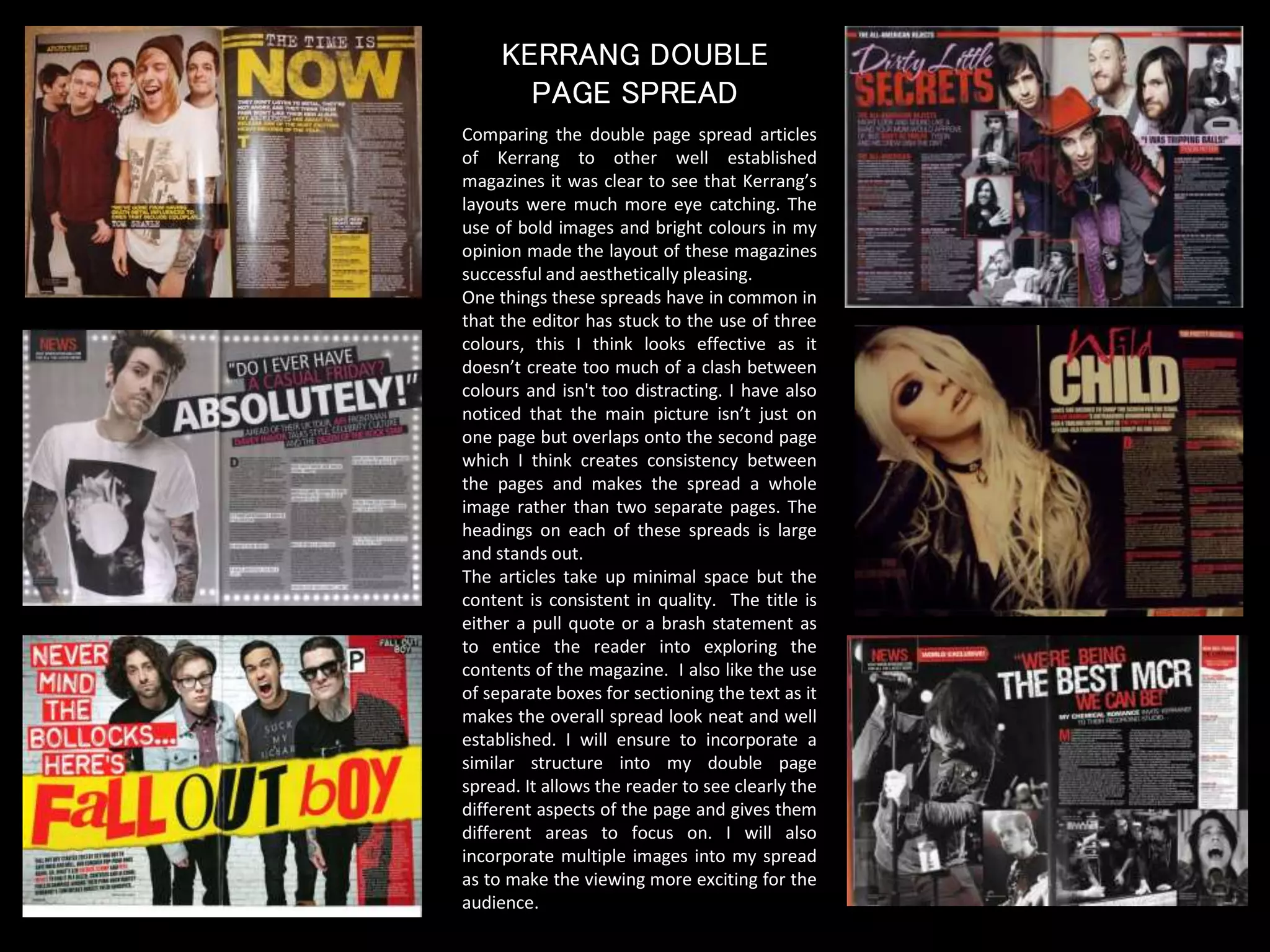
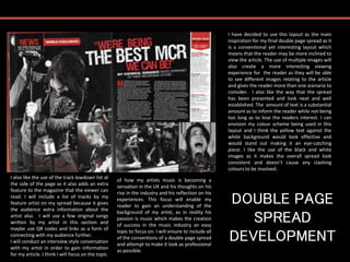
The document discusses the layout and design of magazine double page spreads. It notes that Kerrang magazine uses bold images and bright colors that make their spreads eye-catching. It also comments that using three main colors avoids clashes and overlapping images create consistency. The author decides to use a similar layout for their own double page spread, incorporating multiple images, sufficient text, and additional features like track listings. They plan to interview an artist about their career rise in the music industry and apply conventions of professional double page spreads.