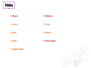
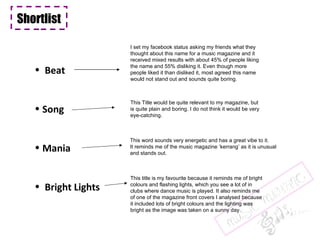
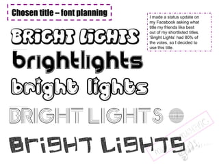
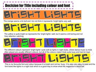
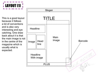
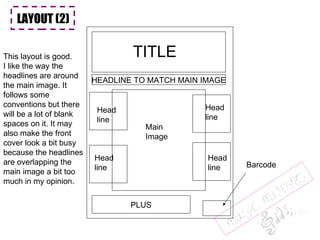
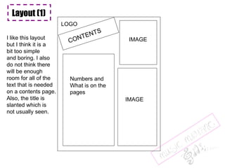
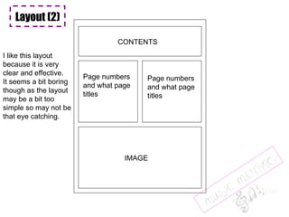
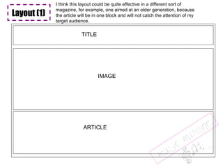
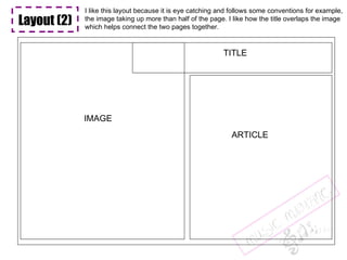
The document discusses planning the front cover of a music magazine. Various title options are considered but "Bright Lights" is selected based on a Facebook poll. Different color and font options are explored for the title before deciding on a bright yellow font that evokes nightclub lighting. Two layout designs are discussed for the front cover, with one using the main image off-center, and for the contents page, with one option deemed too simple.
Here is Gabe Whitley's response to my defamation lawsuit for him calling me a rapist and perjurer in court documents.
You have to read it to believe it, but after you read it, you won't believe it. And I included eight examples of defamatory statements/
03062024_First India Newspaper Jaipur.pdfFIRST INDIA
Find Latest India News and Breaking News these days from India on Politics, Business, Entertainment, Technology, Sports, Lifestyle and Coronavirus News in India and the world over that you can't miss. For real time update Visit our social media handle. Read First India NewsPaper in your morning replace. Visit First India.
CLICK:- https://firstindia.co.in/
#First_India_NewsPaper
04062024_First India Newspaper Jaipur.pdfFIRST INDIA
Find Latest India News and Breaking News these days from India on Politics, Business, Entertainment, Technology, Sports, Lifestyle and Coronavirus News in India and the world over that you can't miss. For real time update Visit our social media handle. Read First India NewsPaper in your morning replace. Visit First India.
CLICK:- https://firstindia.co.in/
#First_India_NewsPaper
01062024_First India Newspaper Jaipur.pdfFIRST INDIA
Find Latest India News and Breaking News these days from India on Politics, Business, Entertainment, Technology, Sports, Lifestyle and Coronavirus News in India and the world over that you can't miss. For real time update Visit our social media handle. Read First India NewsPaper in your morning replace. Visit First India.
CLICK:- https://firstindia.co.in/
#First_India_NewsPaper
El Puerto de Algeciras continúa un año más como el más eficiente del continente europeo y vuelve a situarse en el “top ten” mundial, según el informe The Container Port Performance Index 2023 (CPPI), elaborado por el Banco Mundial y la consultora S&P Global.
El informe CPPI utiliza dos enfoques metodológicos diferentes para calcular la clasificación del índice: uno administrativo o técnico y otro estadístico, basado en análisis factorial (FA). Según los autores, esta dualidad pretende asegurar una clasificación que refleje con precisión el rendimiento real del puerto, a la vez que sea estadísticamente sólida. En esta edición del informe CPPI 2023, se han empleado los mismos enfoques metodológicos y se ha aplicado un método de agregación de clasificaciones para combinar los resultados de ambos enfoques y obtener una clasificación agregada.
An astonishing, first-of-its-kind, report by the NYT assessing damage in Ukraine. Even if the war ends tomorrow, in many places there will be nothing to go back to.
31052024_First India Newspaper Jaipur.pdfFIRST INDIA
Find Latest India News and Breaking News these days from India on Politics, Business, Entertainment, Technology, Sports, Lifestyle and Coronavirus News in India and the world over that you can't miss. For real time update Visit our social media handle. Read First India NewsPaper in your morning replace. Visit First India.
CLICK:- https://firstindia.co.in/
#First_India_NewsPaper
‘वोटर्स विल मस्ट प्रीवेल’ (मतदाताओं को जीतना होगा) अभियान द्वारा जारी हेल्पलाइन नंबर, 4 जून को सुबह 7 बजे से दोपहर 12 बजे तक मतगणना प्रक्रिया में कहीं भी किसी भी तरह के उल्लंघन की रिपोर्ट करने के लिए खुला रहेगा।
4. Chosen title – font planning I made a status update on my Facebook asking what title my friends like best out of my shortlisted titles. ‘ Bright Lights’ had 80% of the votes, so I decided to use this title.
5. Decision for Title including colour and font The orange seems a bit dull and I do not think it represents ‘bright lights very well. The yellow is quite bright so represents the ‘bright lights’ well, but it seems a bit boring and not Very attention catching. The different colours represent ‘bright lights’ quite well as lights in night clubs, where dance music is most often played are usually different colours, but all of the colours make it look quite busy and hard to read. This is my favourite font and colour because it is bright and not too ‘busy’. It is also very easy to read and the font looks like lights in a night club which is a good way to show what the magazine is about too.
8. HEADLINES Top tips for the day after Drink cheap, dance for free! … Reviews night club How to dress to impress Bright scenes How to DJ Top 10 clubs
9. LAYOUT (1) TITLE Slogan Main Image Barcode Headline With image Image Headline Head line PLUS LAYOUT (1) This is a good layout because it follows a lot of conventions and is also very interesting and eye catching. One draw back about it is that the main image is not in the centre of the magazine which is usually what is expected.
10. LAYOUT (2) TITLE Main Image Barcode PLUS Head line Head line Head line Head line HEADLINE TO MATCH MAIN IMAGE LAYOUT (2) LAYOUT (2) This layout is good. I like the way the headlines are around the main image. It follows some conventions but there will be a lot of blank spaces on it. It may also make the front cover look a bit busy because the headlines are overlapping the main image a bit too much in my opinion.
12. Layout (1) CONTENTS LOGO IMAGE Numbers and What is on the pages IMAGE I like this layout but I think it is a bit too simple and boring. I also do not think there will be enough room for all of the text that is needed on a contents page. Also, the title is slanted which is not usually seen.
13. Layout (2) CONTENTS IMAGE Page numbers and what page titles Page numbers and what page titles I like this layout because it is very clear and effective. It seems a bit boring though as the layout may be a bit too simple so may not be that eye catching.
14. Layout (3) CONTENTS IMAGE Page numbers and what page titles Page numbers and what page titles IMAGE Layout (3) This layout is my favourite because it is very similar to my previous mock layout, but with an interesting touch to it. It is more eye catching than the previous layout.
17. Layout (1) TITLE IMAGE ARTICLE Layout (1) Layout (1) I think this layout could be quite effective in a different sort of magazine, for example, one aimed at an older generation, because the article will be in one block and will not catch the attention of my target audience.
18. Layout (2) TITLE IMAGE ARTICLE I like this layout because it is eye catching and follows some conventions for example, the image taking up more than half of the page. I like how the title overlaps the image which helps connect the two pages together.