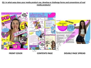
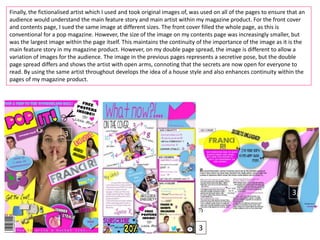
This document discusses how the media product challenges and develops conventions of real magazines.
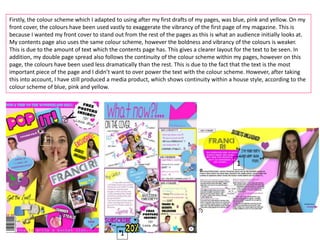
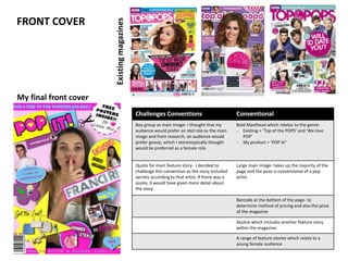
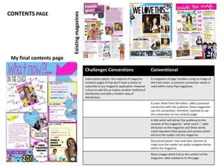
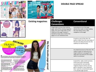
It summarizes that the front cover uses exaggerated colors to stand out, while the contents page and double page spread use the same color scheme with less vibrancy to not overpower the text. Navigation is developed across pages by indicating the feature story on page 8. Continuity is developed by using the same fictional artist image on all pages at different sizes.
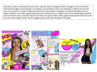
Some conventions are challenged, like including a subscription option on the contents page. The double page spread uses half the page for the main image rather than taking up the majority to suit an individual artist feature.
The document analyzes how the media product both develops conventions of real magazines
Formulae for Enzyme based cosmetic productsMurray Hunter
Formulae for enyme based cosmetic and cleaning products - dishwashing liquid, laundry detergent, shampoo, hair conditioner, shower gel, soap, and a basic enzyme formula. (These are basic formulae just to demonstrate the use of basic village made enzymes in cosmetic and household products - a cosmetic product can be made totally naturally without feedstock based surfactants and other materials - please contact author for information.) These formulations are intended to help "kickstart" village based/kampong industries in SE Asia.
Adjusting primitives for graph : SHORT REPORT / NOTESSubhajit Sahu
Graph algorithms, like PageRank Compressed Sparse Row (CSR) is an adjacency-list based graph representation that is
Multiply with different modes (map)
1. Performance of sequential execution based vs OpenMP based vector multiply.
2. Comparing various launch configs for CUDA based vector multiply.
Sum with different storage types (reduce)
1. Performance of vector element sum using float vs bfloat16 as the storage type.
Sum with different modes (reduce)
1. Performance of sequential execution based vs OpenMP based vector element sum.
2. Performance of memcpy vs in-place based CUDA based vector element sum.
3. Comparing various launch configs for CUDA based vector element sum (memcpy).
4. Comparing various launch configs for CUDA based vector element sum (in-place).
Sum with in-place strategies of CUDA mode (reduce)
1. Comparing various launch configs for CUDA based vector element sum (in-place).
Chatty Kathy - UNC Bootcamp Final Project Presentation - Final Version - 5.23...John Andrews
SlideShare Description for "Chatty Kathy - UNC Bootcamp Final Project Presentation"
Title: Chatty Kathy: Enhancing Physical Activity Among Older Adults
Description:
Discover how Chatty Kathy, an innovative project developed at the UNC Bootcamp, aims to tackle the challenge of low physical activity among older adults. Our AI-driven solution uses peer interaction to boost and sustain exercise levels, significantly improving health outcomes. This presentation covers our problem statement, the rationale behind Chatty Kathy, synthetic data and persona creation, model performance metrics, a visual demonstration of the project, and potential future developments. Join us for an insightful Q&A session to explore the potential of this groundbreaking project.
Project Team: Jay Requarth, Jana Avery, John Andrews, Dr. Dick Davis II, Nee Buntoum, Nam Yeongjin & Mat Nicholas
1. Q1: In what ways does your media product use, develop or challenge forms and conventions of real
media products?
FRONT COVER CONTENTS PAGE DOUBLE PAGE SPREAD
1
1
1
2
2
2
3
3
3
2. Firstly, the colour scheme which I adapted to using after my first drafts of my pages, was blue, pink and yellow. On my
front cover, the colours have been used vastly to exaggerate the vibrancy of the first page of my magazine. This is
because I wanted my front cover to stand out from the rest of the pages as this is what an audience initially looks at.
My contents page also uses the same colour scheme, however the boldness and vibrancy of the colours is weaker.
This is due to the amount of text which the contents page has. This gives a clearer layout for the text to be seen. In
addition, my double page spread also follows the continuity of the colour scheme within my pages, however on this
page, the colours have been used less dramatically than the rest. This is due to the fact that the text is the most
important piece of the page and I didn’t want to over power the text with the colour scheme. However, after taking
this into account, I have still produced a media product, which shows continuity within a house style, according to the
colour scheme of blue, pink and yellow.
1
1
1
3. Secondly, in order to develop the house style, I used the idea of navigation within the pages, to ensure that the
continuity throughout was thorough. For example, my main feature story, was indicated as ‘Page 8’ on the front
cover of my product. In order to keep the continuity, I had to keep my navigation of ‘Page 8’ throughout all my
pages, therefore, my contents page indicates the main feature story as ‘Page 8’ and also the double page spread of
my main feature story, is actually ‘Page 8’ itself. Also, the page numbers of the pages excluding the front cover, have
the same type of page number layout, exaggerating a house style throughout the pages.
2
2
2
4. Finally, the fictionalised artist which I used and took original images of, was used on all of the pages to ensure that an
audience would understand the main feature story and main artist within my magazine product. For the front cover
and contents page, I sued the same image at different sizes. The front cover filled the whole page, as this is
conventional for a pop magazine. However, the size of the image on my contents page was increasingly smaller, but
was the largest image within the page itself. This maintains the continuity of the importance of the image as it is the
main feature story in my magazine product. However, on my double page spread, the image is different to allow a
variation of images for the audience. The image in the previous pages represents a secretive pose, but the double
page spread differs and shows the artist with open arms, connoting that the secrets are now open for everyone to
read. By using the same artist throughout develops the idea of a house style and also enhances continuity within the
pages of my magazine product.
3
3
3
5. Challenges Conventions Conventional
Boy group as main image- I thought that my
audience would prefer an idol role as the main
image and from research, an audience would
prefer gossip, which I stereotypically thought
would be preferred as a female role.
Bold Masthead which relates to the genre:
- Existing = ‘Top of the POPS’ and ‘We love
POP’
- My product = ‘POP It!’
Quote for main feature story- I decided to
challenge this convention as the story included
secrets according to that artist. If there was a
quote, it would have given more detail about
the story.
Large main image- takes up the majority of the
page and the pose is conventional of a pop
artist.
Barcode at the bottom of the page- to
determine method of pricing and also the price
of the magazine
Skyline which includes another feature story
within the magazine
A range of feature stories which relate to a
young female audience
FRONT COVER
My final front cover
Existingmagazines
6. CONTENTS PAGE
Challenges Conventions Conventional
Subscription option- the majority of magazine
contents pages of Pop don’t have a choice to
subscribe to any magazine application. However
I chose to add this as it gives another method of
distribution and adds a modern way of
distribution.
A navigation of page numbers using an image of
the front cover- a common convention which is
used within many Pop magazines.
A cover letter from the editor- adds a personal
connection with the audience. Some magazines
use this convention, therefore I wanted to use
this convention on my contents page.
A title which will attract the audience to the
content of the magazine- ‘what now?!...’ adds
attraction to the magazine and these words
could represent fresh gossip and content which
will lure the reader into the magazine.
Structured layout- neat and clear columns to
make sure the reader can easily navigate stories
within the magazine.
Many images which link to the content of the
magazine- adds substance to the page.
Existingmagazines
My final contents page
7. DOUBLE PAGE SPREAD
Existing magazines
Myfinaldoublepagespread
Challenges
Conventions
Conventional
Image takes up more than half the
page- some of the existing magazine
pages, the main image takes up the
majority of the page, however I
decided to keep mine at half of the
page as it is an individual artist.
Instructions to turn the page-
attracts the reader to keep reading
the main feature story, adds
navigation to the page.
A quote as part of the title- the
quote is taken from the main body of
the text and adds attraction for the
audience to read the story.
An ordered structure of the text- this
makes it easier to read and as my
target audience is young girls this
adds ease and clarity for the reader
within no confusion.
A stand first- adds a brief summary
of the story and is extremely
conventional for not only Pop
magazine feature stories, but any
genre, therefore it was important
that I used this conventional aspect
in my double page spread.