
Recommended
More Related Content
What's hot
What's hot (18)
Viewers also liked
Viewers also liked (15)
Similar to Double Page Spread Analysis
Similar to Double Page Spread Analysis (20)
Recently uploaded
Recently uploaded (19)
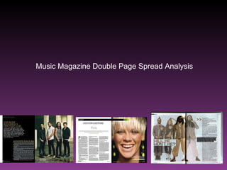
Double Page Spread Analysis
- 1. Music Magazine Double Page Spread Analysis
- 2. I like how this double page spread has split the two pages in half, with one side showing just the photograph, and the other showing the writing. I like how simple it is, using just a few colours (black gold and white) and a font that’s not too fussy. The standfirst stands out by being in a different colour to the rest of the text. I like the simple and natural picture used, and I like that it has been taken outside rather than in a studio. The concrete pillars behind them give the reader an idea of the band’s image (serious rock music). The image looks as though it has been thought out as it shows a good composition, (two band members standing back to back and the other two framing them) it shows a symmetry and is quite pleasing to the eye. I think the title on this double page spread looks insignificant to the rest of the article and in comparison to the image.
- 3. I really like how this double page spread has taken the main colour from the photo (green) and used it in the heading at the top of the page. I think this is a pleasing and simple effect. I like that the magazine has chosen to use a photo of the artist laughing, I think this shows that they are relaxed and friendly and that the interview will be the same. I like how the article fits neatly onto the page, I think it looks well presented and pulled together. The title and standfirst are centred whereas the column is split neatly into 3 sections on the page. I also like how they’ve used a drop cap at the beginning of the article. The standfirst on this page is underneath the title. A pull quote has been used at the bottom right hand corner of the photograph.
- 4. I like what the magazine has done with the photograph on this double page spread – highlighting the band member who the article is about and fading the images of the other band members. The serious expressions give the impression they are a serious band and this is serious topic. I think this instantly draws the reader in and you can see straight away what the article will be about. I also like how the article itself is positioned on the far right, and continues onto the following pages, and I like the use of arrows (chevrons) at the beginning. This double page spread also includes a pull quote from the article, and it has been highlighted in black with white writing. The magazine’s questions have been highlighted in bold to make it easier to determine which are the questions and which are the artist’s answers. The standfirst has been positioned underneath the title.