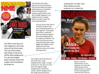
This document describes the design choices made for the front cover of a magazine. A bright red title and banner were used to attract readers' attention as the first thing they see. The main image on the cover was made to stand out by brightening it and placing it on a dark background. The main story text is large and white to stand out from the dark background. Cover lines promoting stories are also in white to stand out from the colored background and larger text is used to draw attention to the most exciting stories. Additional images are included to entice readers to specific pages and stories within the magazine. Consistent font choices and an eye-catching red color are used throughout to maintain branding and keep the reader engaged.