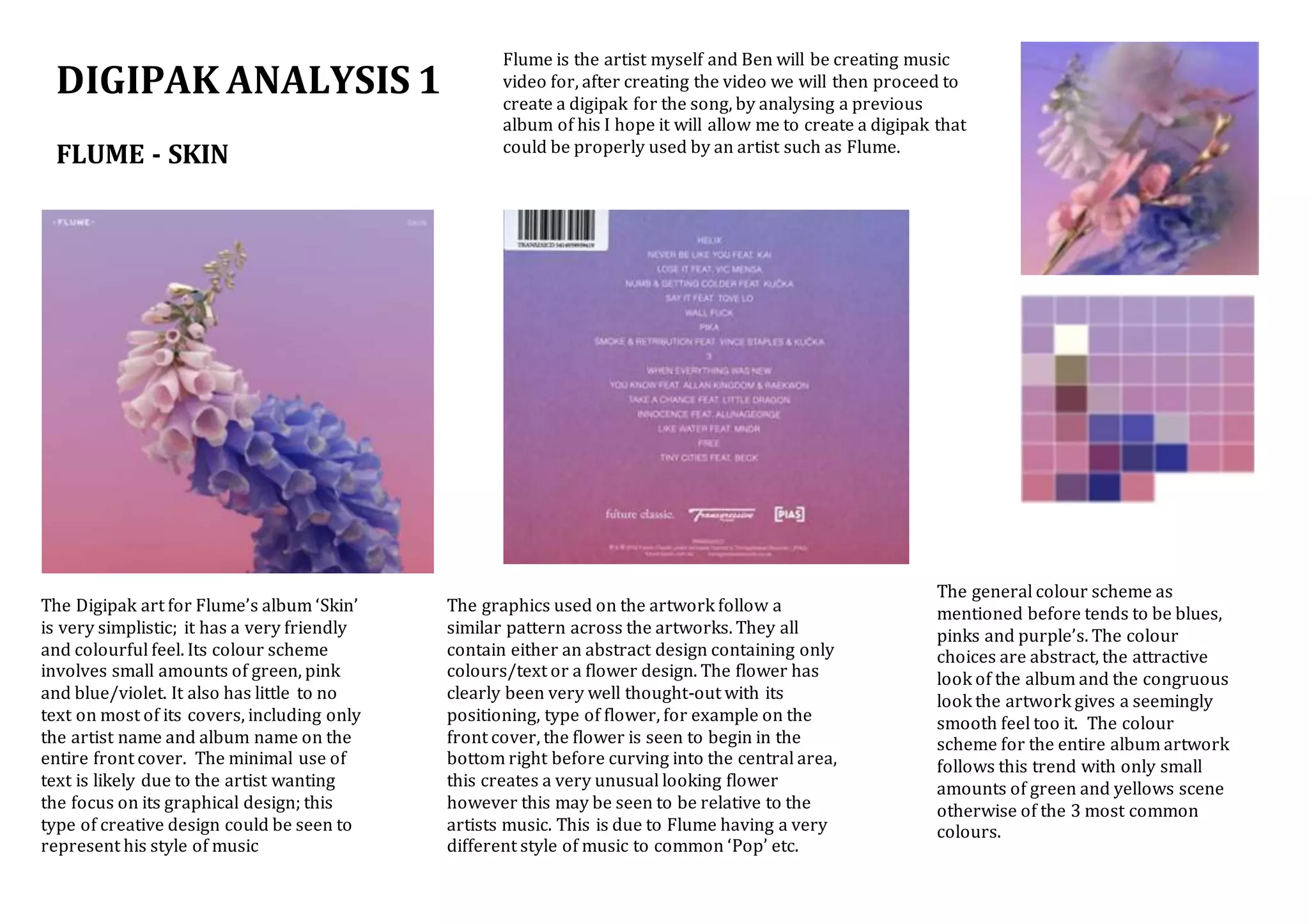
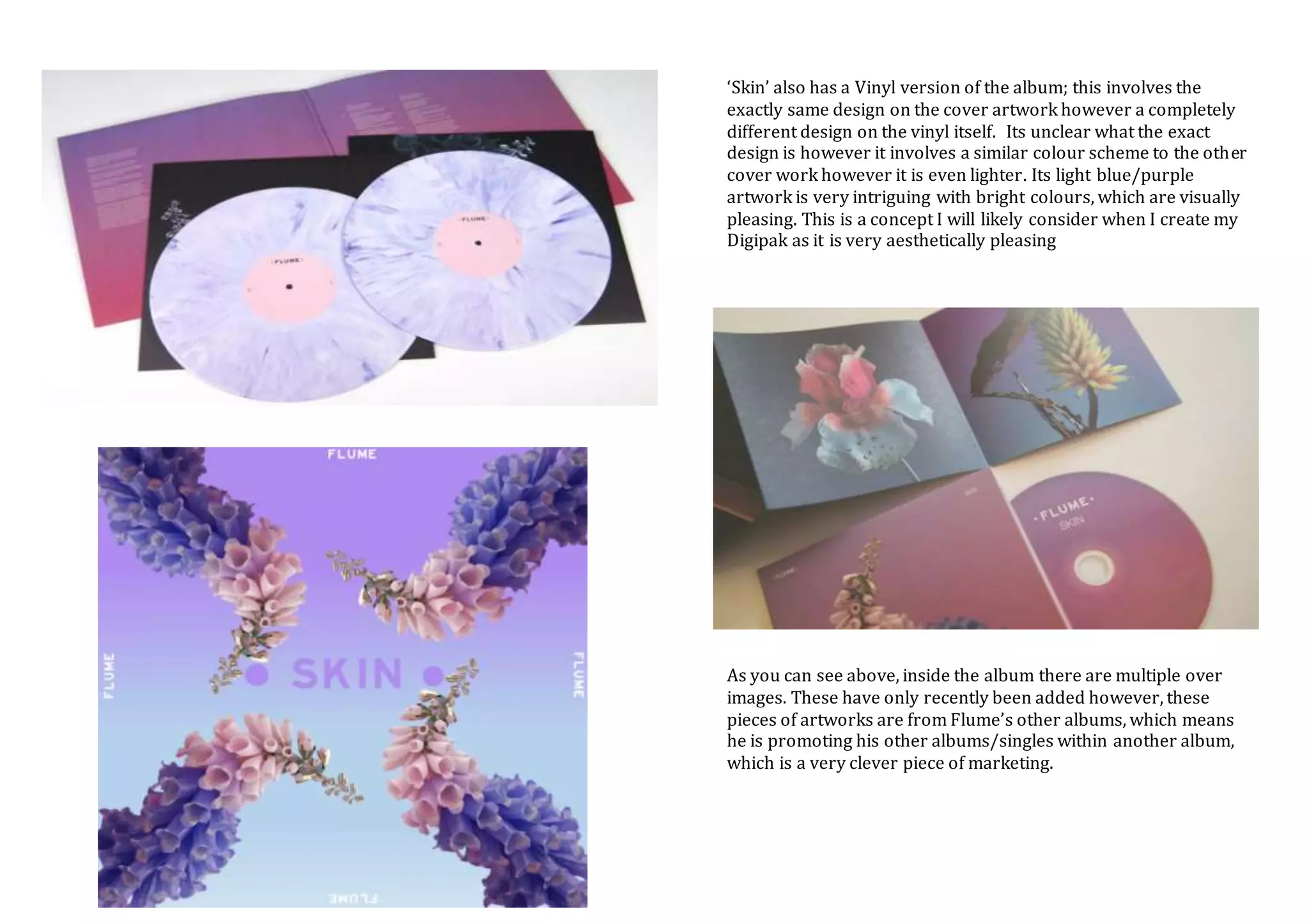
DIGIPAK ANALYSIS 1
FLUME - SKIN
Flume is the artist myself and Ben will be creating music
video for, after creating the video we will then proceed to
create a digipak for the song, by analysing a previous
album of his I hope it will allow me to create a digipak that
could be properly used by an artist such as Flume.
The Digipak art for Flume’s album ‘Skin’
is very simplistic; it has a very friendly
and colourful feel. Its colour scheme
involves small amounts of green, pink
and blue/violet. It also has little to no
text on most of its covers, including only
the artist name and album name on the
entire front cover. The minimal use of
text is likely due to the artist wanting
the focus on its graphical design; this
type of creative design could be seen to
represent his style of music
The general colour scheme as
mentioned before tends to be blues,
pinks and purple’s. The colour
choices are abstract, the attractive
look of the album and the congruous
look the artwork gives a seemingly
smooth feel too it. The colour
scheme for the entire album artwork
follows this trend with only small
amounts of green and yellows scene
otherwise of the 3 most common
colours.
The graphics used on the artwork follow a
similar pattern across the artworks. They all
contain either an abstract design containing only
colours/text or a flower design. The flower has
clearly been very well thought-out with its
positioning, type of flower, for example on the
front cover, the flower is seen to begin in the
bottom right before curving into the central area,
this creates a very unusual looking flower
however this may be seen to be relative to the
artists music. This is due to Flume having a very
different style of music to common ‘Pop’ etc.
‘Skin’ also has a Vinyl version of the album; this involves the
exactly same design on the cover artwork however a completely
different design on the vinyl itself. Its unclear what the exact
design is however it involves a similar colour scheme to the other
cover work however it is even lighter. Its light blue/purple
artwork is very intriguing with bright colours, which are visually
pleasing. This is a concept I will likely consider when I create my
Digipak as it is very aesthetically pleasing
As you can see above, inside the album there are multiple over
images. These have only recently been added however, these
pieces of artworks are from Flume’s other albums, which means
he is promoting his other albums/singles within another album,
which is a very clever piece of marketing.

DIGIPAK ANALYSIS 1

  • 1.
    DIGIPAK ANALYSIS 1 FLUME- SKIN Flume is the artist myself and Ben will be creating music video for, after creating the video we will then proceed to create a digipak for the song, by analysing a previous album of his I hope it will allow me to create a digipak that could be properly used by an artist such as Flume. The Digipak art for Flume’s album ‘Skin’ is very simplistic; it has a very friendly and colourful feel. Its colour scheme involves small amounts of green, pink and blue/violet. It also has little to no text on most of its covers, including only the artist name and album name on the entire front cover. The minimal use of text is likely due to the artist wanting the focus on its graphical design; this type of creative design could be seen to represent his style of music The general colour scheme as mentioned before tends to be blues, pinks and purple’s. The colour choices are abstract, the attractive look of the album and the congruous look the artwork gives a seemingly smooth feel too it. The colour scheme for the entire album artwork follows this trend with only small amounts of green and yellows scene otherwise of the 3 most common colours. The graphics used on the artwork follow a similar pattern across the artworks. They all contain either an abstract design containing only colours/text or a flower design. The flower has clearly been very well thought-out with its positioning, type of flower, for example on the front cover, the flower is seen to begin in the bottom right before curving into the central area, this creates a very unusual looking flower however this may be seen to be relative to the artists music. This is due to Flume having a very different style of music to common ‘Pop’ etc.
  • 2.
    ‘Skin’ also hasa Vinyl version of the album; this involves the exactly same design on the cover artwork however a completely different design on the vinyl itself. Its unclear what the exact design is however it involves a similar colour scheme to the other cover work however it is even lighter. Its light blue/purple artwork is very intriguing with bright colours, which are visually pleasing. This is a concept I will likely consider when I create my Digipak as it is very aesthetically pleasing As you can see above, inside the album there are multiple over images. These have only recently been added however, these pieces of artworks are from Flume’s other albums, which means he is promoting his other albums/singles within another album, which is a very clever piece of marketing.