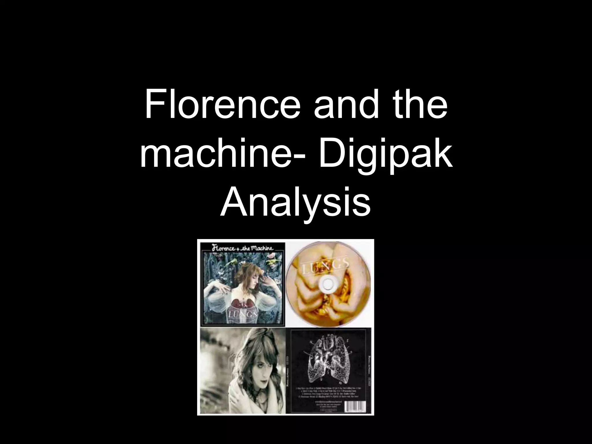
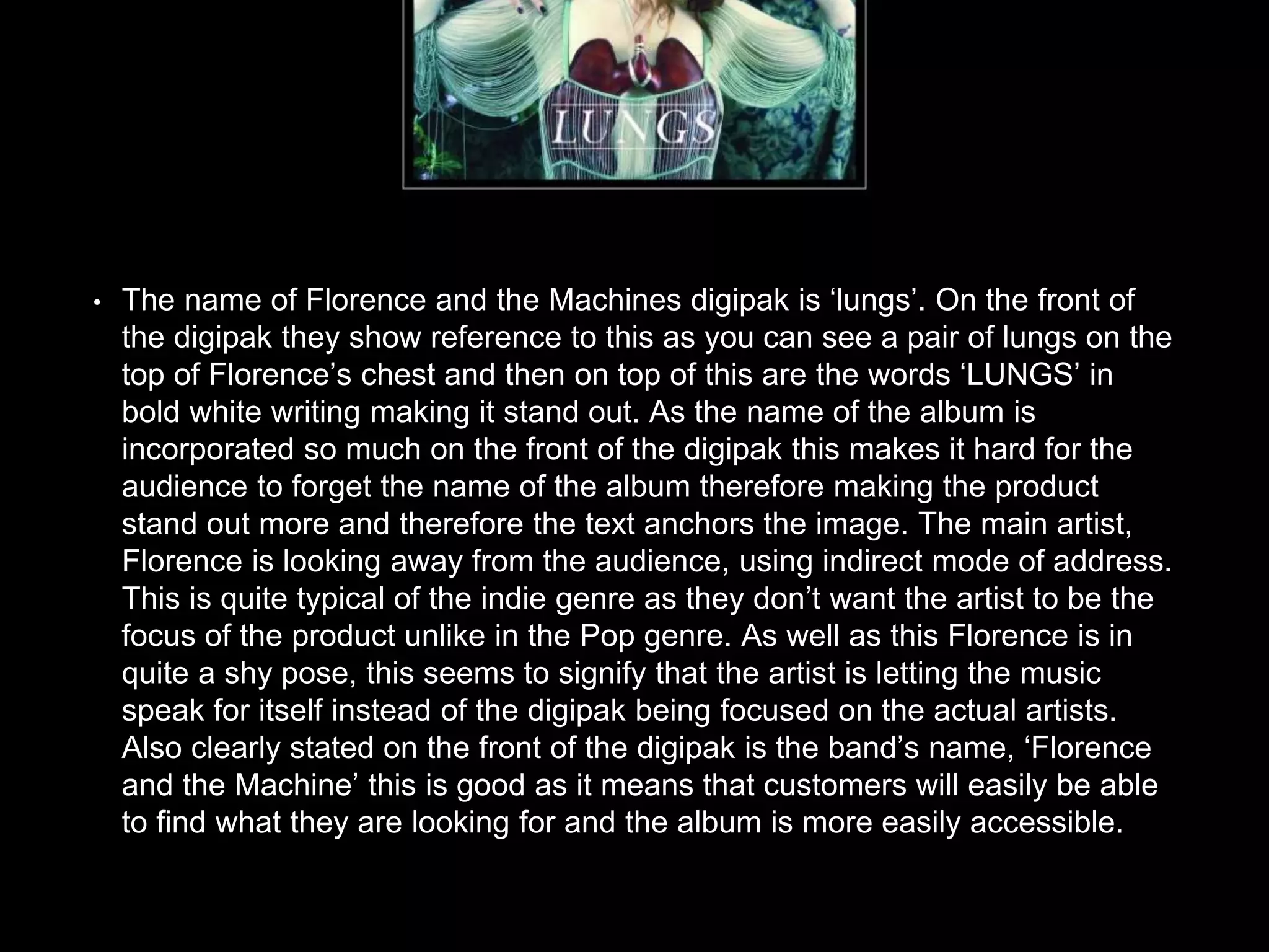
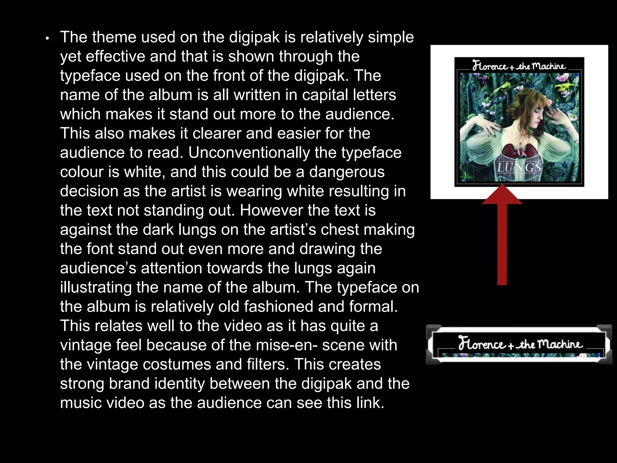
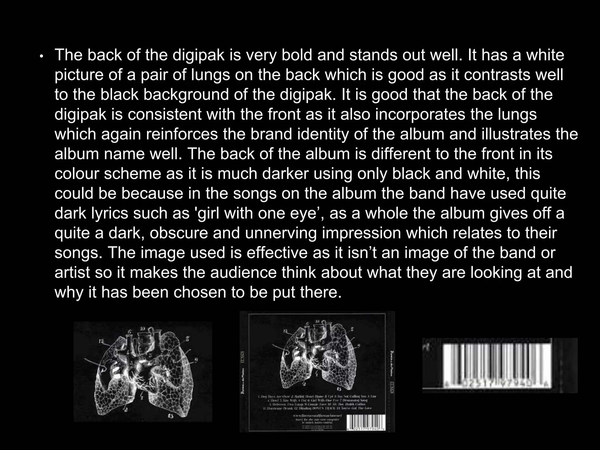
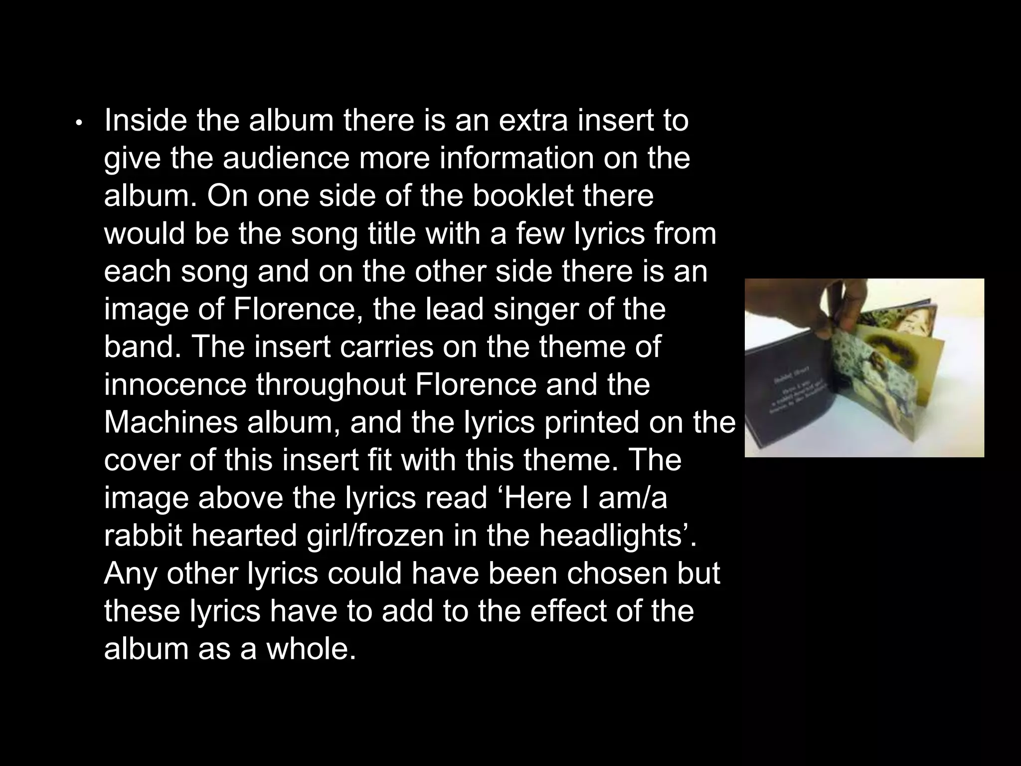
Florence and the
machine- Digipak
Analysis
I chose the artist Florence and the Machine to analysis
their recent digipak, as I thought she was an artist that
fits well in the genre of indie music. I thought that it
was a good choice as it means that the group will have
a further insight into the indie genre so this means that
we can make a more effective final product through
our research.
• Florence and the Machines target audience are teenagers about 14-20 year olds.
Unlike most artist there are reasoning behind all of florence and the machines
actions. They say that they have targeted this age group because it is the age when
you start to become aware of how the world works. I think this age group is targeted
well through her music video as she talks about things which any person of an age
younger than 14 may not actually understand fully and also the concept of the video,
the spiritual ritual, may not be fully understood either, also they sing about situations
of which people in this age bracket could relate to. This shows how Florence is
trying to challenge her audience and make them question certain things, which they
may not have otherwise. However as it is quite a young target audience Florence
and the Machine need to make sure that their music is still interesting and engaging
for the audience so that it appeals and attracts the audience which they want to
appeal too, I think they have done this well as they have used many different
aspects to make their music video different such as the use of camera shots, mise-
en-scene, props, costume, extras and so on. This ensures that any audience
watching the video will find that they are constantly interacting with the music video
and be thinking about what is going on.
• This album has used many typical conventions of a digipak
including the artists name on the front cover, the album name on
the front cover, it has an individual booklet inserted inside the
digipak giving extra information and it has a track listing. The
digipack does include one main picture of the main artist ‘Florence’
however it does not incorporate images of the other members of the
band. This may be because they wanted to be independent and for
their music to speak for itself. The colours they have used on the
front of the digipak are quite muted which is conventional of the
indie music genre. They may have used more muted colours on the
front cover of the digipak to sway the audience’s attention towards
the lungs placed on Florence’s chest and this is effective as again it
makes the audience think of the album name therefore making it
more memorable.
• The name of Florence and the Machines digipak is ‘lungs’. On the front of
the digipak they show reference to this as you can see a pair of lungs on the
top of Florence’s chest and then on top of this are the words ‘LUNGS’ in
bold white writing making it stand out. As the name of the album is
incorporated so much on the front of the digipak this makes it hard for the
audience to forget the name of the album therefore making the product
stand out more and therefore the text anchors the image. The main artist,
Florence is looking away from the audience, using indirect mode of address.
This is quite typical of the indie genre as they don’t want the artist to be the
focus of the product unlike in the Pop genre. As well as this Florence is in
quite a shy pose, this seems to signify that the artist is letting the music
speak for itself instead of the digipak being focused on the actual artists.
Also clearly stated on the front of the digipak is the band’s name, ‘Florence
and the Machine’ this is good as it means that customers will easily be able
to find what they are looking for and the album is more easily accessible.
• The theme used on the digipak is relatively simple
yet effective and that is shown through the
typeface used on the front of the digipak. The
name of the album is all written in capital letters
which makes it stand out more to the audience.
This also makes it clearer and easier for the
audience to read. Unconventionally the typeface
colour is white, and this could be a dangerous
decision as the artist is wearing white resulting in
the text not standing out. However the text is
against the dark lungs on the artist’s chest making
the font stand out even more and drawing the
audience’s attention towards the lungs again
illustrating the name of the album. The typeface on
the album is relatively old fashioned and formal.
This relates well to the video as it has quite a
vintage feel because of the mise-en- scene with
the vintage costumes and filters. This creates
strong brand identity between the digipak and the
music video as the audience can see this link.
• The back of the digipak is very bold and stands out well. It has a white
picture of a pair of lungs on the back which is good as it contrasts well
to the black background of the digipak. It is good that the back of the
digipak is consistent with the front as it also incorporates the lungs
which again reinforces the brand identity of the album and illustrates the
album name well. The back of the album is different to the front in its
colour scheme as it is much darker using only black and white, this
could be because in the songs on the album the band have used quite
dark lyrics such as 'girl with one eye’, as a whole the album gives off a
quite a dark, obscure and unnerving impression which relates to their
songs. The image used is effective as it isn’t an image of the band or
artist so it makes the audience think about what they are looking at and
why it has been chosen to be put there.
• The artist has also chosen to use the annotations of
the lungs as a track list for the music. This is a more
interactive and conceptual/interesting way of
presenting the digipak so it is entertaining for the
audience. I think that the barcode in the right hand
bottom corner of the album takes away from the
effectiveness of the album as it takes away from the
colour scheme of having a black background and
makes the back of the album look a bit messy and
unorganized which is inconsistent with the rest of
the album. This is something that our group should
think about when making our digipak and making
sure that it is effective.
• Inside the album there is an extra insert to
give the audience more information on the
album. On one side of the booklet there
would be the song title with a few lyrics from
each song and on the other side there is an
image of Florence, the lead singer of the
band. The insert carries on the theme of
innocence throughout Florence and the
Machines album, and the lyrics printed on the
cover of this insert fit with this theme. The
image above the lyrics read ‘Here I am/a
rabbit hearted girl/frozen in the headlights’.
Any other lyrics could have been chosen but
these lyrics have to add to the effect of the
album as a whole.
• I think as a whole the Florence and the Machine
album ‘Lungs’ is extremely effective and well laid
out. It incorporates most conventions of a typical
digipak whilst still keeping the audience
interested and giving them as much information
as possible. Something else effective which they
have done is keep a recurring theme throughout
the album and make all of their images and text
consistent so the audience know what they are
buying and know that it will be of consistent
quality. This is something that our group should
consider when making our digipak.

Florence and machine pp

  • 1.
    Florence and the machine-Digipak Analysis
  • 2.
    I chose theartist Florence and the Machine to analysis their recent digipak, as I thought she was an artist that fits well in the genre of indie music. I thought that it was a good choice as it means that the group will have a further insight into the indie genre so this means that we can make a more effective final product through our research.
  • 3.
    • Florence andthe Machines target audience are teenagers about 14-20 year olds. Unlike most artist there are reasoning behind all of florence and the machines actions. They say that they have targeted this age group because it is the age when you start to become aware of how the world works. I think this age group is targeted well through her music video as she talks about things which any person of an age younger than 14 may not actually understand fully and also the concept of the video, the spiritual ritual, may not be fully understood either, also they sing about situations of which people in this age bracket could relate to. This shows how Florence is trying to challenge her audience and make them question certain things, which they may not have otherwise. However as it is quite a young target audience Florence and the Machine need to make sure that their music is still interesting and engaging for the audience so that it appeals and attracts the audience which they want to appeal too, I think they have done this well as they have used many different aspects to make their music video different such as the use of camera shots, mise- en-scene, props, costume, extras and so on. This ensures that any audience watching the video will find that they are constantly interacting with the music video and be thinking about what is going on.
  • 4.
    • This albumhas used many typical conventions of a digipak including the artists name on the front cover, the album name on the front cover, it has an individual booklet inserted inside the digipak giving extra information and it has a track listing. The digipack does include one main picture of the main artist ‘Florence’ however it does not incorporate images of the other members of the band. This may be because they wanted to be independent and for their music to speak for itself. The colours they have used on the front of the digipak are quite muted which is conventional of the indie music genre. They may have used more muted colours on the front cover of the digipak to sway the audience’s attention towards the lungs placed on Florence’s chest and this is effective as again it makes the audience think of the album name therefore making it more memorable.
  • 5.
    • The nameof Florence and the Machines digipak is ‘lungs’. On the front of the digipak they show reference to this as you can see a pair of lungs on the top of Florence’s chest and then on top of this are the words ‘LUNGS’ in bold white writing making it stand out. As the name of the album is incorporated so much on the front of the digipak this makes it hard for the audience to forget the name of the album therefore making the product stand out more and therefore the text anchors the image. The main artist, Florence is looking away from the audience, using indirect mode of address. This is quite typical of the indie genre as they don’t want the artist to be the focus of the product unlike in the Pop genre. As well as this Florence is in quite a shy pose, this seems to signify that the artist is letting the music speak for itself instead of the digipak being focused on the actual artists. Also clearly stated on the front of the digipak is the band’s name, ‘Florence and the Machine’ this is good as it means that customers will easily be able to find what they are looking for and the album is more easily accessible.
  • 6.
    • The themeused on the digipak is relatively simple yet effective and that is shown through the typeface used on the front of the digipak. The name of the album is all written in capital letters which makes it stand out more to the audience. This also makes it clearer and easier for the audience to read. Unconventionally the typeface colour is white, and this could be a dangerous decision as the artist is wearing white resulting in the text not standing out. However the text is against the dark lungs on the artist’s chest making the font stand out even more and drawing the audience’s attention towards the lungs again illustrating the name of the album. The typeface on the album is relatively old fashioned and formal. This relates well to the video as it has quite a vintage feel because of the mise-en- scene with the vintage costumes and filters. This creates strong brand identity between the digipak and the music video as the audience can see this link.
  • 7.
    • The backof the digipak is very bold and stands out well. It has a white picture of a pair of lungs on the back which is good as it contrasts well to the black background of the digipak. It is good that the back of the digipak is consistent with the front as it also incorporates the lungs which again reinforces the brand identity of the album and illustrates the album name well. The back of the album is different to the front in its colour scheme as it is much darker using only black and white, this could be because in the songs on the album the band have used quite dark lyrics such as 'girl with one eye’, as a whole the album gives off a quite a dark, obscure and unnerving impression which relates to their songs. The image used is effective as it isn’t an image of the band or artist so it makes the audience think about what they are looking at and why it has been chosen to be put there.
  • 8.
    • The artisthas also chosen to use the annotations of the lungs as a track list for the music. This is a more interactive and conceptual/interesting way of presenting the digipak so it is entertaining for the audience. I think that the barcode in the right hand bottom corner of the album takes away from the effectiveness of the album as it takes away from the colour scheme of having a black background and makes the back of the album look a bit messy and unorganized which is inconsistent with the rest of the album. This is something that our group should think about when making our digipak and making sure that it is effective.
  • 9.
    • Inside thealbum there is an extra insert to give the audience more information on the album. On one side of the booklet there would be the song title with a few lyrics from each song and on the other side there is an image of Florence, the lead singer of the band. The insert carries on the theme of innocence throughout Florence and the Machines album, and the lyrics printed on the cover of this insert fit with this theme. The image above the lyrics read ‘Here I am/a rabbit hearted girl/frozen in the headlights’. Any other lyrics could have been chosen but these lyrics have to add to the effect of the album as a whole.
  • 10.
    • I thinkas a whole the Florence and the Machine album ‘Lungs’ is extremely effective and well laid out. It incorporates most conventions of a typical digipak whilst still keeping the audience interested and giving them as much information as possible. Something else effective which they have done is keep a recurring theme throughout the album and make all of their images and text consistent so the audience know what they are buying and know that it will be of consistent quality. This is something that our group should consider when making our digipak.