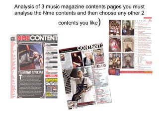
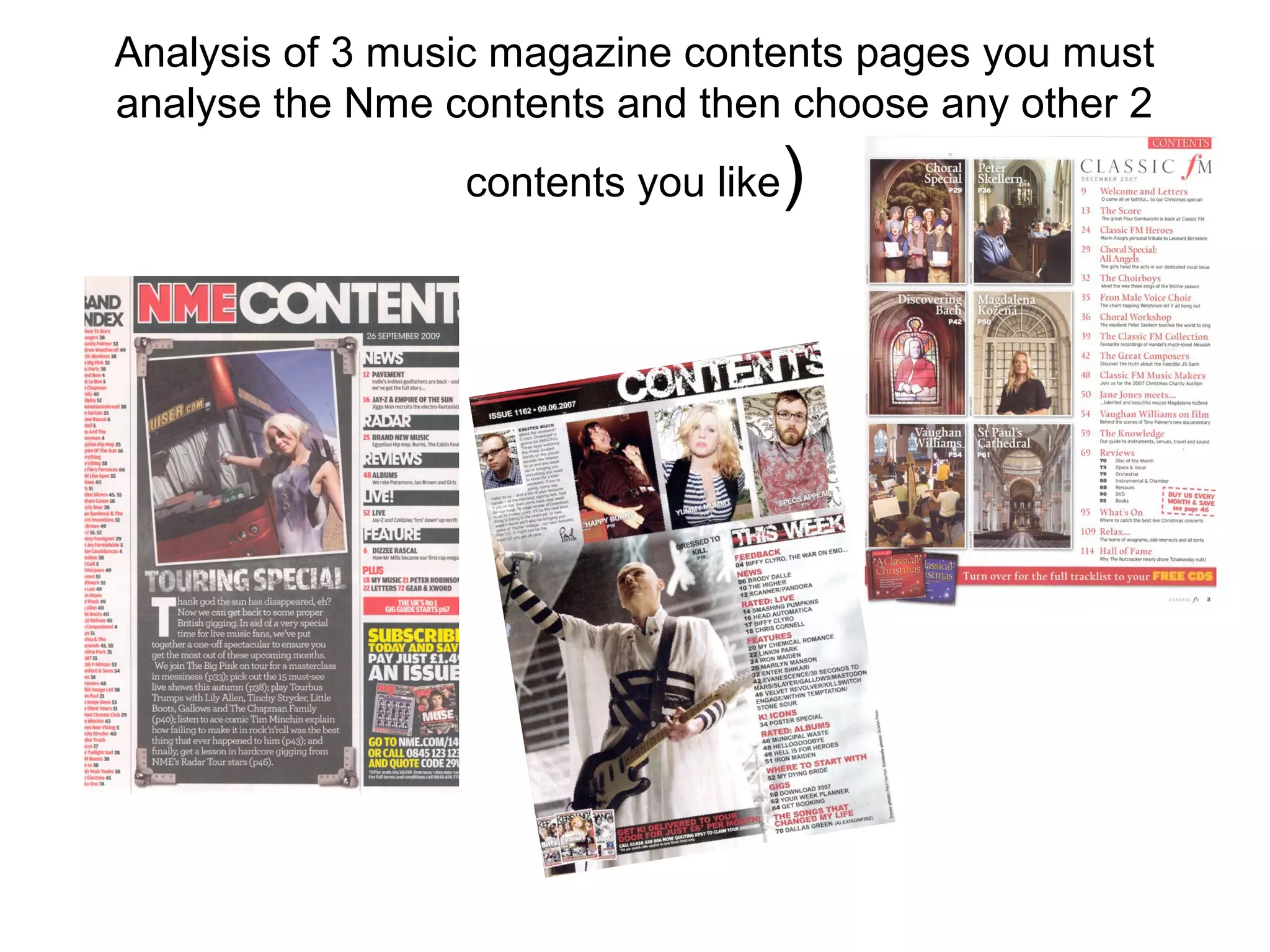
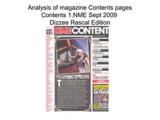
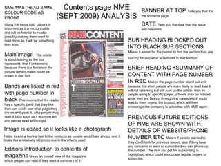
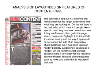
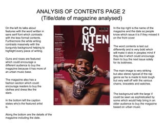
The document analyzes the contents page of NME magazine from September 2009 with a focus on Dizzee Rascal. It summarizes key design elements of the page including its 3 column layout, use of bold colors and fonts to highlight sections, and inclusion of brief summaries and page numbers for articles. Photographs are used to represent the feeling of touring. Contact information is provided to encourage subscriptions. Overall the layout and visual elements are intended to make content easy to navigate and entice readers to learn more and buy specific issues.
I conducted this research to generate ideas for my magazine ancillary task and to identify the elements of a magazine spread featuring a film review, that create a professional style.
Rent for Rio Olympics 2016: Design Ocean Front Villa W42WhereInRio
Rua Jackson de Figueiredo, Joatinga, Rio de Janeiro
- Perfectly located between the Barra and Copacabana Venues.
- Closest Sport Venues: Olympic Golf Course & Lagoa Stadium.
- Design villa with beautiful ocean views in highly secured area.
- Great facilities to relax, to host events or to use as work location.
- Can easily accommodate 6 People.
Rent for Rio Olympics 2016: 2 Beds Studio Copacabana OL18WhereInRio
Rua Saint Roman, Copacabana, Rio de Janeiro.
- Located in the heart Copacabana. 25m2 accommodation area.
- Close to Sport Venue: Fort Copacabana; 1,1 KM.
- Can accommodate 4 people, complete studio in secured building.
- The building offers great facilities to relax and work spaces.
3. NME MASTHEAD SAME Contents page NME BANNER AT TOP Tells you that it’s
COLOUR CODE AS
FRONT (SEPT 2009) ANALYSIS the contents page
Using the same bold colours is DATE Tells you the date that the issue
important as it is recognizable was released
and will be familiar to reader
possibly making them want to
read more as it will be something SUB HEADING BLOCKED OUT
they trust.
INTO BLACK SUB SECTIONS
Makes it easier for the reader to find the section they are
Main image The article
is about touring so the bus looking for and what is featured in that section
represents that Furthermore
because there is a female in the BRIEF HEADING +SUMMARY OF
picture certain males could be
drawn in due to it. CONTENT WITH PAGE NUMBER
IN RED Makes the page number stand out and
Bands are listed in red because it is short people are more likely to read it as it
will not take long but still sum up the article. Also by
with page number in people going to specific pages, adverts may be noticed
black This means that if a reader while they are flicking through the pages which could
lead to them buying the product which will then
has a specific band that they like
encourage the company to advertise with NME again.
they can easily see what page they
are on and go to it. Also people may
read it fairly soon as it is on the left PREVIOUS/FUTURE EDITIONS
and people read left to right.
OF NME ARE SHOWN WITH
Image is edited so it looks like a photograph DETAILS OF WEBSITE/PHONE
Helps to add a touring feel to the contents as people would take photos and it
looks like a relatively old photo due to the effects used
NUMBER ETC Means if people wanted to
they could look for previous issues, also if they have
any concerns or want to subscribe they can phone up
Editiors introduction to contents of the number. The deal you get for subscribing is
magazine Gives an overall view of the magazine highlighted which could encourage regular buyers to
subscribe.
which people can read if they want a summary of it
4. ANALYSIS OF LAYOUT/DESIGN FEATURES OF
CONTENTS PAGE
The contents is laid out in 3 columns that
make it easy for the target audience to find
what they are looking for. On the left there is
the bad index which means if people like a
specific band they can look down it and see
if they are featured, then go to the page
which contrasts to highlight it. In the middle,
it is about touring and the way it appears to
be set out on the side of an amp with a
photo that looks like it has been taken on
holiday possibly suggesting it is seen as a
holiday. On the right the short, concise
sections make it very easy for the reader to
see the different sections of the magazine
such as news and then what is featured in
that part.
5. ANALYSIS OF CONTENTS PAGE 2
(Title/date of magazine analysed)
On the left its talks about In the top right is the name of the
features with the word written in magazine and the date so people
sans serif font which contrasts know which issue it is if they missed it
with the less formal contents. on the front cover
Furthermore the white writing
contrasts massively with the
The word contents is laid out
burgundy background helping to
differently and is very bold which
highlight every piece of writing.
will make it stick in peoples mind if
they like it which could encourage
Guns and roses are featured them to buy the next issue solely
which could encourage a for its boldness.
different audience to buy the
magazine because it has more of
an urban music base. The main image is very striking
but also stereo typical of the rap
genre as he is made to look tough
The magazine also has a but very well off with the various
fashion section which could chains, bracelets and watches.
encourage readers to buy the
clothes and dress like the
stars. The background with the large V
could be seen as sophisticated by
In the bottom left the caption some which would help bring in an
states who's the featured artist older audience to buy the magazine
is. based on urban music
Along the bottom are the details of the
magazine including the date.