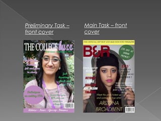
- The author believes their main task music magazine is an improvement over their preliminary student magazine. The main task magazine has more suitable colors that appeal to both genders and a more eye-catching banner, whereas the preliminary magazine had bland colors and only appealed to one gender.
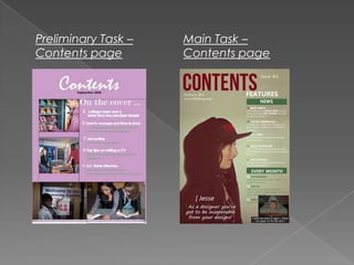
- The contents page of the preliminary magazine lacked conventions, had too much white space, insufficient details and articles, and images that were not neatly ordered. In contrast, the main task contents page looks more professional with quality images, articles relevant to music, and a clear color scheme and text.
- The author's skills in Photoshop and InDesign have improved, allowing them to enhance images and text for the main task magazine, making
3. I can definitely see a positive change from the student
magazine I created for my preliminary task to my music
magazine. I believe that the front cover for the student
magazine applied well to the theme of the task,
generally it does look like a student magazine however,
the cover’s features could have been developed more.
The colours I used for the prelim. task all match too well
too well to the image, this makes it too safe and less
exciting which would not appeal to a young audience.
Whereas in my main task I feel that the colours are more
suited and work well with the theme of the magazine. I
thought carefully about the colours including, what they
connote and if they would appeal to both a male and
female audience. However, I failed to do so for my
prelim. task which lead it to look more like a feminine
magazine thus, not attracting both sexes. I have even
learned little adjustments that would make a huge
difference such as using a eye catching colour such as
yellow instead of a bland colour for the banner.
5. Through out the process I have definitely learned more
about the codes of media publications, especially music
magazines. Looking at my contents page for the prelim.
task it looks extremely unprofessional and lacks
conventions. There is too much white space in the
background due to insufficient writing. I did not put
enough detail into the text as well as enough contents.
The images are not placed in a neat order and lack sub-
text allowing readers to know what article each of this is
associated with. However, the positive attribute is that the
images were all taken place on college grounds and are
all associated with the ‘campus’ atmosphere. The
language used does not associate with my target
audience and there is no colour scheme, leaving the
page looking dull and boring. I believe that my contents
page for the main task looks professional and realistic. The
images used are good quality, the articles are all
associated with the music industry and the colour scheme
and text is consistent and clearly visible.
6. With time, I believe that my skills on Photoshop and
InDesign have definitely enhanced. With my student
magazine I was scared to take any risks on the
programs as I was not sure how to use them and
believed they would ruin the magazine. I only used
the basic tools which left my prelim. Task looking dull
and unprofessional. However, with the main task (
music magazine) I was eager to learn and began to
experiment on the programs, I learned how to
enhance the images and texts which lead my
publication looking professional. I also made sure to
follow other magazines to establish the codes and
conventions of music magazines ensuring that mine
would look realistic.