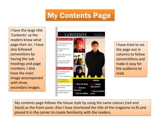
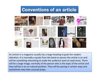
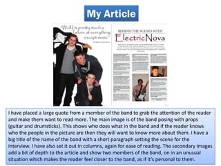
Introduction to forms and conventions
Most media products follow forms and conventions that give the magazine
familiarity amongst it’s readers. Also they help to target the intended audience.
These conventions include;
• A Masthead
• A Tagline
• Sell Lines
• Familiar fonts
• Same colours used over

Conventions also help a magazine get recognized as it will usually have a familiar
look to it every issue. For example, the masthead in the same place or the same
font for the masthead and sell lines.
Conventions of Front Covers

As you can                                                                  They each have
see, they all have                                                          matching
the masthead                                                                colours all
placed at the top                                                           across the front
of the page. This                                                           page. This
is the first thing                                                          creates a sense
the audience                                                                of familiarity to
see’s and let’s                                                             the
them know what                                                              audience, this
they’re looking at.                                                         is known as
                                                                            House Style.


            They all have a main image of a celebrity or someone that is related
            to the topic of the magazine. This again makes the audience
            interested as they will usually know the person on the cover and will
            like them.
My Front Cover
 Masthead is placed at                        Strapline placed below
 the top of the page to                       the masthead. Gives the
 draw attention.                              audience a better idea
                                              of what the magazine is
                                              about.

Main Image is large and                       Three fonts are used
attracts the attention of                     and the same colours
the audience. Cover line                      (Red and Black) to
is attached to the picture                    create a House Style.
to give it more meaning.
Guitar in the main image
gives connotations of
music appealing to the
target audience.
Conventions of Contents pages
The contents page                                                         On the contents
follows the House                                                         page, the
style of the                                                              magazine usually
magazine by using                                                         sets it out in
the same fonts                                                            columns. This
and colours as the                                                        makes it easily
front page, these                                                         readable for the
colours and fonts                                                         audience.
will be seen
throughout the
magazine.


     There is usually a large title to let you know it is the contents page. There are
     also sub-headings such as features or regular things that occur in the magazine.
     There is normally a main picture usually a main feature of the magazine along
     with a few secondary images to go with the other headings.
My Contents Page
I have the large title
‘Contents’ so the
readers know what
page their on. I have                                             I have tried to set
also followed                                                     the page out in
conventions by                                                    columns to follow
having the sub                                                    conventi0ons and
headings and page                                                 make it easy for
numbers. I also                                                   the audience to
have the main                                                     read.
image accompanied
with three
secondary images.


  My contents page follows the house style by using the same colours (red and
  black) as the front cover. Also I have shortened the title of the magazine to RJ and
  placed it in the corner to create familiarity with the readers.
Conventions of an article


An article in a magazine usually has a large heading to grab the readers
attention. It is normally a quote from the band or person the article is on and
will be something interesting to make the audience want to read more. There
will be a large image, normally of the person who is the topic of the article and
they will be in an un-natural position. They will be posing in certain ways and
sometimes may have unusual props.
My Article


I have placed a large quote from a member of the band to grab the attention of the reader
and make them want to read more. The main image is of the band posing with props
(guitar and drumsticks). This shows who does what in the band and if the reader knows
who the people in the picture are then they will want to know more about them. I have a
big title of the name of the band with a short paragraph setting the scene for the
interview. I have also set it out in columns, again for ease of reading. The secondary images
add a bit of depth to the article and show two members of the band, on in an unusual
situation which makes the reader feel closer to the band, as if it’s personal to them.

Evaluation question1

  • 1.
    Introduction to formsand conventions Most media products follow forms and conventions that give the magazine familiarity amongst it’s readers. Also they help to target the intended audience. These conventions include; • A Masthead • A Tagline • Sell Lines • Familiar fonts • Same colours used over Conventions also help a magazine get recognized as it will usually have a familiar look to it every issue. For example, the masthead in the same place or the same font for the masthead and sell lines.
  • 2.
    Conventions of FrontCovers As you can They each have see, they all have matching the masthead colours all placed at the top across the front of the page. This page. This is the first thing creates a sense the audience of familiarity to see’s and let’s the them know what audience, this they’re looking at. is known as House Style. They all have a main image of a celebrity or someone that is related to the topic of the magazine. This again makes the audience interested as they will usually know the person on the cover and will like them.
  • 3.
    My Front Cover Masthead is placed at Strapline placed below the top of the page to the masthead. Gives the draw attention. audience a better idea of what the magazine is about. Main Image is large and Three fonts are used attracts the attention of and the same colours the audience. Cover line (Red and Black) to is attached to the picture create a House Style. to give it more meaning. Guitar in the main image gives connotations of music appealing to the target audience.
  • 4.
    Conventions of Contentspages The contents page On the contents follows the House page, the style of the magazine usually magazine by using sets it out in the same fonts columns. This and colours as the makes it easily front page, these readable for the colours and fonts audience. will be seen throughout the magazine. There is usually a large title to let you know it is the contents page. There are also sub-headings such as features or regular things that occur in the magazine. There is normally a main picture usually a main feature of the magazine along with a few secondary images to go with the other headings.
  • 5.
    My Contents Page Ihave the large title ‘Contents’ so the readers know what page their on. I have I have tried to set also followed the page out in conventions by columns to follow having the sub conventi0ons and headings and page make it easy for numbers. I also the audience to have the main read. image accompanied with three secondary images. My contents page follows the house style by using the same colours (red and black) as the front cover. Also I have shortened the title of the magazine to RJ and placed it in the corner to create familiarity with the readers.
  • 6.
    Conventions of anarticle An article in a magazine usually has a large heading to grab the readers attention. It is normally a quote from the band or person the article is on and will be something interesting to make the audience want to read more. There will be a large image, normally of the person who is the topic of the article and they will be in an un-natural position. They will be posing in certain ways and sometimes may have unusual props.
  • 7.
    My Article I haveplaced a large quote from a member of the band to grab the attention of the reader and make them want to read more. The main image is of the band posing with props (guitar and drumsticks). This shows who does what in the band and if the reader knows who the people in the picture are then they will want to know more about them. I have a big title of the name of the band with a short paragraph setting the scene for the interview. I have also set it out in columns, again for ease of reading. The secondary images add a bit of depth to the article and show two members of the band, on in an unusual situation which makes the reader feel closer to the band, as if it’s personal to them.