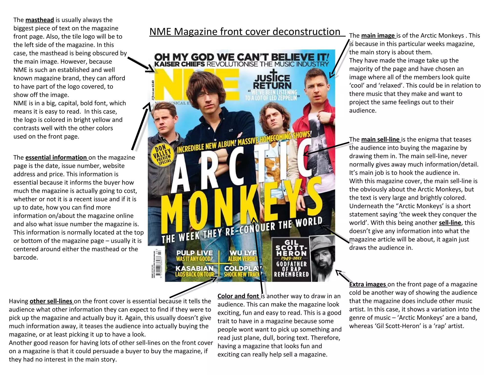
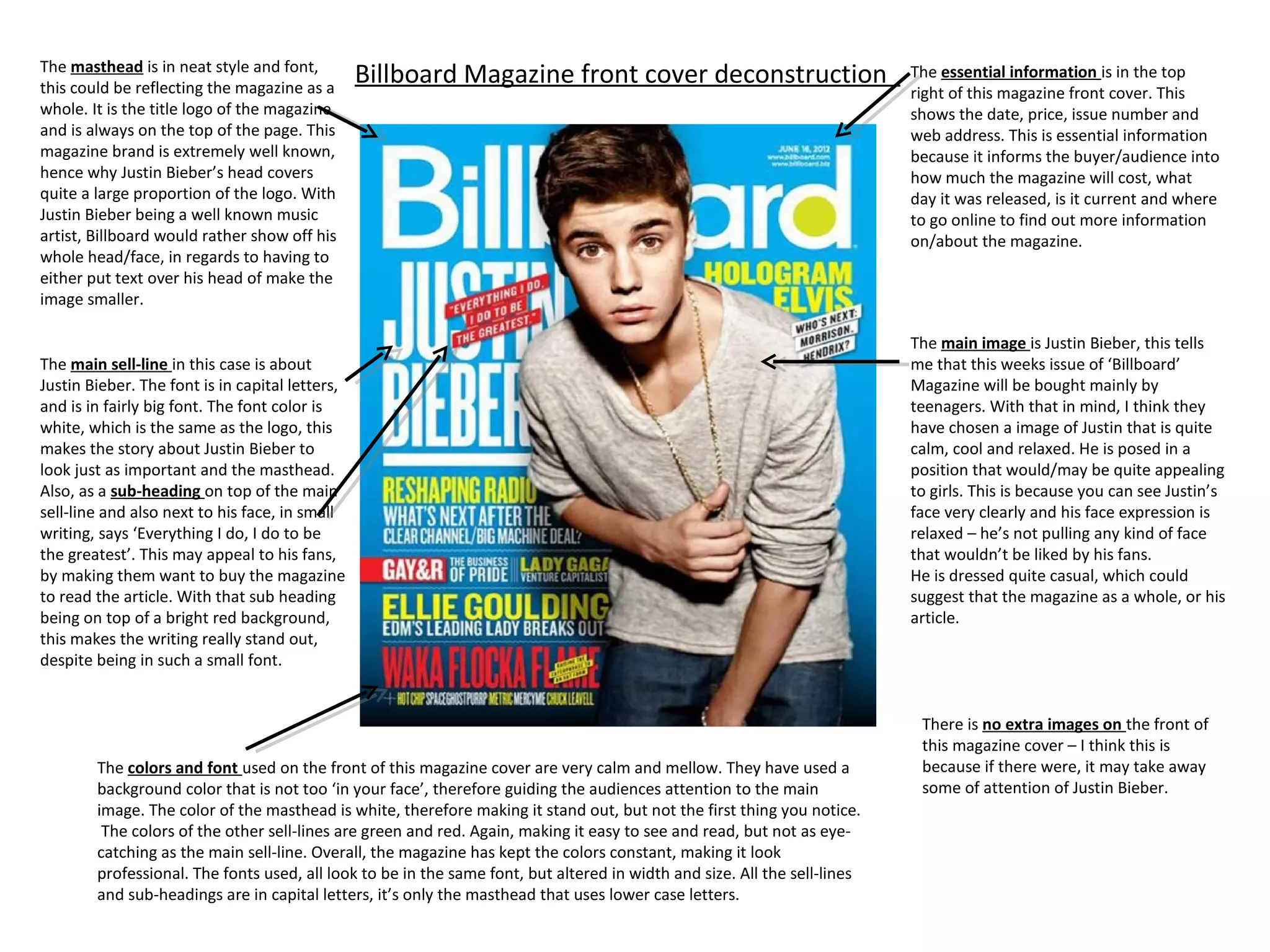
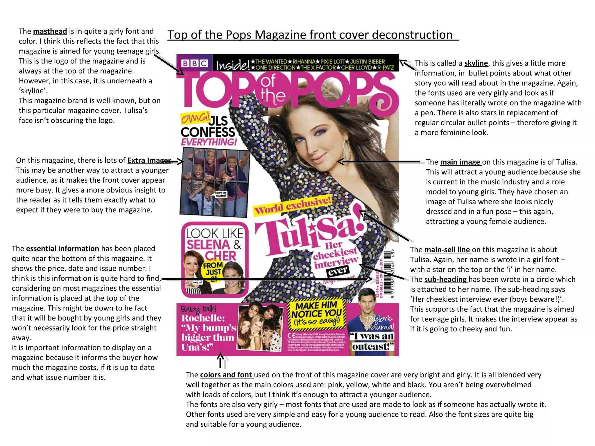
The masthead is usually always the
 biggest piece of text on the magazine
 front page. Also, the tile logo will be to
                                                    NME Magazine front cover deconstruction                                     The main image is of the Arctic Monkeys . This
 the left side of the magazine. In this                                                                                         is because in this particular weeks magazine,
 case, the masthead is being obscured by                                                                                        the main story is about them.
 the main image. However, because                                                                                               They have made the image take up the
 NME is such an established and well                                                                                            majority of the page and have chosen an
 known magazine brand, they can afford                                                                                          image where all of the members look quite
 to have part of the logo covered, to                                                                                           ‘cool’ and ‘relaxed’. This could be in relation to
 show off the image.                                                                                                            there music that they make and want to
 NME is in a big, capital, bold font, which                                                                                     project the same feelings out to their
 means it is easy to read. In this case,                                                                                        audience.
 the logo is colored in bright yellow and
 contrasts well with the other colors
 used on the front page.                                                                                                        The main sell-line is the enigma that teases
                                                                                                                                the audience into buying the magazine by
 The essential information on the magazine                                                                                      drawing them in. The main sell-line, never
 page is the date, issue number, website                                                                                        normally gives away much information/detail.
 address and price. This information is                                                                                         It’s main job is to hook the audience in.
 essential because it informs the buyer how                                                                                     With this magazine cover, the main sell-line is
 much the magazine is actually going to cost,                                                                                   the obviously about the Arctic Monkeys, but
 whether or not it is a recent issue and if it is                                                                               the text is very large and brightly colored.
 up to date, how you can find more                                                                                              Underneath the “Arctic Monkeys’ is a short
 information on/about the magazine online                                                                                       statement saying ‘the week they conquer the
 and also what issue number the magazine is.                                                                                    world’. With this being another sell-line, this
 This information is normally located at the top                                                                                doesn’t give any information into what the
 or bottom of the magazine page – usually it is                                                                                 magazine article will be about, it again just
 centered around either the masthead or the                                                                                     draws the audience in.
 barcode.


                                                                                                                                Extra images on the front page of a magazine
                                                                                                                                cold be another way of showing the audience
                                                                               Color and font is another way to draw in an
Having other sell-lines on the front cover is essential because it tells the                                                    that the magazine does include other music
                                                                               audience. This can make the magazine look
audience what other information they can expect to find if they were to                                                         artist. In this case, it shows a variation into the
                                                                               exciting, fun and easy to read. This is a good
pick up the magazine and actually buy it. Again, this usually doesn’t give                                                      genre of music – ‘Arctic Monkeys’ are a band,
                                                                               trait to have in a magazine because some
much information away, it teases the audience into actually buying the                                                          whereas ‘Gil Scott-Heron’ is a ‘rap’ artist.
                                                                               people wont want to pick up something and
magazine, or at least picking it up to have a look.                            read just plane, dull, boring text. Therefore,
Another good reason for having lots of other sell-lines on the front cover     having a magazine that looks fun and
on a magazine is that it could persuade a buyer to buy the magazine, if        exciting can really help sell a magazine.
they had no interest in the main story.
The masthead is in neat style and font,
this could be reflecting the magazine as a
                                                 Billboard Magazine front cover deconstruction                             The essential information is in the top
                                                                                                                           right of this magazine front cover. This
whole. It is the title logo of the magazine                                                                                shows the date, price, issue number and
and is always on the top of the page. This                                                                                 web address. This is essential information
magazine brand is extremely well known,                                                                                    because it informs the buyer/audience into
hence why Justin Bieber’s head covers                                                                                      how much the magazine will cost, what
quite a large proportion of the logo. With                                                                                 day it was released, is it current and where
Justin Bieber being a well known music                                                                                     to go online to find out more information
artist, Billboard would rather show off his                                                                                on/about the magazine.
whole head/face, in regards to having to
either put text over his head of make the
image smaller.

                                                                                                                           The main image is Justin Bieber, this tells
The main sell-line in this case is about                                                                                   me that this weeks issue of ‘Billboard’
Justin Bieber. The font is in capital letters,                                                                             Magazine will be bought mainly by
and is in fairly big font. The font color is                                                                               teenagers. With that in mind, I think they
white, which is the same as the logo, this                                                                                 have chosen a image of Justin that is quite
makes the story about Justin Bieber to                                                                                     calm, cool and relaxed. He is posed in a
look just as important and the masthead.                                                                                   position that would/may be quite appealing
Also, as a sub-heading on top of the main                                                                                  to girls. This is because you can see Justin’s
sell-line and also next to his face, in small                                                                              face very clearly and his face expression is
writing, says ‘Everything I do, I do to be                                                                                 relaxed – he’s not pulling any kind of face
the greatest’. This may appeal to his fans,                                                                                that wouldn’t be liked by his fans.
by making them want to buy the magazine                                                                                    He is dressed quite casual, which could
to read the article. With that sub heading                                                                                 suggest that the magazine as a whole, or his
being on top of a bright red background,                                                                                   article.
this makes the writing really stand out,
despite being in such a small font.


                                                                                                                            There is no extra images on the front of
                                                                                                                            this magazine cover – I think this is
        The colors and font used on the front of this magazine cover are very calm and mellow. They have used a             because if there were, it may take away
        background color that is not too ‘in your face’, therefore guiding the audiences attention to the main              some of attention of Justin Bieber.
        image. The color of the masthead is white, therefore making it stand out, but not the first thing you notice.
         The colors of the other sell-lines are green and red. Again, making it easy to see and read, but not as eye-
        catching as the main sell-line. Overall, the magazine has kept the colors constant, making it look
        professional. The fonts used, all look to be in the same font, but altered in width and size. All the sell-lines
        and sub-headings are in capital letters, it’s only the masthead that uses lower case letters.
The masthead is in quite a girly font and
  color. I think this reflects the fact that this
                                                    Top of the Pops Magazine front cover deconstruction
  magazine is aimed for young teenage girls.
  This is the logo of the magazine and is                                                                                   This is called a skyline, this gives a little more
  always at the top of the magazine.                                                                                        information, in bullet points about what other
  However, in this case, it is underneath a                                                                                 story you will read about in the magazine. Again,
  ‘skyline’.                                                                                                                the fonts used are very girly and look as if
  This magazine brand is well known, but on                                                                                 someone has literally wrote on the magazine with
  this particular magazine cover, Tulisa’s                                                                                  a pen. There is also stars in replacement of
  face isn’t obscuring the logo.                                                                                            regular circular bullet points – therefore giving it
                                                                                                                            a more feminine look.


 On this magazine, there is lots of Extra Images.                                                                               The main image on this magazine is of Tulisa.
 This may be another way to attract a younger                                                                                   This will attract a young audience because she
 audience, as it makes the front cover appear                                                                                   is current in the music industry and a role
 more busy. It gives a more obvious insight to                                                                                  model to young girls. They have chosen an
 the reader as it tells them exactly what to                                                                                    image of Tulisa where she looks nicely
 expect if they were to buy the magazine.                                                                                       dressed and in a fun pose – this again,
                                                                                                                                attracting a young female audience.


The essential information has been placed                                                                                  The main-sell line on this magazine is about
quite near the bottom of this magazine. It                                                                                 Tulisa. Again, her name is wrote in a girl font –
shows the price, date and issue number. I                                                                                  with a star on the top or the ‘i’ in her name.
think is this information is quite hard to find,                                                                           The sub-heading has been wrote in a circle which
considering on most magazines the essential                                                                                is attached to her name. The sub-heading says
information is placed at the top of the                                                                                    ‘Her cheekiest interview ever (boys beware!)’.
magazine. This might be down to he fact                                                                                    This supports the fact that the magazine is aimed
that it will be bought by young girls and they                                                                             for teenage girls. It makes the interview appear as
won’t necessarily look for the price straight                                                                              if it is going to cheeky and fun.
away.
It is important information to display on a
magazine because it informs the buyer how
much the magazine costs, if it is up to date
and what issue number it is.                           The colors and font used on the front of this magazine cover are very bright and girly. It is all blended very
                                                       well together as the main colors used are: pink, yellow, white and black. You aren’t being overwhelmed
                                                       with loads of colors, but I think it’s enough to attract a younger audience.
                                                       The fonts are also very girly – most fonts that are used are made to look as if someone has actually wrote it.
                                                       Other fonts used are very simple and easy for a young audience to read. Also the font sizes are quite big
                                                       and suitable for a young audience.

Deconstruction od magazine front covers

  • 1.
    The masthead isusually always the biggest piece of text on the magazine front page. Also, the tile logo will be to NME Magazine front cover deconstruction The main image is of the Arctic Monkeys . This the left side of the magazine. In this is because in this particular weeks magazine, case, the masthead is being obscured by the main story is about them. the main image. However, because They have made the image take up the NME is such an established and well majority of the page and have chosen an known magazine brand, they can afford image where all of the members look quite to have part of the logo covered, to ‘cool’ and ‘relaxed’. This could be in relation to show off the image. there music that they make and want to NME is in a big, capital, bold font, which project the same feelings out to their means it is easy to read. In this case, audience. the logo is colored in bright yellow and contrasts well with the other colors used on the front page. The main sell-line is the enigma that teases the audience into buying the magazine by The essential information on the magazine drawing them in. The main sell-line, never page is the date, issue number, website normally gives away much information/detail. address and price. This information is It’s main job is to hook the audience in. essential because it informs the buyer how With this magazine cover, the main sell-line is much the magazine is actually going to cost, the obviously about the Arctic Monkeys, but whether or not it is a recent issue and if it is the text is very large and brightly colored. up to date, how you can find more Underneath the “Arctic Monkeys’ is a short information on/about the magazine online statement saying ‘the week they conquer the and also what issue number the magazine is. world’. With this being another sell-line, this This information is normally located at the top doesn’t give any information into what the or bottom of the magazine page – usually it is magazine article will be about, it again just centered around either the masthead or the draws the audience in. barcode. Extra images on the front page of a magazine cold be another way of showing the audience Color and font is another way to draw in an Having other sell-lines on the front cover is essential because it tells the that the magazine does include other music audience. This can make the magazine look audience what other information they can expect to find if they were to artist. In this case, it shows a variation into the exciting, fun and easy to read. This is a good pick up the magazine and actually buy it. Again, this usually doesn’t give genre of music – ‘Arctic Monkeys’ are a band, trait to have in a magazine because some much information away, it teases the audience into actually buying the whereas ‘Gil Scott-Heron’ is a ‘rap’ artist. people wont want to pick up something and magazine, or at least picking it up to have a look. read just plane, dull, boring text. Therefore, Another good reason for having lots of other sell-lines on the front cover having a magazine that looks fun and on a magazine is that it could persuade a buyer to buy the magazine, if exciting can really help sell a magazine. they had no interest in the main story.
  • 2.
    The masthead isin neat style and font, this could be reflecting the magazine as a Billboard Magazine front cover deconstruction The essential information is in the top right of this magazine front cover. This whole. It is the title logo of the magazine shows the date, price, issue number and and is always on the top of the page. This web address. This is essential information magazine brand is extremely well known, because it informs the buyer/audience into hence why Justin Bieber’s head covers how much the magazine will cost, what quite a large proportion of the logo. With day it was released, is it current and where Justin Bieber being a well known music to go online to find out more information artist, Billboard would rather show off his on/about the magazine. whole head/face, in regards to having to either put text over his head of make the image smaller. The main image is Justin Bieber, this tells The main sell-line in this case is about me that this weeks issue of ‘Billboard’ Justin Bieber. The font is in capital letters, Magazine will be bought mainly by and is in fairly big font. The font color is teenagers. With that in mind, I think they white, which is the same as the logo, this have chosen a image of Justin that is quite makes the story about Justin Bieber to calm, cool and relaxed. He is posed in a look just as important and the masthead. position that would/may be quite appealing Also, as a sub-heading on top of the main to girls. This is because you can see Justin’s sell-line and also next to his face, in small face very clearly and his face expression is writing, says ‘Everything I do, I do to be relaxed – he’s not pulling any kind of face the greatest’. This may appeal to his fans, that wouldn’t be liked by his fans. by making them want to buy the magazine He is dressed quite casual, which could to read the article. With that sub heading suggest that the magazine as a whole, or his being on top of a bright red background, article. this makes the writing really stand out, despite being in such a small font. There is no extra images on the front of this magazine cover – I think this is The colors and font used on the front of this magazine cover are very calm and mellow. They have used a because if there were, it may take away background color that is not too ‘in your face’, therefore guiding the audiences attention to the main some of attention of Justin Bieber. image. The color of the masthead is white, therefore making it stand out, but not the first thing you notice. The colors of the other sell-lines are green and red. Again, making it easy to see and read, but not as eye- catching as the main sell-line. Overall, the magazine has kept the colors constant, making it look professional. The fonts used, all look to be in the same font, but altered in width and size. All the sell-lines and sub-headings are in capital letters, it’s only the masthead that uses lower case letters.
  • 3.
    The masthead isin quite a girly font and color. I think this reflects the fact that this Top of the Pops Magazine front cover deconstruction magazine is aimed for young teenage girls. This is the logo of the magazine and is This is called a skyline, this gives a little more always at the top of the magazine. information, in bullet points about what other However, in this case, it is underneath a story you will read about in the magazine. Again, ‘skyline’. the fonts used are very girly and look as if This magazine brand is well known, but on someone has literally wrote on the magazine with this particular magazine cover, Tulisa’s a pen. There is also stars in replacement of face isn’t obscuring the logo. regular circular bullet points – therefore giving it a more feminine look. On this magazine, there is lots of Extra Images. The main image on this magazine is of Tulisa. This may be another way to attract a younger This will attract a young audience because she audience, as it makes the front cover appear is current in the music industry and a role more busy. It gives a more obvious insight to model to young girls. They have chosen an the reader as it tells them exactly what to image of Tulisa where she looks nicely expect if they were to buy the magazine. dressed and in a fun pose – this again, attracting a young female audience. The essential information has been placed The main-sell line on this magazine is about quite near the bottom of this magazine. It Tulisa. Again, her name is wrote in a girl font – shows the price, date and issue number. I with a star on the top or the ‘i’ in her name. think is this information is quite hard to find, The sub-heading has been wrote in a circle which considering on most magazines the essential is attached to her name. The sub-heading says information is placed at the top of the ‘Her cheekiest interview ever (boys beware!)’. magazine. This might be down to he fact This supports the fact that the magazine is aimed that it will be bought by young girls and they for teenage girls. It makes the interview appear as won’t necessarily look for the price straight if it is going to cheeky and fun. away. It is important information to display on a magazine because it informs the buyer how much the magazine costs, if it is up to date and what issue number it is. The colors and font used on the front of this magazine cover are very bright and girly. It is all blended very well together as the main colors used are: pink, yellow, white and black. You aren’t being overwhelmed with loads of colors, but I think it’s enough to attract a younger audience. The fonts are also very girly – most fonts that are used are made to look as if someone has actually wrote it. Other fonts used are very simple and easy for a young audience to read. Also the font sizes are quite big and suitable for a young audience.