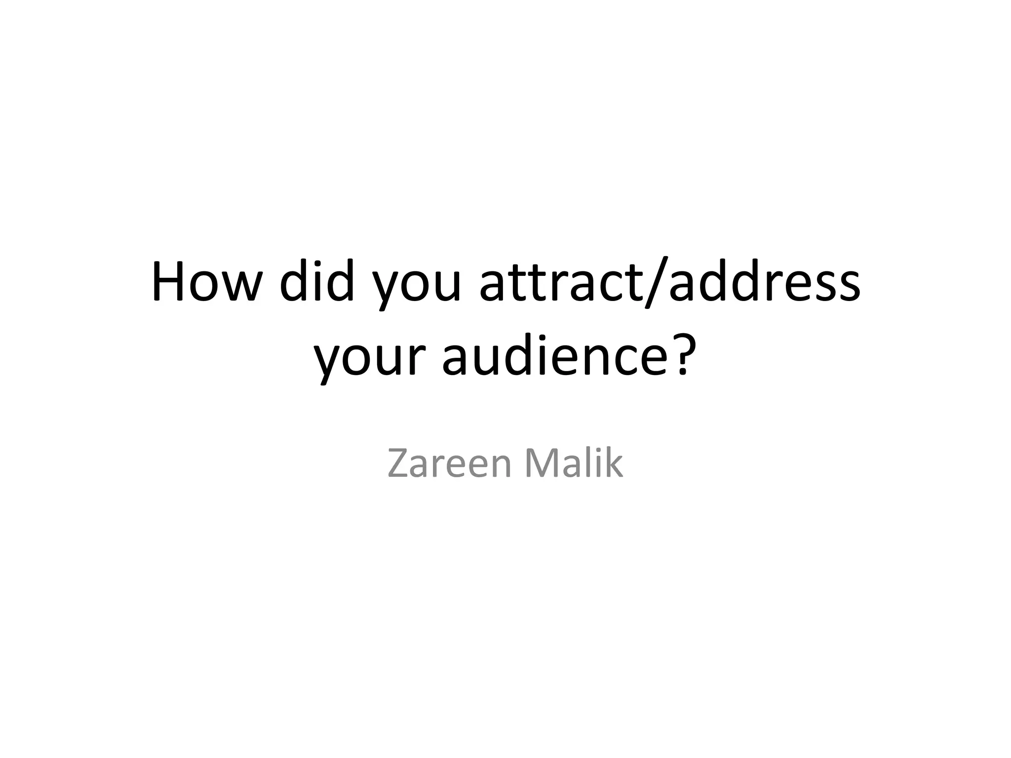
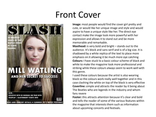
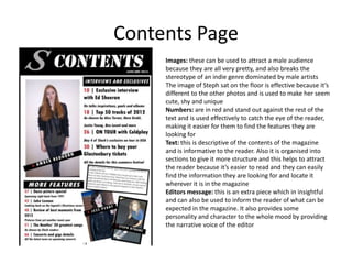
How did you attract/address
     your audience?
         Zareen Malik
Front Cover
    Image: most people would find the cover girl pretty and
    cute, or would like her unique image and style and would
    aspire to have a unique style like her. The direct eye
    contact make the image look more powerful with her
    expression and allows it to stand out and be more
    memorable and remarkable.
    Masthead: is very bold and bright – stands out to the
    audience. It’s block and sans serif and is of a big size. It is
    shadowed by a white replica of the text to place more
    emphasis on it allowing it be much more eye catching
    Colours: I have stuck to a basic colour scheme of black and
    white to make the magazine look more professional and
    striking while these colours always seem to work well with
    this genre.
    I used these colours because the artist is also wearing
    black so the colours work really well together and in this
    case clashing the white on top of the black is very effective
    Coverline: simple and attracts the reader by it being about
    The Beatles who are legends in the industry and whom
    fans revere
    Footer: this attracts attention because it’s clear and bold
    and tells the reader of some of the various features within
    the magazine that interests them such as information
    about upcoming concerts and festivals.
Contents Page
     Images: these can be used to attract a male audience
     because they are all very pretty, and also breaks the
     stereotype of an indie genre dominated by male artists
     The image of Steph sat on the floor is effective because it’s
     different to the other photos and is used to make her seem
     cute, shy and unique
     Numbers: are in red and stand out against the rest of the
     text and is used effectively to catch the eye of the reader,
     making it easier for them to find the features they are
     looking for
     Text: this is descriptive of the contents of the magazine
     and is informative to the reader. Also it is organised into
     sections to give it more structure and this helps to attract
     the reader because it’s easier to read and they can easily
     find the information they are looking for and locate it
     wherever it is in the magazine
     Editors message: this is an extra piece which in insightful
     and can also be used to inform the reader of what can be
     expected in the magazine. It also provides some
     personality and character to the whole mood by providing
     the narrative voice of the editor
Double page spread
                                                                                  Image: Like the front cover image will
                                                                                  appeal to the audience because she is
                                                                                  very pretty and cute and some girls
                                                                                  may want to be like her and have her
                                                                                  style and individuality. The straight
                                                                                  expression and looking straight into
                                                                                  the camera is used to create a much
                                                                                  more striking effect.
                                                                                  Headline and subheading: this is used
                                                                                  to attract the audience by standing out
                                                                                  and immediately catches their
                                                                                  attention by including an interesting
                                                                                  pull quote from the text giving them a
                                                                                  little bit of information about her
                                                                                  character
                                                                                  Layout: this helps to attract the reader
                                                                                  because it’s structured well and easy
                                                                                  to read, everything is simple but
                                                                                  effective and not crowded.
‘Exclusive’ banner: this is used to attract the audience in that it highlights the exclusivity of the interview which
assures the reader that everything is original and exclusive to this magazine which is another way to promote the
magazine.
Text: this attracts the reader in that it tells the reader more about the artist and a few little bits and pieces about her
as a person and some things the audience may not have known before which is good because they always like finding
out new things and some of the gossip in there aswell.

Evaluation q5

  • 1.
    How did youattract/address your audience? Zareen Malik
  • 2.
    Front Cover Image: most people would find the cover girl pretty and cute, or would like her unique image and style and would aspire to have a unique style like her. The direct eye contact make the image look more powerful with her expression and allows it to stand out and be more memorable and remarkable. Masthead: is very bold and bright – stands out to the audience. It’s block and sans serif and is of a big size. It is shadowed by a white replica of the text to place more emphasis on it allowing it be much more eye catching Colours: I have stuck to a basic colour scheme of black and white to make the magazine look more professional and striking while these colours always seem to work well with this genre. I used these colours because the artist is also wearing black so the colours work really well together and in this case clashing the white on top of the black is very effective Coverline: simple and attracts the reader by it being about The Beatles who are legends in the industry and whom fans revere Footer: this attracts attention because it’s clear and bold and tells the reader of some of the various features within the magazine that interests them such as information about upcoming concerts and festivals.
  • 3.
    Contents Page Images: these can be used to attract a male audience because they are all very pretty, and also breaks the stereotype of an indie genre dominated by male artists The image of Steph sat on the floor is effective because it’s different to the other photos and is used to make her seem cute, shy and unique Numbers: are in red and stand out against the rest of the text and is used effectively to catch the eye of the reader, making it easier for them to find the features they are looking for Text: this is descriptive of the contents of the magazine and is informative to the reader. Also it is organised into sections to give it more structure and this helps to attract the reader because it’s easier to read and they can easily find the information they are looking for and locate it wherever it is in the magazine Editors message: this is an extra piece which in insightful and can also be used to inform the reader of what can be expected in the magazine. It also provides some personality and character to the whole mood by providing the narrative voice of the editor
  • 4.
    Double page spread Image: Like the front cover image will appeal to the audience because she is very pretty and cute and some girls may want to be like her and have her style and individuality. The straight expression and looking straight into the camera is used to create a much more striking effect. Headline and subheading: this is used to attract the audience by standing out and immediately catches their attention by including an interesting pull quote from the text giving them a little bit of information about her character Layout: this helps to attract the reader because it’s structured well and easy to read, everything is simple but effective and not crowded. ‘Exclusive’ banner: this is used to attract the audience in that it highlights the exclusivity of the interview which assures the reader that everything is original and exclusive to this magazine which is another way to promote the magazine. Text: this attracts the reader in that it tells the reader more about the artist and a few little bits and pieces about her as a person and some things the audience may not have known before which is good because they always like finding out new things and some of the gossip in there aswell.