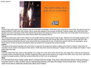
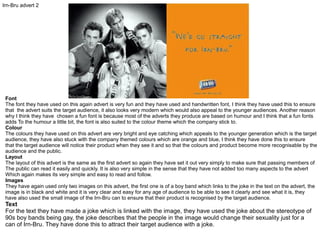
SlideShare a Scribd company logo
1 of 7
Irn-Bru advert 1

Font
The font they have used on this advert is very fun and looks handwritten, I think they have used this to ensure that the advert suits the
target audience, it also looks very modern which would also appeal to the younger audiences. Another reason why I think they have
chosen a fun font is because most of the adverts they produce are based on humour and I think that a fun fonts adds To the humour a
little bit, the font is also suited to the colour theme which the company stick to.
Colour
The colours they have used on this advert are very bright and eye catching which helps to get attention from the target audience and
others outside of the target audience. These two colours which are blue and orange also have a very big connection with the Ir-Bru
company because these are the two main colours that the company like to use on both their adverts and the can packaging, using
these colours on their products and adverts helps the audience to recognise their products easily.
Layout
The layout of this advert has been set out so that it is easy for the audience to follow it easily and so that it is easy to, they have not
included a lot of content to the layout of this advert, I think they have done this because it makes it look more simple and modern, it also
looks clean and neat.
Images
The only image they have used on this website is an image of a horse which links with the text, the image ties in with the text because
it creates humour and tells the joke. Another image they have used on this advert is an image of the drinks cans, they have used these
to show the target audience what their product looks like so that it can be recognized.

Text
For the text they have made a joke which is linked with the image, they have used the joke about a horse having a
long face which is also another way for expressing sadness and also the shape of the horses face. They haven't
used much text to make the advert look clean and modern.
Irn-Bru advert 2

Font
The font they have used on this again advert is very fun and they have used and handwritten font, I think they have used this to ensure
that the advert suits the target audience, it also looks very modern which would also appeal to the younger audiences. Another reason
why I think they have chosen a fun font is because most of the adverts they produce are based on humour and I think that a fun fonts
adds To the humour a little bit, the font is also suited to the colour theme which the company stick to.
Colour
The colours they have used on this advert are very bright and eye catching which appeals to the younger generation which is the target
audience, they have also stuck with the company themed colours which are orange and blue, I think they have done this to ensure
that the target audience will notice their product when they see it and so that the colours and product become more recognisable by the
audience and the public.
Layout
The layout of this advert is the same as the first advert so again they have set it out very simply to make sure that passing members of
The public can read it easily and quickly. It is also very simple in the sense that they have not added too many aspects to the advert
Which again makes its very simple and easy to read and follow.
Images
They have again used only two images on this advert, the first one is of a boy band which links to the joke in the text on the advert, the
image is in black and white and it is very clear and easy for any age of audience to be able to see it clearly and see what it is, they
have also used the small image of the Irn-Bru can to ensure that their product is recognised by the target audience.

Text
For the text they have made a joke which is linked with the image, they have used the joke about the stereotype of
90s boy bands being gay, the joke describes that the people in the image would change their sexuality just for a
can of Irn-Bru. They have done this to attract their target audience with a joke.
Irn-Bru advert 3

Font
The font they have used on this advert is very fun and looks handwritten, again they have used this to ensure that the advert suits the
target audience and that it appeals to them, it also looks very modern which would also appeal to the younger audiences. The advert is
also based around humour and one joke in particular, I think they have incorporated the font to the humour by make it fun.
Colour
The colours used on this advert again are very bright and eye catching and suit with the humourus and fun theme, I also think that it
Helps the advert and the product to appeal more to the younger generation and the young target audience. They have also kept the
Brand and company colours in with this advert.
Layout
The layout of this advert has been set out so that it is easy for the audience to follow it easily and so that it is easy to, they have not
included a lot of content to the layout of this advert, I think they have done this because it makes it look more simple and modern, it also
looks clean and neat.
Images
On this advert again they have used the two images of the joke image and the small image of the can, this image shows a man shouting
an pointing at a donkey, this image goes along with the joke in the text as well as the other adverts I have analysed, again it is in black
and white and clear to make out what the image is to any audience.

Text
The text they have used again describes a joke which links to the image, this keeps in line with the theme of humour
and attracts the young target audience, they have used a joke which says “if it aint irn-bru, you can kiss my ass”
which is another word for a donkey which is why it fits in with the image beside it of the man and the donkey.
Irn-Bru 32 packaging
FONT: the font they have used on the
packaging for the can is very big a bold
which is eye-catching to both the target
audience and the general public, it is also
very narrow and simple which fits in with the
modern theme and again attracts the target
audience.
They have used a mixture of different fonts
but each one is bold and eye-catching and
some of the different type of fonts are in the
irn-bru colours which are blue and orange.

COLOUR: Through many of the packaging
they use for their products they have used
the two main brand colours which are blue
and orange.
These colours are very bright and can be
seen well amongst other rival company
packaging. Using these two colours
throughout their products will also help to
gain consistent customers because they are
colours that can be spotted easily and
customers will recognise them.

LAYOUT: The layout for this can is not as
simple and clear as the adverts they
produce, some of the texts are different
ways around but this creates the fun and
modern, individual style which appeals to
the young target market, they have also
ensured that the text stays on the front of
the can and doesn't wrap around to the back
so that people can read it easily when it is in
a shop.
Energy drink advert 1

Font
The monster company have used very effective techniques for the choice of their font, they have used fonts which represent the nature
of both a monster and energy but choosing a horror themed main font and a modern green font for the word “energy” they have also
again used a horror themed font for the bottom under the main text.
Colour
They have mainly used dark colours for this advert again I think they have done this to represent the monster theme and the horror
theme. But they have also used bright green neon colours to represent the energy aspect of the product because it is a bright vivid
colours, I also think they have used this because it is an eye catching colour and suits the target market well.
Layout
They layout is very easy to follow which not only suits the teenage target market but suits other members of the public who may be
outside of the target audience. They have also made sure that the text is all on one side of the advert and that the image is on the other
side again making it easy to read and follow.
Images
On this advert they have again stuck to using the minimal amount of images like many other drink adverts do, they have used only one
image which is of the product itself, this is simple advertising because it allows the target audience to become farmilliar with the product
and recognise it in shops.

Text
The text is also simple advertising because it shows the name of the product to allow the audience to become
familiar with it, they have also added the product motto which is “unleash the best” which again links into the
monster horror theme and also the energy aspect of the product.
Energy drink advert 2

Font
The font they have used on this advert is very bold and eye catching, I think this suits the target audience very well because it looks
modern and stylish which suits the target audience and its is also easy to read which suits any other potential audience. I think again
they have used the same font as what they do on the packaging to make sure the audience recognise it.
Colour
When looking at this advert I can see straight away that they have used the same colour on the font as they use on the product
packaging which I think is a similar technique to the Irn-Bru adverts, their main colour is green so using it on the adverts ensure that
the target audience will be able to recognise their product and recognise other adverts.
Layout
The layout of this advert has been set out so that it is easy for the audience to follow it easily and so that it is easy to read, they have not
included a lot of content to the layout of this advert, I think they have done this because it makes it look more simple and modern, it also
looks clean and neat which applies to the attraction of the target audience.
Images
Similar to the Monster advert they have only used the image of the drink bottle because it is simple and modern, they have also made
the colours on the bottle a little brighter to attract the audiences eyes to the product rather than the black background, it also helps it to
stand out.

Text
In this advert they have also made a small joke by saying “this is how we dew” instead of “this is how we do” I think
this is a clever way of attracting the audience because it is based on humour and the audience are mainly young
adults and teenagers.
Energy drink advert 3

Font
The only font on this advert is the font which is on the can, the font on the can though is again like the other adverts very bold and big
it helps to attracts the eye and the attention of the target audience and also is is very modern and up to date which again helps to
maintain the companies relationship with the young adult target audience.
Colour
They have used contrasting colours on this advert by using a black background and orange flames to indicate that the drink is full of
energy just like fire is a source of energy. I think they have also used these two colours because these are the colours that are used on
the product packaging.
Layout
The layout of this advert is a bit of a disadvantage because they haven't included any text to go with the images, the positives are that
they have positioned the image of the product in the centre of the advert so that it is the first thing that people see and the main thing
on the advert.
Images
They have used only an image of the can on this advert and the fire flames in the background, I think they have only used these two
images because it is simplistic and modern, it also directs the audiences attention to the product when they look at the advert.
I also think they have used the image of the flames to represent the energy that the drink has in it.

More Related Content

What's hot

Research into billboard advertisements
Research into billboard advertisementsResearch into billboard advertisements
Research into billboard advertisements09higginsa
 
Evaluation question 3
Evaluation question 3 Evaluation question 3
Evaluation question 3 amberbush
 
Question 2 (amy keen) (2)
Question 2 (amy keen) (2)Question 2 (amy keen) (2)
Question 2 (amy keen) (2)ak161702
 
Evaluation Question 2
Evaluation Question 2Evaluation Question 2
Evaluation Question 2sophieoldman
 
What have you learnt from your audience feedback?
What have you learnt from your audience feedback?What have you learnt from your audience feedback?
What have you learnt from your audience feedback?sophieoldman
 
Evaluation Question 2
Evaluation Question 2Evaluation Question 2
Evaluation Question 2joshmanley98
 
Media question 2 (rosie carne)
Media question 2 (rosie carne)Media question 2 (rosie carne)
Media question 2 (rosie carne)rc160161
 
Media Coursework Evaluation
Media Coursework EvaluationMedia Coursework Evaluation
Media Coursework Evaluationreeve6561
 
Evaluation advanced portfolio
Evaluation advanced portfolioEvaluation advanced portfolio
Evaluation advanced portfolioPriyanka Chawla
 
Ancillary product poster
Ancillary product posterAncillary product poster
Ancillary product posterJudeMunday1
 
Annotations for question 2.2
Annotations for question 2.2Annotations for question 2.2
Annotations for question 2.2sophieoldman
 
Advertising campaigns
Advertising campaignsAdvertising campaigns
Advertising campaignsbe05061504
 
Evaluation Question 2
Evaluation Question 2Evaluation Question 2
Evaluation Question 2ECardMedia
 
Tv advert detailed analysis your choice
Tv advert detailed analysis   your choiceTv advert detailed analysis   your choice
Tv advert detailed analysis your choicehfhrehgkerg
 
Evaluation - combining texts
Evaluation - combining textsEvaluation - combining texts
Evaluation - combining textskatiehunt095
 

What's hot (19)

Research
ResearchResearch
Research
 
Task one
Task oneTask one
Task one
 
Research into billboard advertisements
Research into billboard advertisementsResearch into billboard advertisements
Research into billboard advertisements
 
Evaluation question 3
Evaluation question 3 Evaluation question 3
Evaluation question 3
 
Question 2 (amy keen) (2)
Question 2 (amy keen) (2)Question 2 (amy keen) (2)
Question 2 (amy keen) (2)
 
Evaluation Question 2
Evaluation Question 2Evaluation Question 2
Evaluation Question 2
 
Canon brief campaign
Canon brief campaignCanon brief campaign
Canon brief campaign
 
What have you learnt from your audience feedback?
What have you learnt from your audience feedback?What have you learnt from your audience feedback?
What have you learnt from your audience feedback?
 
Evaluation
Evaluation Evaluation
Evaluation
 
Evaluation Question 2
Evaluation Question 2Evaluation Question 2
Evaluation Question 2
 
Media question 2 (rosie carne)
Media question 2 (rosie carne)Media question 2 (rosie carne)
Media question 2 (rosie carne)
 
Media Coursework Evaluation
Media Coursework EvaluationMedia Coursework Evaluation
Media Coursework Evaluation
 
Evaluation advanced portfolio
Evaluation advanced portfolioEvaluation advanced portfolio
Evaluation advanced portfolio
 
Ancillary product poster
Ancillary product posterAncillary product poster
Ancillary product poster
 
Annotations for question 2.2
Annotations for question 2.2Annotations for question 2.2
Annotations for question 2.2
 
Advertising campaigns
Advertising campaignsAdvertising campaigns
Advertising campaigns
 
Evaluation Question 2
Evaluation Question 2Evaluation Question 2
Evaluation Question 2
 
Tv advert detailed analysis your choice
Tv advert detailed analysis   your choiceTv advert detailed analysis   your choice
Tv advert detailed analysis your choice
 
Evaluation - combining texts
Evaluation - combining textsEvaluation - combining texts
Evaluation - combining texts
 

Viewers also liked

วิเคราะห์เว็บไซต์
วิเคราะห์เว็บไซต์วิเคราะห์เว็บไซต์
วิเคราะห์เว็บไซต์aew1234
 
เวบ เล่มเลก
เวบ เล่มเลกเวบ เล่มเลก
เวบ เล่มเลกaew1234
 
Tornyai_Streichquintett_(new version)
Tornyai_Streichquintett_(new version)Tornyai_Streichquintett_(new version)
Tornyai_Streichquintett_(new version)tornyaipeter
 
หลักการออกแบบเวบ
หลักการออกแบบเวบหลักการออกแบบเวบ
หลักการออกแบบเวบaew1234
 
Existing homeless charitie
Existing homeless charitieExisting homeless charitie
Existing homeless charitiehannahlaufeyson
 
เวบ เล่มเลก
เวบ เล่มเลกเวบ เล่มเลก
เวบ เล่มเลกaew1234
 
Tornyai_Tíz magyar népdal - for 10 guitars
Tornyai_Tíz magyar népdal - for 10 guitarsTornyai_Tíz magyar népdal - for 10 guitars
Tornyai_Tíz magyar népdal - for 10 guitarstornyaipeter
 
Wikipedia Project
Wikipedia Project Wikipedia Project
Wikipedia Project alexisz2
 
How To Make Money Online Without Investment
How To Make Money Online Without InvestmentHow To Make Money Online Without Investment
How To Make Money Online Without Investmentdreamkripted
 
Volleyball App
Volleyball AppVolleyball App
Volleyball Appalexisz2
 

Viewers also liked (18)

วิเคราะห์เว็บไซต์
วิเคราะห์เว็บไซต์วิเคราะห์เว็บไซต์
วิเคราะห์เว็บไซต์
 
เวบ เล่มเลก
เวบ เล่มเลกเวบ เล่มเลก
เวบ เล่มเลก
 
LO2
LO2LO2
LO2
 
Tornyai_Streichquintett_(new version)
Tornyai_Streichquintett_(new version)Tornyai_Streichquintett_(new version)
Tornyai_Streichquintett_(new version)
 
หลักการออกแบบเวบ
หลักการออกแบบเวบหลักการออกแบบเวบ
หลักการออกแบบเวบ
 
Existing homeless charitie
Existing homeless charitieExisting homeless charitie
Existing homeless charitie
 
Flat plans
Flat plansFlat plans
Flat plans
 
เวบ เล่มเลก
เวบ เล่มเลกเวบ เล่มเลก
เวบ เล่มเลก
 
Tornyai_Tíz magyar népdal - for 10 guitars
Tornyai_Tíz magyar népdal - for 10 guitarsTornyai_Tíz magyar népdal - for 10 guitars
Tornyai_Tíz magyar népdal - for 10 guitars
 
Portafolio Gráfico
Portafolio GráficoPortafolio Gráfico
Portafolio Gráfico
 
On going evaluations
On going evaluationsOn going evaluations
On going evaluations
 
Task 4
Task 4Task 4
Task 4
 
Evaluation
EvaluationEvaluation
Evaluation
 
Exposicion arq. bioclimatica
Exposicion arq. bioclimaticaExposicion arq. bioclimatica
Exposicion arq. bioclimatica
 
Wikipedia
WikipediaWikipedia
Wikipedia
 
Wikipedia Project
Wikipedia Project Wikipedia Project
Wikipedia Project
 
How To Make Money Online Without Investment
How To Make Money Online Without InvestmentHow To Make Money Online Without Investment
How To Make Money Online Without Investment
 
Volleyball App
Volleyball AppVolleyball App
Volleyball App
 

Similar to advert analysis

Irnbru research task 1
Irnbru research task 1Irnbru research task 1
Irnbru research task 1Ryan Goldsmith
 
Research Irn Bru LO1
Research Irn Bru LO1Research Irn Bru LO1
Research Irn Bru LO1Hannah Sewell
 
EVALUATION QUESTION TWO
EVALUATION QUESTION TWOEVALUATION QUESTION TWO
EVALUATION QUESTION TWOJessica Healey
 
Energy drink research
Energy drink researchEnergy drink research
Energy drink researchchamahan
 
Task1- Research
Task1- ResearchTask1- Research
Task1- Researchchamahan
 
Existing adverts
Existing advertsExisting adverts
Existing advertsMarieSie
 
Task4- Idea Generation
Task4- Idea GenerationTask4- Idea Generation
Task4- Idea Generationchamahan
 
Task7- Evaluation
Task7- EvaluationTask7- Evaluation
Task7- Evaluationchamahan
 
Idea generation task4
Idea generation task4Idea generation task4
Idea generation task4chamahan
 
Presentation4
Presentation4Presentation4
Presentation4ap161525
 
Task7- Production Development (webbanner)
Task7- Production Development (webbanner)Task7- Production Development (webbanner)
Task7- Production Development (webbanner)chamahan
 
Task 5- Idea Development
Task 5- Idea Development Task 5- Idea Development
Task 5- Idea Development chamahan
 
Social action
Social actionSocial action
Social actionchamahan
 
Self evaluation
Self evaluation Self evaluation
Self evaluation wilsonnx
 
Energy drink research pro forma
Energy drink research pro formaEnergy drink research pro forma
Energy drink research pro formaPJG123
 

Similar to advert analysis (20)

Irnbru research task 1
Irnbru research task 1Irnbru research task 1
Irnbru research task 1
 
Research
ResearchResearch
Research
 
TASK 1- IRN BRU 32
TASK 1- IRN BRU 32TASK 1- IRN BRU 32
TASK 1- IRN BRU 32
 
Research Irn Bru LO1
Research Irn Bru LO1Research Irn Bru LO1
Research Irn Bru LO1
 
Developing ideas
Developing ideasDeveloping ideas
Developing ideas
 
EVALUATION QUESTION TWO
EVALUATION QUESTION TWOEVALUATION QUESTION TWO
EVALUATION QUESTION TWO
 
Energy drink research
Energy drink researchEnergy drink research
Energy drink research
 
Task1- Research
Task1- ResearchTask1- Research
Task1- Research
 
Existing adverts
Existing advertsExisting adverts
Existing adverts
 
Task4- Idea Generation
Task4- Idea GenerationTask4- Idea Generation
Task4- Idea Generation
 
Task7- Evaluation
Task7- EvaluationTask7- Evaluation
Task7- Evaluation
 
Idea generation task4
Idea generation task4Idea generation task4
Idea generation task4
 
Presentation4
Presentation4Presentation4
Presentation4
 
Task7- Production Development (webbanner)
Task7- Production Development (webbanner)Task7- Production Development (webbanner)
Task7- Production Development (webbanner)
 
Task 5
Task 5Task 5
Task 5
 
Task 5- Idea Development
Task 5- Idea Development Task 5- Idea Development
Task 5- Idea Development
 
Social action
Social actionSocial action
Social action
 
Self evaluation
Self evaluation Self evaluation
Self evaluation
 
Evaluation
EvaluationEvaluation
Evaluation
 
Energy drink research pro forma
Energy drink research pro formaEnergy drink research pro forma
Energy drink research pro forma
 

More from hannahlaufeyson (20)

Evaluation
EvaluationEvaluation
Evaluation
 
Task 9
Task 9Task 9
Task 9
 
Task 9
Task 9Task 9
Task 9
 
Task 8
Task 8Task 8
Task 8
 
Task 7
Task 7Task 7
Task 7
 
Fibbers
FibbersFibbers
Fibbers
 
Gerard ex
Gerard exGerard ex
Gerard ex
 
Tom
TomTom
Tom
 
Planning pro forma
Planning pro formaPlanning pro forma
Planning pro forma
 
Type
TypeType
Type
 
Fibbers eval
Fibbers evalFibbers eval
Fibbers eval
 
Gerard and tom eval
Gerard and tom evalGerard and tom eval
Gerard and tom eval
 
Typography evaluation
Typography evaluationTypography evaluation
Typography evaluation
 
Word eval
Word evalWord eval
Word eval
 
Word eval
Word evalWord eval
Word eval
 
Fibbers eval
Fibbers evalFibbers eval
Fibbers eval
 
Task 1
Task 1Task 1
Task 1
 
Contact sheet
Contact sheetContact sheet
Contact sheet
 
Experiments
ExperimentsExperiments
Experiments
 
Photographers
PhotographersPhotographers
Photographers
 

Recently uploaded

306MTAMount UCLA University Bachelor's Diploma in Social Media
306MTAMount UCLA University Bachelor's Diploma in Social Media306MTAMount UCLA University Bachelor's Diploma in Social Media
306MTAMount UCLA University Bachelor's Diploma in Social MediaD SSS
 
Cosumer Willingness to Pay for Sustainable Bricks
Cosumer Willingness to Pay for Sustainable BricksCosumer Willingness to Pay for Sustainable Bricks
Cosumer Willingness to Pay for Sustainable Bricksabhishekparmar618
 
3D Printing And Designing Final Report.pdf
3D Printing And Designing Final Report.pdf3D Printing And Designing Final Report.pdf
3D Printing And Designing Final Report.pdfSwaraliBorhade
 
(办理学位证)埃迪斯科文大学毕业证成绩单原版一比一
(办理学位证)埃迪斯科文大学毕业证成绩单原版一比一(办理学位证)埃迪斯科文大学毕业证成绩单原版一比一
(办理学位证)埃迪斯科文大学毕业证成绩单原版一比一Fi sss
 
Call Girls In Safdarjung Enclave 24/7✡️9711147426✡️ Escorts Service
Call Girls In Safdarjung Enclave 24/7✡️9711147426✡️ Escorts ServiceCall Girls In Safdarjung Enclave 24/7✡️9711147426✡️ Escorts Service
Call Girls In Safdarjung Enclave 24/7✡️9711147426✡️ Escorts Servicejennyeacort
 
Kindergarten Assessment Questions Via LessonUp
Kindergarten Assessment Questions Via LessonUpKindergarten Assessment Questions Via LessonUp
Kindergarten Assessment Questions Via LessonUpmainac1
 
PORTFOLIO DE ARQUITECTURA CRISTOBAL HERAUD 2024
PORTFOLIO DE ARQUITECTURA CRISTOBAL HERAUD 2024PORTFOLIO DE ARQUITECTURA CRISTOBAL HERAUD 2024
PORTFOLIO DE ARQUITECTURA CRISTOBAL HERAUD 2024CristobalHeraud
 
Housewife Call Girls NRI Layout - Call 7001305949 Rs-3500 with A/C Room Cash ...
Housewife Call Girls NRI Layout - Call 7001305949 Rs-3500 with A/C Room Cash ...Housewife Call Girls NRI Layout - Call 7001305949 Rs-3500 with A/C Room Cash ...
Housewife Call Girls NRI Layout - Call 7001305949 Rs-3500 with A/C Room Cash ...narwatsonia7
 
VIP Call Girls Service Mehdipatnam Hyderabad Call +91-8250192130
VIP Call Girls Service Mehdipatnam Hyderabad Call +91-8250192130VIP Call Girls Service Mehdipatnam Hyderabad Call +91-8250192130
VIP Call Girls Service Mehdipatnam Hyderabad Call +91-8250192130Suhani Kapoor
 
Call Us ✡️97111⇛47426⇛Call In girls Vasant Vihar༒(Delhi)
Call Us ✡️97111⇛47426⇛Call In girls Vasant Vihar༒(Delhi)Call Us ✡️97111⇛47426⇛Call In girls Vasant Vihar༒(Delhi)
Call Us ✡️97111⇛47426⇛Call In girls Vasant Vihar༒(Delhi)jennyeacort
 
Untitled presedddddddddddddddddntation (1).pptx
Untitled presedddddddddddddddddntation (1).pptxUntitled presedddddddddddddddddntation (1).pptx
Untitled presedddddddddddddddddntation (1).pptxmapanig881
 
Call Girls Meghani Nagar 7397865700 Independent Call Girls
Call Girls Meghani Nagar 7397865700  Independent Call GirlsCall Girls Meghani Nagar 7397865700  Independent Call Girls
Call Girls Meghani Nagar 7397865700 Independent Call Girlsssuser7cb4ff
 
办理(USYD毕业证书)澳洲悉尼大学毕业证成绩单原版一比一
办理(USYD毕业证书)澳洲悉尼大学毕业证成绩单原版一比一办理(USYD毕业证书)澳洲悉尼大学毕业证成绩单原版一比一
办理(USYD毕业证书)澳洲悉尼大学毕业证成绩单原版一比一diploma 1
 
Call In girls Bhikaji Cama Place 🔝 ⇛8377877756 FULL Enjoy Delhi NCR
Call In girls Bhikaji Cama Place 🔝 ⇛8377877756 FULL Enjoy Delhi NCRCall In girls Bhikaji Cama Place 🔝 ⇛8377877756 FULL Enjoy Delhi NCR
Call In girls Bhikaji Cama Place 🔝 ⇛8377877756 FULL Enjoy Delhi NCRdollysharma2066
 
在线办理ohio毕业证俄亥俄大学毕业证成绩单留信学历认证
在线办理ohio毕业证俄亥俄大学毕业证成绩单留信学历认证在线办理ohio毕业证俄亥俄大学毕业证成绩单留信学历认证
在线办理ohio毕业证俄亥俄大学毕业证成绩单留信学历认证nhjeo1gg
 
办理学位证(SFU证书)西蒙菲莎大学毕业证成绩单原版一比一
办理学位证(SFU证书)西蒙菲莎大学毕业证成绩单原版一比一办理学位证(SFU证书)西蒙菲莎大学毕业证成绩单原版一比一
办理学位证(SFU证书)西蒙菲莎大学毕业证成绩单原版一比一F dds
 
Call Girls in Okhla Delhi 💯Call Us 🔝8264348440🔝
Call Girls in Okhla Delhi 💯Call Us 🔝8264348440🔝Call Girls in Okhla Delhi 💯Call Us 🔝8264348440🔝
Call Girls in Okhla Delhi 💯Call Us 🔝8264348440🔝soniya singh
 
ARt app | UX Case Study
ARt app | UX Case StudyARt app | UX Case Study
ARt app | UX Case StudySophia Viganò
 
NATA 2024 SYLLABUS, full syllabus explained in detail
NATA 2024 SYLLABUS, full syllabus explained in detailNATA 2024 SYLLABUS, full syllabus explained in detail
NATA 2024 SYLLABUS, full syllabus explained in detailDesigntroIntroducing
 

Recently uploaded (20)

306MTAMount UCLA University Bachelor's Diploma in Social Media
306MTAMount UCLA University Bachelor's Diploma in Social Media306MTAMount UCLA University Bachelor's Diploma in Social Media
306MTAMount UCLA University Bachelor's Diploma in Social Media
 
Cosumer Willingness to Pay for Sustainable Bricks
Cosumer Willingness to Pay for Sustainable BricksCosumer Willingness to Pay for Sustainable Bricks
Cosumer Willingness to Pay for Sustainable Bricks
 
3D Printing And Designing Final Report.pdf
3D Printing And Designing Final Report.pdf3D Printing And Designing Final Report.pdf
3D Printing And Designing Final Report.pdf
 
(办理学位证)埃迪斯科文大学毕业证成绩单原版一比一
(办理学位证)埃迪斯科文大学毕业证成绩单原版一比一(办理学位证)埃迪斯科文大学毕业证成绩单原版一比一
(办理学位证)埃迪斯科文大学毕业证成绩单原版一比一
 
Call Girls In Safdarjung Enclave 24/7✡️9711147426✡️ Escorts Service
Call Girls In Safdarjung Enclave 24/7✡️9711147426✡️ Escorts ServiceCall Girls In Safdarjung Enclave 24/7✡️9711147426✡️ Escorts Service
Call Girls In Safdarjung Enclave 24/7✡️9711147426✡️ Escorts Service
 
Kindergarten Assessment Questions Via LessonUp
Kindergarten Assessment Questions Via LessonUpKindergarten Assessment Questions Via LessonUp
Kindergarten Assessment Questions Via LessonUp
 
PORTFOLIO DE ARQUITECTURA CRISTOBAL HERAUD 2024
PORTFOLIO DE ARQUITECTURA CRISTOBAL HERAUD 2024PORTFOLIO DE ARQUITECTURA CRISTOBAL HERAUD 2024
PORTFOLIO DE ARQUITECTURA CRISTOBAL HERAUD 2024
 
Housewife Call Girls NRI Layout - Call 7001305949 Rs-3500 with A/C Room Cash ...
Housewife Call Girls NRI Layout - Call 7001305949 Rs-3500 with A/C Room Cash ...Housewife Call Girls NRI Layout - Call 7001305949 Rs-3500 with A/C Room Cash ...
Housewife Call Girls NRI Layout - Call 7001305949 Rs-3500 with A/C Room Cash ...
 
VIP Call Girls Service Mehdipatnam Hyderabad Call +91-8250192130
VIP Call Girls Service Mehdipatnam Hyderabad Call +91-8250192130VIP Call Girls Service Mehdipatnam Hyderabad Call +91-8250192130
VIP Call Girls Service Mehdipatnam Hyderabad Call +91-8250192130
 
Call Us ✡️97111⇛47426⇛Call In girls Vasant Vihar༒(Delhi)
Call Us ✡️97111⇛47426⇛Call In girls Vasant Vihar༒(Delhi)Call Us ✡️97111⇛47426⇛Call In girls Vasant Vihar༒(Delhi)
Call Us ✡️97111⇛47426⇛Call In girls Vasant Vihar༒(Delhi)
 
Untitled presedddddddddddddddddntation (1).pptx
Untitled presedddddddddddddddddntation (1).pptxUntitled presedddddddddddddddddntation (1).pptx
Untitled presedddddddddddddddddntation (1).pptx
 
Call Girls Meghani Nagar 7397865700 Independent Call Girls
Call Girls Meghani Nagar 7397865700  Independent Call GirlsCall Girls Meghani Nagar 7397865700  Independent Call Girls
Call Girls Meghani Nagar 7397865700 Independent Call Girls
 
办理(USYD毕业证书)澳洲悉尼大学毕业证成绩单原版一比一
办理(USYD毕业证书)澳洲悉尼大学毕业证成绩单原版一比一办理(USYD毕业证书)澳洲悉尼大学毕业证成绩单原版一比一
办理(USYD毕业证书)澳洲悉尼大学毕业证成绩单原版一比一
 
Call In girls Bhikaji Cama Place 🔝 ⇛8377877756 FULL Enjoy Delhi NCR
Call In girls Bhikaji Cama Place 🔝 ⇛8377877756 FULL Enjoy Delhi NCRCall In girls Bhikaji Cama Place 🔝 ⇛8377877756 FULL Enjoy Delhi NCR
Call In girls Bhikaji Cama Place 🔝 ⇛8377877756 FULL Enjoy Delhi NCR
 
在线办理ohio毕业证俄亥俄大学毕业证成绩单留信学历认证
在线办理ohio毕业证俄亥俄大学毕业证成绩单留信学历认证在线办理ohio毕业证俄亥俄大学毕业证成绩单留信学历认证
在线办理ohio毕业证俄亥俄大学毕业证成绩单留信学历认证
 
Cheap Rate ➥8448380779 ▻Call Girls In Iffco Chowk Gurgaon
Cheap Rate ➥8448380779 ▻Call Girls In Iffco Chowk GurgaonCheap Rate ➥8448380779 ▻Call Girls In Iffco Chowk Gurgaon
Cheap Rate ➥8448380779 ▻Call Girls In Iffco Chowk Gurgaon
 
办理学位证(SFU证书)西蒙菲莎大学毕业证成绩单原版一比一
办理学位证(SFU证书)西蒙菲莎大学毕业证成绩单原版一比一办理学位证(SFU证书)西蒙菲莎大学毕业证成绩单原版一比一
办理学位证(SFU证书)西蒙菲莎大学毕业证成绩单原版一比一
 
Call Girls in Okhla Delhi 💯Call Us 🔝8264348440🔝
Call Girls in Okhla Delhi 💯Call Us 🔝8264348440🔝Call Girls in Okhla Delhi 💯Call Us 🔝8264348440🔝
Call Girls in Okhla Delhi 💯Call Us 🔝8264348440🔝
 
ARt app | UX Case Study
ARt app | UX Case StudyARt app | UX Case Study
ARt app | UX Case Study
 
NATA 2024 SYLLABUS, full syllabus explained in detail
NATA 2024 SYLLABUS, full syllabus explained in detailNATA 2024 SYLLABUS, full syllabus explained in detail
NATA 2024 SYLLABUS, full syllabus explained in detail
 

advert analysis

  • 1. Irn-Bru advert 1 Font The font they have used on this advert is very fun and looks handwritten, I think they have used this to ensure that the advert suits the target audience, it also looks very modern which would also appeal to the younger audiences. Another reason why I think they have chosen a fun font is because most of the adverts they produce are based on humour and I think that a fun fonts adds To the humour a little bit, the font is also suited to the colour theme which the company stick to. Colour The colours they have used on this advert are very bright and eye catching which helps to get attention from the target audience and others outside of the target audience. These two colours which are blue and orange also have a very big connection with the Ir-Bru company because these are the two main colours that the company like to use on both their adverts and the can packaging, using these colours on their products and adverts helps the audience to recognise their products easily. Layout The layout of this advert has been set out so that it is easy for the audience to follow it easily and so that it is easy to, they have not included a lot of content to the layout of this advert, I think they have done this because it makes it look more simple and modern, it also looks clean and neat. Images The only image they have used on this website is an image of a horse which links with the text, the image ties in with the text because it creates humour and tells the joke. Another image they have used on this advert is an image of the drinks cans, they have used these to show the target audience what their product looks like so that it can be recognized. Text For the text they have made a joke which is linked with the image, they have used the joke about a horse having a long face which is also another way for expressing sadness and also the shape of the horses face. They haven't used much text to make the advert look clean and modern.
  • 2. Irn-Bru advert 2 Font The font they have used on this again advert is very fun and they have used and handwritten font, I think they have used this to ensure that the advert suits the target audience, it also looks very modern which would also appeal to the younger audiences. Another reason why I think they have chosen a fun font is because most of the adverts they produce are based on humour and I think that a fun fonts adds To the humour a little bit, the font is also suited to the colour theme which the company stick to. Colour The colours they have used on this advert are very bright and eye catching which appeals to the younger generation which is the target audience, they have also stuck with the company themed colours which are orange and blue, I think they have done this to ensure that the target audience will notice their product when they see it and so that the colours and product become more recognisable by the audience and the public. Layout The layout of this advert is the same as the first advert so again they have set it out very simply to make sure that passing members of The public can read it easily and quickly. It is also very simple in the sense that they have not added too many aspects to the advert Which again makes its very simple and easy to read and follow. Images They have again used only two images on this advert, the first one is of a boy band which links to the joke in the text on the advert, the image is in black and white and it is very clear and easy for any age of audience to be able to see it clearly and see what it is, they have also used the small image of the Irn-Bru can to ensure that their product is recognised by the target audience. Text For the text they have made a joke which is linked with the image, they have used the joke about the stereotype of 90s boy bands being gay, the joke describes that the people in the image would change their sexuality just for a can of Irn-Bru. They have done this to attract their target audience with a joke.
  • 3. Irn-Bru advert 3 Font The font they have used on this advert is very fun and looks handwritten, again they have used this to ensure that the advert suits the target audience and that it appeals to them, it also looks very modern which would also appeal to the younger audiences. The advert is also based around humour and one joke in particular, I think they have incorporated the font to the humour by make it fun. Colour The colours used on this advert again are very bright and eye catching and suit with the humourus and fun theme, I also think that it Helps the advert and the product to appeal more to the younger generation and the young target audience. They have also kept the Brand and company colours in with this advert. Layout The layout of this advert has been set out so that it is easy for the audience to follow it easily and so that it is easy to, they have not included a lot of content to the layout of this advert, I think they have done this because it makes it look more simple and modern, it also looks clean and neat. Images On this advert again they have used the two images of the joke image and the small image of the can, this image shows a man shouting an pointing at a donkey, this image goes along with the joke in the text as well as the other adverts I have analysed, again it is in black and white and clear to make out what the image is to any audience. Text The text they have used again describes a joke which links to the image, this keeps in line with the theme of humour and attracts the young target audience, they have used a joke which says “if it aint irn-bru, you can kiss my ass” which is another word for a donkey which is why it fits in with the image beside it of the man and the donkey.
  • 4. Irn-Bru 32 packaging FONT: the font they have used on the packaging for the can is very big a bold which is eye-catching to both the target audience and the general public, it is also very narrow and simple which fits in with the modern theme and again attracts the target audience. They have used a mixture of different fonts but each one is bold and eye-catching and some of the different type of fonts are in the irn-bru colours which are blue and orange. COLOUR: Through many of the packaging they use for their products they have used the two main brand colours which are blue and orange. These colours are very bright and can be seen well amongst other rival company packaging. Using these two colours throughout their products will also help to gain consistent customers because they are colours that can be spotted easily and customers will recognise them. LAYOUT: The layout for this can is not as simple and clear as the adverts they produce, some of the texts are different ways around but this creates the fun and modern, individual style which appeals to the young target market, they have also ensured that the text stays on the front of the can and doesn't wrap around to the back so that people can read it easily when it is in a shop.
  • 5. Energy drink advert 1 Font The monster company have used very effective techniques for the choice of their font, they have used fonts which represent the nature of both a monster and energy but choosing a horror themed main font and a modern green font for the word “energy” they have also again used a horror themed font for the bottom under the main text. Colour They have mainly used dark colours for this advert again I think they have done this to represent the monster theme and the horror theme. But they have also used bright green neon colours to represent the energy aspect of the product because it is a bright vivid colours, I also think they have used this because it is an eye catching colour and suits the target market well. Layout They layout is very easy to follow which not only suits the teenage target market but suits other members of the public who may be outside of the target audience. They have also made sure that the text is all on one side of the advert and that the image is on the other side again making it easy to read and follow. Images On this advert they have again stuck to using the minimal amount of images like many other drink adverts do, they have used only one image which is of the product itself, this is simple advertising because it allows the target audience to become farmilliar with the product and recognise it in shops. Text The text is also simple advertising because it shows the name of the product to allow the audience to become familiar with it, they have also added the product motto which is “unleash the best” which again links into the monster horror theme and also the energy aspect of the product.
  • 6. Energy drink advert 2 Font The font they have used on this advert is very bold and eye catching, I think this suits the target audience very well because it looks modern and stylish which suits the target audience and its is also easy to read which suits any other potential audience. I think again they have used the same font as what they do on the packaging to make sure the audience recognise it. Colour When looking at this advert I can see straight away that they have used the same colour on the font as they use on the product packaging which I think is a similar technique to the Irn-Bru adverts, their main colour is green so using it on the adverts ensure that the target audience will be able to recognise their product and recognise other adverts. Layout The layout of this advert has been set out so that it is easy for the audience to follow it easily and so that it is easy to read, they have not included a lot of content to the layout of this advert, I think they have done this because it makes it look more simple and modern, it also looks clean and neat which applies to the attraction of the target audience. Images Similar to the Monster advert they have only used the image of the drink bottle because it is simple and modern, they have also made the colours on the bottle a little brighter to attract the audiences eyes to the product rather than the black background, it also helps it to stand out. Text In this advert they have also made a small joke by saying “this is how we dew” instead of “this is how we do” I think this is a clever way of attracting the audience because it is based on humour and the audience are mainly young adults and teenagers.
  • 7. Energy drink advert 3 Font The only font on this advert is the font which is on the can, the font on the can though is again like the other adverts very bold and big it helps to attracts the eye and the attention of the target audience and also is is very modern and up to date which again helps to maintain the companies relationship with the young adult target audience. Colour They have used contrasting colours on this advert by using a black background and orange flames to indicate that the drink is full of energy just like fire is a source of energy. I think they have also used these two colours because these are the colours that are used on the product packaging. Layout The layout of this advert is a bit of a disadvantage because they haven't included any text to go with the images, the positives are that they have positioned the image of the product in the centre of the advert so that it is the first thing that people see and the main thing on the advert. Images They have used only an image of the can on this advert and the fire flames in the background, I think they have only used these two images because it is simplistic and modern, it also directs the audiences attention to the product when they look at the advert. I also think they have used the image of the flames to represent the energy that the drink has in it.