
Recommended
More Related Content
What's hot
What's hot (19)
Similar to Evaluation Question 2
Similar to Evaluation Question 2 (20)
Recently uploaded
Recently uploaded (20)
Evaluation Question 2
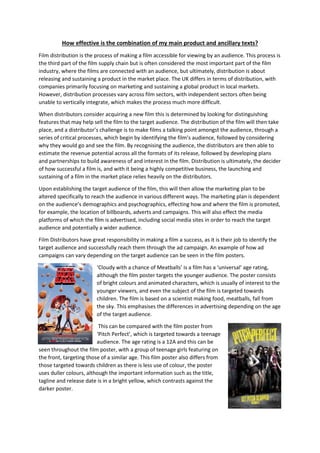
- 1. How effective is the combination of my main product and ancillary texts? Film distribution is the process of making a film accessible for viewing by an audience. This process is the third part of the film supply chain but is often considered the most important part of the film industry, where the films are connected with an audience, but ultimately, distribution is about releasing and sustaining a product in the market place. The UK differs in terms of distribution, with companies primarily focusing on marketing and sustaining a global product in local markets. However, distribution processes vary across film sectors, with independent sectors often being unable to vertically integrate, which makes the process much more difficult. When distributors consider acquiring a new film this is determined by looking for distinguishing features that may help sell the film to the target audience. The distribution of the film will then take place, and a distributor’s challenge is to make films a talking point amongst the audience, through a series of critical processes, which begin by identifying the film’s audience, followed by considering why they would go and see the film. By recognising the audience, the distributors are then able to estimate the revenue potential across all the formats of its release, followed by developing plans and partnerships to build awareness of and interest in the film. Distribution is ultimately, the decider of how successful a film is, and with it being a highly competitive business, the launching and sustaining of a film in the market place relies heavily on the distributors. Upon establishing the target audience of the film, this will then allow the marketing plan to be altered specifically to reach the audience in various different ways. The marketing plan is dependent on the audience’s demographics and psychographics, effecting how and where the film is promoted, for example, the location of billboards, adverts and campaigns. This will also effect the media platforms of which the film is advertised, including social media sites in order to reach the target audience and potentially a wider audience. Film Distributors have great responsibility in making a film a success, as it is their job to identify the target audience and successfully reach them through the ad campaign. An example of how ad campaigns can vary depending on the target audience can be seen in the film posters. ‘Cloudy with a chance of Meatballs’ is a film has a ‘universal’ age rating, although the film poster targets the younger audience. The poster consists of bright colours and animated characters, which is usually of interest to the younger viewers, and even the subject of the film is targeted towards children. The film is based on a scientist making food, meatballs, fall from the sky. This emphasises the differences in advertising depending on the age of the target audience. This can be compared with the film poster from ‘Pitch Perfect’, which is targeted towards a teenage audience. The age rating is a 12A and this can be seen throughout the film poster, with a group of teenage girls featuring on the front, targeting those of a similar age. This film poster also differs from those targeted towards children as there is less use of colour, the poster uses duller colours, although the important information such as the title, tagline and release date is in a bright yellow, which contrasts against the darker poster.
- 2. Trainspotting can be used as an example of an 18 rated film poster. Trainspotting involves heavy drug use, therefore is not suitable for younger viewers. The film poster is targeted towards the older audience and can be seen through the use of black and white and the characters used on the front, who are older than those picture on the previous posters. Therefore, these examples emphasise the differences in film posters dependent on the age rating. U rated films tend to have brighter, more colourful posters with animated characters, whereas the teenage audience is targeted through the use of darker colours and younger characters. Whereas 18 rated films capture and address a certain amount of realism in the films, which is then portrayed in the film poster, targeting the older audience. It is crucial that the distributors correctly identify the target audience so that the ad campaign can be directed towards them in order to make the film a success. The impact of a successful ad campaign can be seen in the film Deadpool, which effectively reached the target audience as well as a wider audience. When researching existing film posters, I was intrigued by the use of lighting throughout them, which prompted me to use low-key lighting in my own film poster in order to create suspense and mystery. For example, the Insidious 3 film poster uses (presumably) the main character with low-key lighting and high-key lighting to create shadows on her face and the background. This influenced my film poster largely as my image uses the main character’s face exposed to high-key lighting but is photographed in a dark environment which allows for shadows to form around her face, symbolising the horror genre and evoking fear and mystery. Similarly, the Mirrors film poster also has an interesting use of light, where the face is exposed through a black background, emphasising the character’s facial expression and features. This is much like what I was trying to achieve in my film poster with the use of light, as it would emphasise the fear within the character’s face and look much more effective when symbolising the horror genre. I also used the credits within the Mirrors film poster as a template for creating my own as I found the placement more suitable when combined with the position of the title. When researching age certificates and existing media products of different ages, it was clear to see the differences between a 12 certificated film and a 15 certificated film. This prompted my group and I to make the decision of making our film a 15 as it involves moderate violence but not excessively gory scenes, which 12 rated films are often not allowed to include.
- 3. For my magazine cover I decided to use the total film magazine as a template, using the same title and layout. However, I slightly changed the title and other details in order to make mine vaguely different. The magazine covers I used for inspiration both feature the main characters from the films along with a bold title across the middle of the page/towards the bottom and a strict colour scheme. I used this to get an idea of the placings of the text against the image, and also what colours to use for this text. Throughout my products, red has been a dominant colour used throughout my products, which meant my magazine cover would use this as the main colour. Furthermore, it was also evident from my research that total film magazines use textured backgrounds in order to make the cover more effective, which is what lead me to create a red/black background with a slight texture. Therefore, the magazines I used as inspiration have allowed me to create a professional magazine cover. I have created continuity throughout my magazine cover and film poster with the use of colour and also the recognisable title used. When deciding on the font of my film title, my group and I chose a bold, cracked font which resembles the broken family within the storyline. This title is used throughout all three of my products, including the magazine cover, film poster and trailer, allowing all three of them to work together in order to promote and advertise my film. Additionally, the use of colour used throughout the title also contributes to the continuity, I have used red throughout the title of my film and the background of my magazine cover, making the two products similar and recognisable. Throughout my trailer, the main characters can be established very easily, which is made easier for the audience by including them on my film poster and magazine cover. By using the two main characters in my advertising campaign this allows the audience to get an idea of the characters and also the storyline, which encourages and influences them to watch the trailer. In addition to this, we have also ensured that the title of our film and the theme of our storyline is continued throughout all three products. Within my film poster and magazine cover I have used the same font for ‘Perfect’,
- 4. which gives a smashed effect, and to transfer this into my trailer we created a smashing effect on the ‘Perfect’ in the title, whilst also keeping the same colour theme. This was done in order to keep the continuity throughout my products and to portray a unified marketing strategy which is more effective in reaching the target audience.