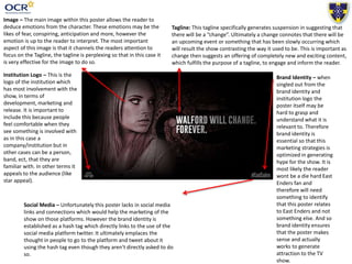
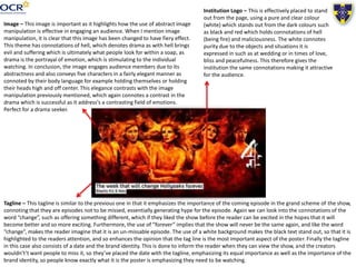
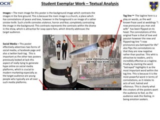
This document analyzes several soap opera posters and identifies conventions used in their design. It notes that the EastEnders poster uses a single main image to avoid looking congested. The Hollyoaks poster effectively uses abstract image manipulation to convey contrasting emotions. Compacting important information like the show name and air time with the tagline allows viewers to easily find key details. Advertising social media accounts on the poster helps promote the show online in addition to drawing attention with the physical poster. Repeating successful conventions from the examples could help create an effective new soap opera poster.