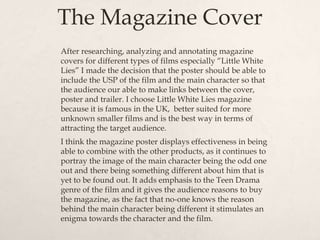
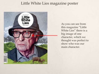
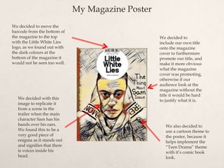
Introduction to ArtificiaI Intelligence in Higher Education
Question 2 - Media coursework
1. Question 2 - How effective is
the combination of your
main product and ancillary
texts?
2. Main product and Ancillary
Texts
The combination of our main product and ancillary texts has proven to
be very effective and all have been carefully put together to promote our
film, using a teaser trailer, magazine front cover and a poster. We
concentrated on basing our Brand Identity around “The Perks of Being a
Wallflower” and by using an affective font, background colour and main
characters. The genre for our Trailer is “Teen Drama”, so we used all the
conventions of a Teen Drama and the Unique Selling Points of our film
and implemented them into our three different products. We did this so
that the film would be able to attract and keep the audience engaged
and interested in the film.
3. Branding
A brand is the identity of a specific product, service, or business.
A brand can take many forms, including
a name, sign, symbol, colour combination or slogan. A legally
protected brand name is called a trademark. The word brand
has continued to evolve to encompass identity - it affects the
personality of a product, company or service.
4. Why is Branding
Important?
Branding is a way of clearly highlighting what makes your product or service different to,
and more attractive than, your competitors'. There are four key elements in a successful
branding project:
The big idea - The big idea is the starting point for any branding project. It is a summary of
your business' or product's 'personality', and what makes it different. To find your big
idea, you must first look very carefully at your business and the marketplace you operate
in.
Vision - An understanding of where your business is going, or where you want it to go, so
you can plan your journey. Your vision may be large scale - such as switching the
emphasis of your business from one core area to another - or simple, such as offering an
existing product in a completely new way.
Values – Clarifies what your business stands for. Your values are an important part of how
people see your business - however, it can be tricky to communicate values.
Personality - When you start communicating your brand to consumers, you will also be
expressing the personality of your company through the tone, language and design you
use.
5. The Perks of Being a Wallflower Poster Analysis
There are the names of the
actors at the top of the
Poster n a very visible font.
This is done to get the
attention of the target
audience as they would
have a high interest in the
film.
This is the slogan for the
film. It’s very short and
catchy. The slogan is
designed to target the
minds of the audience
causing them to think
deeper into the meaning of
it.
The title of the film
is very powerful for
different reasons. It
is written in a
handwriting font to
help portray the
Teen Drama theme
of students.
Tagline and Credits
The back ground of the poster
is very basic. This is done so
that the attention doesn't’t get
diverted from the main image
of the three characters.
This is an image of the three main characters
in the film. This straight away shows the
audience who are the main characters.
6. My Film Poster Analysis
For our Poster we decided,
much like the POBAW
poster, to include the actors
names at the top, so you can
clearly understand how
many, and who are the main
characters.
We also decided to keep
the theme shown on the
real media product, of
having the three main
characters shown on the
front cover.
With our background
we decided to try and
replicate the typical
teen diary, with the
scribbles and different
objects that had been
drawn.
We also, like the real
media product, added
the credits with a
tagline to further
induce the audience to
watch the trailer.
We also added the
production company ident,
like that on the real media
product.
7. Film Poster Analysis
It is associated with the film trailer and magazine cover.
This is mainly shown through the main character (me)
being on the front of both posters, on the film poster it is the
three main characters which catches the eye of the audience
and provides synergy by being the same character (me) that
appears on both posters and in the trailer. The film poster
features an image with other main characters in it as well as
me to create more of an appeal for the audience.
8. The Magazine Cover
After researching, analyzing and annotating magazine
covers for different types of films especially “Little White
Lies” I made the decision that the poster should be able to
include the USP of the film and the main character so that
the audience our able to make links between the cover,
poster and trailer. I choose Little White Lies magazine
because it is famous in the UK, better suited for more
unknown smaller films and is the best way in terms of
attracting the target audience.
I think the magazine poster displays effectiveness in being
able to combine with the other products, as it continues to
portray the image of the main character being the odd one
out and there being something different about him that is
yet to be found out. It adds emphasis to the Teen Drama
genre of the film and it gives the audience reasons to buy
the magazine, as the fact that no-one knows the reason
behind the main character being different it stimulates an
enigma towards the character and the film.
9. Little White Lies magazine poster
As you can see from
this magazine “Little
White Lies” there is a
big image of one
character, which we
thought was perfect to
show who was our
main character.
10. My Magazine Poster
We decided to
include our own title
onto the magazine
cover to furthermore
promote our title, and
make it more obvious
what the magazine
cover was promoting,
otherwise if our
audience look at the
magazine without the
title it would be hard
to justify what it is.
We decided to move the
barcode from the bottom of
the magazine to the top
with the Little White Lies
logo, as we found out with
the dark colours at the
bottom of the magazine it
would not be seen too well.
We decided with this
image to replicate it
from a scene in the
trailer when the main
character Sam has his
hands over his ears.
We found this to be a
very good piece of
enigma as it stands out
and signifies that there
is voices inside his
head.
We also decided to
use a cartoon theme to
the poster, because it
helps implement the
“Teen Drama” theme
with it’s comic book
look.
11. Our Products
In our products, we used the font called “Ninoshandwriting” which we found
from “dafont.com”. We were able to use the font across all of our posters and
trailer. After researching what type of fonts are in Teen Drama’s we decided
that this font was the closet to what we wanted. They look handwritten which
is what we wanted to achieve.
12. The Genre – Teen Drama
After researching teaser trailers, (The Perks of Being a Wallflower) I learnt that
the trailer is the basis for which the themes, characters, images, colours and
symbols of the film and its synergy campaign are first taken, as it shows parts
of the film. Overall I think that our trailer adds effect to the overall package, as
it includes the same characters, colours and themes as the magazine cover and
film poster. For example, there is a shot of the main character with his hands
over his ears, and this is also shown on the Magazine Poster. The repetition of
this image meaning the audience would know they are part of the same film
by looking at the three media texts. The font that is used in the titles of the
trailer is the same font used in the film poster, which also creates a link for the
audience across the media texts.