Initial Plans
Sean Cawood
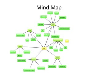
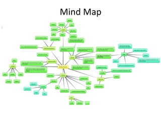
Mind Map
Mind MapMind Map
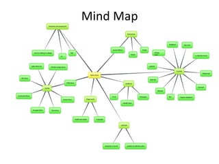
Mind Map
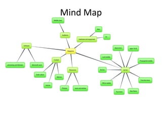
Mind MapMind Map
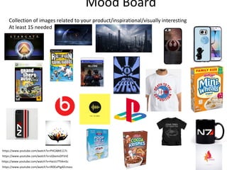
Mood Board
Collection of images related to your product/inspirational/visually interesting
At least 15 needed
https://www.youtube.com/watch?v=IRDEaPtg4Zcmass
https://www.youtube.com/watch?v=HaUU7TtAm5c
https://www.youtube.com/watch?v=sGbxmsDFVnE
https://www.youtube.com/watch?v=PHCA8tK117c
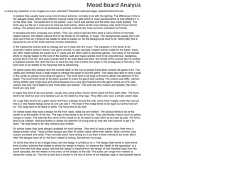
Mood Board Analysis
Is there any repetition in the images you have collected? Repeated colours/images styles/fonts/tone/mood
•
In posters they usually have some kind of colour scheme, normally to do with the lighting. The difference in this is
the stargate poster which uses different colours inside the gate which is more representative of how different it is
on the other side. The styles tend to be stylistic, one I found was painted and the other was made digitally. The
fonts vary but the sci fi ones tend to have big bold writing, where as the more fantasy ones tend to have thinner
writing. The posters tend to be landscape or portrait, however the most common orientation is Portrait
•
In backgrounds they unusually very artistic. They use colours well and they keep a colour theme of normally
related colours, the related colours tend to be similar by the lighting. In mugs. The backgrounds usually don’t use
fonts but if they do it tends to be related to what its based on. All the backgrounds tend to be 1920x1080, this is
because its one of the most common monitor resolutions.
•
In the trailers the scenes tend to change and act in beat with the music. The exception in this tends to be
cinematic trailers where it doesn’t use game scenes, it uses specially created scenes made for the trailer, these
are often made outside the studio by a 3rd
party and are often used to advertise games. The colour of the scenes
tends to change based on the tone of the scenes, safe and happy scenes tend to be coloured blue, dangerous
scenes tend to be red, and scary scenes tend to be quite black and dark. the moods of the scenes tend to portray
a hopeless scenes that need the hero to save the day, that is either the player or the protagonist of the story. The
fonts tend to be related to the franchise that its advertising.
•
On game cases they always have the console label on the top so people know what console the game is for. The
cases also normally have a large image to intrigue the player to buy the game. The cases also tend to have a logo
in the center so people know what the game is. The fonts tend to be large and bold to attract the attention of the
player. The tone/mood tends to be action packed to make the game look exciting. The colours use differ, rayman
raving rabbits uses bright blue and yellow because it’s a very light hearted and silly game where as GTA uses
colours that look more faded to look more older and stylistic. The fonts are very custom and stylistic, the ones I
found are very bold.
•
In logos they tend to be very simple, usually only using a few colours which stand out from each other. The fonts
tend to be bold but also very stylized such as the beats by drey logo. They often also have a simple vector style.
•
On mugs they tend to be a plain colour and have a design across the side, some have images under the cup but
this is a very flawed design since no one can see it. The style of the image tends to be logos but some have art
on. The mugs tend to be black or white. The fonts tend to be bold.
•
On cereal boxes they have a design for the front, back, sides top and bottom. The product tends to be at the
center or at the bottom of the box. The logo or text tends to be at the top. They use friendly colours such as yellow,
orange or brown. The side has the name of the cereal on so its easier to spot when its but side by side. The fonts
tend to be childish, bold and bubbly to attract the attention of young kids so they ask their parents to get it for
them. The style tends to be very cartoony and childish.
•
On phone cases they have designs available for most phones. They tend to have a solid colour then have a
design printed ontop. These printed designs are often of rubber cases rather than leather. Most common case
colours are black and white. They normally doent have writing on it but them it does it tends to be small. More
often the designs have art on the front instead of writing. Sometimes it’s a logo.
•
On shirts they tend to be a single colour and the design is printed on to it. The design itself tends to have some
kind of colour scheme that relates to where the design is inspire, for instance the “death to the opposition” is a
quote from star trek deep space nine and the design is inspired from the design of their baseball caps from the
same episodes, the red relates to the colour of the stripes on the ball. The styles can range from realistic to
cartoonish vector art. The font is bold and is similar to the font of some of the baseball caps in real baseball teams
21/03/18
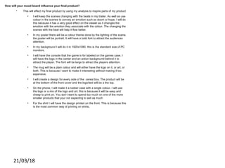
How will your mood board influence your final product?
• This will effect my final product by using my analysis to inspire parts of my product
• I will keep the scenes changing with the beats in my trailer. As well as use
colour in the scenes to convey an emotion such as doom or hope. I will do
this because it has a very good effect on the viewer as it changes the
emotion with the emotion they associate with the colour. The changing the
scenes with the beat will help it flow better.
• In my poster there will be a colour theme done by the lighting of the scene.
the poster will be portrait. It will have a bold font to attract the audiences
attention.
• In my background I will do it in 1920x1080. this is the standard size of PC
monitors.
• I will have the console that the game is for labeled on the games case. I
will have the logo in the center and an action background behind it to
attract the player. The font will be large to attract the players attention.
• The mug will be a plain colour and will either have the logo on it, or art, or
both. This is because I want to make it interesting without making it too
expensive.
• I will create a design for every side of the cereal box. The product will be
at the bottom of the front cover and the logo/text will be a the top.
• On the phone, I will make it a rubber case with a single colour. I will use
the logo or a mix of the logo and art. this is because it will be easy and
cheep to print on. You don’t want to spend too much on one of the more
smaller products that your not expecting to sell as much
• For the shirt I will have the design printed on the front. This is because this
is the most common way of printing on shirts,
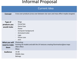
Informal Proposal
Current Idea
Concept Cross over products (cross over between star wars and mass effect maybe stargate)
Type of
products you
would make
• Mugs
• Cereal box
• Game Case
• Poster
• Computer background
• Animated trailer
• Logo
• Phone case
• shirt
What you will
need to make
them
Photoshop
Existing 3D models and edit the UV textures creating Illumination/glow maps
After effect
Maya
Audience 14-30
Middle class
Belongs
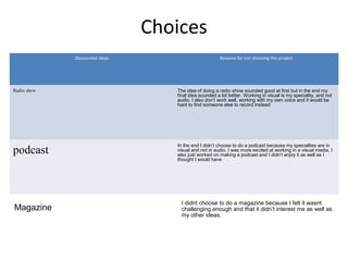
Choices
Discounted ideas Reasons for not choosing this project
Radio show The idea of doing a radio show sounded good at first but in the end my
final idea sounded a lot better. Working in visual is my speciality, and not
audio. I also don’t work well, working with my own voice and it would be
hard to find someone else to record instead
podcast
In the end I didn’t choose to do a podcast because my specialties are in
visual and not in audio. I was more excited at working in a visual media. I
also just worked on making a podcast and I didn’t enjoy it as well as I
thought I would have
Magazine
I didnt choose to do a magazine because I felt it wasnt
challenging enough and that it didn’t interest me as well as
my other ideas.

1. fmp initial plans (finished)

  • 1.
  • 2.
  • 3.
  • 4.
  • 5.
  • 6.
    Mood Board Collection ofimages related to your product/inspirational/visually interesting At least 15 needed https://www.youtube.com/watch?v=IRDEaPtg4Zcmass https://www.youtube.com/watch?v=HaUU7TtAm5c https://www.youtube.com/watch?v=sGbxmsDFVnE https://www.youtube.com/watch?v=PHCA8tK117c
  • 7.
    Mood Board Analysis Isthere any repetition in the images you have collected? Repeated colours/images styles/fonts/tone/mood • In posters they usually have some kind of colour scheme, normally to do with the lighting. The difference in this is the stargate poster which uses different colours inside the gate which is more representative of how different it is on the other side. The styles tend to be stylistic, one I found was painted and the other was made digitally. The fonts vary but the sci fi ones tend to have big bold writing, where as the more fantasy ones tend to have thinner writing. The posters tend to be landscape or portrait, however the most common orientation is Portrait • In backgrounds they unusually very artistic. They use colours well and they keep a colour theme of normally related colours, the related colours tend to be similar by the lighting. In mugs. The backgrounds usually don’t use fonts but if they do it tends to be related to what its based on. All the backgrounds tend to be 1920x1080, this is because its one of the most common monitor resolutions. • In the trailers the scenes tend to change and act in beat with the music. The exception in this tends to be cinematic trailers where it doesn’t use game scenes, it uses specially created scenes made for the trailer, these are often made outside the studio by a 3rd party and are often used to advertise games. The colour of the scenes tends to change based on the tone of the scenes, safe and happy scenes tend to be coloured blue, dangerous scenes tend to be red, and scary scenes tend to be quite black and dark. the moods of the scenes tend to portray a hopeless scenes that need the hero to save the day, that is either the player or the protagonist of the story. The fonts tend to be related to the franchise that its advertising. • On game cases they always have the console label on the top so people know what console the game is for. The cases also normally have a large image to intrigue the player to buy the game. The cases also tend to have a logo in the center so people know what the game is. The fonts tend to be large and bold to attract the attention of the player. The tone/mood tends to be action packed to make the game look exciting. The colours use differ, rayman raving rabbits uses bright blue and yellow because it’s a very light hearted and silly game where as GTA uses colours that look more faded to look more older and stylistic. The fonts are very custom and stylistic, the ones I found are very bold. • In logos they tend to be very simple, usually only using a few colours which stand out from each other. The fonts tend to be bold but also very stylized such as the beats by drey logo. They often also have a simple vector style. • On mugs they tend to be a plain colour and have a design across the side, some have images under the cup but this is a very flawed design since no one can see it. The style of the image tends to be logos but some have art on. The mugs tend to be black or white. The fonts tend to be bold. • On cereal boxes they have a design for the front, back, sides top and bottom. The product tends to be at the center or at the bottom of the box. The logo or text tends to be at the top. They use friendly colours such as yellow, orange or brown. The side has the name of the cereal on so its easier to spot when its but side by side. The fonts tend to be childish, bold and bubbly to attract the attention of young kids so they ask their parents to get it for them. The style tends to be very cartoony and childish. • On phone cases they have designs available for most phones. They tend to have a solid colour then have a design printed ontop. These printed designs are often of rubber cases rather than leather. Most common case colours are black and white. They normally doent have writing on it but them it does it tends to be small. More often the designs have art on the front instead of writing. Sometimes it’s a logo. • On shirts they tend to be a single colour and the design is printed on to it. The design itself tends to have some kind of colour scheme that relates to where the design is inspire, for instance the “death to the opposition” is a quote from star trek deep space nine and the design is inspired from the design of their baseball caps from the same episodes, the red relates to the colour of the stripes on the ball. The styles can range from realistic to cartoonish vector art. The font is bold and is similar to the font of some of the baseball caps in real baseball teams
  • 8.
    21/03/18 How will yourmood board influence your final product? • This will effect my final product by using my analysis to inspire parts of my product • I will keep the scenes changing with the beats in my trailer. As well as use colour in the scenes to convey an emotion such as doom or hope. I will do this because it has a very good effect on the viewer as it changes the emotion with the emotion they associate with the colour. The changing the scenes with the beat will help it flow better. • In my poster there will be a colour theme done by the lighting of the scene. the poster will be portrait. It will have a bold font to attract the audiences attention. • In my background I will do it in 1920x1080. this is the standard size of PC monitors. • I will have the console that the game is for labeled on the games case. I will have the logo in the center and an action background behind it to attract the player. The font will be large to attract the players attention. • The mug will be a plain colour and will either have the logo on it, or art, or both. This is because I want to make it interesting without making it too expensive. • I will create a design for every side of the cereal box. The product will be at the bottom of the front cover and the logo/text will be a the top. • On the phone, I will make it a rubber case with a single colour. I will use the logo or a mix of the logo and art. this is because it will be easy and cheep to print on. You don’t want to spend too much on one of the more smaller products that your not expecting to sell as much • For the shirt I will have the design printed on the front. This is because this is the most common way of printing on shirts,
  • 9.
    Informal Proposal Current Idea ConceptCross over products (cross over between star wars and mass effect maybe stargate) Type of products you would make • Mugs • Cereal box • Game Case • Poster • Computer background • Animated trailer • Logo • Phone case • shirt What you will need to make them Photoshop Existing 3D models and edit the UV textures creating Illumination/glow maps After effect Maya Audience 14-30 Middle class Belongs
  • 10.
    Choices Discounted ideas Reasonsfor not choosing this project Radio show The idea of doing a radio show sounded good at first but in the end my final idea sounded a lot better. Working in visual is my speciality, and not audio. I also don’t work well, working with my own voice and it would be hard to find someone else to record instead podcast In the end I didn’t choose to do a podcast because my specialties are in visual and not in audio. I was more excited at working in a visual media. I also just worked on making a podcast and I didn’t enjoy it as well as I thought I would have Magazine I didnt choose to do a magazine because I felt it wasnt challenging enough and that it didn’t interest me as well as my other ideas.

Editor's Notes

  • #3 Bubbl.us or hand drawn-scanned using college printers exploring your final idea
  • #4 Bubbl.us or hand drawn-scanned using college printers exploring your final idea
  • #5 Bubbl.us or hand drawn-scanned using college printers exploring your final idea
  • #6 Bubbl.us or hand drawn-scanned using college printers exploring 3 potential ideas
  • #7 Collection of images related to your product/inspirational/visually interesting At least 15 needed
  • #10 For your idea, write a brief, informal proposal. Ensure you proof read and check spelling etc For the audience section consider age/gender/psychographic/geodemographic/social grade etc
  • #11 Discuss the other two ideas from your initial mind map and reasons for why you didn’t choose them