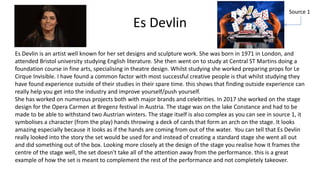
PJ Liguori is a British/Italian YouTube and film producer known for works like Tiny Planet Explorer (2012) and Oscars Hotel for Fantastical Creatures (2014-2015). He enjoys experimenting with different film roles and believes in trying new things. Es Devlin is renowned for imaginative set designs that complement performances. Her 2017 opera stage in Austria was complex and symbolized the story. Neil Gaiman is a prolific writer known for works like Coraline and Neverwhere. He encourages creatives to write for pride over money and see mistakes as a sign of progress.
The document summarizes an artist's body of work from early explorations of erotic and fetish themes to more recent interactive installations. It describes several key works including LadyGarden, a series of collages exploring sexuality and taboos; Stash, a collection of intimate polaroids presented as a "private collection"; and Layers, which displays anonymous graffiti quotes gathered from public toilets overlaid with found images. Current and future projects aim to further engage viewers through projections and movable installations.
John Lee Beatty is an acclaimed Broadway scenic designer known for his innovative and realistic designs. His early interest in design faced resistance from his father, who wanted him to pursue a more traditional career. After studying English and theatre in college, Beatty went on to study scenic design under Ming Cho Lee at Yale. His early Broadway designs like Veronica's Room and Knock Knock showed his unique style of creating realistic environments that enhanced performances. However, his breakthrough design for Talley's Folly in 1980 established his reputation, winning him his first Tony Award. Throughout his career, Beatty focused on letting the story take priority over spectacle in his designs.
The document discusses creative writing, motion picture production, and media communication. It describes creative writing as freedom to write about anything from any perspective. Motion picture production is described as where ideas come to life through a team working together under a director. Media communication is how we receive information today through various devices and platforms, and how our lives rely on media. The document then discusses how these three areas are interconnected and rely on each other to bring ideas, stories, and information to audiences.
The document is an evaluation by Taynie Gage of their graphic narrative children's book based on Alice in Wonderland. Taynie feels their final product closely reflects their original plans and intentions. They carefully storyboarded and planned each page, making minor adjustments during production for layout and design improvements. Taynie constructed characters and imagery using techniques learned in class, such as adding textures. They believe the text fits well with the planned images on each page to advance the story, though a few pages could be improved. Overall, Taynie feels the book is suitable for its intended 6-9 year old audience and that they effectively employed learned techniques in its creation.
The document discusses the locations chosen to film interviews for a documentary. It begins by explaining that the director Jeff's cluttered office, filled with his influences, represents his creative and nonlinear thinking. It then explains that the workshop of Checkland Kindleysides will be used for montage footage to show the collaboration of multiple skills. David Gauntlet will be interviewed at Westminster University to represent his academic and impersonal approach to media theory. Paul Bennett will be interviewed at a comic book café to match his similar creative interests. Paul's workshop will also be used for footage as it shows his personal influences. A busker will be filmed in Trafalgar Square to show how their work must appeal to tourists over maintaining a personal touch.
The document discusses the locations chosen to film interviews for a documentary. It begins by explaining that Checkland Kindleysides head office was selected to film Jeff due to the clutter representing his creative and nonlinear thinking. It then explains that the workshop will be used for montage footage to show the collaboration of multiple skills. David Gauntlet will be interviewed at Westminster University to represent his academic background in media theory. Paul Bennett will be interviewed at a comic book café to match his similar creative interests. Paul's workshop will also be used for montage footage as it shows his personal influences. Finally, a busker will be filmed in Trafalgar Square to represent having to appeal to tourists over a personal artistic vision.
Lydia created three horror movie posters for her final major project. She took photos of a classmate and edited them in Photoshop to look scary, applying effects like red eyes and pale skin. She chose a red, black, and white color scheme to convey blood, darkness, and contrast. Lydia researched successful horror movies and analyzed an existing poster to inform her taglines and design. She received feedback from classmates that her posters looked professional but the font could be improved. Overall, Lydia enjoyed the process of researching, designing, and receiving feedback on her three horror posters.
This portfolio document summarizes Jeffrey Lagden's graphic design work. It includes logos and identities he created for fictional companies as well as real clients. Some of the projects featured are logos for a delivery service, subway artwork, a photography business, and a film. The document also outlines his skills and work experience in graphic design, photography, and media production.
The document provides an evaluation of the technical quality and production of movie posters created as the final product for an assignment. It discusses the layout, images, colors, and text used in the posters. It describes the skills learned and improved during the process, such as using effects like rain and color changes in Photoshop. While some intentions like specific photo shots were not achieved due to limitations, the final posters generally matched the original goals of portraying characters and scenes from a story about being trapped in virtual reality. Time management and problem-solving were needed when plans changed and locations could not be secured. Feedback indicated the posters appealed most to younger male audiences interested in fantasy genres.
The student visited the National Portrait Gallery to get inspiration for a portrait painting assignment. They observed and drew sketches of four paintings they admired in the BP Portrait Award exhibition. They focused their study on Toby Mulligan's portrait of his daughter titled "About Time". They tried to replicate Mulligan's limited color palette and compositional style in their own practice portrait. For their self-portraits, they experimented with poses and preliminary studies before attempting to capture their facial features and use shading techniques like Mulligan to add dimension. While challenging, the student was pleased with applying what they learned from studying Mulligan's work.
The student visited the National Portrait Gallery to get inspiration for a portrait painting assignment. They observed and drew sketches of four paintings they admired in the BP Portrait Award exhibition. They focused their study on Toby Mulligan's portrait of his daughter titled "About Time". They tried to replicate Mulligan's limited color palette and compositional style in their own practice portraits. While they found the self-portrait project challenging, drawing from life and copying Mulligan's techniques improved their skills and confidence in portrait painting.
The document summarizes a student's summer assignment where they visited the National Portrait Gallery for inspiration. They did observational drawings of portraits and were inspired by Toby Mulligan's painting of his daughter. The student tried to replicate Mulligan's limited color palette and compositional style in their own portrait paintings. They found the self-portrait project challenging but felt it improved their drawing and painting skills, especially in capturing dimension within a portrait.
- The document discusses creative decisions made for a thriller trailer adapting a fairy tale. It was decided to hide the identity of the witch to add mystery and suspense. The genre was changed to thriller to heighten these elements.
- A red dress was chosen instead of a cape to modernize and make the character more relatable. The landscape and lighting will be used to further the mystery.
- A sinister fairytale soundtrack was selected to intrigue the target audience who enjoy thrill and excitement. Representations of women as weaker and unable to defend themselves were kept to challenge audience perspectives. An all-white cast was chosen to relate to common stereotypes.
Here are the key strengths and weaknesses of the research methods you used:
- Product research:
- Strengths: Allowed you to directly analyze existing products and gather concrete details. Provided inspiration for visual style, genres, etc.
- Weaknesses: Limited to just a few existing products. Analysis of some elements like mise-en-scene may have been overanalyzed or irrelevant.
- Questionnaires:
- Strengths: Provided quantitative data on audience preferences directly from your target demographic. Large sample size allowed trends to emerge.
- Weaknesses: Responses could be inconsistent or contradictory between questions. Open to interpretation in analysis.
- Interviews:
- Strengths: Allowed
The document summarizes a role-playing performance called "House of Aesthetics" put on by students in an art class. It lists the philosophers portrayed by each student actor, such as Plato, Aristotle, Kant and Foucault. It also provides brief biographies of each philosopher and quotes related to their aesthetic views. The performance involved creating visual representations of the philosophers to embody and discuss their ideas about art and aesthetics at a fictional dinner party setting. Photos from the production and acknowledgments from the instructor praise the students' efforts in bringing complex aesthetic theories to life through embodied performance and visualization.
Scott Keneally Sample Treatment - ChapstickScott Keneally
The filmmaker is excited about the project creating videos for Chapstick DUO lip balm. They propose filming each influencer for half a day doing everyday activities while using the product. They also suggest filming a group discussion where the influencers can interact and discuss DUO naturally. Various creative elements are proposed like challenges tailored to each influencer and testimonials filmed against colored backgrounds matching DUO's flavors. The overall goal is to showcase the influencers' personalities and lives while demonstrating how well DUO fits into their routines in an authentic way.
Unit 4 group presentation late to the party with ant and beeChelseaPentecost
The summary is as follows:
1. Ant and Bee are late to a party in the forest and take a shortcut by flying down from their windowsill, but get blown into a drain by rain and end up lost in the sewers.
2. In the sewers, they meet Glug who agrees to help them get out. However, Ant's reckless decision causes Bee to get separated from them in the rushing sewer water.
3. Distraught, Ant and Glug emerge from the sewers alone into a dark, lifeless forest. But Bee turns up having survived, and their reunion brings the forest back to life just in time for the party.
The document contains evaluations from a student of various digital graphic narrative exercises they completed, including shaping an image, rotoscoping, creating a text-based image, making a comic book page, and taking photographs. For each exercise, the student provides what they liked about their image and what they would improve if doing the exercise again, focusing on things like color schemes, subject matter, and artistic effects.
Here is a revised script that addresses some areas for improvement:
Once upon a time, there was a little old baker. She decided to make a gingerbread man for her shop. She rolled out the dough and cut it into the shape of a man. For eyes, she used raisins and for teeth she used peppermints. She iced hair on his head and then placed him in the oven.
When the gingerbread man was done baking, he jumped out of the oven. "Stop!" said the little old baker. "I want to sell you in my shop." But the gingerbread man said "No, I want to see the world!" And he ran away as fast as he could.
This document summarizes the background and skills of an artist named Raechel Gasparac. She was born in Canada but moved to Texas at age 11 where she began pursuing fine arts. She studied graphic design and was on the dean's list for several semesters. In college, she was the president of the creative arts club and won awards for her poster designs. She has over 11 years of experience in areas like graphic design, film editing, photography, and live theater. She creates multimedia projects that challenge her and has led creative teams and startups.
Stefan Sagmeister is an Austrian graphic designer born in 1962 known for album covers for bands like the Rolling Stones. He has an unconventional design process that he describes as "building a dice" where the concept that results is unexpected. Paula Scher is an American graphic designer born in 1948 known for her work with brands like Coca-Cola and Microsoft. She finds inspiration in boredom and sees identities as the foundation of design. Steven Heller is an American design historian and educator born in 1950. He believes experimentation and being multidisciplinary are important to avoid becoming repetitive in one's work.
Stefan Sagmeister is an Austrian graphic designer born in 1962. He began his career at age 15 designing for a left-wing magazine. Notable clients include the Rolling Stones. His process for logo design involves reducing brand attributes to a minimum and conceptualizing the design process as "building a dice" to generate random concepts.
Paula Scher is an American graphic designer born in 1948 known for her work with major corporations like Microsoft and Coca-Cola. She believes identities are how things are recognized and that creativity thrives during periods of boredom.
Steven Heller is an American design historian and critic born in 1950. He has edited magazines and written columns promoting experimentation in design. He
The document contains summaries of several of the submitter's design projects from 2011-2013. The first project was a magazine layout focusing on musician Ellie Goulding, where the designer explored cover, spread, and jump page designs and found they enjoyed representing the artist's sound visually. The second was an event poster for suicide prevention where both horizontal and vertical designs were made to encourage positivity on tablets and phones. The third was a "No Shave November" contest poster highlighting social media participation. Other projects included logo, illustration, painting, sculpture, and pastel works exploring themes of self, form, and message communication through minimalism.
The document summarizes the author's research and planning process for an animated story project. They conducted context research on animators, illustrators, and storytellers to inform their project. They also researched existing children's programs to understand different approaches. While secondary research was their preferred method, the author recognizes they could have benefited from primary research as well. Their final concept involved animating and twisting an old nursery rhyme, though drawing all the characters proved challenging. Overall, the author learned from the experience and feels prepared to apply those lessons to future projects and university studies.
This document contains a mid-unit review and feedback on various learning outcomes for a photography student. It summarizes three photo shoots the student completed - one using a flash gun to capture a disturbing feel at night, another using studio lights and slow shutter speed to show model movement, and a third researching photographer Alec Game's project on identity and belonging. It also provides initial ideas for another project on adolescence, including influences from photographers Nadav Kander and Alec Soth. Finally, it reflects on independent time management and a plan to submit work for the D&AD New Blood Awards.
The document contains evaluations from students of different digital graphic narrative assignments they completed, including shaping an image, rotoscoping, creating text-based images, comic books, photography, and illustrations. For each assignment, the students note what they liked about their image and what they would improve if they did the assignment again. They provide feedback on strengths and areas for improvement for each other's proposals and idea generation processes.
This document contains Nick Aldous' evaluations of various digital graphic narrative development tasks he completed. For each task, Nick provides feedback on what he liked about his image and how he could improve. He completed tasks involving shape, rotocope, text-based, comic book, and photography images. The document also includes Nick's proposal for creating a children's book, which outlines his story, production methods, audience, and deadline. Feedback provided on the proposal and idea generation suggests strengths while also offering areas for improvement.
The document outlines a story about a boy named Little Blue Hat who goes to visit his sick grandmother in the woods, but encounters a wolf along the way. The wolf tricks Little Blue Hat into leaving to pick flowers, while the wolf goes to the grandmother's house, eats her, and disguises himself as the grandmother to try and eat Little Blue Hat too. The story is presented over 9 pages in a script format and includes feedback from the creator on ways to improve the story and images.
The document provides feedback on a student's digital graphic narrative development project. It summarizes the student's proposal, which included an outline of an 11-page story adaptation of Little Red Riding Hood set on the moon. It also discusses the student's idea generation, including a mind map for the story. The feedback notes strengths like clear audience targeting and unique story ideas, while suggesting areas for improvement such as simplifying the complex story and allowing more time for page production to ensure high quality. Overall, the feedback aims to help the student strengthen their project proposal and planning.
The document contains evaluations from a student of different digital graphic narrative assignments they completed, including shaping an image, rotoscoping, creating text-based images, comic books, photography, and illustrations. For each assignment, the student provides what they liked about their image and what they would improve if doing the assignment again.
This document provides context for Olivia Waller's final major project (FMP) in fine art photography. Originally, she planned to do landscape photography but became interested in fine art after researching other portfolios. She has decided to create a fine art photography portfolio to showcase her edited photos. She feels confident in this choice because she has successfully completed similar projects like a fanzine in the past. The document also discusses several artists - Jeremy Blincoe, Oleg Dou, Vee Speers, Lucia Emanuela Curzi, and Silke Bachman - that inspire Olivia's style and techniques. It analyzes books on portrait photography and using Photoshop to manipulate images. Finally, it considers the theories
This document provides instructions for an art assignment requiring students to create a psychological self-portrait inspired by an artist from the textbook. Students are asked to take a selfie using their phone's camera settings to manipulate colors, cropping, etc. in a way that conveys their mental and emotional state. They must then analyze their self-portrait in an essay discussing how elements like composition, color, and objects relate to the inspiring historical artist and achieve the intended psychological effect. Prompts and examples of other students' works are provided to illustrate the assignment goals.
- The document contains evaluations from a student on various digital graphic narrative assignments they completed, including shaping images, adding rotoscoping, creating film quotes, manipulating text, comic book elements, photo stories, illustrations, and narrative environments.
- For each assignment, the student describes what they liked about their work and how they would improve it. Common feedback includes adding more details, colors, and background elements to make the images more interesting and visually engaging.
- The document also includes idea generation and inspiration from children's stories, a script draft, and a proposal that provides an overview of the planned story, dimensions, export format, production timeline, and intended audience. The proposal describes the production methods but could provide more story
The document discusses different options for presenting a film and media production (FMP) work project online, including YouTube, Adobe Sparks, social media platforms, and online forums. It determines that Adobe Sparks would be the best way to clearly show the work and process through photos with explanations, and that spreading the link on social media and forums could help reach a larger audience than just a standalone website.
The document discusses different options for presenting course work, including creating a website, video, or using Adobe Spark. The author thinks a website showing photos of their prop making process along with explanations would be the best way to showcase their work, as people could view it at their own pace. A video is deemed less suitable as the work relies on pictures. Adobe Spark is also considered but may be difficult to make look presentable.
The document summarizes the student's final major project (FMP) process for creating props for a stop motion video based on The Legend of Zelda: Breath of the Wild game. Some key points:
- The student chose to make props due to COVID restrictions and their interest in prop making. They struggled with motivation during lockdown which caused delays.
- Contextual research focused on inspirational prop makers but lacked audience analysis. Production research was also added later.
- Audience research for stop motion films was difficult at first but improved when focused on the Zelda audience.
- Sculpting the props went well but painting was a challenge, though issues were addressed.
-
The document provides details on the props the creator plans to make for a stop motion animation project based on The Legend of Zelda: Breath of the Wild. Some of the key props that will be made include statues, offering trays, apples, and a Korok character. Clay and paint will be used as the main materials. Reference images from the game are included in a mood board for design guidance. Sketches of the statue and Korok props show construction techniques and important design details. A production schedule is also provided, prioritizing the statue, Korok, tray, and apple props in that order over the course of a week.
This document analyzes set designs from the films Coraline and Lord of the Rings to understand techniques used to immerse audiences. For Coraline, the set of Mr. Bobinsky's house reflects his eccentric circus-obsessed character through props like a cannon and Ferris wheel. Dark colors and cracks suggest a neglected home. For Lord of the Rings, round shapes and warm colors in the Hobbiton set create a cozy, homely feeling. Both sets use color, props, lighting, and clutter effectively to establish different atmospheres that immerse audiences in the stories.
The document summarizes the process of making three sculptures - a statue, a korok, and a tray with an apple. For the statue, foil and clay were used to shape the base and details were added to the face. For the korok, clay was used to shape the rounded body and details were painted. The tray was made with clay, painted beige and grey for depth, and sealed. The sculptures were created using materials like foil, clay, acrylic paint, and glazing medium to achieve the desired textures and details.
The document summarizes the student's process for their final major project (FMP) creating props for a stop motion video based on The Legend of Zelda: Breath of the Wild game. They decided on this project due to COVID restrictions requiring a home-based project. They conducted research on prop makers, existing products, and their target audience. Production took a week and included sculpting and painting clay props. While happy with the overall quality, the student notes areas for improvement like paint mixing and adding more details. Comparing their props to the original game designs and other products showed successes in accuracy but also opportunities to enhance realism and movement.
The document provides planning details for a stop motion animation project based on The Legend of Zelda: Breath of the Wild. The creator will make props to tell the story of Link collecting Korok seeds. Props will include statues, offering trays, apples, and a Korok. Clay and paint will be used to make and detail the props. A studio will be used to photograph the completed miniature set against a plain background in order to showcase the details. Planning includes purchasing materials, creating a schedule with deadlines, and taking references from the game.
This document provides research on production techniques for a Legend of Zelda-inspired set design project. It discusses the advantages of using 3D printing for mini models and props, including fast design and production, cost effectiveness, and ability to add fine details. Lighting techniques are also explored, such as using softboxes on both sides of the set for even illumination and adding colored gels for aesthetic effects. The bibliography cites sources on Zelda games, reviews, books, and technical information about 3D printing and lighting.
Through creating a faux cake prop, the author gained experience problem solving that will help with their final mini set design project. Issues addressed included proper storage of works in progress, backing up digital files, protecting work surfaces from mess, managing costs, and taking breaks to avoid injury. Trying different materials helped identify effective options. Getting feedback improved outcomes. Looking online provided tutorials for using new materials. This experiment supported developing checklists, gathering references, and finding solutions to potential production problems.
This document contains a proposal for a film and photography project focused on set design. The student proposes to design a set based on analyzing the mood, environment, and tone of a scene from an existing book. Over 17 weeks, the student will research set designs, experiment with designing props and miniature furniture, develop a concept and mood board, and create the set. Progress will be tracked through a weekly diary and evaluations will incorporate feedback from peers. The final weeks will include a presentation and show of the completed set design project.
The student proposes to create a set design for a story or scene to better understand the process of designing and constructing a set. Some influences for the project include the filmmaker Kick the PJ and author Neil Gaiman. Research will also be done into the Netflix show A Series of Unfortunate Events for inspiration. The goal is for the audience to intuitively understand the tone and mood of the set design through use of colors and materials similar to how Foley sounds subconsciously set the atmosphere in film. The style will be fantasy adventure to inspire the student and experiment with a new genre they have not worked in before.
Aasiyah conducted research on her target audience which is young adults and teenagers interested in nature and cottagecore aesthetics. She interviewed 10 people and found that they prefer magazine covers with good color schemes and interactive elements like fold-out pages. Most respondents preferred physical copies over digital. Her secondary research on nature zine Instagram accounts found they have visually pleasing posts and engaged audiences. She also researched common fungi in the UK, noting their names, habitats, seasons, and features to include information in her zine.
1) The author created a handmade fanzine focused on herbs and nature to learn a new skill during COVID lockdown. Researching modern and historical fanzines helped inspire the idea to make it fully by hand.
2) Planning went well in developing ideas but lacked detail on page designs. Experimenting with page styles would have helped avoid mistakes. Production challenges included a page that strayed from the intended style and inability to fix errors by hand.
3) Time management was difficult due to mental health impacts of COVID, but taking the first steps helped progress. The fanzine appealed to its target audience of teens interested in nature through interactive elements but could have been improved with more photos.
The document provides details on the process of creating a factual fanzine. It describes steps taken to bind pages of the fanzine using embroidery thread. It also outlines the creation of various elements of the fanzine including a contents wheel with cutouts, illustrations on pages about drying herbs and herbal tea, recipes presented with watercolors, and a front cover design inspired by stamps. Updates are provided on designs and layouts, with notes on desired aesthetics and any changes or improvements needed.
This document provides the schedule and descriptions for films being shown at the Aesthetica Short Film Festival 2020. It includes 9 short films spanning genres like drama, thriller, dance, documentary and music video. Film topics explore mental health, gang violence, gender identity, prosthetics and more. The document also summarizes 2 masterclasses on stop motion cinematography and visual effects. Finally, it describes the University of the Arts London student showcase and a documentary program on modern Britain.
The document outlines plans for a fanzine with a cottage core aesthetic focusing on nature, gardening, herbalism, crafts, and tutorials. It includes analyses of mood boards exploring themes, page layouts, front cover designs, and content sections. The production schedule allocates 4 weeks to write articles, take photos, edit content, and finalize the fanzine.
This document analyzes several fanzines and discusses their contexts, styles, techniques, and contents. It compares two fanzines called "Now What" and "Changes" that were created during the COVID-19 pandemic to provide information and inspiration. It also analyzes fanzines focused on specific interests like anime ("Fly High" and "Film Garden"). The document finds that while fanzine styles have modernized, their purpose remains for communities to connect over shared passions and give voice to topics not represented by mainstream media, reflecting the issues relevant to their times of release.
This applicant is currently studying an Extended Diploma in Creative Media Production and Technology. They enjoy using creative software like Photoshop and Premiere Pro. Their favorite project so far was making a music video, which has sparked an interest in studying video production further. They want to specialize in a creative field at university to pursue a career they are passionate about. Outside of college, they work part-time and volunteer, helping to build independence and life skills. Their top choices for university study are filmmaking, prop making, and visual effects due to the versatile career opportunities in these fields.
This document outlines a 5-year plan for pursuing a career in media. The individual is currently studying creative media to gain practical skills and build a portfolio. They plan to continue their studies and achieve high grades. Potential university courses mentioned are prop making at Royal Central School of Speech & Drama, filmmaking at Leeds Art University, and film at Middlesex University. Work experience with prop makers or on film sets is suggested. Personal skills like motivation and confidence need improvement. The 5-year goal is to complete university and gain experience in the media industry.
This tutorial offers a step-by-step guide on how to effectively use Pinterest. It covers the basics such as account creation and navigation, as well as advanced techniques including creating eye-catching pins and optimizing your profile. The tutorial also explores collaboration and networking on the platform. With visual illustrations and clear instructions, this tutorial will equip you with the skills to navigate Pinterest confidently and achieve your goals.
❼❷⓿❺❻❷❽❷❼❽ Dpboss Kalyan Satta Matka Guessing Matka Result Main Bazar chart Final Matka Satta Matta Matka 143 Kalyan Chart Satta fix Jodi Kalyan Final ank Matka Boss Satta 143 Matka 420 Golden Matka Final Satta Kalyan Penal Chart Dpboss 143 Guessing Kalyan Night Chart
Fashionista Chic Couture Maze & Coloring Adventures is a coloring and activity book filled with many maze games and coloring activities designed to delight and engage young fashion enthusiasts. Each page offers a unique blend of fashion-themed mazes and stylish illustrations to color, inspiring creativity and problem-solving skills in children.
The cherry: beauty, softness, its heart-shaped plastic has inspired artists since Antiquity. Cherries and strawberries were considered the fruits of paradise and thus represented the souls of men.
2. PJ Liguori
PJ Liguori is a British/ Italian YouTube and film producer born December 1990. He started making short
videos with his friends whilst studying at the university of the creative art. He said in a video that one of
the best ways to learn and get experience whilst at university is to do mini projects along with what you
are already doing.
some of his most notable works include; Tiny Planet Explorer(2012), The Forever Train (2012), Oscars
Hotel for Fantastical Creatures(2014-2015) and Hair and Brimstone (2016). Tiny Planet Explorer was a
short film PJ made that got a lot of notice, it won a virgin media award. Oscars Hotel for Fantastical
Creatures was a mini web series starring some internet personalities as well as actor Patrick Stewart. This
series had a lot of monstrous type characters/creature, to make them come to life they partnered with Jim
Henson's creature shop. They needed many props from puppets to costumes and prosthetics.
PJ himself likes to work in many areas of film, going from set designing to story telling and costume design.
He said in a video titled “HOW TO MAKE THE SADDEST GHOST” he said that the reason he likes trying out
new things is because he read once that “you might be really good at something but will never know
because you haven't tried it”. PJ’s outlook on life is to be creative and experiment in trying out new
things.
3. Oscars Hotel for Fantastical Creatures
Oscars Hotel was a mini series directed by PJ Liguori in partnership with New Form Digital. Its about a hotel
(as the name suggests) for mysterious and fantastical creatures. It follows Oliver as he suddenly has to take
over the hotel while his uncle(Oscar) is away on business.
One of the most memorable things about the series are the designs of the creatures. They used a mix of
puppets and costumes to bring the creatures to life.
PJ likes to create set designs that creates an atmosphere
related to the story being told. He achieves this by focusing on
certain factors such as lighting , colours and materials. This is
helpful to my project since when creating my set design I will
need to consider these things as well to get the outcome that
I want.
Something I really look up to about PJ is his outlook on life and the way he takes on new creative projects and
ideas. the fact that he tries things even if he may not be the best, he is willing to work on it, learn and improve.
his way of thinking - living is something I feel is really important for creative's as if your not willing to try then you
can’t improve.
4. How does PJ Liguori work help me to create my final
product?
In PJ sets something I have noticed is how he uses small details that
relate to the story or character. This can be see in Hair and Brimstones.
The main character (Hades) is shown drinking coffee multiple times, his
love for coffee is also represented through the background of some
shots in the film where a pile of used mugs and tea cups can be seen
on a table. The fact that there are used mugs laying around also reflects
Hades personality and suggests that he isn't bothered about keeping
his place tidy. This reflects on his character and helps the audience by
giving them more information about the character.
I can use this technique in my own work by finding ways to give the
viewer information though analysing characteristics. If a character is
someone who likes order and control they are more likely to be living in
a tidy space with simplistic colours.
This also can be used to show the characters social status, purpose or
goals, by considering this you can make sets that fit them. Considering
these details will make a set make more sense along side the story.
5. Neil Gaiman
Neil Gaiman is well known for his writing whether it be in books, comics or screen play. Some of his work
include; Coraline (2002), Neverwhere (book in 2008), and the Grave yard Books(2008) as well as writing 2
Doctor Who episodes in 2011 and 2013. His works are mostly sci-fi fantasy and adventure. He likes to cross
genres and write books both for kids and adults.
Neil as a child loved spending time in the library reading the works of C.S Lewis and Edgar Allen Poe (as well a
many others). On is website he states that he wouldn't be who he is without libraries.
In 2012 he made a graduation speech at the university of the arts. In this speech he not only gives advice
about the creative world but also shares his experiences. One experience he shared was when he decided
not to write for the money but to instead write things that he was proud of, this was so that if he did the
work and didn't get paid at least he was doing the work for himself, however if he wasn't proud of his work
he would not feel he had to take it further. This tells his audience that intention is very key when it comes to
what you are creating, do it for the right reasons. He goes on to say that the things he did just for the money
never came out well and that it something that he need to remind himself of from time to time.
6. here are some quotes I took from his speech that I found gave me a better idea of who he is as well as useful for me
and my work. They can help to show a new perspective and suggest how I can improve on my work.
“I suggest she pretend that she was someone who could do it”
Sometimes when we want to do something we can compare ourselves to other people or not have trust in our
instincts and ideas. But in reality everyone is in the same boat, we are all just doing the best we can do. By
pretending we are someone who knows what to do we have more faith in our selves, its sort of like seeing yourself
from a different perspective. This advise will help me through my FMP project
Especially through production when things can get stressful. By using this
advise I will be able to have more trust in myself and my work.
“if you make mistakes it means your out there doing something”
Here Neil Gaiman explains that although you will make mistakes, that only
means you are doing something and moving forward. When we make
mistakes we can be hard on ourselves, however when you look at it from this
perspective ( your out there doing something and making progress/trying) it
give us a positive outlook and thus makes us more motivated to keep going.
7. how does Neil Gaiman influence my work/projects
Neil Gaiman writes many fascinating scenes and environments in his
novels. These scense inspire me because of the thought and detail
that's gone into them. They intrigue me because not only are they
creative (environments that don't exist) but they also reflect things in
the story. for instance in Neverwhere there is a scene where the
main characters are travelling up a long bridge. Below and around
the bridge is nothing but darkness and reflects the main character
sense of uncertainty and lack of knowledge in this new world they
has been thrown into. The imagery of a long bridge can also be seen
as a reference to the afterlife or starting a new journey.
I really enjoy these types of scenes and plan on making my set design
like his by creating a distinctive mood with my set. To do this I need
to think about what I want to express to my audience ( for instance
thrill, adventure or mystery). Depending on this factor I can create
my design accordingly and use specific props to give the audience
information.
8. Es Devlin
Es Devlin is an artist well known for her set designs and sculpture work. She was born in 1971 in London, and
attended Bristol university studying English literature. She then went on to study at Central ST Martins doing a
foundation course in fine arts, specialising in theatre design. Whilst studying she worked preparing props for Le
Cirque Invisible. I have found a common factor with most successful creative people is that whilst studying they
have found experience outside of their studies in their spare time. this shows that finding outside experience can
really help you get into the industry and improve yourself/push yourself.
She has worked on numerous projects both with major brands and celebrities. In 2017 she worked on the stage
design for the Opera Carmen at Bregenz festival in Austria. The stage was on the lake Constance and had to be
made to be able to withstand two Austrian winters. The stage itself is also complex as you can see in source 1, it
symbolises a character (from the play) hands throwing a deck of cards that form an arch on the stage. It looks
amazing especially because it looks as if the hands are coming from out of the water. You can tell that Es Devlin
really looked into the story the set would be used for and instead of creating a standard stage she went all out
and did something out of the box. Looking more closely at the design of the stage you realise how it frames the
centre of the stage well, the set doesn't take all of the attention away from the performance. this is a great
example of how the set is meant to complement the rest of the performance and not completely takeover.
Source 1
9. How does Es Devlin’s work help me to create my
final product?
Es Devlin is really good at making her sets unique and specific to the purpose/artist/story. Because of
this her stage designs are never the same and there's always something new and exciting about them.
She is able to do this by taking time to fully understand the project she is working on. She can then see
the purpose of the project clearly and from there can create a stage that matches it as well as one that
will suit the audience. The result of this is uniting the audience as they all crowd together and
experience the end result, they all get the message or interpret it in their own way. This inspires me to
really think about what I want to create and express to my audience and to explore new ways to
convey a message/story.
I can do this by spending more time on planning and really
looking into what sort of set I want to make and what I want my
audience to experience from it. I can research into relating
topics and draw inspiration from them (if its crime I can look at
popular existing cases and reference them in my scene by
including specific details or props relating to that case)
10. Bibliography
• (2013). Neil Gaiman: Why our future depends on libraries, reading and daydreaming. Available:
https://www.theguardian.com/books/2013/oct/15/neil-gaiman-future-libraries-reading-daydreaming . Last
accessed February 2021.
• (2017). 10 Influential Set Designers You Should Know. Available: https://somethingcurated.com/2017/10/03/10-
influential-set-designers-you-should-know/ . Last accessed 2021.
• “Oscar's Hotel for Fantastical Creatures” watched on amazon prime
• Es Devlin. (-). Biography. Available: https://esdevlin.com/information . Last accessed February 2021.
• https://en.wikipedia.org/wiki/Neil_Gaiman -wiki on neil gaimen
• https://en.wikipedia.org/wiki/PJ_Liguori - wiki page on PJ Liguori.
• https://www.youtube.com/watch?v=CeOadxT7kPA -Mind-blowing stage sculptures that fuse music and
technology | Es Devlin
• https://www.youtube.com/watch?v=ikAb-NYkseI -Neil Gaiman - Inspirational Commencement Speech at the
University of the Arts 2012
• https://youtu.be/mUvKPrjYGTE- Making of the Food Creatures | Oscar's Hotel x Jim Henson's Creature Shop
(Oct 2, 2015)
• Neil Gaiman. (-). Biography. Available: https://www.neilgaiman.com/About_Neil/Biography . Last accessed
February 2021.
Editor's Notes
Details that refelct the charecters personality (care-free = mess room)