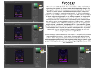
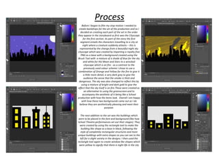
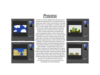
Production Reflection
Connor Wiffen
Poster
Process
Before I could create the poster I needed to capture each of the potential figures I would be using by placing them in front of a red
screen which was situated on a desk setting the camera up on a tripod which allowed me to take stable and well focused shots of
the figures. For the first part of the production I began by creating the poster for the production. To do this I started the project by
placing each of the characters in front of the red screen to make it easier to remove the background in Adobe Photoshop and
place the characters onto the poster. With the pictures of the characters in front of a red screen in Photoshop I selected the red
sections with the Magic Wand tool and then deleted the background so the characters were the only object within the frame
which then allowed me to crop it down to a point where only their heads were visible so it would fit better with the poster
aesthetic I was going for. I did this for all three of the Lego figures I would be using in the poster which included the main
character, secondary character and the concept’s main villain. With the characters being disembodied heads without a
background, it was a lot easier to move them onto the new background I had chosen for the Poster.
I didn’t run into any glaring issues during this process, however the end result of the separations could be a lot smoother and less
jaggy but this isn’t particularly visible when they are on the Poster’s background. There is also a little bit of colour bleed where the
red is mixed with the edge of the minifigures which again isn’t very noticeable when on the new background. Further editing in
Photoshop would solve these problems.
Process
With the characters cropped and ready to use in the creation of the
poster, I then needed to find a background which would emulate the
colour scheme I had selected before. I primarily went for a black and
purple theme as I felt like it complimented the production well as it
allowed me to obscure the main antagonist of the piece within the
design itself which reflects the very nature of the character due to it
being extremely good at camouflaging itself. For the design I used a
picture I took of the character facing towards the camera and
cropped the image to the point where it was just the chest upwards.
To implement it into the poster, I rotated the image 180 degrees and
placed it at the top of the poster where I changed it to luminosity so
it would blend a lot better into the background but not enough to
completely hide it from view.
I think the aesthetic I was going for works well as I didn’t want to
give away the antagonist straight away but still hint at it with
making it slightly harder to see but not enough to completely
obscure it from the audience’s eyes. The Purple and Black colour
scheme creates an appealing foundation of which the entire poster
will be built upon. However I have been told that the antagonist can
be practically invisible so it may be improved by having some sort of
outline to make it more distinctive from the background.
Process
As with the first character, I only needed a small section of them for
the poster which is why I erased everything except their heads
initially. As I was taking inspiration from the Scream poster with how
the characters are around the outside of the vocal point which for this
poster is the antagonist, the Xenomorph was put on the highest layer
so they would be on layers underneath it which would then allow me
to create the design you can see on the left where the protagonists
are behind the main antagonist but are a lot more visible and less
blended in, however I turned the transparency of the images to 52%
because the slightly jaggy edges are less visible and makes it a little
more unique. The next addition to the poster was the title at the
bottom which was created using a font from DaFont called ‘Night
Machine’. I played around with the size for a little while before I
settled on 102.79pt being just about right as it left a minimal amount
of free space which it is vital for a poster not to have. For the colour
scheme I again went for the purple but this time a brighter one which
stood out from the already established colour scheme on the poster
and attracts the viewers eyes to the title as it contrasts well with the
darker purple used before and stands out because of it.
I am happy with how the design has come out so far as it is very
similar to my original concept for the poster. Although the
constraints of using figures with strange proportions are rather clear
when you look at the necks but this was unavoidable due to the
nature of the figures used.
Process
There isn’t much to talk about with these screenshots but adding onto the title, I
duplicated it and changed the colour to orange which added a level of depth and
vibrancy which makes the title stand out even more than it already did. The next
feature of a poster I decided to implement myself was that of a ‘coming soon’
message at the top which would eventually change to the definitive release date
once one was revealed. The colour of the ‘coming soon’ is white as it stands out from
the darker aspects of the poster and lets the audience know that the film is coming
out soon. The final addition to the poster was the actor’s names which are
commonly included upon it in a place that is immediately visible to the human eye
and audience, as you can see the placement of them changed around a lot before
coming to the final design with them at first being placed at the top of the poster
aligned with the “Coming Soon” which worked well for a little bit before I realised
that they looked better woven between the title so I moved them down which makes
it look a lot better than it originally did. I decided on having the colour be yellow as
it was a major contrast to the other colours used do it can stand out on its own
without taking away from the rest of the Poster.
Overall I am happy with how the text has come out as it is one of the most important
aspects of a poster, if it doesn’t attract people then the product will not have an
audience. White, Orange and Purple all compliment each other well with none of
them taking away from each other. As for the actor’s names who are attached to the
project I think the yellow font works very well at distinguishing it from the rest of the
text on the Poster.
Stop Motion Set
Before I began to film my stop motion I needed to
create backdrops for the set of the production and as I
decided on creating each part of the set in the order
they appear in the storyboard so first was the Cityscape
for the first section. As part of the story the first
segment entails the characters travelling to a city at
night where a creature suddenly attacks – this is
represented by the change from a beautiful night sky
cityscape which was created by importing a royalty free
PNG as a base with a background created using the
Brush Tool with a mixture of a shade of blue for the sky
and white for the Moon and Stars to a wrecked
cityscape which is on fire - as a contrast to the
previously used colour scheme I chose to use a
combination of Orange and Yellow for the fire to give it
a little more detail, a very dark grey to give the
audience the sense that the smoke is thick and
dangerous. The sky was also changed to reflect this by
using a mixture of bright and dark gold to give the
effect that the sky itself is on fire.These were created as
an alternative to using the greenscreen and to
accompany the aesthetic of it being like a School
production with how the items look. Overall I am happy
with how these two backgrounds came out as I do
believe they are aesthetically pleasing and meet their
purpose.
The next addition to the set was the buildings which
were to be placed in the fore and background (like how
School Theatre performances set out their stages). They
were created by using the rectangle tool to make the
building like shape as a base in black, following the
style of completely rectangular structures and more
unique buildings with extra shapes as you can see to the
left for a slight variety in the designs. I then used the
rectangle tool again to create window like shapes which
were yellow to signify that there is night life in the city
Process
Process
For the next scenes I followed the same process as I
did with the cityscape where I used the brush tool to
create each section. Here, as the setting is in the day
light the scene is a lot brighter in contrast to the city
one so I used a brighter colour scheme to reflect this.
For the sky I used the paint bucket tool to fill the
background in blue and the pen tool to draw the
clouds. A similar method was used making this
scene’s background where I used a mixture of two
shades of blue to create the sky. I then used the brush
tool again to draw an outline of some sandy rocks
which were then given some light additional details
with a dark orange acting as a way to give them more
definition. This colour scheme was carried over to
creating the smaller rocks which would be placed in
the foreground of the scene and hid behind by the
main characters. The final aspect of the scene I
needed to make was the Dragon eggs which I again
made by using the brush tool , first using a shade of
brown to form the bottom of the nest with the added
use of a lighter shade to give the whole thing more
detail so it wasn’t just a static colour, the eggs were
made the same way too but with white markings to
represent the sunlight bouncing off of them.
I do think that these have come out well and as
intended for the entire production.
Process
For the final scene I didn’t need much in terms of props for the set due
to it being set within a dark cave so all I did was use the paint bucket
to fill in the background completely with black and the paint brush tool
to draw extra details around the edge in grey so it wouldn’t just be a
black background. The dark black rocks were created in the same way
as the previous ones using the brush tool and drawing the random
shapes to make them seem like realistic rocks. This was the simplest
set to make as it only required me to use black and grey to create and
as the scene is mostly in the dark there wasn’t the need for much
detail in either the rocks or background. There wasn’t much I could get
wrong with this due to how simple the process was but if I had more
time I could have added to the quantity of the rocks to give the cave
setting more depth.
Process
Before I could start the production I needed to set up the equipment on a
table where the project would be filmed, some of which were provided to
me by the college but the Studio and Green Screen were bought by
myself. Although I did film a lot of it with the Camera but for some scenes
I chose to use my Phone as it could create more interesting angles and
shots. As for the props I mostly used the Lego and action figures along
with the ones I created earlier which were held up by screwing up some
paper and sticking it to the back with glue so they could stand up on its
own throughout the production. I was also going to be using small studio
lights but they began to get extremely warm and spark which just ended
up getting me frustrated with it all – adding to the setback I was already
having so I decided to compromise by filming in front of a window with
blinds so the light wasn’t too overbearing and would not saturate the
footage.
If I had more time I would have
made sure that my equipment was
ready with enough time around it so
the unforeseeable issue of the
equipment showing up late would
have been less of an impact on the
production because it wouldn’t have
pushed everything back in the
production schedule, another change
I should have made to this section of
the production was starting to
create the props way earlier instead
of days before as this would have
reduced my levels of stress which
was in a constant battle with my
work ethic as every set back was
reducing it further and further.
Process
After I had taken the shots needed to form
the Stop Motion Project, I needed to transfer
the footage onto he computer and into
Adobe Premiere Pro. I then went scene by
scene and placed them onto the timeline
before slowing each image down to 0.25
seconds which gave them more fluidity as
previously the images had ran for far too
long. The next addition to this segment of the
production was creating the effect of the
LEGO TARDIS coming in and out of existence
before landing which entailed overlapping
the images (One with and one without the
TARDIS) implementing a cross fade transition
between them to give the illusion of the
classic effect from the show.
If I had more time I would have gone back
and made the scenes where the TARDIS
appears and disappears and make them
practically identical so the jump between
frames would not be as apparent as it is now.
However, regardless of it not looking quite
right I think the effect has come out as close
to what I envisioned as was possible with
what I had.
Process
As I wanted to do the rest of my editing at home I
exported the video file from Adobe Premiere which had
the already established edits and scenes in order as an
MP4 file and placed it into the editing software I chose to
use which in this case was Sony Vegas Pro 14 as it is the
editor I have the most experience in due to the editing I do
in my free time. Once the footage was in Vegas Pro I
again decided to edit the speed as the scenes still went
past far too quickly for comfortable viewing. Whilst in the
VEGAS editing software I noticed that the ending section
of the sequence was over even quicker so had to reduce
the playback speed even more by around 25% as the
viewer would find it difficult to actually see what is going
on in the scenes presented. Unfortunately slowing the
footage by 25% affected the visual quality as it was
noticeable that the footage had been slowed down.
However I feel as if the issue of the footage being too fast
is rooted in the fact that it wasn’t very smooth to begin
with as I never took multiple photos of the same scene as I
admittedly wanted to get it done as soon as possible due
to how close I was becoming to be to the deadline, had I
had more time I would have been more willing to take a
larger amount of pictures and smooth out the movements
so it wouldn’t be as jumpy.
Process
I then moved onto adding in the sound effects which came
from variety of sources, for example the backing music was
from a royalty free channel on YouTube who created it
themselves. I also sampled the Xenomorph, Sonic
Screwdriver, Godzilla’s, Doors opening and the clashing
sound effects from various channels which I then converted
to an MP3 file with YoutubeMP3 so it would be useable and
compatible in Sony Vegas Pro 14. The rest were acquired
through different websites like one which had various
TARDIS sound effects that were perfect for use in my project
and any other sounds were mostly reused from past projects.
I placed the sounds beneath the footage in several layers but
realised that a lot of them would either cut off randomly or
be far too loud so I attempted to fix this issue by fading them
either in or out and reducing the dB of the sounds depending
on which issue it was.
There wasn’t much I needed to do with the sound effects as
they mostly fit very well with the footage due to the nature
of it, there wasn’t any dialogue so the sound effects were all
that was needed. Personally I feel as if the sound effects
work well with the visuals, bringing them to life. However,
again if I had more time I would have created a lot more of
the sound effects myself using a sound recorder provided by
Collage and definitely would have made my own soundtrack
as that could be easily done with the software I have at
home as well as the ones I have access to through College.
Process
Finalising the production, I went into Adobe
Photoshop to create the end/title card which
implemented the same font used in the
Poster for the title of the project. There
wasn’t much that needed to be done with
this simple addition as it was only enlarging
the text seen on the poster on a completely
black background which could be
transitioned into from the footage.
However I could have improved the ending
titles by implementing them into the actual
footage somehow, although I’m not entirely
sure how I would go about this with what I
have. I could have also added some credits at
the end but it would only act as extra flair
with there only being me who worked on the
project so the names would minimal.
Finishing the project, I rendered the footage
in 1080p for YouTube and uploaded it onto
my YouTube channel.
Double Page Spread
Additionally to the production I also
produced a two page spread to
accompany it as even though I did good
enough with what I had, my production
could definitely be improved. This double
page spread contains an interview done
with me about the production and other
questions related to it. I first decided on
the questions and typed them into a
Microsoft Word document before
copying it into Adobe Photoshop. I drew
out the outlines of the page with the
rectangular shape tool which mostly
serves as a way to add to the aesthetic of
the page along with the page numbers as
they are a staple of Magazines. For the
article’s title I chose to use purple as it
contrasts well with the purple in the
screencap of the short film project which
led on nicely to the Implementation of the
text with the question being in bold whilst
my answer is in italics so the reader can
easily distinguish each piece of text. This
design continues throughout the first
page until the second pages changes it by
having an image in portrait instead of
landscape. The text is split into two
columns which continues onto the second
page with three questions in a row to
accommodate the change with the design
returning to the original style for the final
question to end the article off.
Process
However, after some consideration I realised
that I could improve the design and make it a
lot more Magazine-esque so I went back into
Photoshop to make these changes. First of all I
went through and changed the size of the text
from twenty four to fourteen although this
meant I also needed to add my more text
which would conclude the article but this
wasn’t added till the end. I changed the
layout so the screencap takes up a large
amount of the top of the article, making it the
first thing the reader sees and thus tells them
immediately what the article is about,
especially with the large white text ‘Interview
Corner’ and the subtitle giving more
information on who the interview is with. I
changed the text on the first page to be in
three rows with an image in the bottom right
hand corner. The second page stays largely the
same with the picture still being in portrait,
however some of the text has been moved
around to better fit the layout of the page and
to reduce the white space . As mentioned
before I finished the article off with an
additional summary paragraph which also tells
the reader who will be interviewed next
month.
Process

Production reflection fmp

  • 1.
  • 2.
  • 3.
    Process Before I couldcreate the poster I needed to capture each of the potential figures I would be using by placing them in front of a red screen which was situated on a desk setting the camera up on a tripod which allowed me to take stable and well focused shots of the figures. For the first part of the production I began by creating the poster for the production. To do this I started the project by placing each of the characters in front of the red screen to make it easier to remove the background in Adobe Photoshop and place the characters onto the poster. With the pictures of the characters in front of a red screen in Photoshop I selected the red sections with the Magic Wand tool and then deleted the background so the characters were the only object within the frame which then allowed me to crop it down to a point where only their heads were visible so it would fit better with the poster aesthetic I was going for. I did this for all three of the Lego figures I would be using in the poster which included the main character, secondary character and the concept’s main villain. With the characters being disembodied heads without a background, it was a lot easier to move them onto the new background I had chosen for the Poster. I didn’t run into any glaring issues during this process, however the end result of the separations could be a lot smoother and less jaggy but this isn’t particularly visible when they are on the Poster’s background. There is also a little bit of colour bleed where the red is mixed with the edge of the minifigures which again isn’t very noticeable when on the new background. Further editing in Photoshop would solve these problems.
  • 4.
    Process With the characterscropped and ready to use in the creation of the poster, I then needed to find a background which would emulate the colour scheme I had selected before. I primarily went for a black and purple theme as I felt like it complimented the production well as it allowed me to obscure the main antagonist of the piece within the design itself which reflects the very nature of the character due to it being extremely good at camouflaging itself. For the design I used a picture I took of the character facing towards the camera and cropped the image to the point where it was just the chest upwards. To implement it into the poster, I rotated the image 180 degrees and placed it at the top of the poster where I changed it to luminosity so it would blend a lot better into the background but not enough to completely hide it from view. I think the aesthetic I was going for works well as I didn’t want to give away the antagonist straight away but still hint at it with making it slightly harder to see but not enough to completely obscure it from the audience’s eyes. The Purple and Black colour scheme creates an appealing foundation of which the entire poster will be built upon. However I have been told that the antagonist can be practically invisible so it may be improved by having some sort of outline to make it more distinctive from the background.
  • 5.
    Process As with thefirst character, I only needed a small section of them for the poster which is why I erased everything except their heads initially. As I was taking inspiration from the Scream poster with how the characters are around the outside of the vocal point which for this poster is the antagonist, the Xenomorph was put on the highest layer so they would be on layers underneath it which would then allow me to create the design you can see on the left where the protagonists are behind the main antagonist but are a lot more visible and less blended in, however I turned the transparency of the images to 52% because the slightly jaggy edges are less visible and makes it a little more unique. The next addition to the poster was the title at the bottom which was created using a font from DaFont called ‘Night Machine’. I played around with the size for a little while before I settled on 102.79pt being just about right as it left a minimal amount of free space which it is vital for a poster not to have. For the colour scheme I again went for the purple but this time a brighter one which stood out from the already established colour scheme on the poster and attracts the viewers eyes to the title as it contrasts well with the darker purple used before and stands out because of it. I am happy with how the design has come out so far as it is very similar to my original concept for the poster. Although the constraints of using figures with strange proportions are rather clear when you look at the necks but this was unavoidable due to the nature of the figures used.
  • 6.
    Process There isn’t muchto talk about with these screenshots but adding onto the title, I duplicated it and changed the colour to orange which added a level of depth and vibrancy which makes the title stand out even more than it already did. The next feature of a poster I decided to implement myself was that of a ‘coming soon’ message at the top which would eventually change to the definitive release date once one was revealed. The colour of the ‘coming soon’ is white as it stands out from the darker aspects of the poster and lets the audience know that the film is coming out soon. The final addition to the poster was the actor’s names which are commonly included upon it in a place that is immediately visible to the human eye and audience, as you can see the placement of them changed around a lot before coming to the final design with them at first being placed at the top of the poster aligned with the “Coming Soon” which worked well for a little bit before I realised that they looked better woven between the title so I moved them down which makes it look a lot better than it originally did. I decided on having the colour be yellow as it was a major contrast to the other colours used do it can stand out on its own without taking away from the rest of the Poster. Overall I am happy with how the text has come out as it is one of the most important aspects of a poster, if it doesn’t attract people then the product will not have an audience. White, Orange and Purple all compliment each other well with none of them taking away from each other. As for the actor’s names who are attached to the project I think the yellow font works very well at distinguishing it from the rest of the text on the Poster.
  • 7.
  • 8.
    Before I beganto film my stop motion I needed to create backdrops for the set of the production and as I decided on creating each part of the set in the order they appear in the storyboard so first was the Cityscape for the first section. As part of the story the first segment entails the characters travelling to a city at night where a creature suddenly attacks – this is represented by the change from a beautiful night sky cityscape which was created by importing a royalty free PNG as a base with a background created using the Brush Tool with a mixture of a shade of blue for the sky and white for the Moon and Stars to a wrecked cityscape which is on fire - as a contrast to the previously used colour scheme I chose to use a combination of Orange and Yellow for the fire to give it a little more detail, a very dark grey to give the audience the sense that the smoke is thick and dangerous. The sky was also changed to reflect this by using a mixture of bright and dark gold to give the effect that the sky itself is on fire.These were created as an alternative to using the greenscreen and to accompany the aesthetic of it being like a School production with how the items look. Overall I am happy with how these two backgrounds came out as I do believe they are aesthetically pleasing and meet their purpose. The next addition to the set was the buildings which were to be placed in the fore and background (like how School Theatre performances set out their stages). They were created by using the rectangle tool to make the building like shape as a base in black, following the style of completely rectangular structures and more unique buildings with extra shapes as you can see to the left for a slight variety in the designs. I then used the rectangle tool again to create window like shapes which were yellow to signify that there is night life in the city Process
  • 9.
    Process For the nextscenes I followed the same process as I did with the cityscape where I used the brush tool to create each section. Here, as the setting is in the day light the scene is a lot brighter in contrast to the city one so I used a brighter colour scheme to reflect this. For the sky I used the paint bucket tool to fill the background in blue and the pen tool to draw the clouds. A similar method was used making this scene’s background where I used a mixture of two shades of blue to create the sky. I then used the brush tool again to draw an outline of some sandy rocks which were then given some light additional details with a dark orange acting as a way to give them more definition. This colour scheme was carried over to creating the smaller rocks which would be placed in the foreground of the scene and hid behind by the main characters. The final aspect of the scene I needed to make was the Dragon eggs which I again made by using the brush tool , first using a shade of brown to form the bottom of the nest with the added use of a lighter shade to give the whole thing more detail so it wasn’t just a static colour, the eggs were made the same way too but with white markings to represent the sunlight bouncing off of them. I do think that these have come out well and as intended for the entire production.
  • 10.
    Process For the finalscene I didn’t need much in terms of props for the set due to it being set within a dark cave so all I did was use the paint bucket to fill in the background completely with black and the paint brush tool to draw extra details around the edge in grey so it wouldn’t just be a black background. The dark black rocks were created in the same way as the previous ones using the brush tool and drawing the random shapes to make them seem like realistic rocks. This was the simplest set to make as it only required me to use black and grey to create and as the scene is mostly in the dark there wasn’t the need for much detail in either the rocks or background. There wasn’t much I could get wrong with this due to how simple the process was but if I had more time I could have added to the quantity of the rocks to give the cave setting more depth.
  • 11.
    Process Before I couldstart the production I needed to set up the equipment on a table where the project would be filmed, some of which were provided to me by the college but the Studio and Green Screen were bought by myself. Although I did film a lot of it with the Camera but for some scenes I chose to use my Phone as it could create more interesting angles and shots. As for the props I mostly used the Lego and action figures along with the ones I created earlier which were held up by screwing up some paper and sticking it to the back with glue so they could stand up on its own throughout the production. I was also going to be using small studio lights but they began to get extremely warm and spark which just ended up getting me frustrated with it all – adding to the setback I was already having so I decided to compromise by filming in front of a window with blinds so the light wasn’t too overbearing and would not saturate the footage. If I had more time I would have made sure that my equipment was ready with enough time around it so the unforeseeable issue of the equipment showing up late would have been less of an impact on the production because it wouldn’t have pushed everything back in the production schedule, another change I should have made to this section of the production was starting to create the props way earlier instead of days before as this would have reduced my levels of stress which was in a constant battle with my work ethic as every set back was reducing it further and further.
  • 12.
    Process After I hadtaken the shots needed to form the Stop Motion Project, I needed to transfer the footage onto he computer and into Adobe Premiere Pro. I then went scene by scene and placed them onto the timeline before slowing each image down to 0.25 seconds which gave them more fluidity as previously the images had ran for far too long. The next addition to this segment of the production was creating the effect of the LEGO TARDIS coming in and out of existence before landing which entailed overlapping the images (One with and one without the TARDIS) implementing a cross fade transition between them to give the illusion of the classic effect from the show. If I had more time I would have gone back and made the scenes where the TARDIS appears and disappears and make them practically identical so the jump between frames would not be as apparent as it is now. However, regardless of it not looking quite right I think the effect has come out as close to what I envisioned as was possible with what I had.
  • 13.
    Process As I wantedto do the rest of my editing at home I exported the video file from Adobe Premiere which had the already established edits and scenes in order as an MP4 file and placed it into the editing software I chose to use which in this case was Sony Vegas Pro 14 as it is the editor I have the most experience in due to the editing I do in my free time. Once the footage was in Vegas Pro I again decided to edit the speed as the scenes still went past far too quickly for comfortable viewing. Whilst in the VEGAS editing software I noticed that the ending section of the sequence was over even quicker so had to reduce the playback speed even more by around 25% as the viewer would find it difficult to actually see what is going on in the scenes presented. Unfortunately slowing the footage by 25% affected the visual quality as it was noticeable that the footage had been slowed down. However I feel as if the issue of the footage being too fast is rooted in the fact that it wasn’t very smooth to begin with as I never took multiple photos of the same scene as I admittedly wanted to get it done as soon as possible due to how close I was becoming to be to the deadline, had I had more time I would have been more willing to take a larger amount of pictures and smooth out the movements so it wouldn’t be as jumpy.
  • 14.
    Process I then movedonto adding in the sound effects which came from variety of sources, for example the backing music was from a royalty free channel on YouTube who created it themselves. I also sampled the Xenomorph, Sonic Screwdriver, Godzilla’s, Doors opening and the clashing sound effects from various channels which I then converted to an MP3 file with YoutubeMP3 so it would be useable and compatible in Sony Vegas Pro 14. The rest were acquired through different websites like one which had various TARDIS sound effects that were perfect for use in my project and any other sounds were mostly reused from past projects. I placed the sounds beneath the footage in several layers but realised that a lot of them would either cut off randomly or be far too loud so I attempted to fix this issue by fading them either in or out and reducing the dB of the sounds depending on which issue it was. There wasn’t much I needed to do with the sound effects as they mostly fit very well with the footage due to the nature of it, there wasn’t any dialogue so the sound effects were all that was needed. Personally I feel as if the sound effects work well with the visuals, bringing them to life. However, again if I had more time I would have created a lot more of the sound effects myself using a sound recorder provided by Collage and definitely would have made my own soundtrack as that could be easily done with the software I have at home as well as the ones I have access to through College.
  • 15.
    Process Finalising the production,I went into Adobe Photoshop to create the end/title card which implemented the same font used in the Poster for the title of the project. There wasn’t much that needed to be done with this simple addition as it was only enlarging the text seen on the poster on a completely black background which could be transitioned into from the footage. However I could have improved the ending titles by implementing them into the actual footage somehow, although I’m not entirely sure how I would go about this with what I have. I could have also added some credits at the end but it would only act as extra flair with there only being me who worked on the project so the names would minimal. Finishing the project, I rendered the footage in 1080p for YouTube and uploaded it onto my YouTube channel.
  • 16.
  • 17.
    Additionally to theproduction I also produced a two page spread to accompany it as even though I did good enough with what I had, my production could definitely be improved. This double page spread contains an interview done with me about the production and other questions related to it. I first decided on the questions and typed them into a Microsoft Word document before copying it into Adobe Photoshop. I drew out the outlines of the page with the rectangular shape tool which mostly serves as a way to add to the aesthetic of the page along with the page numbers as they are a staple of Magazines. For the article’s title I chose to use purple as it contrasts well with the purple in the screencap of the short film project which led on nicely to the Implementation of the text with the question being in bold whilst my answer is in italics so the reader can easily distinguish each piece of text. This design continues throughout the first page until the second pages changes it by having an image in portrait instead of landscape. The text is split into two columns which continues onto the second page with three questions in a row to accommodate the change with the design returning to the original style for the final question to end the article off. Process
  • 18.
    However, after someconsideration I realised that I could improve the design and make it a lot more Magazine-esque so I went back into Photoshop to make these changes. First of all I went through and changed the size of the text from twenty four to fourteen although this meant I also needed to add my more text which would conclude the article but this wasn’t added till the end. I changed the layout so the screencap takes up a large amount of the top of the article, making it the first thing the reader sees and thus tells them immediately what the article is about, especially with the large white text ‘Interview Corner’ and the subtitle giving more information on who the interview is with. I changed the text on the first page to be in three rows with an image in the bottom right hand corner. The second page stays largely the same with the picture still being in portrait, however some of the text has been moved around to better fit the layout of the page and to reduce the white space . As mentioned before I finished the article off with an additional summary paragraph which also tells the reader who will be interviewed next month. Process

Editor's Notes

  • #4 Discuss the tools and processes used in your production. Log your thoughts and feelings about your work.
  • #5 Discuss the tools and processes used in your production. Log your thoughts and feelings about your work.
  • #6 Discuss the tools and processes used in your production. Log your thoughts and feelings about your work.
  • #7 Discuss the tools and processes used in your production. Log your thoughts and feelings about your work.
  • #9 Discuss the tools and processes used in your production. Log your thoughts and feelings about your work.
  • #10 Discuss the tools and processes used in your production. Log your thoughts and feelings about your work.
  • #11 Discuss the tools and processes used in your production. Log your thoughts and feelings about your work.
  • #13 Discuss the tools and processes used in your production. Log your thoughts and feelings about your work.
  • #14 Discuss the tools and processes used in your production. Log your thoughts and feelings about your work.
  • #15 Discuss the tools and processes used in your production. Log your thoughts and feelings about your work.
  • #16 Discuss the tools and processes used in your production. Log your thoughts and feelings about your work.