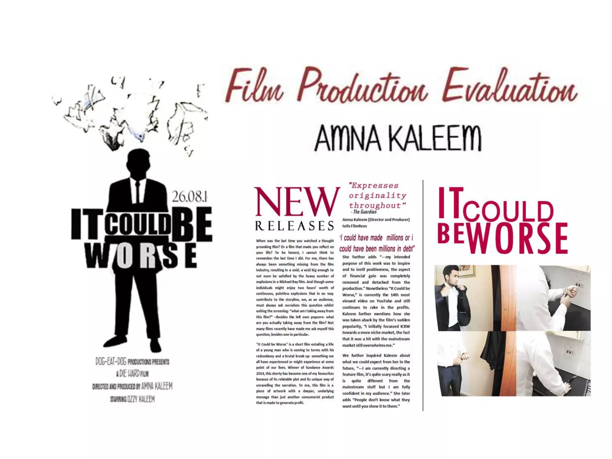
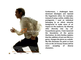
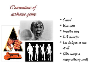
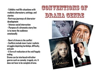
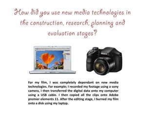
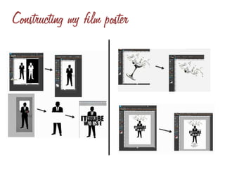
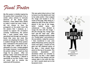
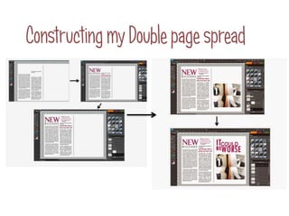
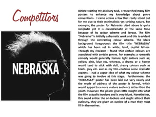
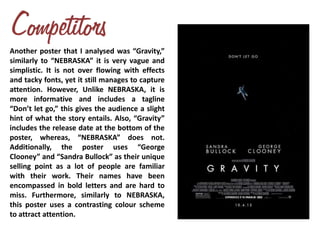
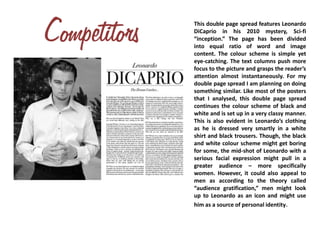
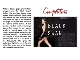
Independent Joka Escorts ✔ 8250192130 ✔ Full Night With Room Online Booking 2...
Film production 1
1.
2. While deciding on a new genre for my film, I came
to the conclusion that my short film will not entail
a specific genre. However, it will consist of some
aspects of an art-house and drama narrative. This
will allow me to showcase my ideas and concepts
in a distinctive and clear manner. The dictionary
definition of an art-house film describes it as a film
intended to be an artistic work, often experimental
and not designed for mass appeal. Furthermore,
the guidelines for this project, expects the film to
last approximately 5 minutes, therefore this is the
length that I am planning to adapt to, even though
most short films that I have analysed have been
over 5 minutes, usually lasting up to 10 minutes. I
am gearing my short film to be aimed towards
both, male and female target audiences. This will
be done through the easily relatable narrative plot.
The short film will have a straight forward
storyline, so from the very start the audience will
be able to follow the story.
3. One way in which my film challenges
conventions of real films is how Instead of
using diegetic dialogue, it uses a non-
diegetic voice over as it has more of the
desired effect. This could be seen as
unconventional as short films typically
use dialogue to convey a message. I have
used actions of the protagonist to deliver
the message in a more appropriate
manner.
Another way in which my film deviates from real
film conventions is how it combines very dissimilar
genres such as art-house and social drama.
Elements of the art-house e.g. non-linear narration,
forking paths and symbolism display the inner
psyche of the character, which relates to the drama
aspect of my film. Through this, my film has
changed the art-house genre as a whole as it can
now be merged with other genres to convey a
narrative.
4.
5.
6.
7. Initially, I opted my film to be associated with the art-house genre, however to aid the
development of the plot, some elements of social drama are also included. For
example; I have used multiple low angle close ups of the subject in a distressed state.
This displays the inner psyche of the character and helps the audience empathise
with him. These close-ups relate to the “drama” aspect of the film. Furthermore, the
film carries a serious tone through-out. This is quite unconventional as most art-
house films involve a light hearted tone to express one’s ideologies. This pushes my
film more towards the social drama category than art-house. However, my film is set
in a house which can be seen as a quite confined space. This showcases the subject’s
inward isolation through the setting. For example; many of my shots have a white
wall present in the background, this creates a claustrophobic atmosphere.
Furthermore, Symbolism is quite repetitive in my short film, which usually is an art-
house convention. For example; the protagonist’s phone is used as a vessel through
which his problems are revealed to the audience. Additionally, the phone can be seen
as a status symbol which the audience can relate to and therefore, empathise with
the subject’s situation.
8. Moreover, the background music creates a
melancholy mode of address to relate to
the gloomy narrative. Though, it speeds up
as the text comes to a climax through a
master shot of the protagonist in a
frustrated state with his head in his hands.
This relates to the audience as they might
have experienced a mutual feeling of
frustration at some point in their lives and
therefore, they can relate to the plot
through the empowering music. The
background music is a major asset in my
short film as no dialogue has been used.
Through my secondary research I found
this to be more of an art-house convention.
However, I have also subverted this
convention as I have used diegetic sound
effects that disrupted the flow of the
background music. For example; I keyed in
a slow-paced heartbeat effect to
accompany a close up of the subject’s
hands carrying a knife. This creates tension
and exaggerates the issue of suicide in the
modern society and the consequences of it.
9. For my film, I was completely dependant on new media
technologies. For example; I recorded my footage using a sony
camera, I then transferred the digital data onto my computer
using a USB cable. I then copied all the clips onto Adobe
premier elements 11. After the editing stage, I burned my film
onto a disk using my laptop.
10.
11. My film poster is initially inspired by
the posters that I researched. It has a
similar colour scheme to insinuate
elements of the drama genre.
However, I have added other details
to make it stand out more. Firstly, I
did not choose to have my
protagonist on the poster much like
the posters that I analysed, as I
wanted to capture the on-looker’s
curiosity. Furthermore, the picture
that I used instead looks more
specialised and through my research I
found that more and more film
posters are adapting this layout. This
is evident through the three posters
that I evaluated in the previous post.
The image that I opted for was a
silhouette of a man, I simply googled
the image, however, I commented on
the picture asking if I could use that
image for my project. After not
getting a reply, I went along and used
the image. Nonetheless, I altered it
specifically to my film. Firstly, I used
an eraser tool to remove the
watermark off the picture.
This was quite tricky to do as I had
to home in on the details and I had
to be really careful. I then cropped
the image and located it at the
center of the page. After doing so, I
added the title of the film. At first I
placed it the top of the image,
which looked tacky and
unbalanced. I then decided to
merge the text with the image. I
did this through the “merge layer
tool” and the “text” tool. After
doing this, I googled another image
of a “broken glass” and similarly to
the one before, I asked for consent.
I then transferred it over onto
adobe Photoshop and by using the
eraser tool again, I erased out the
glass but left shattered pieces of
the glass. I then placed those
pieces at the top of my poster. This
connotes devastation and
desolation which are included as
themes in my film. I then added
the credits at the bottom and the
release date in line with the title,
as I felt it would stand out to the
by-passers more.
12.
13. After finishing my film poster, I started
constructing my double page spread. Initially I
was planning on continuing with the same colour
scheme as my poster. However, as my film
transforms from black and white at the start into
colour at the end, that is what I was hoping to
achieve for my ancillary task. My film poster
involved colours such as black, white and grey.
However, for my double page spread I decided to
include a vibrant colour that was capable of
grasping one’s attention. The first stages of
constructing my double page spread required me
to open up adobe Photoshop and divide my page
into equal ration of text and imagery, similarly to
the Leonardo DiCaprio double page spread. Next,
I wrote my article, as that was the lengthiest part
of the process. On completion of the article, I
added a title, a pull out quote and a review of
the film. I set these in a different colour to the
rest of my project to attract attention and to
make a bold impression. I then added the feature
article picture, which is basically screenshots of
the scenes from the film (unedited) merged
together. I then added the film title and tied the
whole page together. I left quite a bit of negative
space to maximize the minimalism. (:
14.
15.
16. Before starting my ancillary task, I researched many film
posters to enhance my knowledge about genre
conventions. I came across a few that really stood out
for me due to their minimalistic yet striking nature. For
example; the poster for Nebraska cited above is quite
simplistic yet it is melodramatic at the same time
because of its colour scheme and layout. The film
“Nebraska” is initially a dramatic work and this is evident
through the contrasting colour scheme. The black
background foregrounds the film title “NEBRASKA”
which has been set in white, bold, capital letters.
Through my research I found that certain colours are
associated with certain genres. For example; a romantic
comedy would generally feature light colours such as;
yellow, pink, blue etc. whereas, a drama or a horror
would tend to stick with dull, dreary colours such as
black, grey etc. and as my film contains some dramatic
aspects, I had a vague idea of what my colour scheme
was going to involve at this stage. Furthermore, the
“NEBRASKA” poster has been laid out very neatly and
the mode of address of the poster is formal, which
would appeal to a more mature audience rather than the
youth. However, the poster gives little insight into what
the film actually involves and is very blunt. Nonetheless,
this could entice the on-lookers and might attract their
curiosity, they are given an outline of a man they must
fill in themselves.
17. Another poster that I analysed was “Gravity,”
similarly to “NEBRASKA” it is very vague and
simplistic. It is not over flowing with effects
and tacky fonts, yet it still manages to capture
attention. However, Unlike NEBRASKA, it is
more informative and includes a tagline
“Don’t let go,” this gives the audience a slight
hint of what the story entails. Also, “Gravity”
includes the release date at the bottom of the
poster, whereas, “NEBRASKA” does not.
Additionally, the poster uses “George
Clooney” and “Sandra Bullock” as their unique
selling point as a lot of people are familiar
with their work. Their names have been
encompassed in bold letters and are hard to
miss. Furthermore, similarly to NEBRASKA,
this poster uses a contrasting colour scheme
to attract attention.
18. This double page spread features Leonardo
DiCaprio in his 2010 mystery, Sci-fi
“inception.” The page has been divided
into equal ratio of word and image
content. The colour scheme is simple yet
eye-catching. The text columns push more
focus to the picture and grasps the reader’s
attention almost instantaneously. For my
double page spread I am planning on doing
something similar. Like most of the posters
that I analysed, this double page spread
continues the colour scheme of black and
white and is set up in a very classy manner.
This is also evident in Leonardo’s clothing
as he is dressed very smartly in a white
shirt and black trousers. Though, the black
and white colour scheme might get boring
for some, the mid-shot of Leonardo with a
serious facial expression might pull in a
greater audience – more specifically
women. However, it could also appeal to
men as according to the theory called
“audience gratification,” men might look
up to Leonardo as an icon and might use
him as a source of personal identity.
19. Another double page spread that I
analysed was the “Black Swan.”
Unlike, the previous double page
spread that I evaluated, this is more
eye catching and bold. The title of the
film is laid out right in the centre of
the page and divides the text from
the feature article picture. It also
contains less text and is more image
based. The subject in the feature
article is turned away from the
camera and therefore is disconnected
from the audience. The make-up of
the subject is quite excessive and
dramatic and links in to the black in
the background. This gives the
audience a slight idea about the tone
of the film, as the tone of the double
page spread is quite serious.
20. What have you learned from
your audience feedback
After I had completed my film, I received some quite useful feedback
from my peers and teachers. The first feedback that I got was that the
background music was too repetitive and did not contribute to the
narrative. This led me to change my background music. I also added a
voice over to take away from the repetitiveness. I also got a lot of
feedback on my poster and my double page spread. Many people
favoured the fact the I did not include a feature picture into my poster.
Additionally, feedback on my double page suggested that I should add
more vibrant colours, this led to me adding the maroon-ish colour
scheme. Overall, the feedback from my audience has helped me
advance my work and has polished the rough edges.