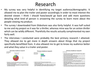
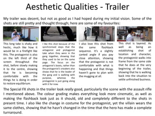
Evaluation
Spencer Fox
Production Process Evaluation
Research
• I believe my analysis of the original John Wick trailer was very helpful in
structuring my own trailer and assisted the planning of the whole
production stage. It also influenced some of the shots, cuts and scenes
that ended up being used for my own trailer.
• The analysis I did for the Atomic Blonde poster also helped in letting me
know what I should include on my own poster for this fictional
promotional campaign.
• Analysing the interviews for Captain Marvel and Taken, as well as watching
a lot of similar interviews in the past, gave my own interview a familiar
feel and structure.
• The research analysis was in-depth and reflected on what I could have
improved on, included or what I didn’t need.
• The secondary research I did complimented my own survey and interviews
well, covering areas I might have missed while still talking about the
same/similar topics.
• My subject research gave me a lot of context to the work that goes into
these kinds of productions, as well as allowing me to learn about certain
techniques and such.
• My practical research prepared me for my productions in that I knew what
and how I was going to create each thing.
Research
• My survey was very helpful in identifying my target audience/demographic. It
allowed me to plan the trailer and poster accordingly in order to most interest the
desired viewer. I think I should have/would go back and add more questions
detailing what kind of person is answering the survey to learn more about the
people viewing my product.
• The survey I downloaded from Slideshare was also fairly helpful. It was half suited
to me and my project as it was for a thriller, whereas mine was for an action thriller
which can be wildly different. Thankfully the results actually complimented my own
fairly well.
• The interviews I conducted were probably the best primary research I attained.
They allowed me to get more in depth answers about things that my project
specifically benefitted from. It also allowed me to get to know my audience better
and what they value in a trailer and poster.
Planning
• My screenplay was made using professional software that many writers in the industry
use. It was well structured, as far as writing a trailer goes, seen as normally you do not
write a trailer, you create the full film before selecting sections of it for the trailer.
• The storyboards were detailed and fairly well drawn, clearly depicting what I intended
to include in the final product.
• The style sheets were packed with information, including images and text regarding
them.
• My poster layouts ended up being used to create the poster I ended up with.
•
• My resources lists were detailed and included anything that I’d need at all.
• My shot list was really helpful. It had so many shots in it and was laid out really well.
The way I collated the shots by location rather than just chronologically in terms of
appearance in the trailer was extremely advantageous during the shoot.
• The location recces could’ve been better, in that I could have personally gone there to
take the photos myself rather than use google maps, although I have already been to
the area plenty of times, meaning I knew the area and its positives.
Time Management
My time management was great until the production stage, where I had nothing to
do until the third week, as my actors could not seem to find a day that they were all
free on until then. That did mean I could add to and improve the previous pro
formas.
As for the shoot, we managed everything very well, efficiently moving from location
to location, from camera position to camera position and so on. The edit was
extremely flawed because of technical difficulties, however I still finished within the
timeframe allocated with a product I was happy enough with being marked. I was
able to fix all technical issues either through sheer luck or through tech knowledge I
have from years of using the software.
If I had more time, I would definitely go through reshoots to fix some of the shots
that I don’t like, and some of the focus issues that are evident on playback. I would
love to make everything a lot better and more to the standards I set myself at the
beginning of this project through my initial vision.
I wish I could go back and have more crew assisting me on the shoot, helping
everything go smoother and to a better quality.
Technical & Aesthetic Qualities - Poster
The poster I created for my project
was actually fairly solid. The title
has texture and stands out from
the rest of the text, despite also
being a lot bigger. The professional
poster is more artistic and
minimalist compared to my own,
and I feel I could’ve done more to
boost my poster’s aesthetic
qualities. This would include
altering the image more, to fit the
tone of my film more, perhaps
making it darker and more central
focused. Both the professional
poster and my own has the main
actors above the title and the
producing companies beneath, at
the bottom of the poster. They
both also have the release date
beside the title.
I really like various elements of the photography behind the image in my poster. The bricks on either side
all point straight down the middle of the photo, drawing the viewers’ eye to the middle of the photo,
where the protagonist/subject stands. The alleyway itself looks/seems to be leading to a dead end,
possibly eluding to the subject facing his end, or the inevitable, which suits the film very well, and the title
itself.
Technical Qualities - Trailer
The cuts in the edit and the layering audio really boost the trailer in a positive direction. It adds a
dynamic feel to the whole production. It subtly builds to the point where the disequilibrium begins in
the story, where the protagonist’s friend becomes the antagonist. The time jump back to present time is
brought there by a train in a train station, almost saying that the audience has literally been transported
through time on that train, arriving there with the protagonist himself. I had to sync up an audio track of
the antagonist during his monologue to our protagonist, where the audio and the visuals were from two
completely different takes. I feel that the final product isn’t actually too bad at all.
The whole trailer follows the normal structure of most films, starting with equilibrium, breaking into
disequilibrium, in this case when the protagonist runs away from a crime scene that he had no intention
of creating to such an extent, and then attempting to bring it back to equilibrium by confronting his
former friend.
The cuts are well placed and often to the beat of the music, adding more emphasis to the sudden
change of scenery. It also amplifies the titles at the end of the trailer, making them really stand out to
the viewer, making them easier to remember.
Most shots are well framed and focus. I see composition as one of the most important aspects when it
comes to shooting a short film, even more so than script or acting. Some shots, unfortunately, aren’t as
good as I intended. Some are out of focus or slightly too dark or too light in terms of exposure. I’d go
back and reshoot these bad shots if I could.
In terms of camera and lens choice, I was limited to the Canon 1300D with the normal 18mm-55mm kit
lens. This means I had no articulating screen, so I could not see anything in frame unless I was behind
the camera itself, and that I had no wide or telephoto capabilities. I feel as though, considering these
limitations, my work was fairly technically sound.
Aesthetic Qualities - Trailer
My trailer was decent, but not as good as I had hoped during my initial vision. Some of the
shots are still pretty and thought through; here are some of my favourites:
This long take is shaky and
hectic, much like how it
would be in a firefight like
this. The protagonist is also
on the left third of the
screen throughout the
shot, before slowly making
it to the centre, showing
that he is becoming
comfortable with the
things he is doing in order
to restore equilibrium.
I like this shot because of the
synchronised steps that the
antagonist and protagonist
take when they were in the
gang together, showing that
they used to be on the same
page. The focus on the
antagonist’s boots, rather than
the protagonist’s sneakers also
shows that he is the leader of
the gang and is walking with
purpose, whereas the
protagonist is just going along
with it for now.
I also love this shot from
the same flashback
sequence. It’s a slightly
canted angle if you pay
close attention, showing
that the protagonist is not
comfortable with what is
happening and that things
haven’t gone to plan with
the mugging at all.
This shot is layered. As
well as being an
establishing shot of
location and character,
the protagonist walks into
frame from the same side
that he does at the very
beginning of the trailer,
showing that he is walking
back into the situation to
settle unfinished business.
The Special FX shots in the trailer look really good, particularly the scene with the assault rifle
I mentioned above. The colour grading makes everything look more cinematic, as well as
making the flashback look just as it should, old and completely different to the shots in
present time. I also like the change in costume for the protagonist, yet the villain wears the
same clothes, showing that he hasn’t changed in the time that the hero has made a complete
turnaround.
Aural Qualities
• My trailer has a few moments of deeply layered audio
tracks. What springs to mind is the action shot of my
protagonist firing his assault rifle down the street. I
used multiple gun shot sounds as no gun sounds 100%
the same each shot you fire, many bullet flyby sounds
when the gun is facing more towards camera to feel as
though the audience are really witnessing this scene
firsthand. I also added multiple collision sounds too
seem as if the bullets he’s firing are actually directed
towards something and have weight to them.
https://youtu.be/pz0XWjWuI2M
• The soundtrack dips in volume where it needs to,
boosting back up when appropriate.
• The voice over is clear and easily understood over all
other noise.
• The voice through the phone sounds very authentic.
Audience Appeal
My demographic was 16-24 year old heterosexual males as they tend to be
the ones who enjoy action thriller films the most, which my research
confirmed.
• I included special effects that appeal to them, gunshots and chaotic
violence scenes, although is not too gory that the under 18s in my
audience would be deterred or put off.
• I made the trailer fast, in that it was under two minutes long, and yet
suspenseful by drawing out the faster scenes with mysterious dialogue.
• My antagonist was the leader of an underground organisation, as preferred
on my survey.
• The poster I created was dark and moody as stated by my survey’s results.
Overall, my trailer generally adheres to the results of my survey I conducted
using Survey Monkey. The trailer also reaches the target psychographic of my
audience due to its themes: locality, Great Britain, community etc.
Peer
Feedback
Feedback 1
• What did you like about the product?
– The thing that I liked the most about your product was the background
sounds which in my opinion is an important aspect to make the
audience feel curious and interest to watch it.
– I also liked the effects that you used, the gun shots, the fight was really
well played.
– I loved the poster, it looks extremely professional, the fonts that you
used matches with the pictures and the layout. I also liked what you
did on the poster’s main title, the texture is really nice.
• What improvements could have been made to the product?
– In the phone call could be a bit louder when the guys says “Why did
you run?”
– In the part “I killed that guy to protect you” it didn’t make much sense
because the video was after, so this could also be improved. You could
match the audio with the video, this would make the flashback make
more sense for the audience.
– In the texts I think would look interesting if it was zooming in or if it
has some effects.
Feedback 2
• What did you like about the product?
– Tension is built really well with the types of shots as well as the colour grade,
and with the music playing over.
– Not too much is revealed about how the film itself plays out and this is how a
trailer should be as it encourages viewers to go see the full film.
– The sound editing is also pretty seamless as it is in time with the VFX and is at
a volume where it seems as though the sounds are being created by the
props.
– The trailer meets almost all the conventions of an action/thriller trailer.
• What improvements could have been made to
the product?
– Some shots are a little shaky so maybe a tripod or stabiliser would have
helped.
– Sometimes the colour grade gets lighter in one or two shots.
– One of the final shots is slightly out of focus possibly due to autofocus.
Feedback 3
What did you like about the product?
• I like the different effects used in this, for example when the garage door
closes and it turns dark.
• The gun sound effect is edited in well to make it sound more realistic and the
visual effects of the shots are well edited because it’s as if you can see the
bullets flying out.
• The clips are all well edited and the music and effects make it all mysterious.
• The poster looks professional and the image used is interesting and quite
dramatic in a way.
• I also like the font for the title as it’s clear and detailed.
What improvements could have been made to the
product?
• Some sound effects are louder than others (for example the gun shots could
have been a little bit quieter and the phone call could have been a bit louder)
• Looking at the poster and the video, I would have used the same font used in
the poster, for the end of the video when the text comes up.
Peer Feedback Summary
• What do you agree with from your peer feedback?
– I agree that some shots are out of focus
– The special FX are good
– I like the audio mixing, although some parts do need fine
tuning (gun shot and phone call volume)
– I also like the font, although looking back on it, it’s
different to the font used in the poster and agree that it
needs changing
• What do you disagree with from your peer feedback?
– I disagree that the colour grade changes, as it actually
doesn’t, the exposure does due to fluctuating light on the
day because of clouds moving in front of the sun.
– I don’t agree that the “I killed that guy to protect you” line
didn’t make sense, but I do feel that if cast hadn’t have
dropped out a week before it would’ve been a lot clearer.
Peer Feedback Summary
I would personally change or reshoot a number of things with my trailer and my
poster.
I think I would go back and match the title font from the trailer up to the poster (I used
the wrong one).
I’d revisit the sound mixing of certain shots to make them fit better in the grand
scheme of the whole trailer. Specifically, I’d lower the volume of the assault rifle gun
shots as they are far louder than the rest of the trailer, blowing out the audience’s
eardrums whenever it pops up on screen, and I would boost the volume of the phone
call so that the antagonist can be heard better.
I would love to reshoot some of the shots to improve focus pulling and correct the
focus on one of the shots at the end of the trailer where it is focused on the wall,
rather than the villain himself.
I’d also reshoot the flashback, adding more gang members to make it feel as though it
isn’t just the protagonist and antagonist and that there is actually more affected
people involved in the story, giving the antagonist more power against the lonesome
hero.
With the poster, I’d change lens to a wider format, maybe 10mm, and then shoot a
very similar photo, making it much moodier and mysterious in Photoshop. I would
much prefer if the poster image was darker and more contrasting from light and dark.

5. Evaluation

  • 1.
  • 2.
  • 3.
    Research • I believemy analysis of the original John Wick trailer was very helpful in structuring my own trailer and assisted the planning of the whole production stage. It also influenced some of the shots, cuts and scenes that ended up being used for my own trailer. • The analysis I did for the Atomic Blonde poster also helped in letting me know what I should include on my own poster for this fictional promotional campaign. • Analysing the interviews for Captain Marvel and Taken, as well as watching a lot of similar interviews in the past, gave my own interview a familiar feel and structure. • The research analysis was in-depth and reflected on what I could have improved on, included or what I didn’t need. • The secondary research I did complimented my own survey and interviews well, covering areas I might have missed while still talking about the same/similar topics. • My subject research gave me a lot of context to the work that goes into these kinds of productions, as well as allowing me to learn about certain techniques and such. • My practical research prepared me for my productions in that I knew what and how I was going to create each thing.
  • 4.
    Research • My surveywas very helpful in identifying my target audience/demographic. It allowed me to plan the trailer and poster accordingly in order to most interest the desired viewer. I think I should have/would go back and add more questions detailing what kind of person is answering the survey to learn more about the people viewing my product. • The survey I downloaded from Slideshare was also fairly helpful. It was half suited to me and my project as it was for a thriller, whereas mine was for an action thriller which can be wildly different. Thankfully the results actually complimented my own fairly well. • The interviews I conducted were probably the best primary research I attained. They allowed me to get more in depth answers about things that my project specifically benefitted from. It also allowed me to get to know my audience better and what they value in a trailer and poster.
  • 5.
    Planning • My screenplaywas made using professional software that many writers in the industry use. It was well structured, as far as writing a trailer goes, seen as normally you do not write a trailer, you create the full film before selecting sections of it for the trailer. • The storyboards were detailed and fairly well drawn, clearly depicting what I intended to include in the final product. • The style sheets were packed with information, including images and text regarding them. • My poster layouts ended up being used to create the poster I ended up with. • • My resources lists were detailed and included anything that I’d need at all. • My shot list was really helpful. It had so many shots in it and was laid out really well. The way I collated the shots by location rather than just chronologically in terms of appearance in the trailer was extremely advantageous during the shoot. • The location recces could’ve been better, in that I could have personally gone there to take the photos myself rather than use google maps, although I have already been to the area plenty of times, meaning I knew the area and its positives.
  • 6.
    Time Management My timemanagement was great until the production stage, where I had nothing to do until the third week, as my actors could not seem to find a day that they were all free on until then. That did mean I could add to and improve the previous pro formas. As for the shoot, we managed everything very well, efficiently moving from location to location, from camera position to camera position and so on. The edit was extremely flawed because of technical difficulties, however I still finished within the timeframe allocated with a product I was happy enough with being marked. I was able to fix all technical issues either through sheer luck or through tech knowledge I have from years of using the software. If I had more time, I would definitely go through reshoots to fix some of the shots that I don’t like, and some of the focus issues that are evident on playback. I would love to make everything a lot better and more to the standards I set myself at the beginning of this project through my initial vision. I wish I could go back and have more crew assisting me on the shoot, helping everything go smoother and to a better quality.
  • 7.
    Technical & AestheticQualities - Poster The poster I created for my project was actually fairly solid. The title has texture and stands out from the rest of the text, despite also being a lot bigger. The professional poster is more artistic and minimalist compared to my own, and I feel I could’ve done more to boost my poster’s aesthetic qualities. This would include altering the image more, to fit the tone of my film more, perhaps making it darker and more central focused. Both the professional poster and my own has the main actors above the title and the producing companies beneath, at the bottom of the poster. They both also have the release date beside the title. I really like various elements of the photography behind the image in my poster. The bricks on either side all point straight down the middle of the photo, drawing the viewers’ eye to the middle of the photo, where the protagonist/subject stands. The alleyway itself looks/seems to be leading to a dead end, possibly eluding to the subject facing his end, or the inevitable, which suits the film very well, and the title itself.
  • 8.
    Technical Qualities -Trailer The cuts in the edit and the layering audio really boost the trailer in a positive direction. It adds a dynamic feel to the whole production. It subtly builds to the point where the disequilibrium begins in the story, where the protagonist’s friend becomes the antagonist. The time jump back to present time is brought there by a train in a train station, almost saying that the audience has literally been transported through time on that train, arriving there with the protagonist himself. I had to sync up an audio track of the antagonist during his monologue to our protagonist, where the audio and the visuals were from two completely different takes. I feel that the final product isn’t actually too bad at all. The whole trailer follows the normal structure of most films, starting with equilibrium, breaking into disequilibrium, in this case when the protagonist runs away from a crime scene that he had no intention of creating to such an extent, and then attempting to bring it back to equilibrium by confronting his former friend. The cuts are well placed and often to the beat of the music, adding more emphasis to the sudden change of scenery. It also amplifies the titles at the end of the trailer, making them really stand out to the viewer, making them easier to remember. Most shots are well framed and focus. I see composition as one of the most important aspects when it comes to shooting a short film, even more so than script or acting. Some shots, unfortunately, aren’t as good as I intended. Some are out of focus or slightly too dark or too light in terms of exposure. I’d go back and reshoot these bad shots if I could. In terms of camera and lens choice, I was limited to the Canon 1300D with the normal 18mm-55mm kit lens. This means I had no articulating screen, so I could not see anything in frame unless I was behind the camera itself, and that I had no wide or telephoto capabilities. I feel as though, considering these limitations, my work was fairly technically sound.
  • 9.
    Aesthetic Qualities -Trailer My trailer was decent, but not as good as I had hoped during my initial vision. Some of the shots are still pretty and thought through; here are some of my favourites: This long take is shaky and hectic, much like how it would be in a firefight like this. The protagonist is also on the left third of the screen throughout the shot, before slowly making it to the centre, showing that he is becoming comfortable with the things he is doing in order to restore equilibrium. I like this shot because of the synchronised steps that the antagonist and protagonist take when they were in the gang together, showing that they used to be on the same page. The focus on the antagonist’s boots, rather than the protagonist’s sneakers also shows that he is the leader of the gang and is walking with purpose, whereas the protagonist is just going along with it for now. I also love this shot from the same flashback sequence. It’s a slightly canted angle if you pay close attention, showing that the protagonist is not comfortable with what is happening and that things haven’t gone to plan with the mugging at all. This shot is layered. As well as being an establishing shot of location and character, the protagonist walks into frame from the same side that he does at the very beginning of the trailer, showing that he is walking back into the situation to settle unfinished business. The Special FX shots in the trailer look really good, particularly the scene with the assault rifle I mentioned above. The colour grading makes everything look more cinematic, as well as making the flashback look just as it should, old and completely different to the shots in present time. I also like the change in costume for the protagonist, yet the villain wears the same clothes, showing that he hasn’t changed in the time that the hero has made a complete turnaround.
  • 10.
    Aural Qualities • Mytrailer has a few moments of deeply layered audio tracks. What springs to mind is the action shot of my protagonist firing his assault rifle down the street. I used multiple gun shot sounds as no gun sounds 100% the same each shot you fire, many bullet flyby sounds when the gun is facing more towards camera to feel as though the audience are really witnessing this scene firsthand. I also added multiple collision sounds too seem as if the bullets he’s firing are actually directed towards something and have weight to them. https://youtu.be/pz0XWjWuI2M • The soundtrack dips in volume where it needs to, boosting back up when appropriate. • The voice over is clear and easily understood over all other noise. • The voice through the phone sounds very authentic.
  • 11.
    Audience Appeal My demographicwas 16-24 year old heterosexual males as they tend to be the ones who enjoy action thriller films the most, which my research confirmed. • I included special effects that appeal to them, gunshots and chaotic violence scenes, although is not too gory that the under 18s in my audience would be deterred or put off. • I made the trailer fast, in that it was under two minutes long, and yet suspenseful by drawing out the faster scenes with mysterious dialogue. • My antagonist was the leader of an underground organisation, as preferred on my survey. • The poster I created was dark and moody as stated by my survey’s results. Overall, my trailer generally adheres to the results of my survey I conducted using Survey Monkey. The trailer also reaches the target psychographic of my audience due to its themes: locality, Great Britain, community etc.
  • 12.
  • 13.
    Feedback 1 • Whatdid you like about the product? – The thing that I liked the most about your product was the background sounds which in my opinion is an important aspect to make the audience feel curious and interest to watch it. – I also liked the effects that you used, the gun shots, the fight was really well played. – I loved the poster, it looks extremely professional, the fonts that you used matches with the pictures and the layout. I also liked what you did on the poster’s main title, the texture is really nice. • What improvements could have been made to the product? – In the phone call could be a bit louder when the guys says “Why did you run?” – In the part “I killed that guy to protect you” it didn’t make much sense because the video was after, so this could also be improved. You could match the audio with the video, this would make the flashback make more sense for the audience. – In the texts I think would look interesting if it was zooming in or if it has some effects.
  • 14.
    Feedback 2 • Whatdid you like about the product? – Tension is built really well with the types of shots as well as the colour grade, and with the music playing over. – Not too much is revealed about how the film itself plays out and this is how a trailer should be as it encourages viewers to go see the full film. – The sound editing is also pretty seamless as it is in time with the VFX and is at a volume where it seems as though the sounds are being created by the props. – The trailer meets almost all the conventions of an action/thriller trailer. • What improvements could have been made to the product? – Some shots are a little shaky so maybe a tripod or stabiliser would have helped. – Sometimes the colour grade gets lighter in one or two shots. – One of the final shots is slightly out of focus possibly due to autofocus.
  • 15.
    Feedback 3 What didyou like about the product? • I like the different effects used in this, for example when the garage door closes and it turns dark. • The gun sound effect is edited in well to make it sound more realistic and the visual effects of the shots are well edited because it’s as if you can see the bullets flying out. • The clips are all well edited and the music and effects make it all mysterious. • The poster looks professional and the image used is interesting and quite dramatic in a way. • I also like the font for the title as it’s clear and detailed. What improvements could have been made to the product? • Some sound effects are louder than others (for example the gun shots could have been a little bit quieter and the phone call could have been a bit louder) • Looking at the poster and the video, I would have used the same font used in the poster, for the end of the video when the text comes up.
  • 16.
    Peer Feedback Summary •What do you agree with from your peer feedback? – I agree that some shots are out of focus – The special FX are good – I like the audio mixing, although some parts do need fine tuning (gun shot and phone call volume) – I also like the font, although looking back on it, it’s different to the font used in the poster and agree that it needs changing • What do you disagree with from your peer feedback? – I disagree that the colour grade changes, as it actually doesn’t, the exposure does due to fluctuating light on the day because of clouds moving in front of the sun. – I don’t agree that the “I killed that guy to protect you” line didn’t make sense, but I do feel that if cast hadn’t have dropped out a week before it would’ve been a lot clearer.
  • 17.
    Peer Feedback Summary Iwould personally change or reshoot a number of things with my trailer and my poster. I think I would go back and match the title font from the trailer up to the poster (I used the wrong one). I’d revisit the sound mixing of certain shots to make them fit better in the grand scheme of the whole trailer. Specifically, I’d lower the volume of the assault rifle gun shots as they are far louder than the rest of the trailer, blowing out the audience’s eardrums whenever it pops up on screen, and I would boost the volume of the phone call so that the antagonist can be heard better. I would love to reshoot some of the shots to improve focus pulling and correct the focus on one of the shots at the end of the trailer where it is focused on the wall, rather than the villain himself. I’d also reshoot the flashback, adding more gang members to make it feel as though it isn’t just the protagonist and antagonist and that there is actually more affected people involved in the story, giving the antagonist more power against the lonesome hero. With the poster, I’d change lens to a wider format, maybe 10mm, and then shoot a very similar photo, making it much moodier and mysterious in Photoshop. I would much prefer if the poster image was darker and more contrasting from light and dark.

Editor's Notes

  • #4 What were the strengths of your research? How did your research help your product? What were the weaknesses of your research? What could you have done better/improve? What effect would this have had on your product?
  • #5 What were the strengths of your research? How did your research help your product? What were the weaknesses of your research? What could you have done better/improve? What effect would this have had on your product?
  • #6 What were the strengths of your planning? How did your planning help your product? What were the weaknesses of your planning? What could you have done better/improve? What effect would this have had on your product?
  • #7 Did you manage your time well? Did you complete your project on time or would your products have improved with additional time? What would you have done if you had more time to produce your work?
  • #8 Compare your work to similar existing products and discuss the similarities and differences Put your final piece(s) in the centre of a page alongside an existing product Use text boxes and arrows
  • #9 Compare your work to similar existing products and discuss the similarities and differences Put your final piece(s) in the centre of a page alongside an existing product Use text boxes and arrows
  • #10 Does your work look good? Was it creative? What aspects of your game’s visuals do you like? What would you improve? How would you improve it? Discuss the strengths and weaknesses Put your final piece(s) in the centre of a page and analyse them Use text boxes and arrows
  • #12 How have you appealed to your target audience? What specific bits of content would appeal to your target audience. Refer to your findings from your questionnaire. Put your final piece(s) in the centre of a page and analyse them Use text boxes and arrows
  • #18 What changes would you make to your product based upon your peer feedback and why?