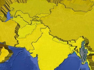
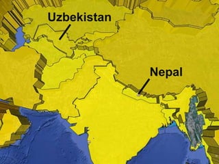
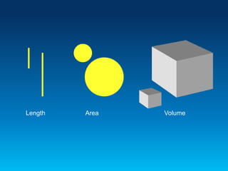
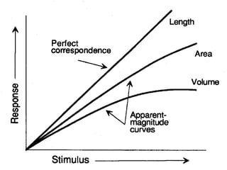
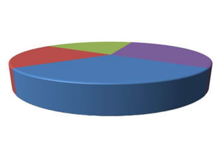
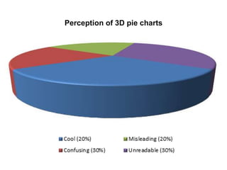
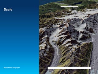
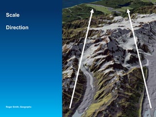
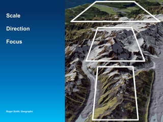
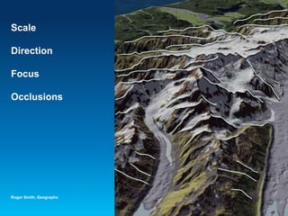
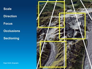
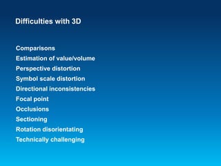
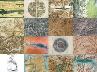
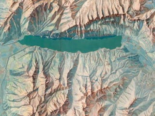
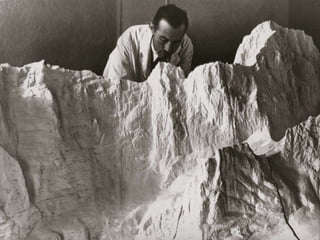
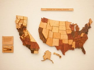
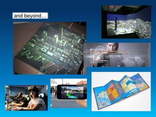
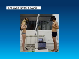
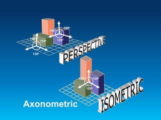
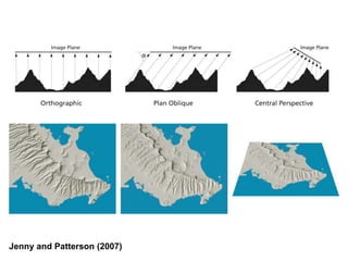
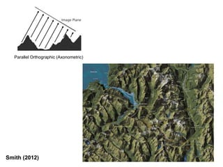
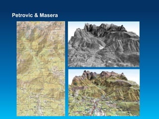
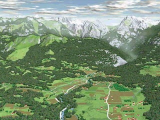
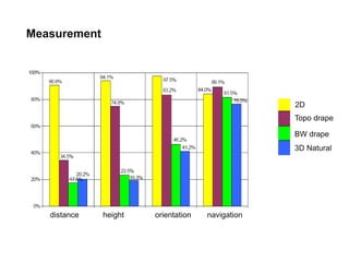
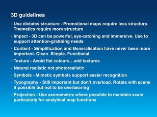
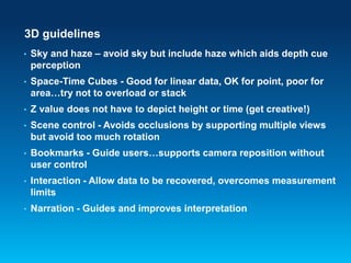
3D cartography
glitz, glamour and sometimes useful
Kenneth Field
Nepal
Uzbekistan
Length Area Volume
Perception of 3D pie charts
Scale
Roger Smith, Geographx
Scale
Direction
Roger Smith, Geographx
Scale
Direction
Focus
Roger Smith, Geographx
Scale
Direction
Focus
Occlusions
Roger Smith, Geographx
Scale
Direction
Focus
Occlusions
Sectioning
Roger Smith, Geographx
Difficulties with 3D
Comparisons
Estimation of value/volume
Perspective distortion
Symbol scale distortion
Directional inconsistencies
Focal point
Occlusions
Sectioning
Rotation disorientating
Technically challenging
Difficulties with 3D
Comparisons
Estimation of value/volume
Perspective distortion
Symbol scale distortion
Directional inconsistencies
Focal point
Occlusions
Sectioning
Rotation disorientating
Technically challenging
So why do we use 3D?…
Visually interesting
Real-world view
Better terrain recognition
Unconstrained
Lacks rules
Aesthetically exciting
Pushes the limits
More artistic/less graphic
Great for marketing and advertising
…because we’ve always used 3D
2300 B.C.
2005-present
and beyond…
and even further beyond…
120o120o
120o
110o
120o
130o
109o
116o
135o
Axonometric
Jenny and Patterson (2007)
Smith (2012)
Parallel Orthographic (Axonometric)
Petrovic & Masera
2D
Topo drape
BW drape
3D Natural
distance height orientation navigation
Measurement
Object recognition
Topo drape
BW drape
3D Natural
building church road stream forest rocks
Map type preference
3D guidelines
• Use dictates structure - Promotional maps require less structure.
Thematics require more structure
• Impact - 3D can be powerful, eye-catching and immersive. Use to
support attention-grabbing needs
• Content - Simplification and Generalisation have never been more
important. Clean. Simple. Functional
• Texture - Avoid flat colours…add textures
• Natural realistic not photorealistic
• Symbols - Mimetic symbols support easier recognition
• Typography - Still important but don’t overload. Rotate with scene
if possible but not to be overbearing
• Projection - Use axonometric where possible to maintain scale
particularly for analytical map functions
3D guidelines
• Sky and haze – avoid sky but include haze which aids depth cue
perception
• Space-Time Cubes - Good for linear data, OK for point, poor for
area…try not to overload or stack
• Z value does not have to depict height or time (get creative!)
• Scene control - Avoids occlusions by supporting multiple views
but avoid too much rotation
• Bookmarks - Guide users…supports camera reposition without
user control
• Interaction - Allow data to be recovered, overcomes measurement
limits
• Narration - Guides and improves interpretation
3D guidelines
If the third dimension doesn’t encode something useful…
STICK WITH 2D
Thank you
Kenneth Field
www.arcgis.com Maps with Attitude

3D Cartography

Editor's Notes

  • #2 What’s the point of doing work if it doesn’t get seen? We’d like it to be seen as interesting and innovative even. In so doing, we often develop ways of practicing our art that capture the imagination of our readers by turning to techniques that perhaps provide more immediate visual impact. We often go beyond the planimetric and play with soundscapes, animation, smellscapes and the third dimension…but does it work? Actually, most of what I am going to talk about is actually 2.5D…real 3D deals with volumetric features and that’s rarer still.
  • #3 This talk is about 3D maps…and the cartographic ideas and principles that underpin their design. How does using the third dimension add to our design pallette and our communication potential? Is 3D really of significant value to cartography? Does new technology support any real design advantage? Yes we have powerful graphics card and lots of RAM but is it used effectively? I briefly explore some of the history of 3D mapping by discussing some classic examples and why they were successful. I then focus on contemporary work by one or two researchers and also work we’re doing at Esri and discuss how the language of cartography can be spoken in the third dimension and how our traditional conception of design principles can be developed for 3D. This goes beyond an attempt to use 3D simply to capture attention, but to add value, be more immersive and modernize
  • #4 Bertin’s retinal variables – very familiar system for 2D cartography Similar schemas do not exist for 3D. Let’s try a few tests
  • #5 Let’s begin with a test that one of my colleagues Mark Harrower blogged about in 2009 TASK #1: As quickly as you can, how does Nepal compare to Uzbekistan?  TASK #2: As quickly as you can, find all of the other places on the map similar to Nepal? Which place is most similar? Which one least?
  • #6 A regular 2D classed choropleth map or proportional symbol map would make short work of those questions. The Lack of a zero-line reference makes it hard to judge absolute magnitudes. The “fish eye lens” effect mean each prism is viewed from a different angle than its neighbors, making comparison just a little bit harder as we have to mentally account for these differences in our estimates. It is hard to judge the height of something when you are staring directly down at it. This matters because height is the visual variable that does the “work” in this graphic—it’s how the data are encoded visually. Why obscure the very thing map-readers need to make sense of the graphic (e.g., the side-view height of each polygon)?
  • #7 Test 2: Estimate the quantifiable difference between map symbols – important because many mapping tasks involve making comparisons. If we struggle to estimate single objects how can we possibly understand complex irregular objects?
  • #8 We know this is a problem because research tells us Much of the work that James Flannery did in the mid 1900s showed that human beings have considerable difficulties in translating their perception of objects to relative measures.
  • #9 Third test: How do all these pie slices relate to one another?
  • #10 Perspective creates huge foreshortening because scale varies across the image…and distorts the amount of visual real estate of each slice relative to one another This is why 3D pie charts are so reviled
  • #11 Occlusion still occurs with 3D symbology as well
  • #12 Paradoxically we bring the smaller objects to the front and although larger objects take precedence in our estimation of quantity, we place them towards the back in our visual hierarchy.
  • #13 Of course this is the reality
  • #14 If we turn our attention to landscapes we can see the problems we have in understanding what it is we are seeing Scale is seriously modified by a perspective view
  • #15 Direction, or orientation to north (or any other compass point) differs across the map
  • #16 Our focus is compromised because shapes change across the map from a broadly planimetric view at the foot to an oblique view at the top. Comparing place to place across this sort of map becomes difficult.
  • #17 Occlusions are sometimes quite profound. In this map we lose about 30% of information hiding behind the larger landforms. The very technique we are using to emphasise the landscape makes us lose detail.
  • #18 And of course, all of these problems operate differently at different places in the field of view.
  • #21 3D maps are not new though as we’ve perpetually concerned ourselves with relief representation Planimetric in the main but perspective relief representation is a side view as viewed from the river that flows between the mountains. Earliest form of relief mapping which was also the main representation on Greek coins some 2000 years later. Relief mapping has revealed our changing perception of the natural world. At times we’ve had symbolism, at others emphasis on scientific truth. The artistic acumen for developing representational techniques has been characterised by long periods of stasis punctuated by periods of intense innovation.
  • #22 Tabula Peutingeriana 4th century - profile Rudimentum Novitorum printed in Lübeck 1475 - Tand O molehills Da Vinci exposes this in his detailed map of eastern Tuscany c1502. drawn in perspective, light falling from the right. Hans Conrad Gyger’s cantons of Zurich was the first planimetric depiction of relief 1668 First map to use hachures was Vivier’s carte particuliere des environs de paris 1674 Plan de Paris by Louis Bretez, 1739 uses an isometric projection and for the time, went against the trend of more geometric, planimetric depictions Heinrich Weis and Joachim Muller 1786 – 1802 Atlas de la Suisse or ‘Meyer atlas’ Completely planimetric and heavy on hachuring but not yet systemized and appears sometimes cluttered Topographic map of Switzerland by G. H. Dufour 1864. Shadow hachure combined slope hachure with a north westerly light source to create a shadow. Xaver Imfeld Reliefkarte der Centralschweiz 1887. Famous for cliff drawings and relief representation Bathymetrical survey of the fresh water lochs of Scotland by James Parsons and T. R. H. Garrett 1902. In the late 19th century contours became the most common way of relief presentation for all large scale maps. Spot elevations, contours, isobaths and hypsometric tints. Birds-eye view from Summit of Mt Washington by Boston and Maine Railroad, 1902 Grand Canyon: Bright Angel by United States Geological Survey, 1903. Single representation of relief Amundsen’s South Pole Expedition by Gordon Home, 1911 The Chevalier map of San Francisco by August Chevalier, 1911 – hill shading nd contours unusual on a large scale map Yosemite by Jo Mora, 1931 Mora’s map is not only meant to entertain but also provide a window into the environment Karte der Gegend um den Walensee by Eduard Imhof, 1938.
  • #23 Karte der Gegend um den Walensee by Eduard Imhof, 1938. This original image measures 9.6m in width and illustrates he area around Walensee at 1:10,000. This is a painting in gouache that Imhof used to show a plan view portrayal as naturally as possible. Imhof employed the techniques of a landscape painter. All linear elements that might be produced using woodcuts, etchings, engraving or lithography are removed since they are abstract and do not appear in a natural landscape. No aerial photographs or existing maps were used as underlay. The result is a beautiful, aesthetically pleasing impressionistic painting yet one that is highly accurate.
  • #24 Eduard Imhof, Relief Model of the mountain Range Grosse Windgälle, (1939)
  • #26 Mt McKinley by U.S. Army Corp of Engineers, 1941 This example of Mount McKinley illustrates the pinnacle of small format plastic relief model design but require considerable vertical exaggeration Guide for visitors to Ise Shrine, Japan c.1950. Hand painted, oblique representation of the landscape gives way to a diagrammatic and planimetric view of the extended rail link to the right Disneyland by Sam McKim, 1958-1964. Rich in detail to give a sense of a living, breathing, exciting place Pictorial Guide to the Lakeland Fells by Alfred Wainwright, 1955-1966 The ascent maps are planimetric in the foreground and morph to become perspective in the distance showing natural features. Contours are included View and Map of New York City by Herman Bollmann, 1962. Isometric projection preserves scale, incredibl detail and widened road widths Yellowstone National Park by Heinrich Berann, 1962. Curved perspective projection. Incredible detail and saturated colours Atlantic Ocean Floor by Heinrich Berann, 1968. Hugely exaggerated plan oblique Hagerstrand (1970) proposed a framework of time geography to study social interaction and movement of individuals in space and time. STC is visual representation of that framework. Suffers problems of overplotting, disorientation & occlusion United States by Raven Maps, 1987 beautifully rendered hypsometric tinting and masterful hill-shading that crates contrast between mountainous regions and the great plains Mount Everest by the National Geographic Society, 1988. Last example of hand drawn Swiss hill shading. Mount St Helens anaglyph 1999 Google Maps 2005 – present The map itself is in the typical style of Google Maps which since its launch in 2005 has matured well into a familiar and coherent style in its own right. The third dimension is rendered well with shadow, transparency and simplified buildings. Savile Row by Katherine Baxter, 2006 – hand drawn axonometric projection TIME magazine 2007 – Spikes Here and There by Jack Shulze and Matt Webb, 2009 – inverse of the more normal progressive projection Mt Everest in 3D by 3D RealityMaps, 2011 – 3D camera, detailed survey and fly-through
  • #27 LiDAR mapping
  • #28  2005-present Google Earth supported new wave of thematics – pure chartjunk Virtual Globes are terrible for thematics because of symbol scaling and perspective Rotation, pan and zoom causes short-term memory flushing and increases cognitive load…we’re making reading maps harder!
  • #29 Armsglobe by Google Ideas, 2012 The armsglobe is fully interactive and allows intuitive zooming and rotation. Click events highlight a particular country and the labels rotate and scale as the map view updates. Graphs provide some quantifiable comparisons that show a breakdown of imports and exports. The viewer has control over showing or hiding some of the graphs as well as different ways to filter the data. In this way, one can show everything to gain an overall impression or focus on a specific type of import or export. there’s even a temporal slider to explore historic data.
  • #30 Real 3D maps: holograms, lenticular foil, caves, virtual reality, augmented reality
  • #31 ?
  • #32 Here we see the difference between the two projections we’ve seen. The perspective projection is the way our eyes work and places objects closer to the viewer larger with everything else receding. An Axonometric projection is a type of parallel projection, which shows an image of an object as viewed from a skew direction in order to reveal more than one side in the same picture. There are several types of axonometric – the isometric projection is the most commonly-used form where the direction of viewing is such that the three axes of space appear equally foreshortened. The displayed angles among them and also the scale of foreshortening are universally known. With axonometric projections the scale of distant features is the same as for near features, such pictures will look distorted, as it is not how our eyes or photography work. This distortion is especially evident if the object to view is mostly composed of rectangular features. Despite this limitation, axonometric projection can be useful for purposes of illustration and as the examples have illustrated…for cartography in large-scale urban landscapes.
  • #33 Plan oblique is similar to axonometric city maps but applied to terrain Central Perspective mimics the view from an aircraft window but plan oblique is more suited to mapmaking Better preserves geographic shapes, reduces occlusion, foreshortening and convergence to a distant vanishing point Uses a planimetric base but renders elevation at an angle of incidence of 90 degrees
  • #34 Moving the image plane to an orthographic perspective
  • #35 Petrovic and Masera Research questions: Differences in measurement (defining distance, defining north direction, and defining height difference between two points or through selected track) Differences in recognition (building, church, forest, rocks, road, and stream) Typical 2D map Topographic map draped over DTM with added hill-shading and sky shading Black/white orthophoto image, draped over DTM with added hill-shading and sky shading
  • #36 3D symbolic presentation, supplemented with atmospheric phenomena. Naturalistic but not photo-realistic
  • #37 - could they measure the distance between two points? - could they measure the height difference between two points? - could they define North direction? - could they get adequate impression about the route between two points? 2D wins but users favoured draped topographic map, especially due to contours and grids that were draped over the DTM together with other map content
  • #38 Results show that 3D cartographic symbols have been recognised as even better than on topographic map. Obviously, 3D symbols are very associative and without previous knowing of symbols participant had no problem to recognise them – possibly because they are increasingly mimetic
  • #39 Although participants found 3D symbolic maps as the most useful for object recognition they preferred draped topographic map.
  • #40 Chromastereoscopic 3D points with time on z axis Multiple layers and drapes Linear flow and direction 3D symbology Isometric prism map Large scale city planning Building infrastructure and internals Comparison and quantity assessment – Oso landslip Lego Minard 3D space-time cube – interactive 3D hot spot analysis – interactive Crime scene reconstruction LiDAR Thematic mapping – isometric on a globe 3D choropleth
  • #41 Ultimately, reprojecting data onto a virtual globe does not solve a cartographic problem then stick with 2D. Otherwise, we truly have a cool new technology in search of an application, and that’s just putting the cart before the horse. Cartography, like all good design, is about communicating the maximum amount of information with the least amount of ink (or pixels). The world is just too complex and interesting to be wasting our ink/pixels on non-functioning ornamentation. Key to 3D is the interface - if only the interface provides an appropriate technical construction. The technical construction of the interface still is a main factor for the ‘quality’ of cartographic products, which primarily has focused on printable resolutions of paper media or interactive, but 2D, web maps. Effectiveness regards aesthetic concerns as well as effective information acquisition, immersive interface use, optimisation processes for data simplification and visual rendering improvement.
  • #42 Ultimately, reprojecting data onto a virtual globe does not solve a cartographic problem then stick with 2D. Otherwise, we truly have a cool new technology in search of an application, and that’s just putting the cart before the horse. Cartography, like all good design, is about communicating the maximum amount of information with the least amount of ink (or pixels). The world is just too complex and interesting to be wasting our ink/pixels on non-functioning ornamentation. Key to 3D is the interface - if only the interface provides an appropriate technical construction. The technical construction of the interface still is a main factor for the ‘quality’ of cartographic products, which primarily has focused on printable resolutions of paper media or interactive, but 2D, web maps. Effectiveness regards aesthetic concerns as well as effective information acquisition, immersive interface use, optimisation processes for data simplification and visual rendering improvement.
  • #43 Ultimately, reprojecting data onto a virtual globe does not solve a cartographic problem then stick with 2D. Otherwise, we truly have a cool new technology in search of an application, and that’s just putting the cart before the horse. Cartography, like all good design, is about communicating the maximum amount of information with the least amount of ink (or pixels). The world is just too complex and interesting to be wasting our ink/pixels on non-functioning ornamentation. Key to 3D is the interface - if only the interface provides an appropriate technical construction. As ever, a good map requires the convergence of the art, science and technology of cartography…and looking to the past gives us huge pointers.