Downloaded 147 times


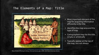
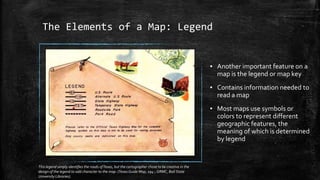
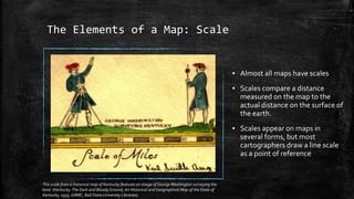
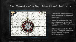
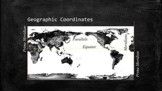
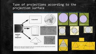
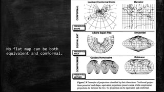
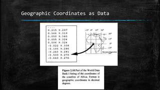
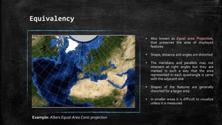
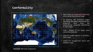
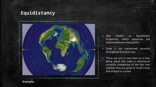
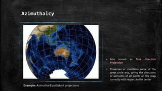
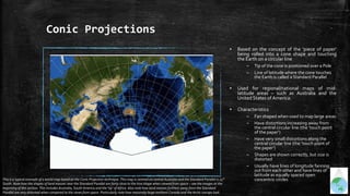
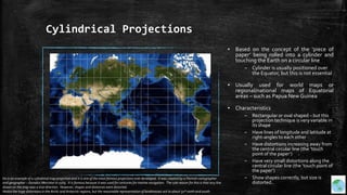
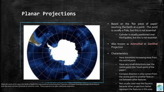
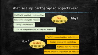
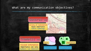
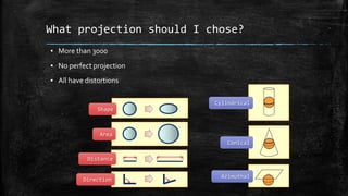
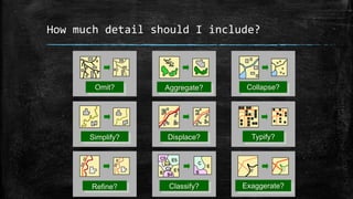
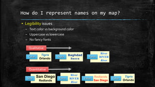
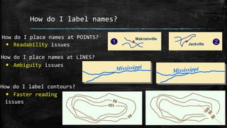
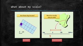
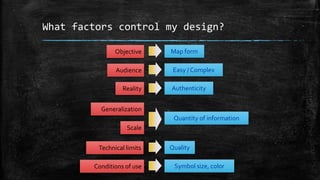

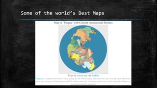
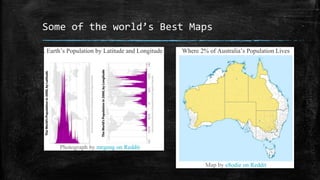
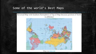
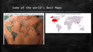


The document provides an overview of cartography and the key elements involved in mapmaking. It discusses important concepts like map projections, datums, geographic coordinates, and the common elements of maps such as titles, legends, scales, and directional indicators. It also examines different types of map projections including conic, cylindrical, and planar projections; and factors to consider in map design like the target audience, level of detail to include, appropriate use of symbols, colors and labeling. In the end, it shares some examples of excellent maps created by cartographers and acknowledges the sources of information.