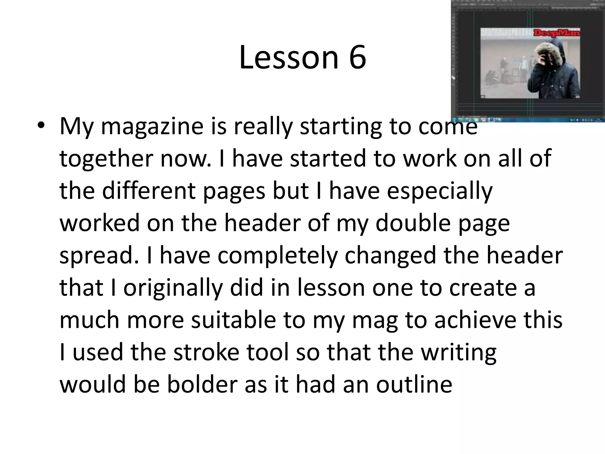
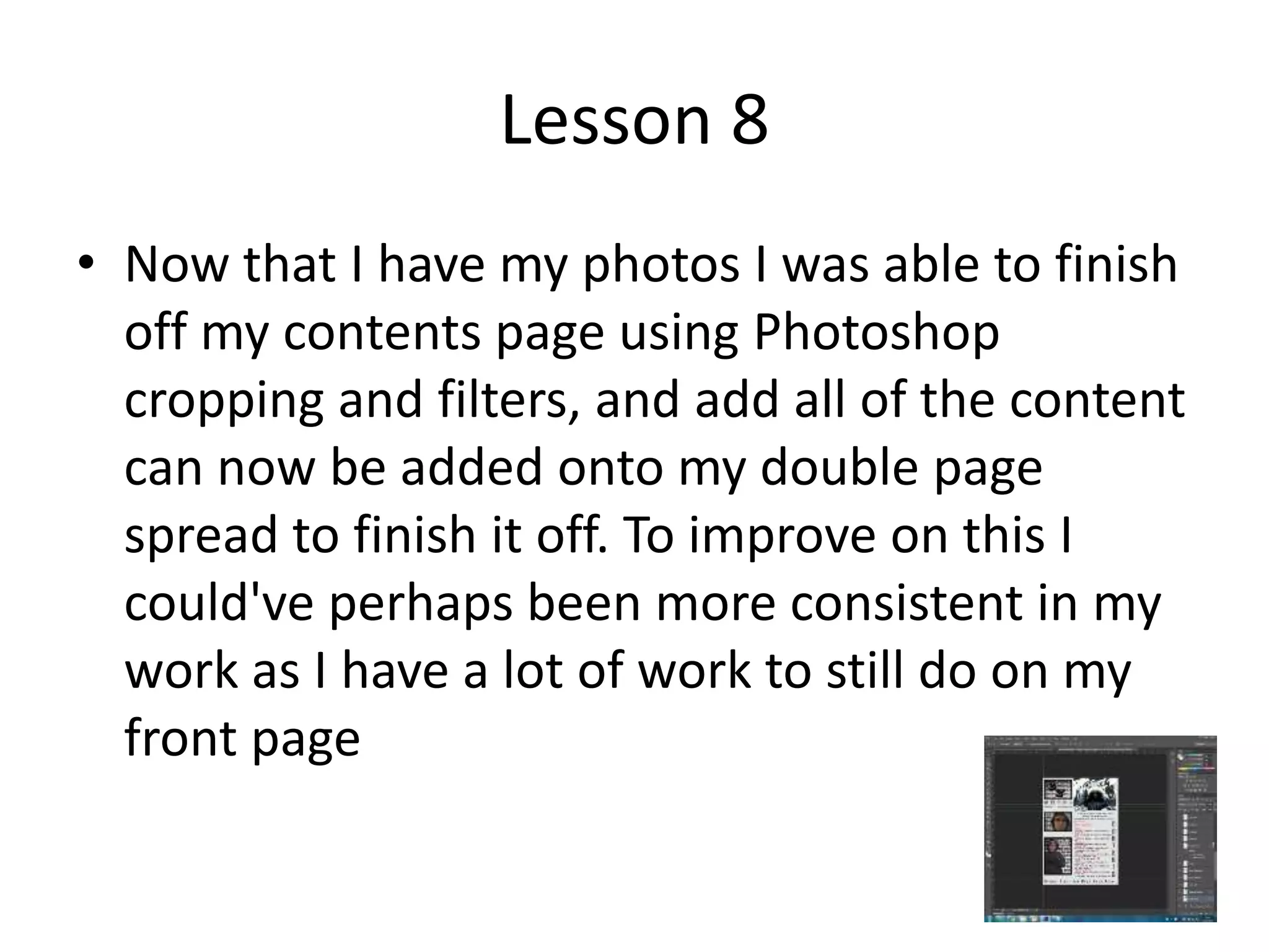
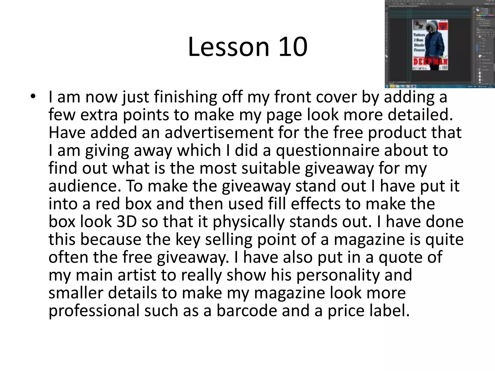
2. Lesson 1
I have spent most of my time creating the
header for my page because that is what
shall be used throughout the magazine to
represent my artist throughout my
magazine. I had to make sure it was perfect
for my target market. I feel however I need
to be more careful with my time and be
much more concentrated so i can have a
more fulfilling lesson.
3. Lesson 2
• I have begun to work on my front cover. I have
been deciding the colour for my backropund
and starting to create the name for my
magazine. I have had to use photo shop to be
able to create the different filter effect that I
would like to add to the backdrop of my
magazine. To improve for next time I shall
watch some videos online about how I can use
Photoshop to create a more specific filter
4. Lesson 3
• In this lesson I have made a start on my
contents page. I have begun to make the
congent that will be filled in for the different
page numbers. I have also chosen the
backround colour for my contents page that
would be suitable for my magazine. To
improve for next lesson I should keep an eye
on time management and make sure I
complete all tasks set
5. Lesson four
• I took the photos of my artist to use in my
magazine. This lesson was successful as I had
costume
6. Lesson five
• Now that I have my photos I am able to select
and start cropping them to make sure that
they are suitable for my magazine. I had to use
the crop tool in Photoshop and the filter tools
to make sure that can achieve the photo that
I aimed for.
7. Lesson 6
• My magazine is really starting to come
together now. I have started to work on all of
the different pages but I have especially
worked on the header of my double page
spread. I have completely changed the header
that I originally did in lesson one to create a
much more suitable to my mag to achieve this
I used the stroke tool so that the writing
would be bolder as it had an outline
8. Lesson 7
• I have really started to work on my contents
page. Now that I have all of the content on my
contents page I just need to decide which
fonts would be suitable and the colour
scheme. I also need to add the photos in. To
improve for next time I should have all of my
photos prepared in one sitting as I had to take
more photos for my contents page
9. Lesson 8
• Now that I have my photos I was able to finish
off my contents page using Photoshop
cropping and filters, and add all of the content
can now be added onto my double page
spread to finish it off. To improve on this I
could've perhaps been more consistent in my
work as I have a lot of work to still do on my
front page
10. Lesson nine
• I can finally start to properly work on my front cover. I have started
to fill in the subheadings and have choses colours and outline
colours for them to make sure that they are clearly unique and
stand out from the other headings. This puts them into their own
unique place as the subheadings. I have also worked on the main
heading which crosses over the main artist so that I can show the
importance of the header. I have made this its own separate colour
to also make sure that it stands out on its own without escaping
colour themes of the magazine. The main skill I have used however
is creating my social media logos. I have cutted out the shape of the
logo using the magic wand tool and then took the cutout and
reflected it onto a pattern of my choice. This skill was very useful
because it makes the social media signs much more themed to my
magazine and shows that our social media would stay in coherence
with my magazine
11. Lesson 10
• I am now just finishing off my front cover by adding a
few extra points to make my page look more detailed.
Have added an advertisement for the free product that
I am giving away which I did a questionnaire about to
find out what is the most suitable giveaway for my
audience. To make the giveaway stand out I have put it
into a red box and then used fill effects to make the
box look 3D so that it physically stands out. I have done
this because the key selling point of a magazine is quite
often the free giveaway. I have also put in a quote of
my main artist to really show his personality and
smaller details to make my magazine look more
professional such as a barcode and a price label.
12. Lesson 11
• After a few extra touch ups such as some extra
cropping and putting very small details to
make the magazine look much more
professional such as page numbers that are
created using the same font as the name of
the magazine to bring the link to the logo.
Here are the final products in Photoshop form.