2.5 measure of position
•
7 likes•1,218 views

This document provides information on measures of position including z-scores, percentiles, quartiles, and outliers. It includes definitions and formulas for calculating z-scores, percentiles, and quartiles. Examples are provided to demonstrate calculating these measures of position for given data sets and identifying outliers. The document also discusses exploratory data analysis and box-and-whisker plots.

More Related Content
What's hot
What's hot (20)
Viewers also liked
Similar to 2.5 measure of position
Similar to 2.5 measure of position (20)
More from University of Salahaddin-Erbil
More from University of Salahaddin-Erbil (12)
Recently uploaded
Recently uploaded (20)
2.5 measure of position
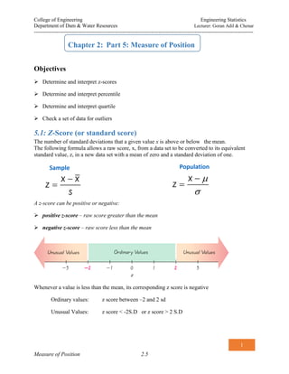
- 1. College of Engineering Engineering Statistics Department of Dam & Water Resources Lecturer: Goran Adil & Chenar ------------------------------------------------------------------------------------------------------------------------------- 1 Measure of Position 2.5 Chapter 2: Part 5: Measure of Position Objectives Determine and interpret z-scores Determine and interpret percentile Determine and interpret quartile Check a set of data for outliers 5.1: Z-Score (or standard score) The number of standard deviations that a given value x is above or below the mean. The following formula allows a raw score, x, from a data set to be converted to its equivalent standard value, z, in a new data set with a mean of zero and a standard deviation of one. A z-score can be positive or negative: positive z-score – raw score greater than the mean negative z-score – raw score less than the mean Whenever a value is less than the mean, its corresponding z score is negative Ordinary values: z score between –2 and 2 sd Unusual Values: z score < -2S.D or z score > 2 S.D x x z s x z Sample Population
- 2. College of Engineering Engineering Statistics Department of Dam & Water Resources Lecturer: Goran Adil & Chenar ------------------------------------------------------------------------------------------------------------------------------- 2 Measure of Position 2.5 Example 2.21 Annual rainfall. If the annual rainfalls in a certain city are 1, 22, 26, 33, and 123. cm over a 5-year period. Determine the z-score for each raw score. Discuss the value ?. is there any UN-USUAL Data
- 3. College of Engineering Engineering Statistics Department of Dam & Water Resources Lecturer: Goran Adil & Chenar ------------------------------------------------------------------------------------------------------------------------------- 3 Measure of Position 2.5 5.2: Position There are several ways of measuring the relative position of a specific member of a set. 5.2.1: Quartiles Quartiles split a set of ordered data into four parts. Q1 is the First Quartile 25% of the observations are smaller than Q1 and 75% of the observations are larger Q2 is the Second Quartile 50% of the observations are smaller than Q2 and 50% of the observations are larger. Same as the Median. It is also the 50th percentile. Q3 is the Third Quartile 75% of the observations are smaller than Q3and 25% of the observations are larger Q1, Q2, Q3 .Divides ranked scores into four equal parts The lower quartile is the median of the lower half of the data and the upper quartile is the median of the upper half. The median divides the data in the data in half. The upper and lower quartiles divide each half into two parts.
- 4. College of Engineering Engineering Statistics Department of Dam & Water Resources Lecturer: Goran Adil & Chenar ------------------------------------------------------------------------------------------------------------------------------- 4 Measure of Position 2.5 Example 2.22 Find Q1, Q2, and Q3 for the following data set. 15, 13, 6, 5, 12, 50, 22, 18 Sort in ascending order. 5, 6, 12, 13, 15, 18, 22, 50 1 6 12 Q , 9 2 median Low MD 2 13 15 Q , 14 2 median Low High 3 18 22 Q , 20 2 median MD High 5.2.2: Percentiles Just as there are quartiles separating data into four parts, there are 99 percentiles denoted P1, P2, . . . P99, which partition the data into 100 groups. A percentile is the value of a variable below which a certain percent of observations fall. So the 20th percentile is the value (or score) below which 20 percent of the observations may be found. A person with percentile rank of 20, means that he /she scored the same as or better than 20 percent of the group. 0 5 100 .number of values less than x Percentile of valuex total number of values
- 5. College of Engineering Engineering Statistics Department of Dam & Water Resources Lecturer: Goran Adil & Chenar ------------------------------------------------------------------------------------------------------------------------------- 5 Measure of Position 2.5 Example 2.23 The following series is the minimum monthly flow (m3 S-l ) in each of the 10 years Of a certain river. 36, 4, 21, 21, 23, 11, 10, 10, 12, 17 - What percentage of the data is less than 11? - What percentage of the data is less than 23?
- 6. College of Engineering Engineering Statistics Department of Dam & Water Resources Lecturer: Goran Adil & Chenar ------------------------------------------------------------------------------------------------------------------------------- 6 Measure of Position 2.5 5.2.3: Converting from the kth Percentile to the Corresponding Data Value n total number of values in the data set k percentile being used L locator that gives the position of a value Pk kth percentile HINT Step 3: If L is not a whole number, round up to the next whole number. If L is a whole number, use the value halfway between L and L+1. 100 k L n
- 7. College of Engineering Engineering Statistics Department of Dam & Water Resources Lecturer: Goran Adil & Chenar ------------------------------------------------------------------------------------------------------------------------------- 7 Measure of Position 2.5 Example 2.24 A teacher gives a 20-point test to 10 students. Find the value corresponding to the 25th and 60th percentile. 18, 15, 12, 6, 8, 2, 3, 5, 20, 10 Sort in ascending order. 2, 3, 5, 6, 8, 10, 12, 15, 18, 20 a) For 25th percentile The value 5 corresponds to the 25th percentile. (a student who had 5, did better than 25th percent of all student) b) For 60th percentile 2, 3, 5, 6, 8, 10, 12, 15, 18, 20 7 the vale = 12 Hence, A score of 11 correspond to the 60th Percentile 100 k L n 25 10 2 5 3 100 .L roundupto In part A the L value was not a whole number (2.5) Hence, L was rounded up to the next large number (2.5 rounded up to 3). And the corresponding value to the 25th percentile is the 3rd from the lowest 100 k L n 60 10 6 100 L In Part B the L value is a whole number (6) FROM THE HINT If L is a whole number, use the value halfway between L and L+1. 10 12 11 2 average 6th value 7th value
- 8. College of Engineering Engineering Statistics Department of Dam & Water Resources Lecturer: Goran Adil & Chenar ------------------------------------------------------------------------------------------------------------------------------- 8 Measure of Position 2.5 5.3: Exploratory Data Analysis Exploratory Data Analysis is the process of using statistical tools (such as graphs, measures of centre, and measures of variation) to investigate data sets in order to understand their important characteristics 5.3.1: Outlier An outlier is a value that is located very far away from almost all the other values. Important Principles An outlier can have a dramatic effect on the mean An outlier have a dramatic effect on the standard deviation An outlier can have a dramatic effect on the scale of the histogram so that the true nature of the distribution is totally obscured 5.3.2: Box-lots(Box-and-Whisker Diagram) A box-and-whisker plot shows the spread of a data set. It displays 5 key points: the minimum and maximum values, the median, and the first and third quartiles. A box-plot is a graph of the five-number summary. A central box spans the quartiles; A line in the box marks the median; Lines extend from the box out to the smallest and largest observations. Useful for side-by-side comparison of several distributions.
- 9. College of Engineering Engineering Statistics Department of Dam & Water Resources Lecturer: Goran Adil & Chenar ------------------------------------------------------------------------------------------------------------------------------- 9 Measure of Position 2.5 Example 2.25 on Making a Box-and-Whisker Plot and Finding the Interquartile Range Make a box-and-whisker plot of the data. Find the interquartile range. {6, 8, 7, 5, 10, 6, 9, 8, 4} Step 1 Order the data from least to greatest. 4, 5, 6, 6, 7, 8, 8, 9, 10 Step 2 Find the minimum, maximum, median, and quartiles. Step 3 Draw a box-and-whisker plot. Draw a number line, and plot a point above each of the five values. Then draw a box from the first quartile to the third quartile with a line segment through the median. Draw whiskers from the box to the minimum and maximum. IRQ = 8.5 – 5.5 = 3 The interquartile range is 3, the length of the box in the diagram. Step 1 Order the data from least to greatest. 11, 12, 12, 13, 13, 13, 14, 14, 14, 15, 17, 18, 18, 19, 22, 23 Step 2 Find the minimum, maximum, median, and quartiles.
- 10. College of Engineering Engineering Statistics Department of Dam & Water Resources Lecturer: Goran Adil & Chenar ------------------------------------------------------------------------------------------------------------------------------- 10 Measure of Position 2.5 Method of detecting an outlier To determine whether a data value can be considered as an outlier: Step 1: Compute Q1 and Q3. Step 2: Find the IQR = Q3 – Q1. Step 3: Compute (1.5)(IQR). Step 4: Compute Q1 – (1.5)(IQR) and Q3 + (1.5)(IQR). Step 5: Compare the data value (say X) with Q1 – (1.5)(IQR) and Q3 + (1.5)(IQR). If X < Q1 – (1.5)(IQR) or if X > Q3 + (1.5)(IQR), then X is considered an outlier. Example 2.26 Given the data set 5, 6, 12, 13, 15, 18, 22, 50, can the value of 50 be considered as an outlier?
- 11. College of Engineering Engineering Statistics Department of Dam & Water Resources Lecturer: Goran Adil & Chenar ------------------------------------------------------------------------------------------------------------------------------- 11 Measure of Position 2.5 Tutorial on 2.5 Examples 2.17 The following series is the minimum monthly flow (m3 S-l ) in each of the 20 years 1957 to 1976 at Bywell on the River Tyne: 21, 36, 4, 16, 21, 21, 23, 11, 46, 10, 25, 12, 9, 16, 10, 6, 11, 12, 17, and 3 - Find Q1, Q2, and Q3 for the following data set. - Determine the z-score for each raw score. Discuss the value ?. is there any UN-USUAL Data - What percentage of the data are less than 21? - What percentage of the data are less than 36? - Find the value corresponding to the 25th and 60th . 91th percentile. - Make a box-and-whisker plot of the data. Find the interquartile range. Example 2.18 A data set has a mean of 10 and a standard deviation of 2. Find a value that is: (i) 3 standard deviations above the mean (i) 2 standard deviations below the mean Example 2.19 Find Q1, Q2, and Q3 for the data set. 121, 129, 116, 106, 114, 122, 109, 125. Example 2.20 Given a data set with a mean of 10 and a standard deviation of 2, determine the z-score for each of the following raw scores,. [8,10,16]. Exercise 2.21 Compute the quartiles from the following data.
- 12. College of Engineering Engineering Statistics Department of Dam & Water Resources Lecturer: Goran Adil & Chenar ------------------------------------------------------------------------------------------------------------------------------- 12 Measure of Position 2.5 Examples 2.22 Make a box-and-whisker plot of the data. Find the interquartile range. {13, 14, 18, 13, 12, 17, 15, 12, 13, 19, 11, 14, 14, 18, 22, 23} Exercise 2.23 Compute the quartiles from the following data. Marks No. of students 1-10 3 11-20 16 21-30 26 31-40 31 41-50 16 51-60 8 Exercise 2.24 Stream flow velocity. A practical example of the mean is the determination of the mean velocity of a stream based on measurements of travel times over a given reach of the stream using a floating device. For instance, if 10 velocities are calculated as follow: Velocity, m/s 0.20 0.20 0.21 0.42 0.24 0.16 0.55 0.70 43 0.34 - Find Q1, Q2, and Q3 for the following data set. - Determine the z-score for each raw score. Discuss the value ?. is there any UN-USUAL Data - What percentage of the velocities are less than 0.24 m/sec? - What percentage of the data are less than 0.34 m/sec? - Find the velocity value corresponding to the 25th , 51th and 70th . 91th percentile. - Make a box-and-whisker plot of the data. Find the interquartile range. Exercise 2.25 Make a box-and-whisker plot of the data. Find the interquartile range. {6, 8, 7, 5, 10, 6, 9, 8, 4}
- 13. College of Engineering Engineering Statistics Department of Dam & Water Resources Lecturer: Goran Adil & Chenar ------------------------------------------------------------------------------------------------------------------------------- 13 Measure of Position 2.5 Exercise 2.26 Make a box-and-whisker plot of the data. Find the interquartile range. {13, 14, 18, 13, 12, 17, 15, 12, 13, 19, 11, 14, 14, 18, 22, 23} Exercise 2.28 The data values on the table below depict the maximum monthly discharges of a certain River for nine consecutive months. Create a box-and-whisker plot to display the data. April May June July August September October November December 110, 98, 91, 102, 89, 95, 108, 118, 152 Exercise 2.29 Concrete cube test. From 28-day concrete cube tests made in England in 1990, the following results of maximum load at failure in kilonewtons and compressive strength in newtons per square millimeter were obtained: Maximum load: 950, 972, 981, 895, 908, 995, 646, 987, 940, 937, 846, 947, 827, 961, 935, 956. Compressive strength: 42.25, 43.25, 43.50, 39.25, 40.25, 44.25, 28.75, 44.25, 41.75, 41.75, 38.00, 42.50, 36.75, 42.75, 42.00, 33.50. - Find Q1, Q2, and Q3 for the following data set. - Determine the z-score for each raw score. Discuss the value ?. is there any UN-USUAL Data - What percentage of the Maximum load are less than 895 and 950 KN? - What percentage of the compressive strength are 42.00 less than ? - Find the maximum load and compressive strength values corresponding to the 25th , 51th and 70th . 91th percentile. - Make a two separate box-and-whisker plot for the two set of data.. Find the interquartile range. Exercise 2.30 An experiments measuring the percent shrinkage on drying of 50 clay specimens produced the following data : 18.5 22 24 19 16 21.5 17 15 20 10 9.5 17 20.5 19 22.5
- 14. College of Engineering Engineering Statistics Department of Dam & Water Resources Lecturer: Goran Adil & Chenar ------------------------------------------------------------------------------------------------------------------------------- 14 Measure of Position 2.5 A) Compute the sample and population for both variance and standard deviation B) Draw box-plot and indicate outlier Exercise 2.31 The data in Table below (Adamson, 1989) are the annual maximum flood peak flows to the Hardap Dam in Namibia, covering the period from October1962 to September 1987. The range of these data is from 30 to 6100. Annual maximum flood-peak inflows to Hardap Dam (Namibia): catchment area 12600 km2 Year 1962-3 1963-4 1964-5 1965-6 1966-7 1967-8 1968-9 1969-0 1970-1 Inflow (m3 S-l) 1864 44 46 364 911 83 477 457 782 Year 1971-2 1972-3 1973-4 1974-5 1975-6 1976-7 1977-8 1978-9 1979-0 Inflow (m3 S-l) 6100 197 3259 554 1506 1508 236 635 230 Year 1980-1 1981-2 1982-3 1983-4 1984-5 1985-6 1986-7 Inflow (m3 S-l) 125 131 30 765 408 347 412 - Find Q1, Q2, and Q3 for the following data set. - Determine the z-score for each raw score. Discuss the value ?. is there any UN-USUAL Data - What percentage of the discharges are less than 911 m3 /sec? - What percentage of the data is less than 1864 m3 /sec? - Find the discharge value corresponding to the 25th and 60th . 91th percentile. - Make a box-and-whisker plot of the data. Find the interquartile range.