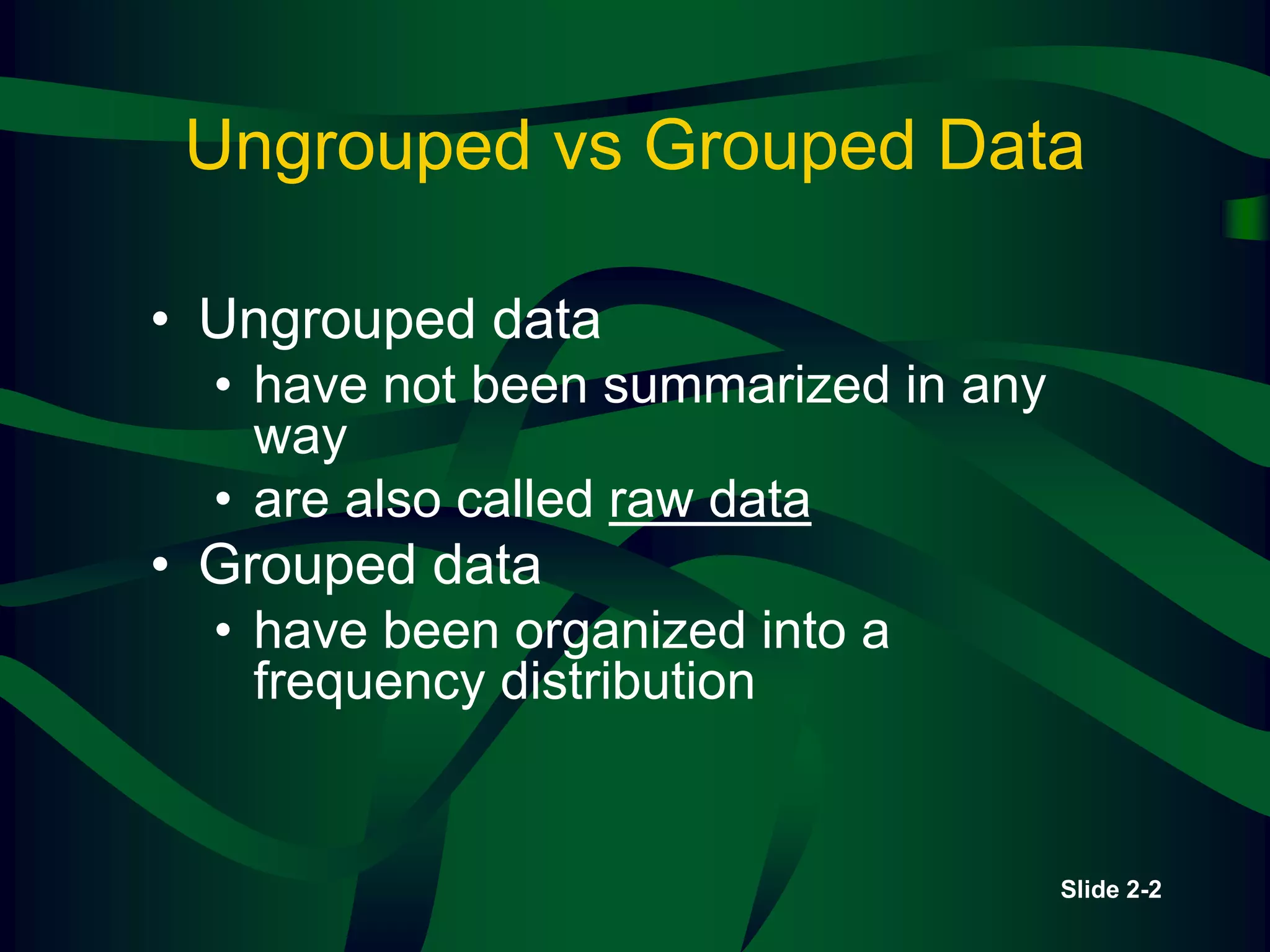
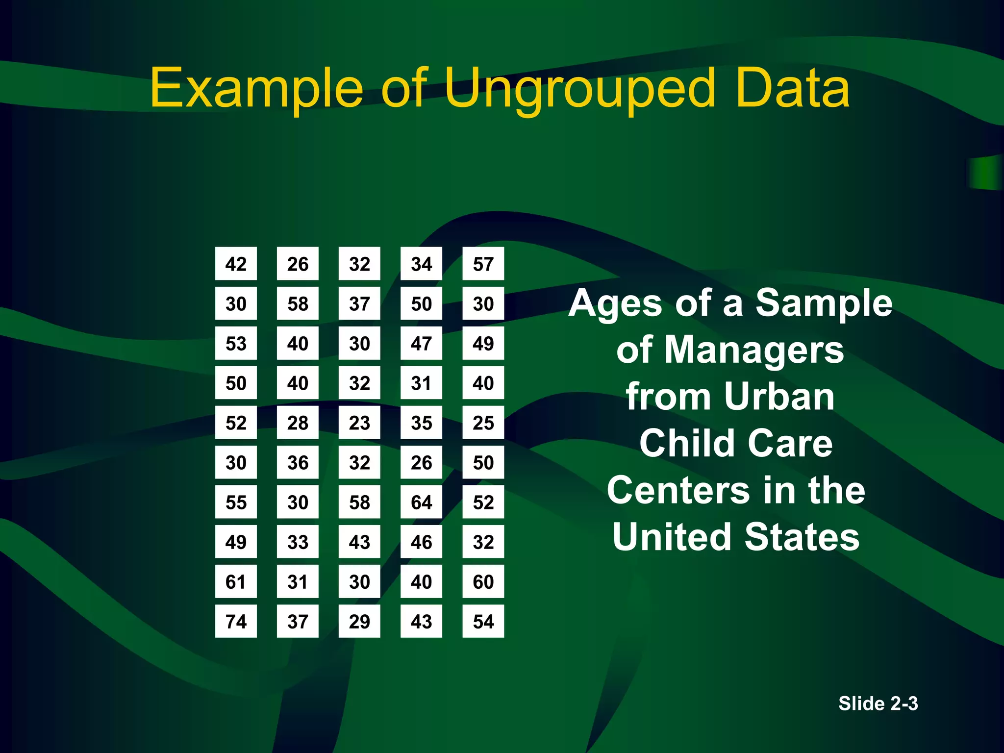
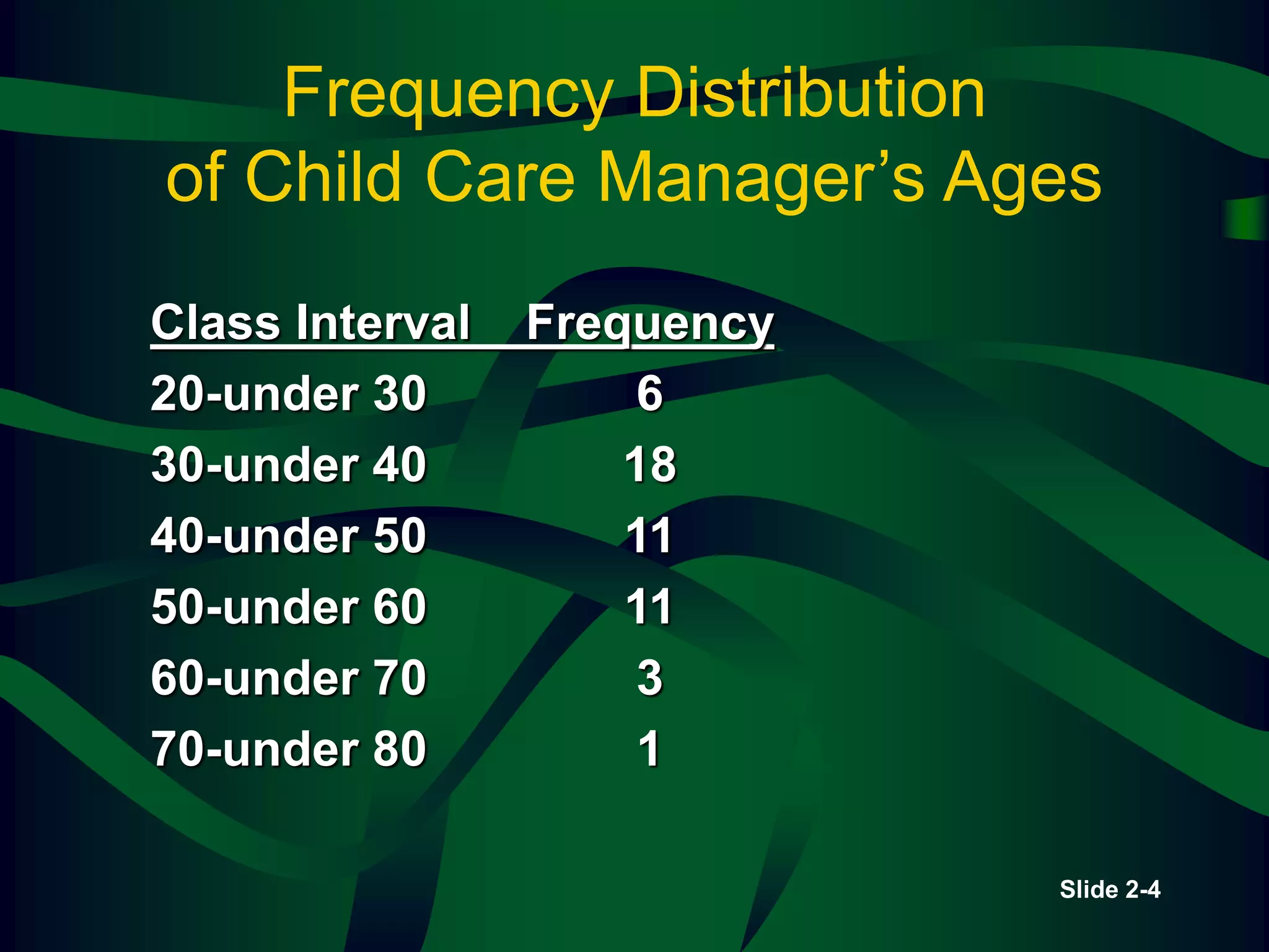
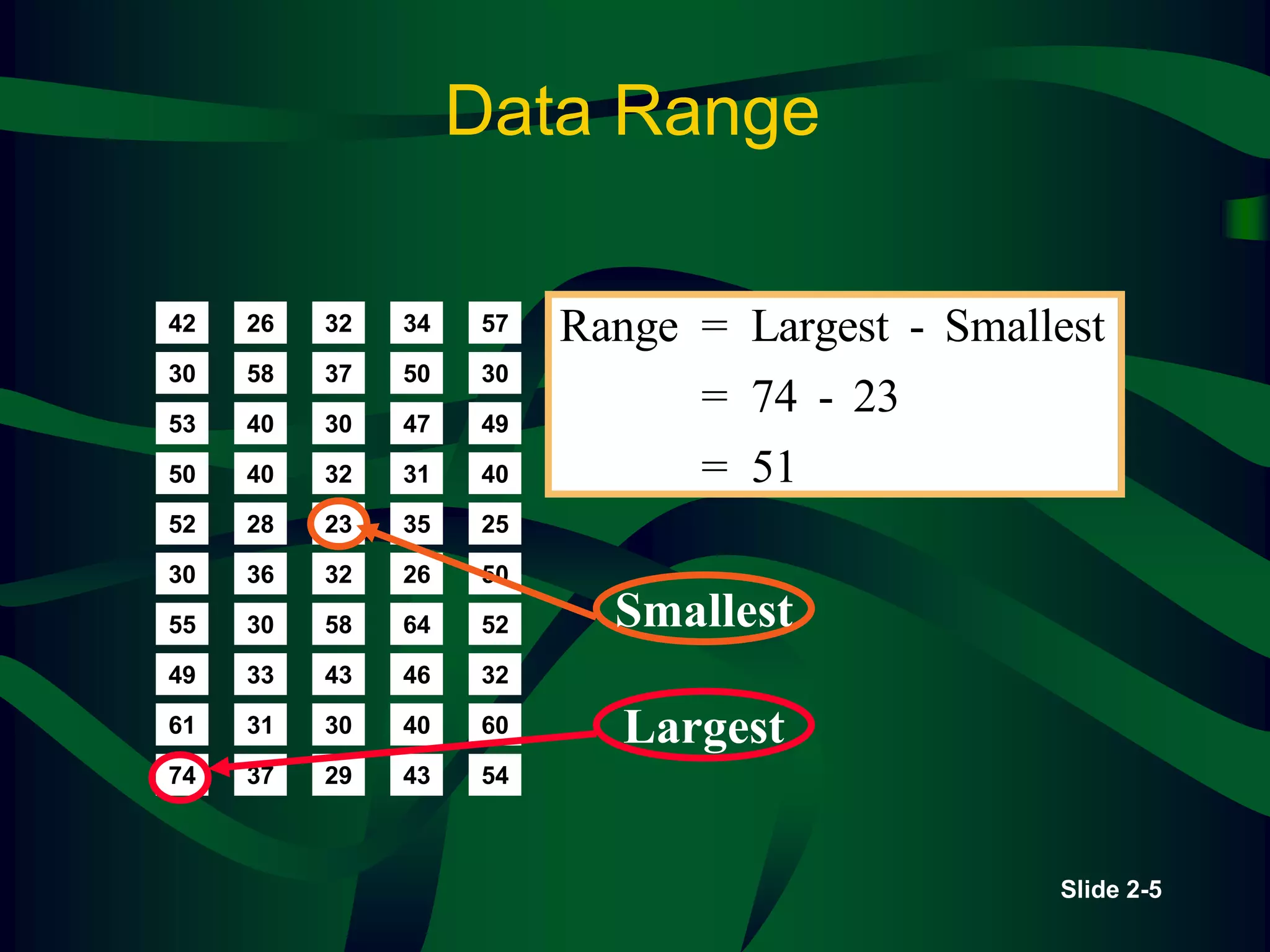
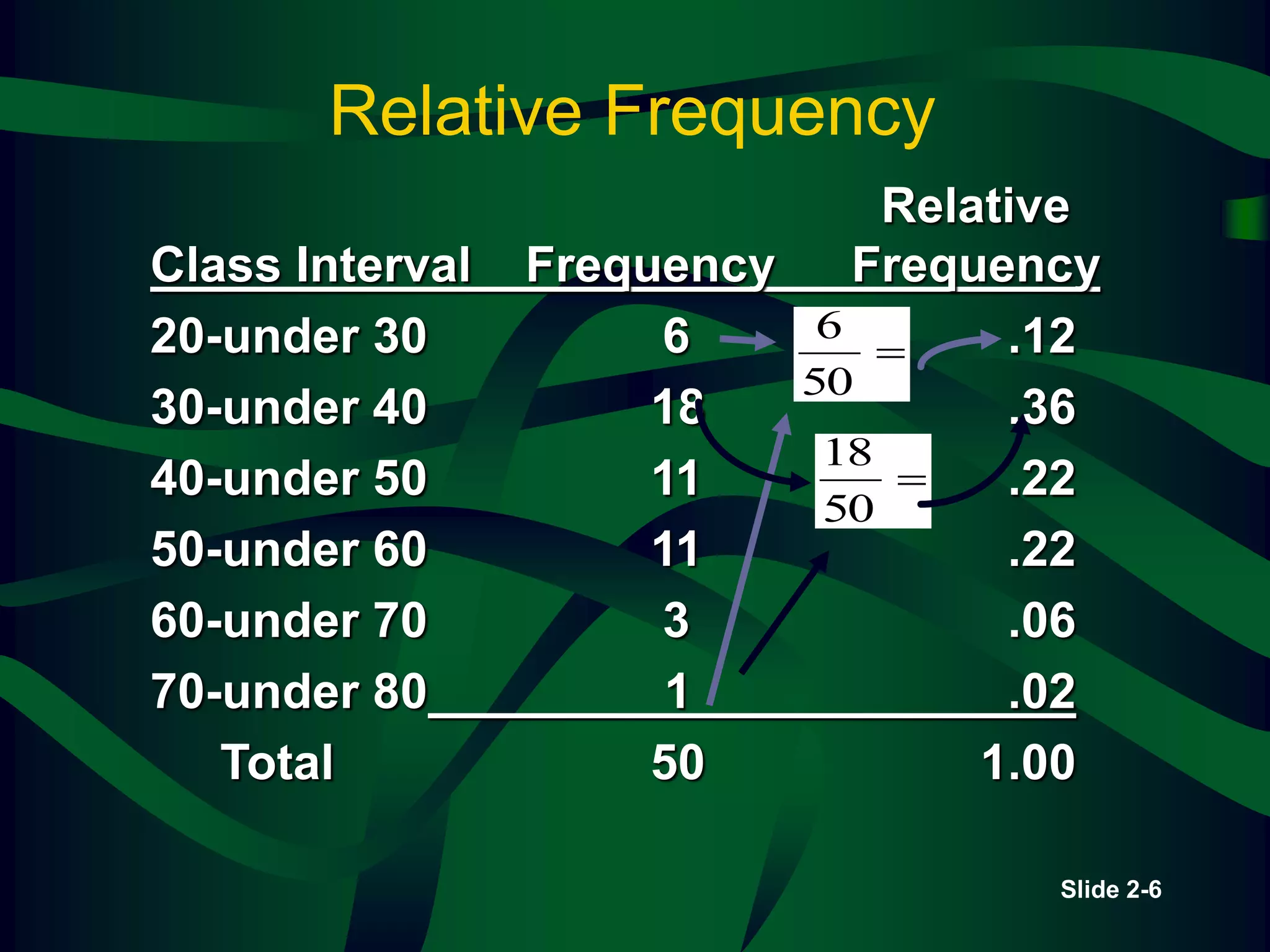
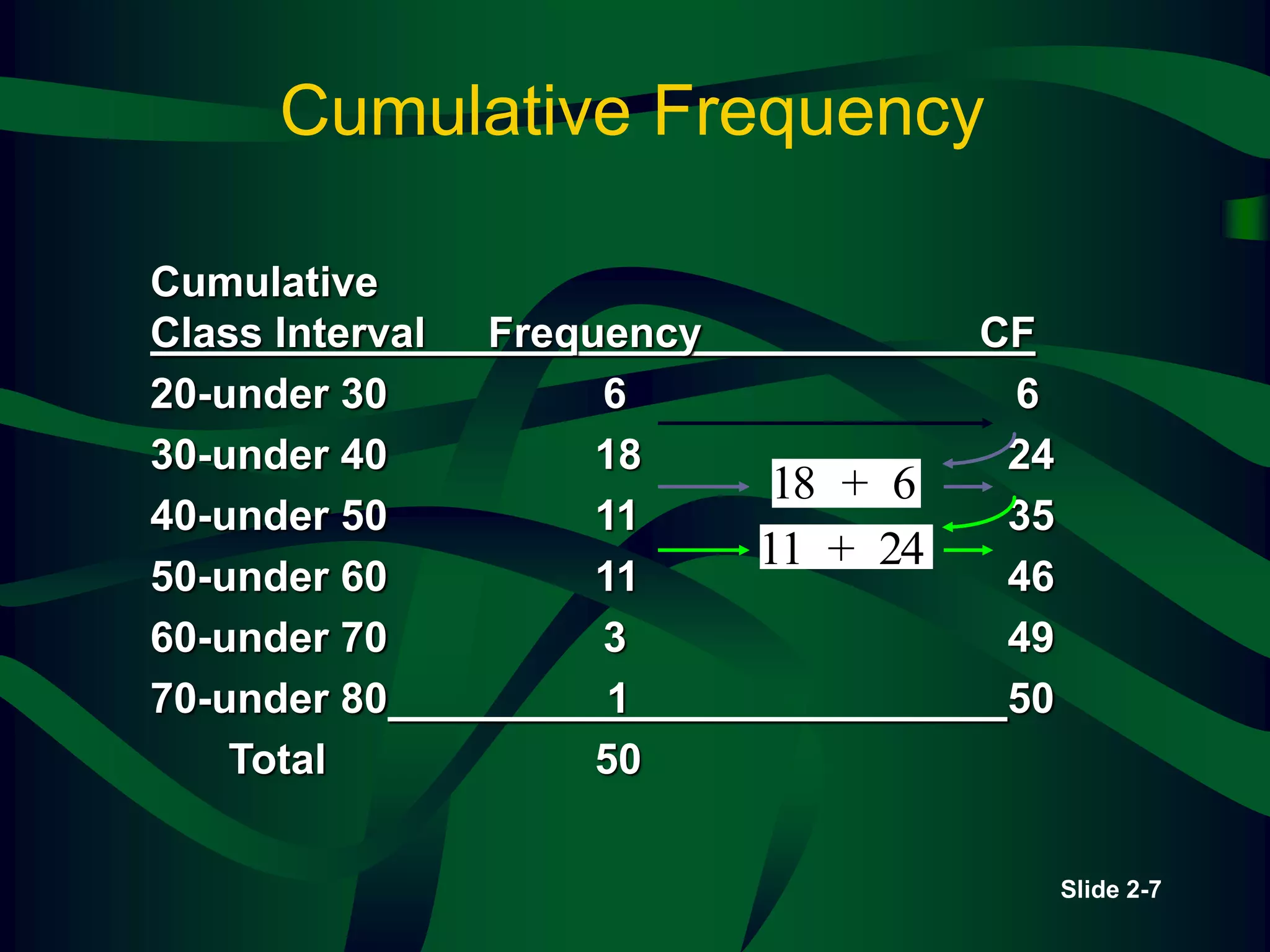
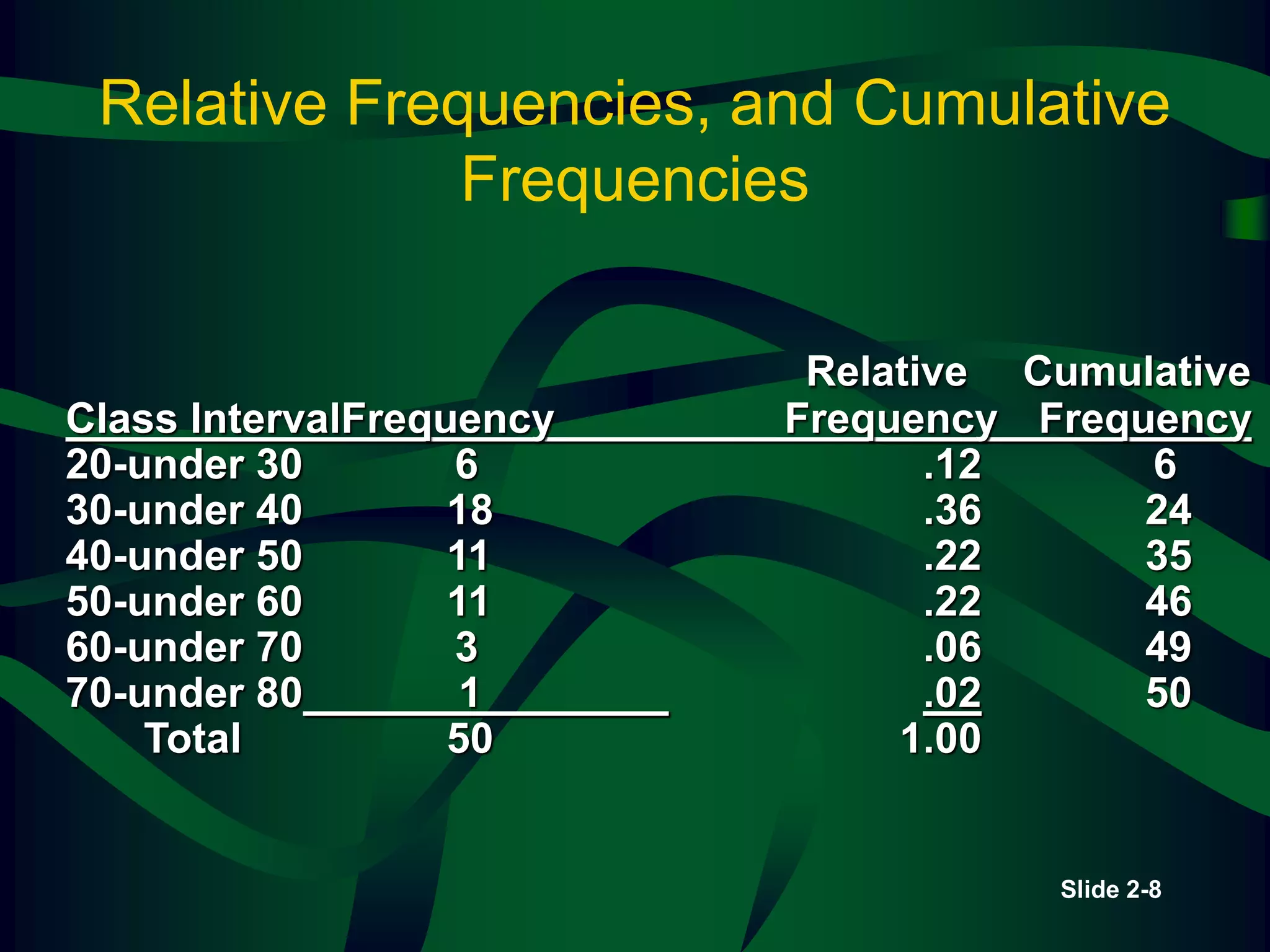
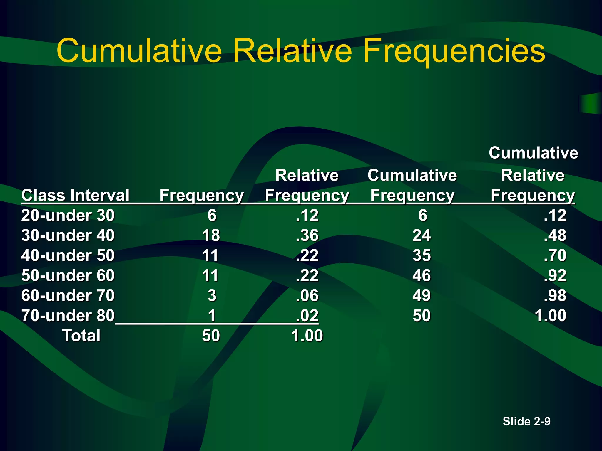
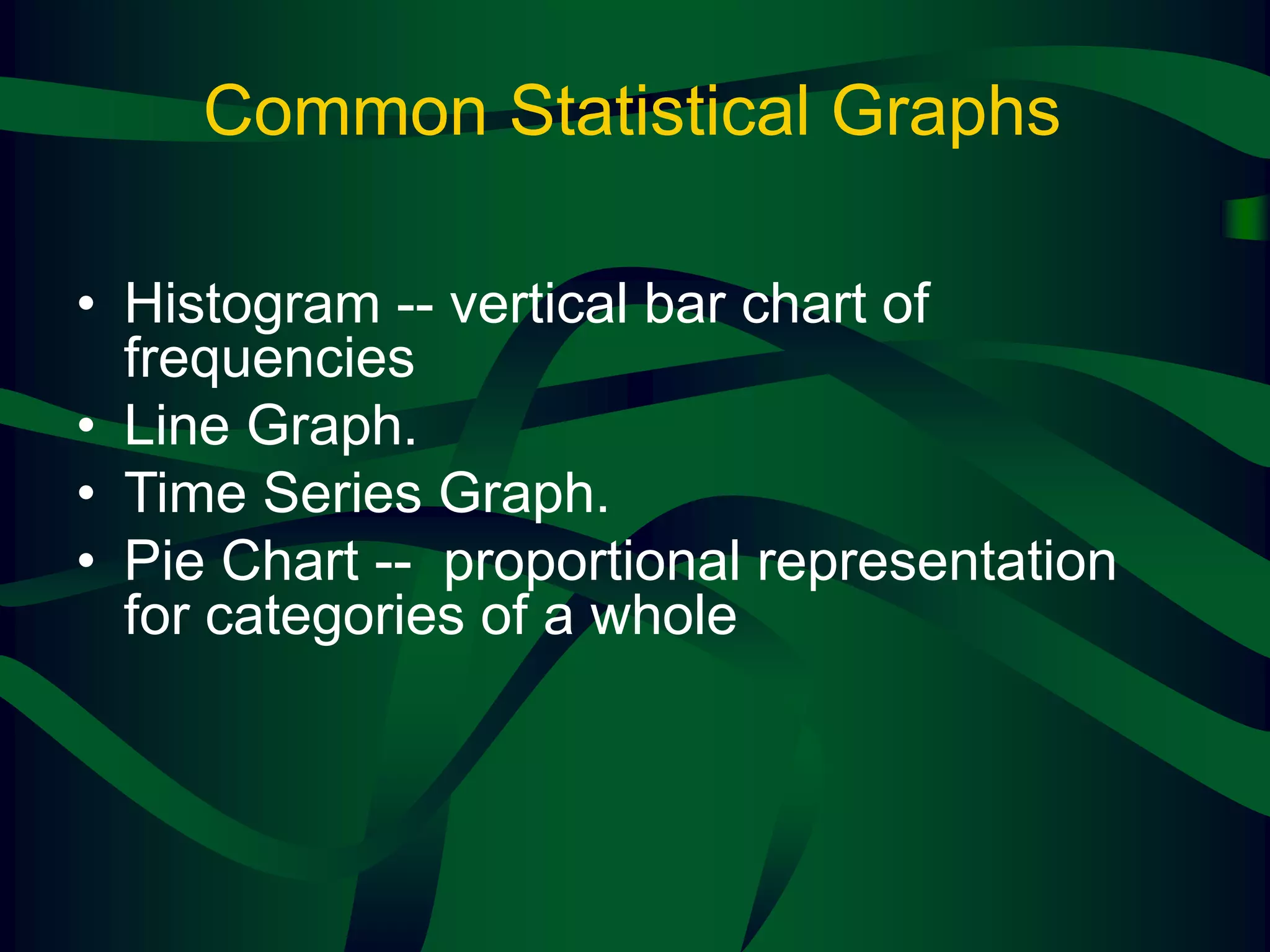
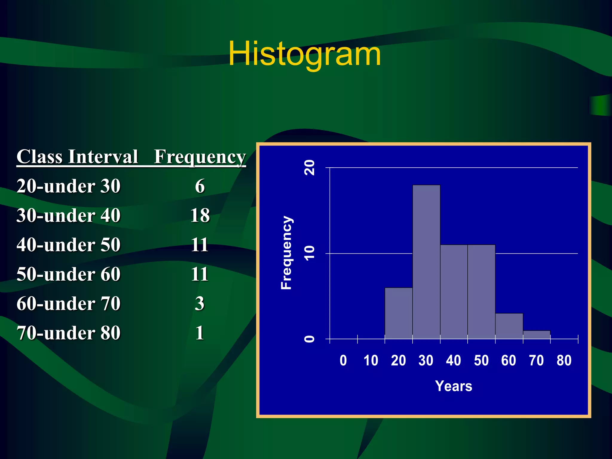
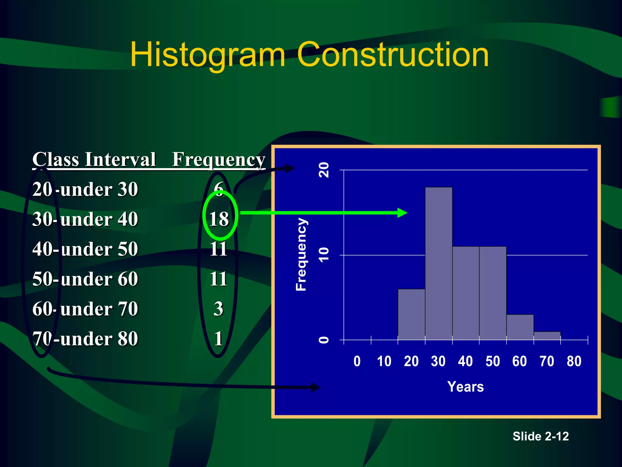
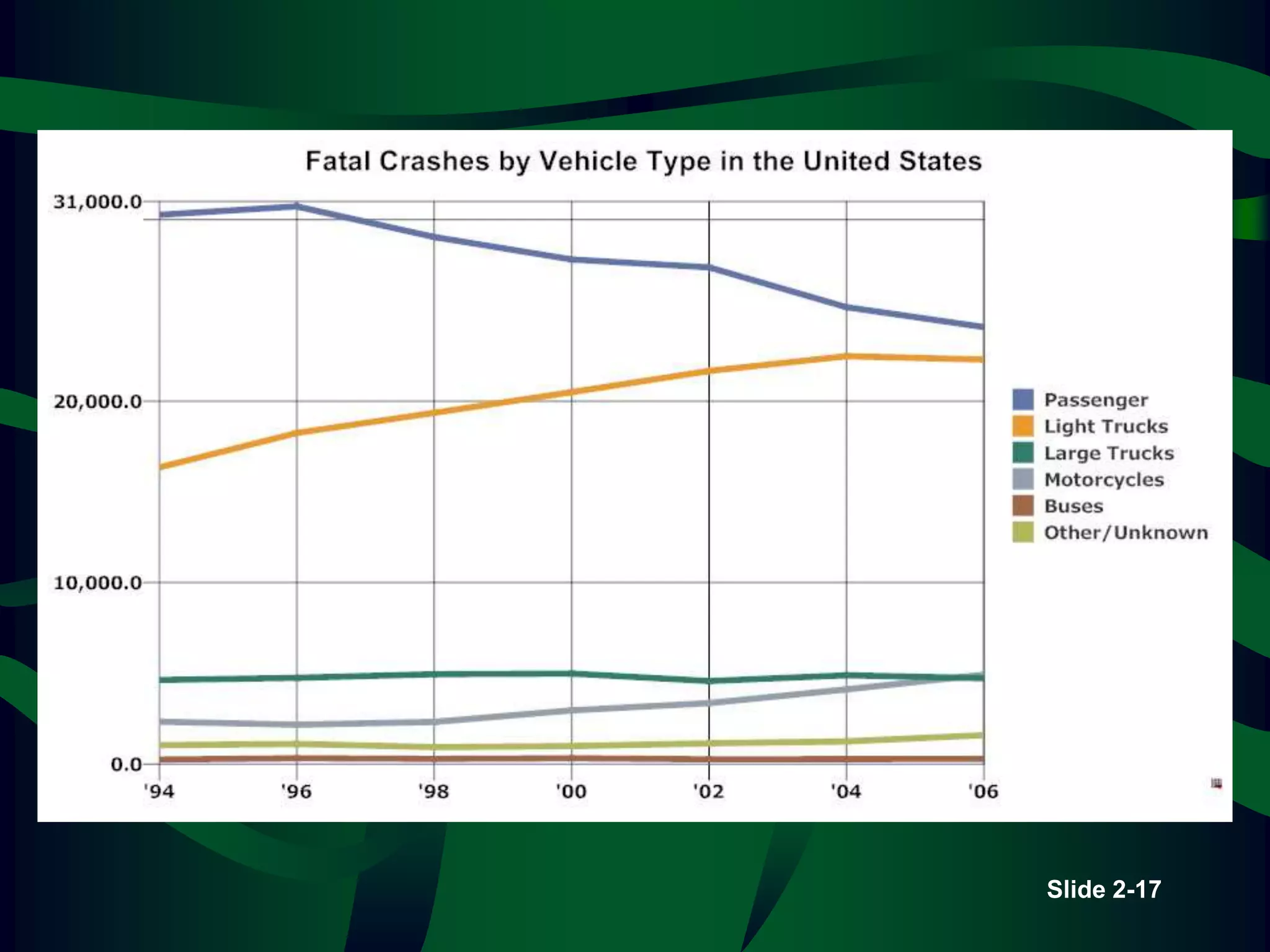
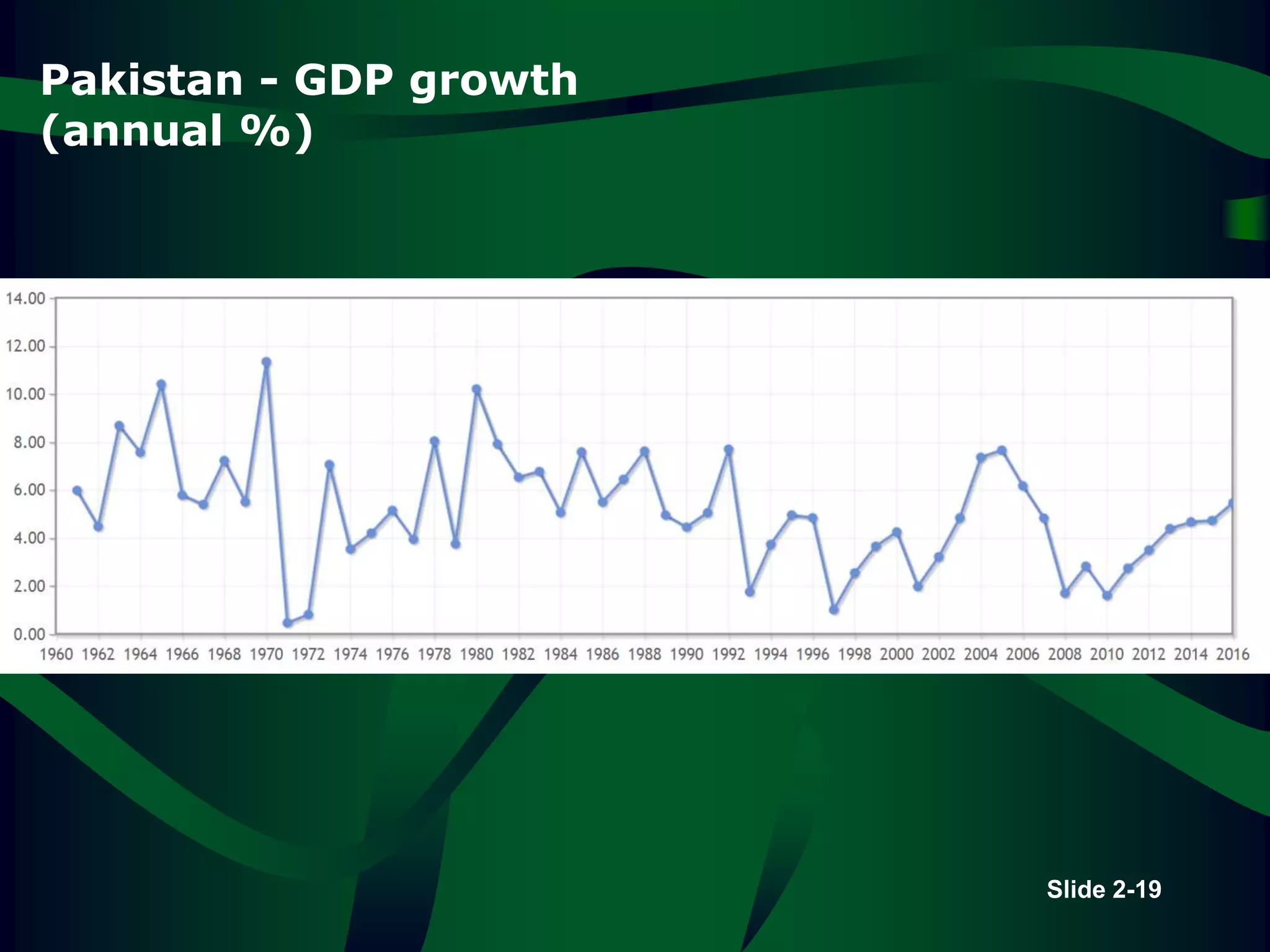
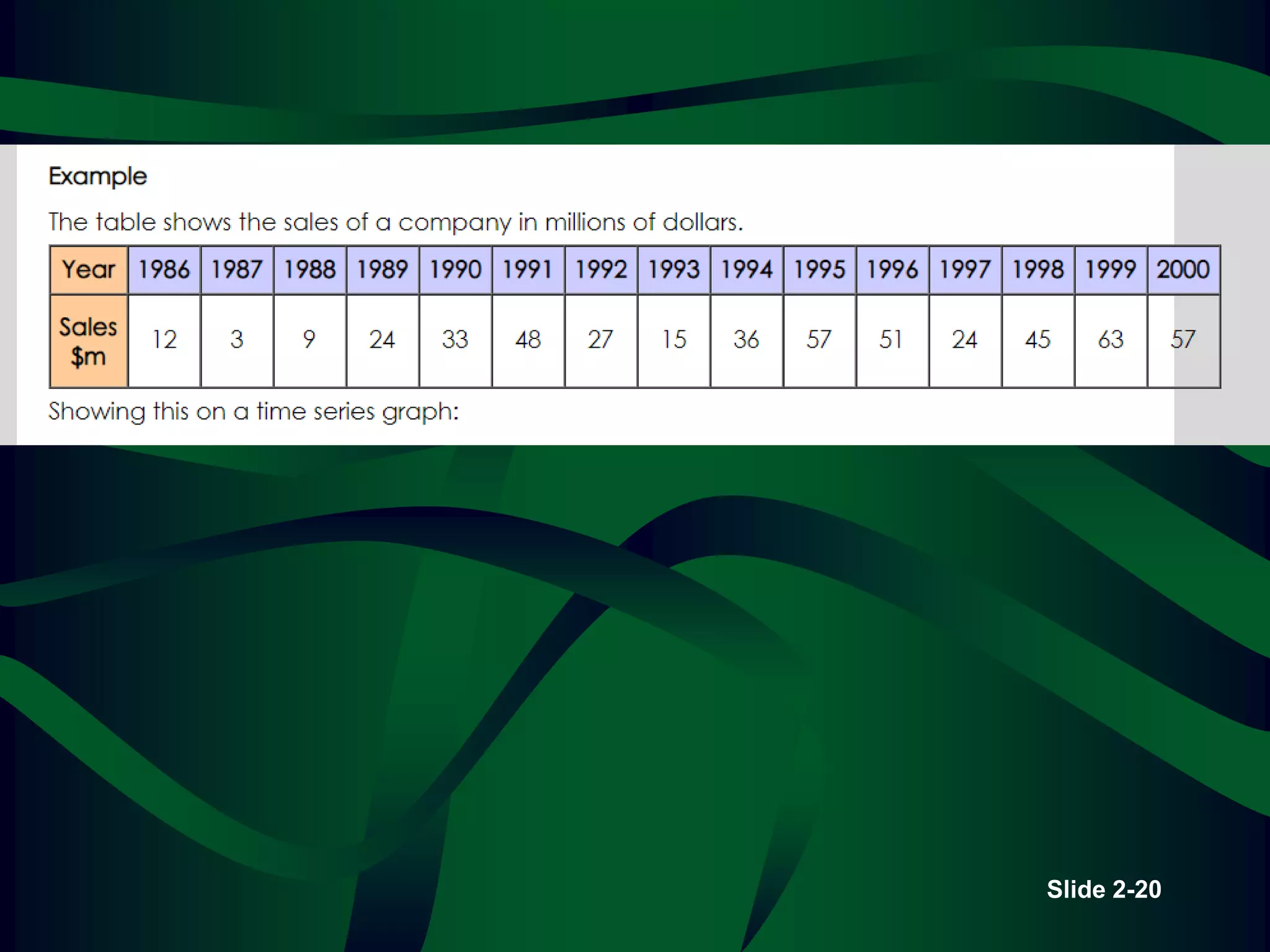
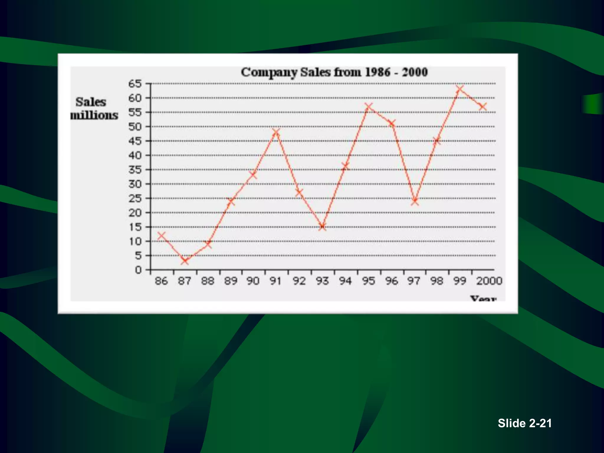
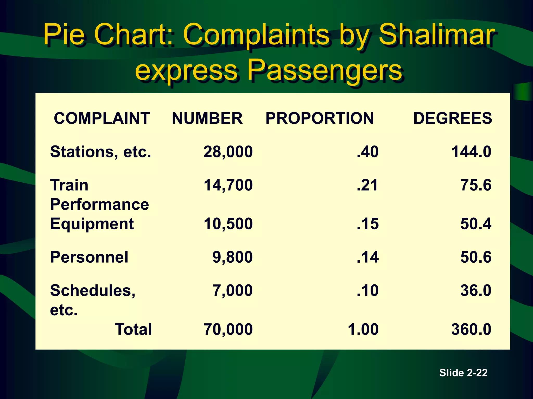
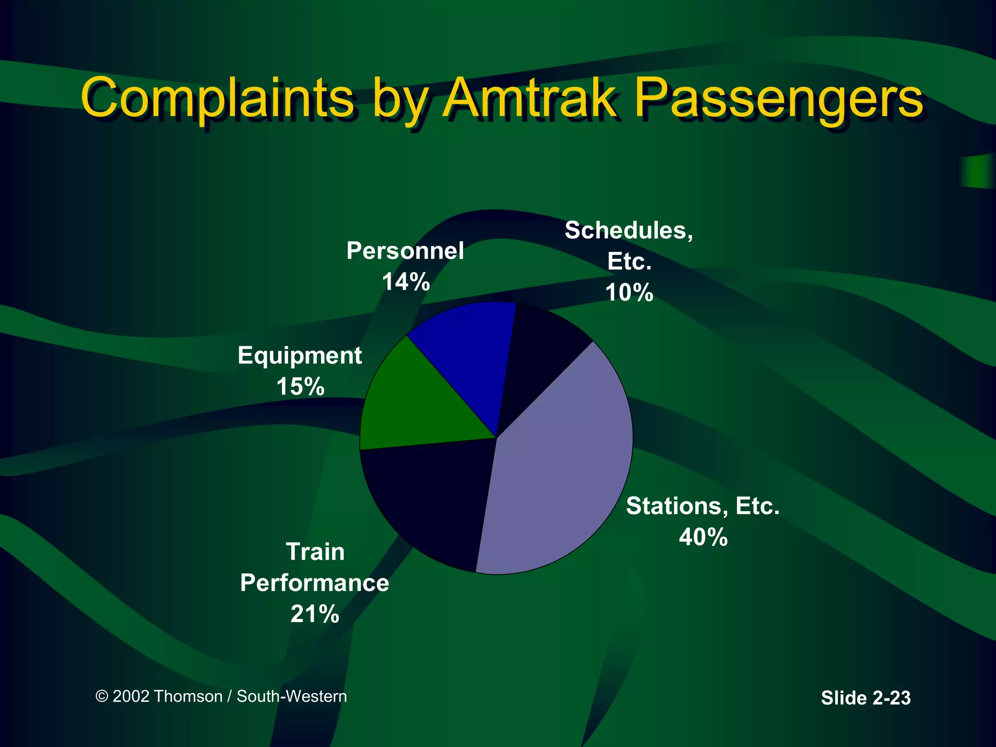
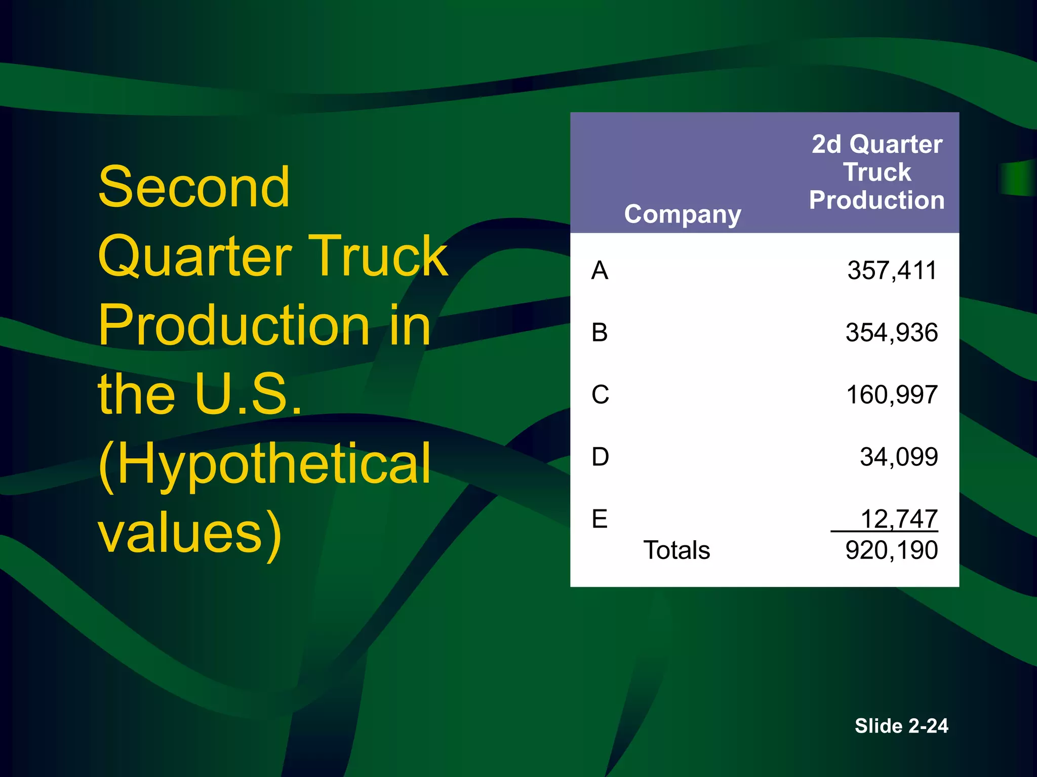
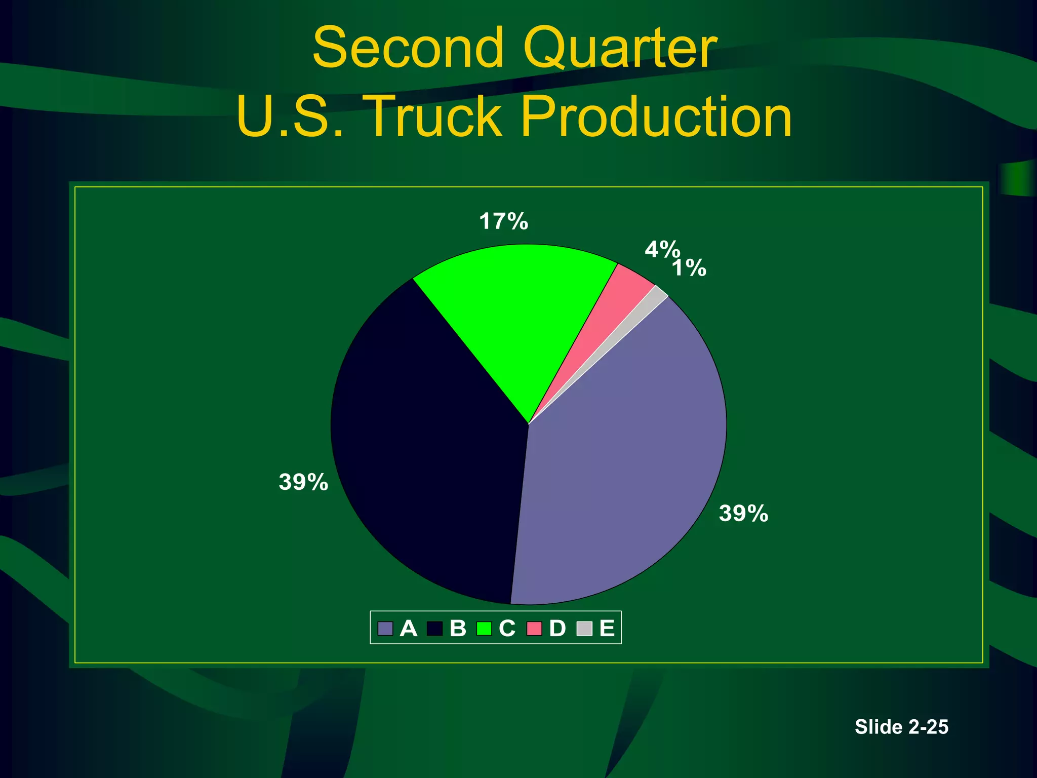
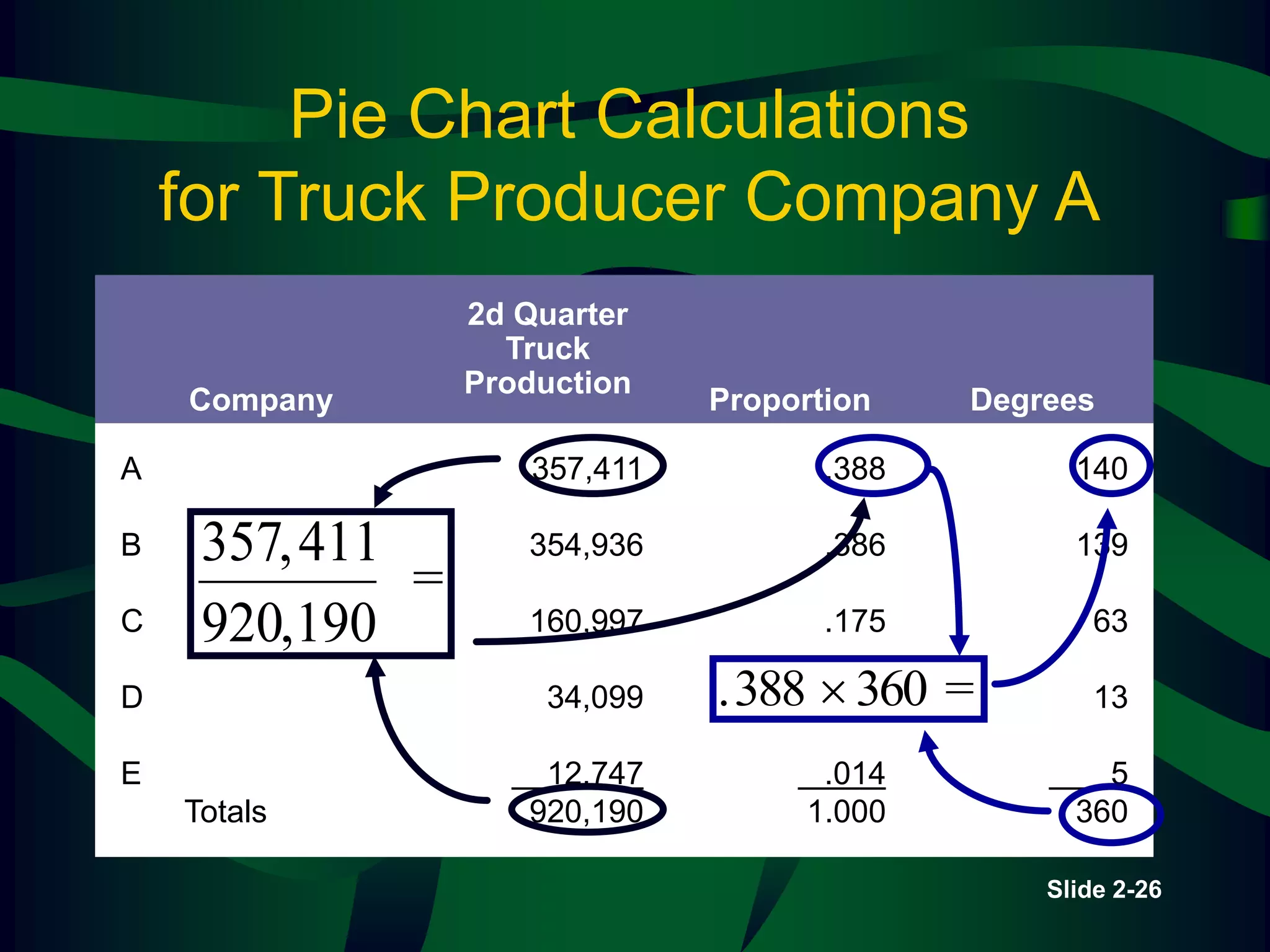
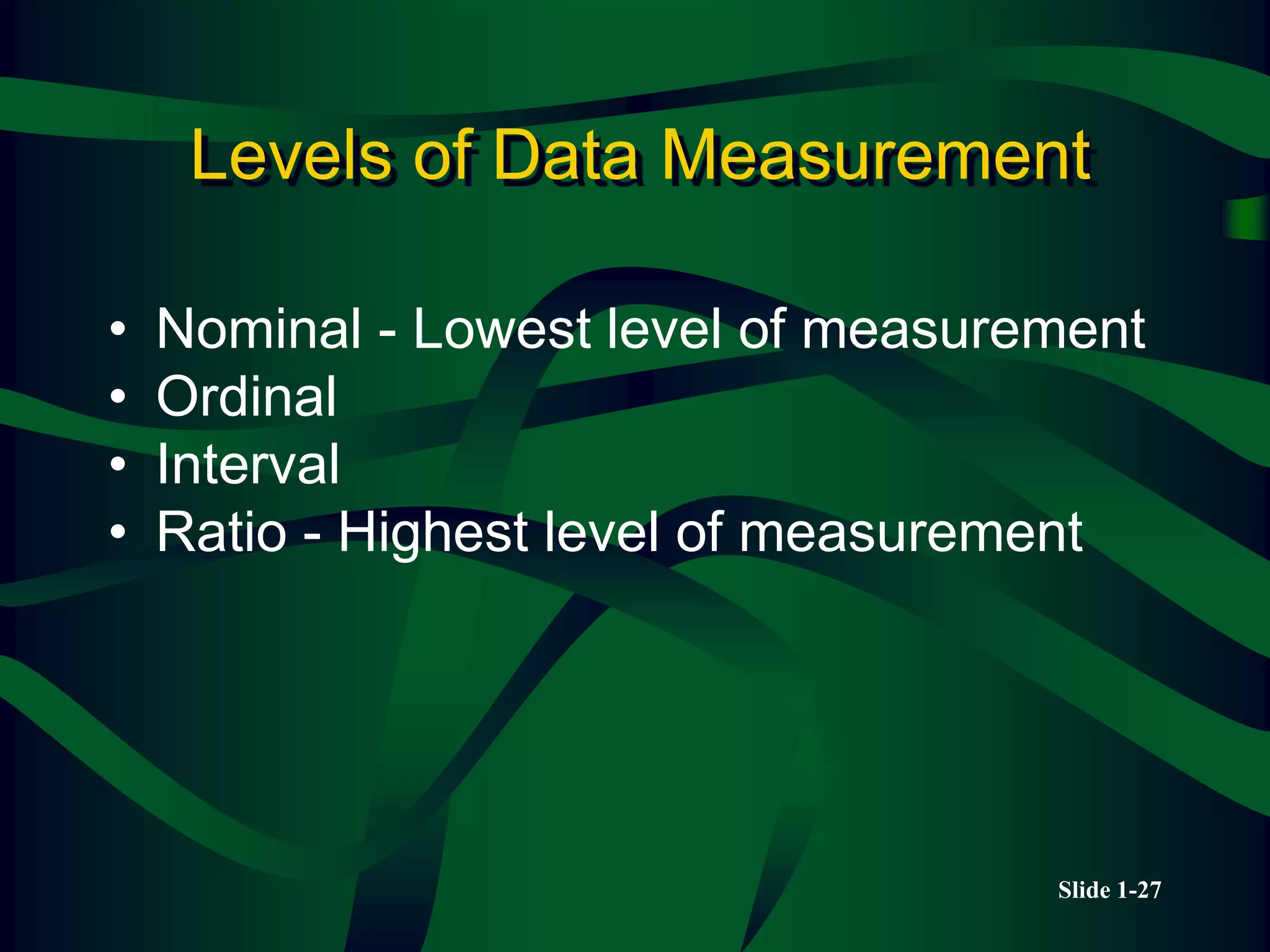
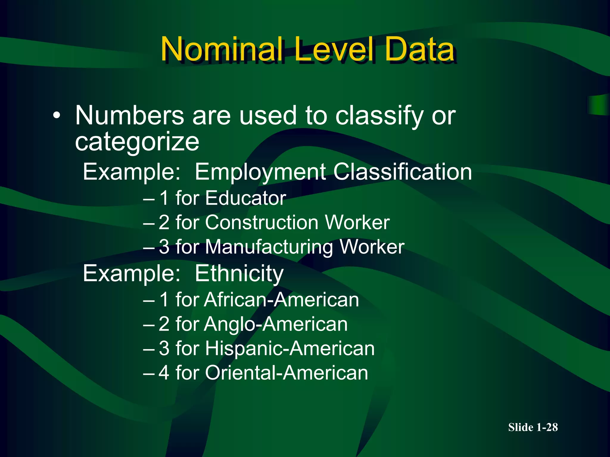
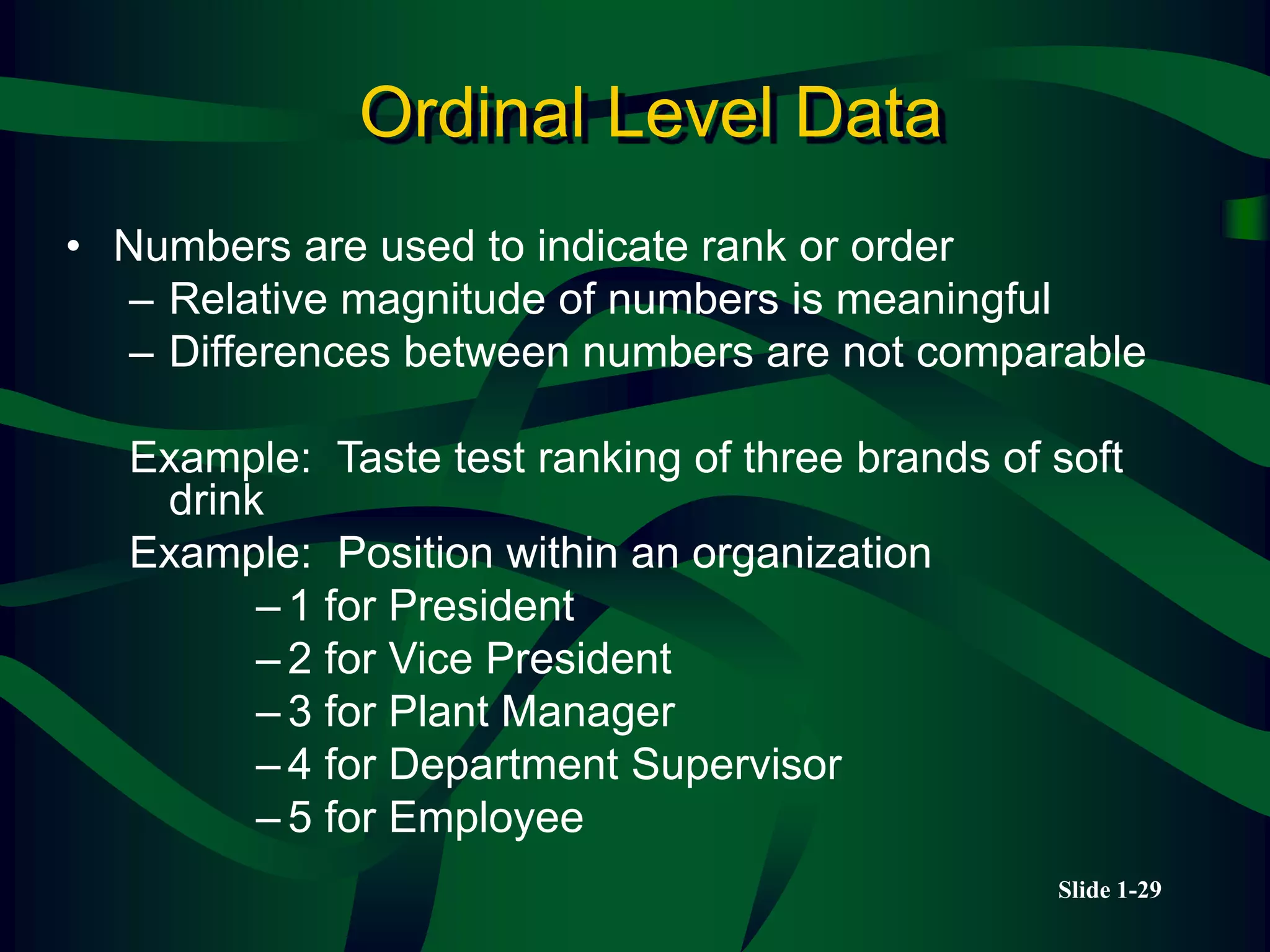
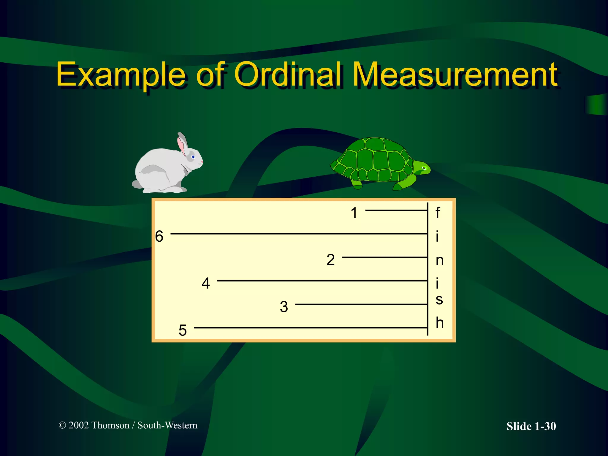
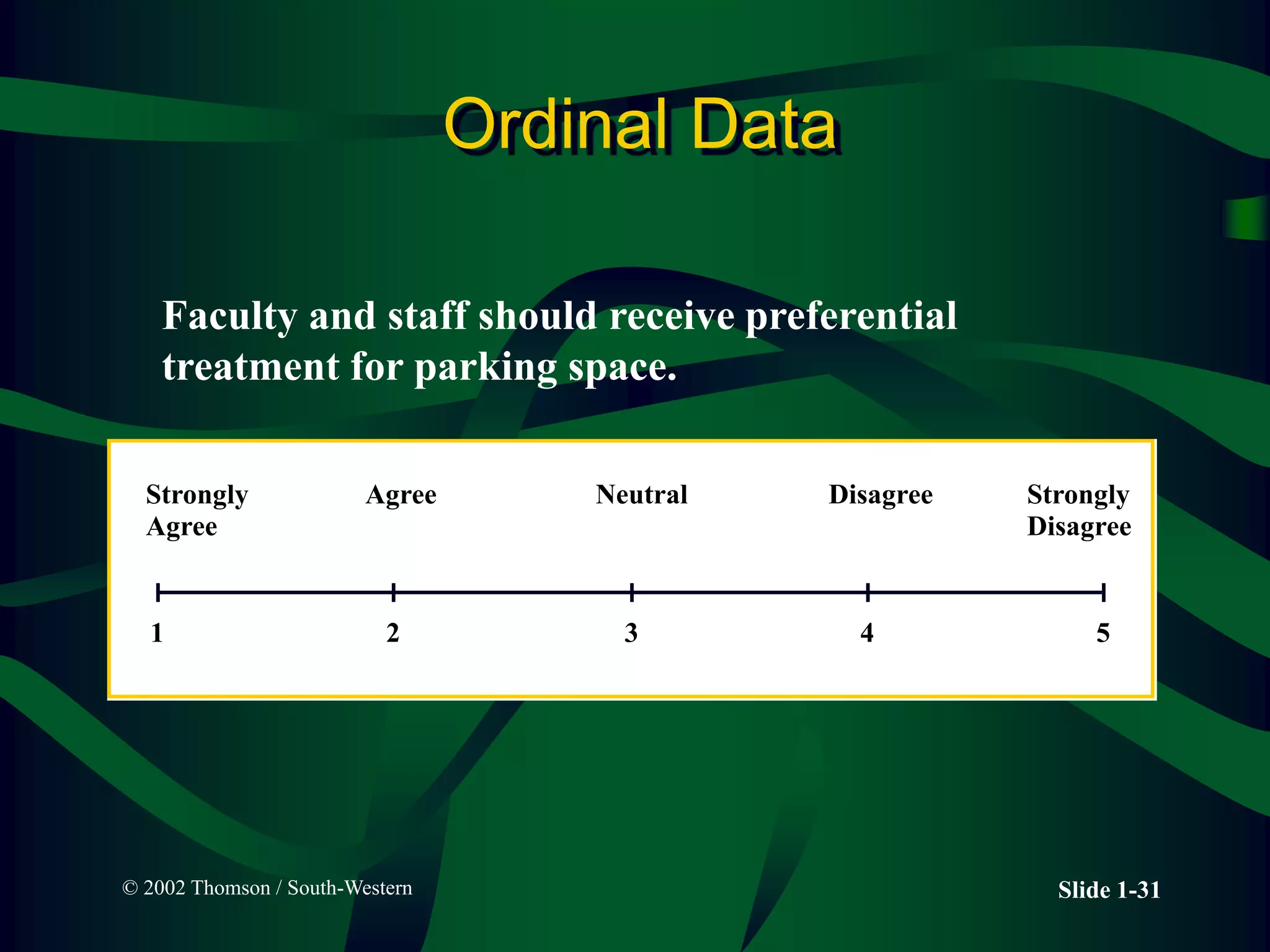
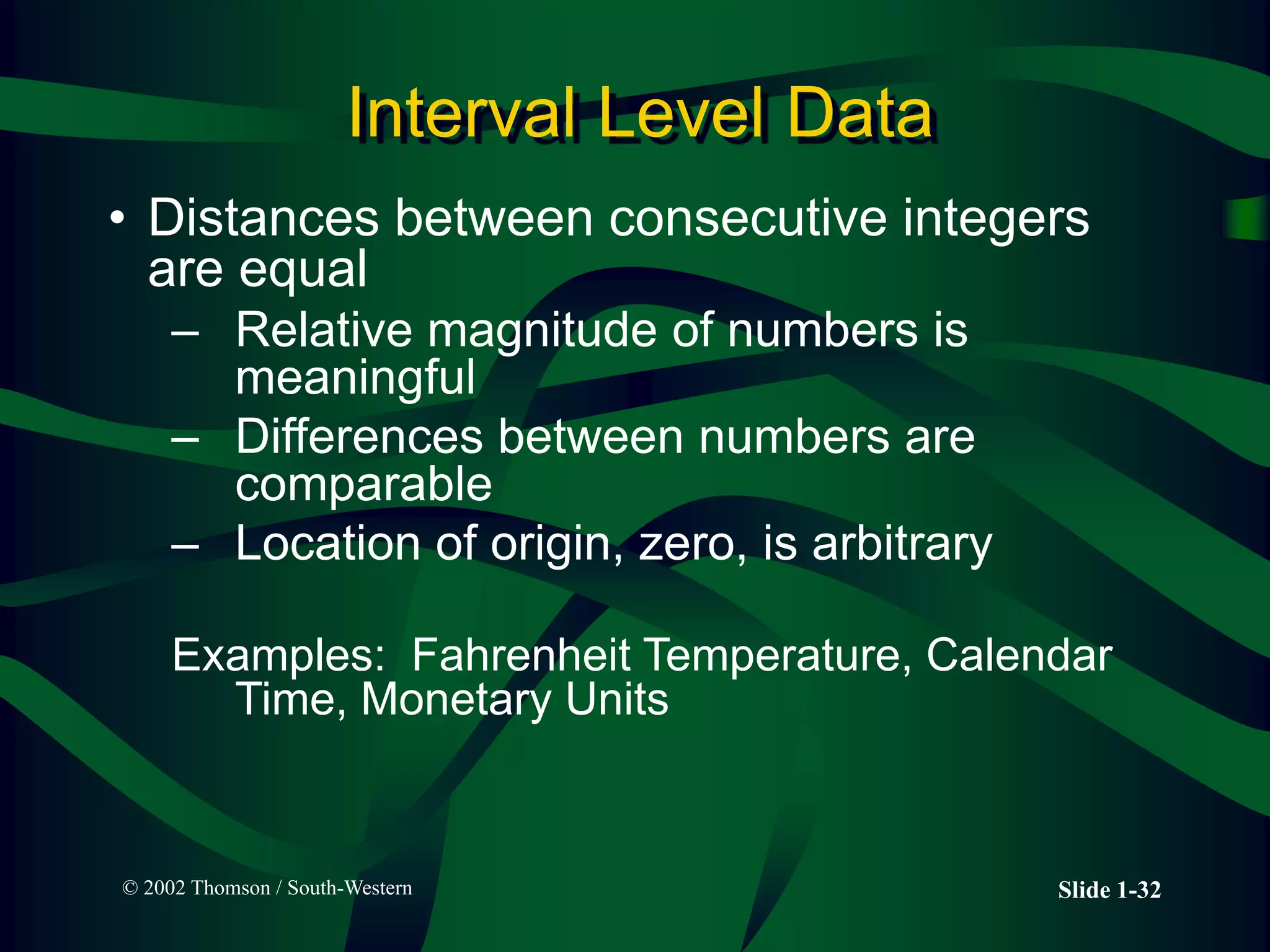
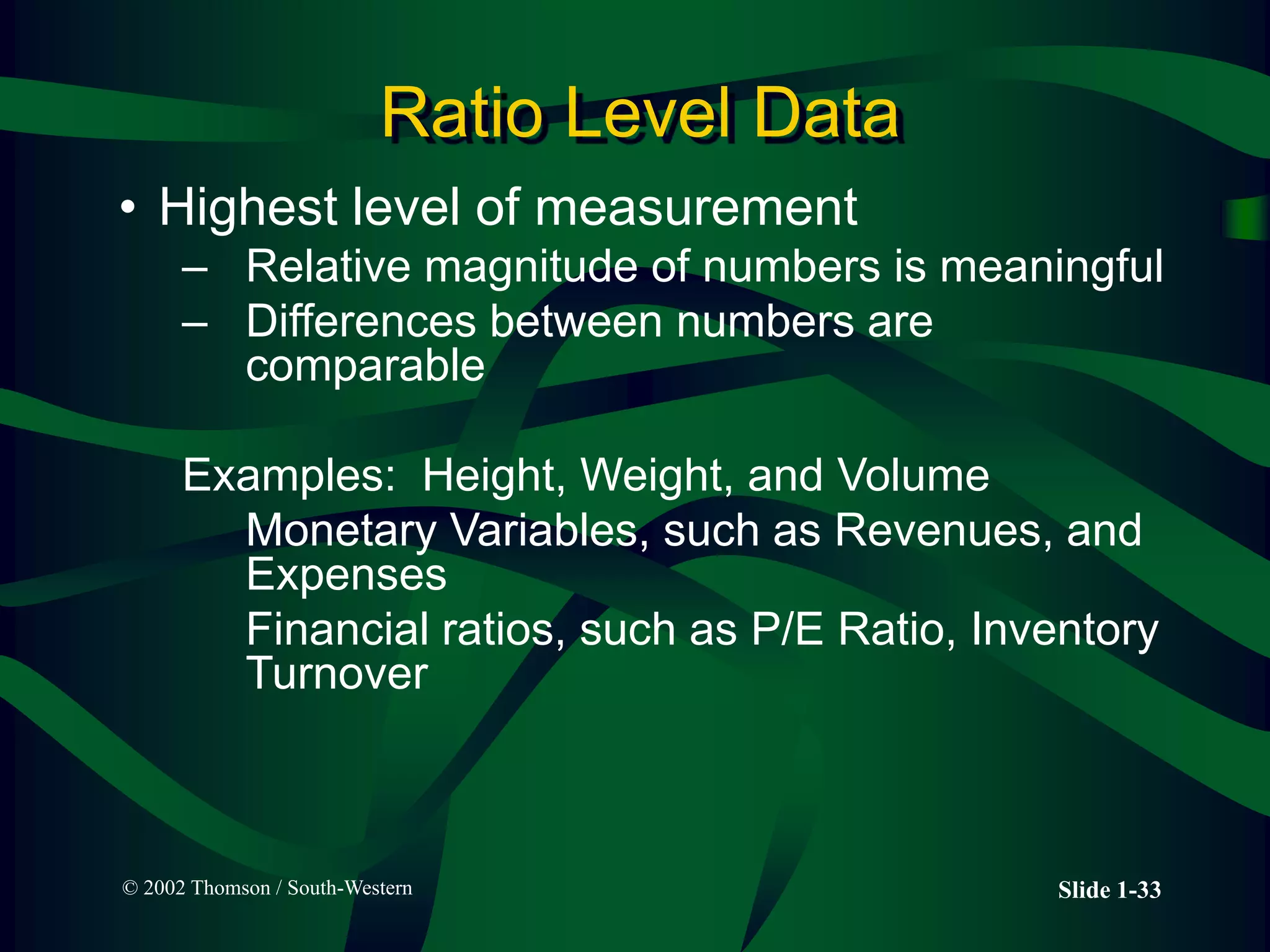
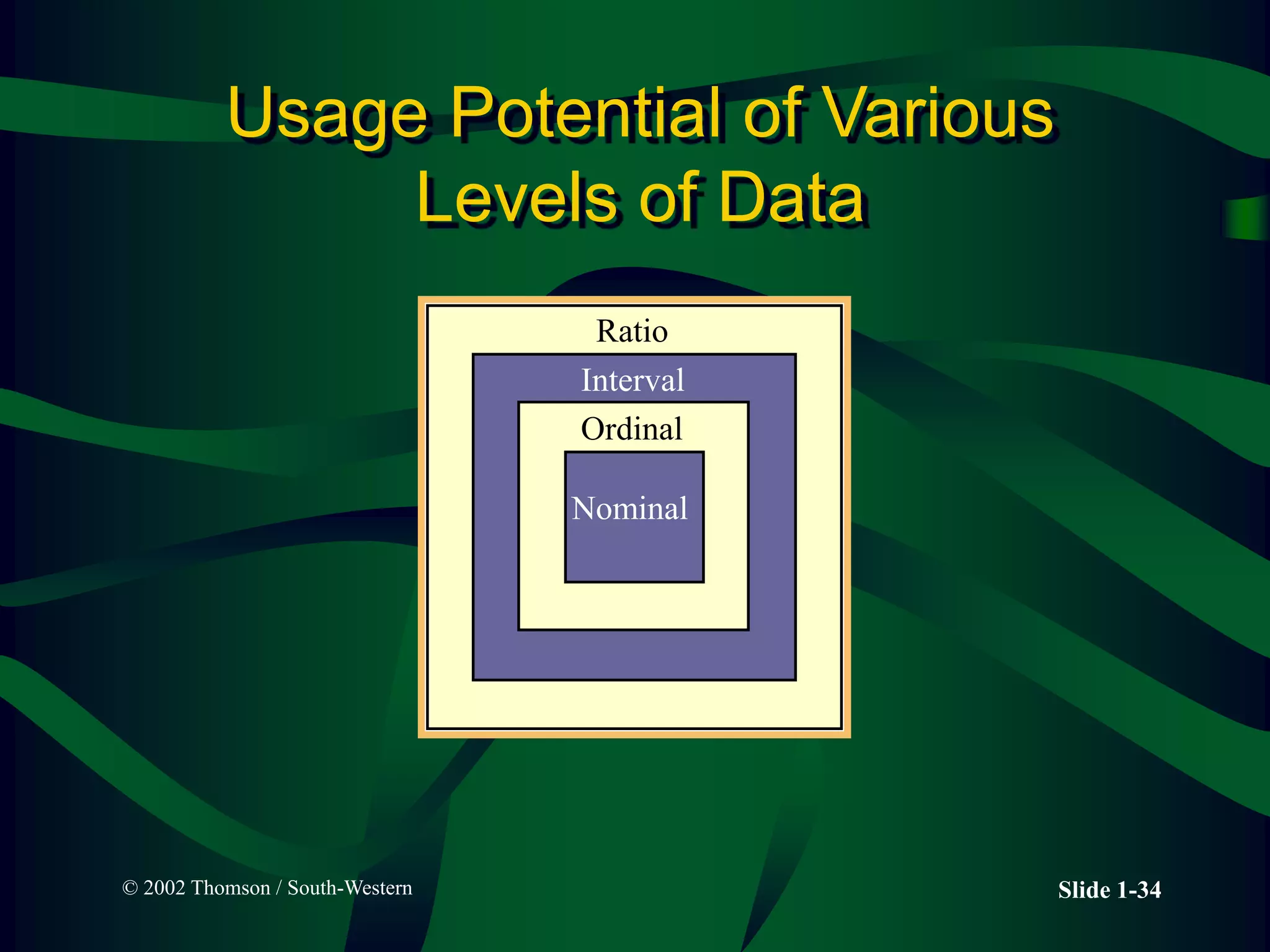
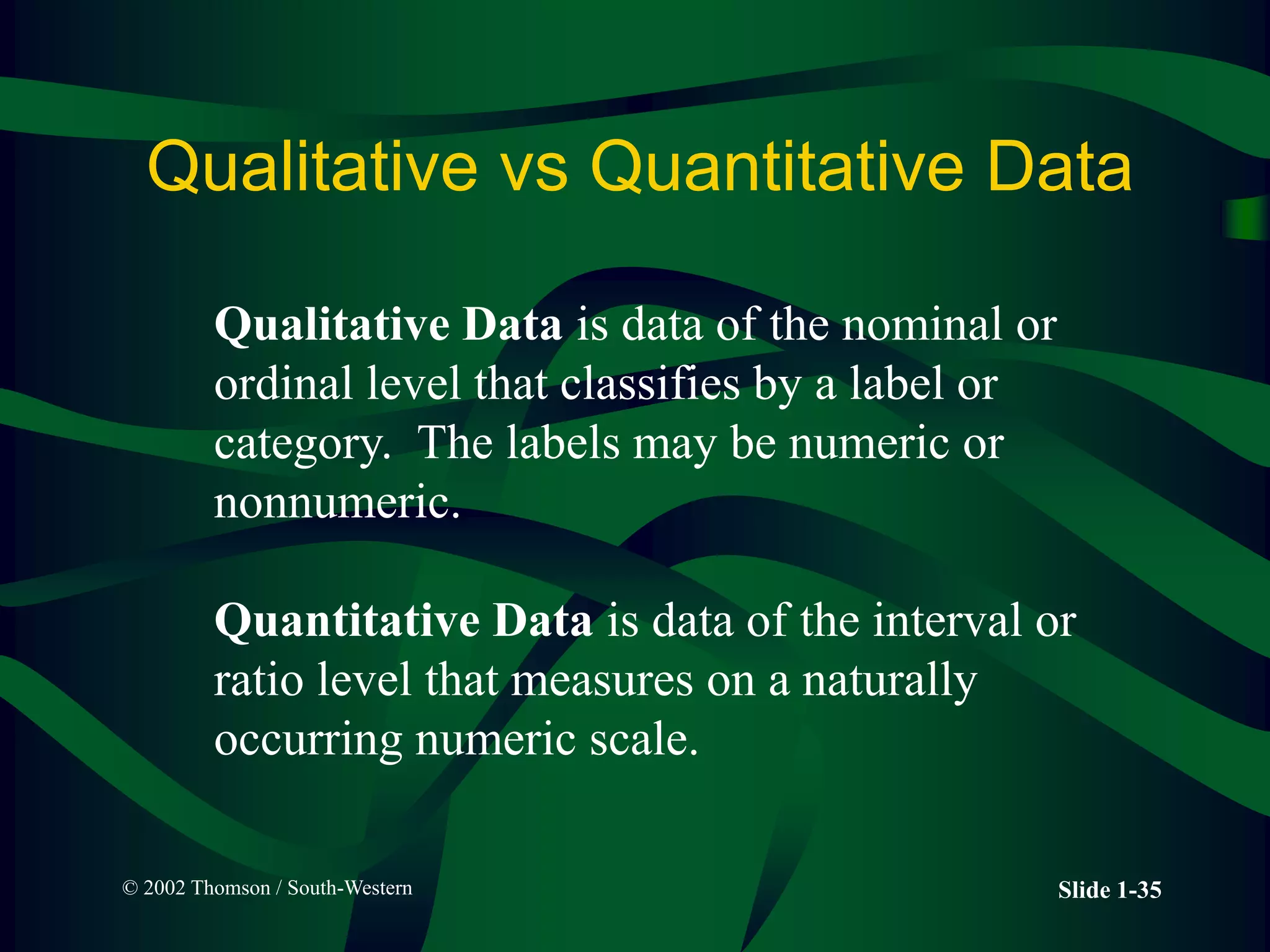
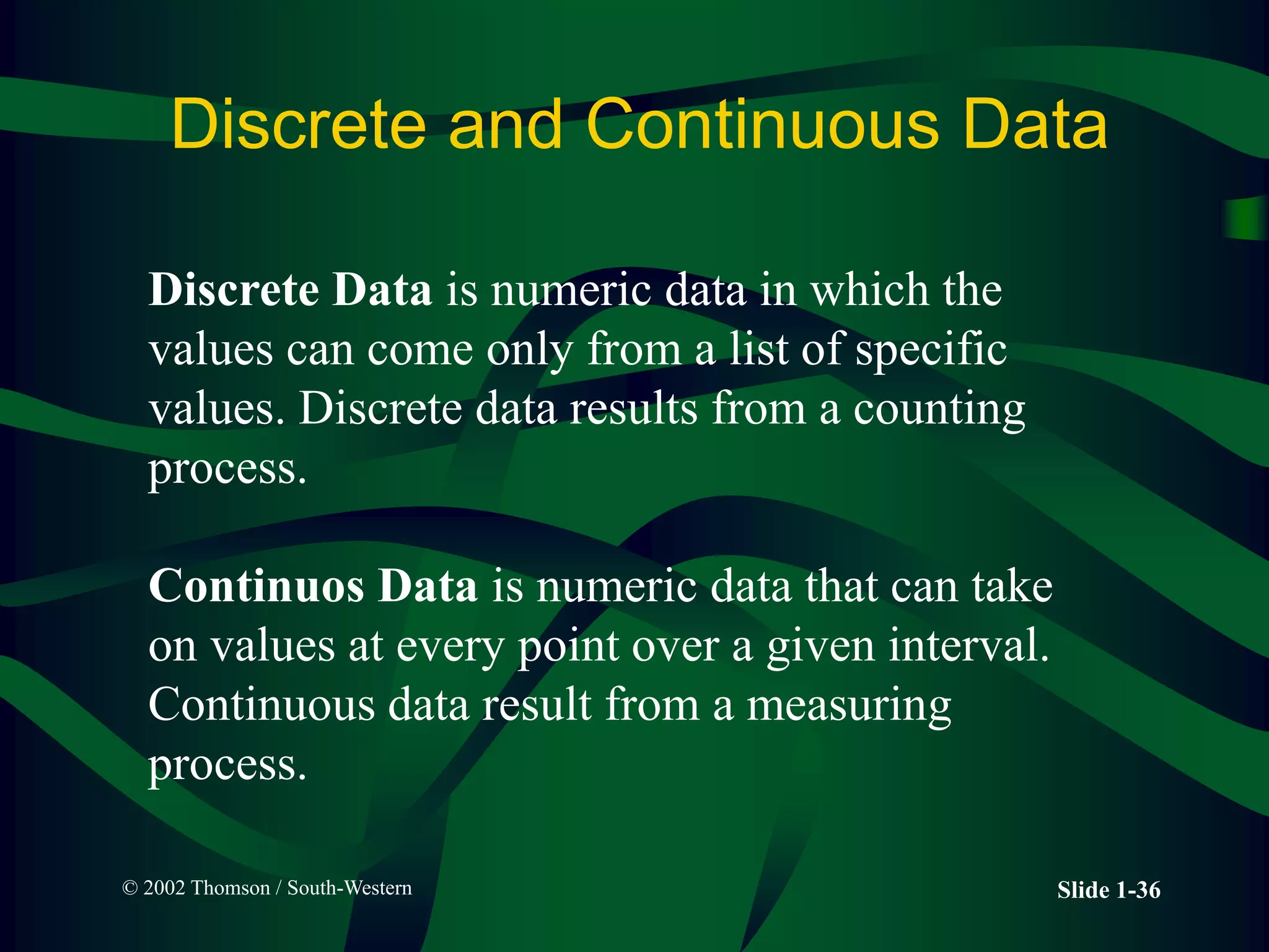
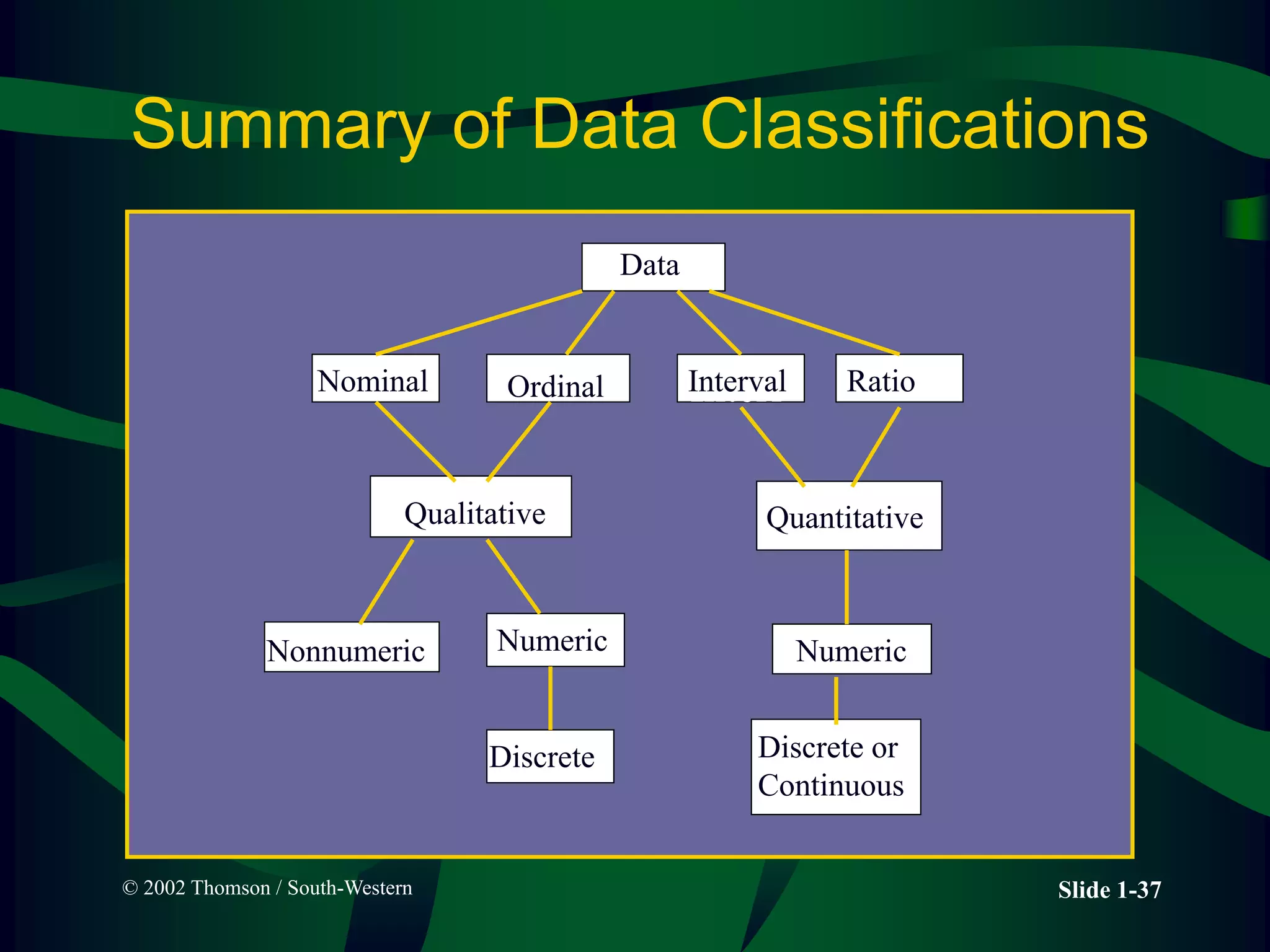
Business statistics
LECTURE 3
Descriptive Charts and
Graphs
Instructor: Araiz Murad Dahir.
Slide 2-2
Ungrouped vs Grouped Data
• Ungrouped data
• have not been summarized in any
way
• are also called raw data
• Grouped data
• have been organized into a
frequency distribution
Slide 2-3
Example of Ungrouped Data
42
30
53
50
52
30
55
49
61
74
26
58
40
40
28
36
30
33
31
37
32
37
30
32
23
32
58
43
30
29
34
50
47
31
35
26
64
46
40
43
57
30
49
40
25
50
52
32
60
54
Ages of a Sample
of Managers
from Urban
Child Care
Centers in the
United States
Slide 2-4
Frequency Distribution
of Child Care Manager’s Ages
Class Interval Frequency
20-under 30 6
30-under 40 18
40-under 50 11
50-under 60 11
60-under 70 3
70-under 80 1
Slide 2-5
Data Range
42
30
53
50
52
30
55
49
61
74
26
58
40
40
28
36
30
33
31
37
32
37
30
32
23
32
58
43
30
29
34
50
47
31
35
26
64
46
40
43
57
30
49
40
25
50
52
32
60
54
Smallest
Largest
Range = Largest - Smallest
= 74 - 23
= 51
Slide 2-6
Relative Frequency
Relative
Class Interval Frequency Frequency
20-under 30 6 .12
30-under 40 18 .36
40-under 50 11 .22
50-under 60 11 .22
60-under 70 3 .06
70-under 80 1 .02
Total 50 1.00
6
50

18
50

Slide 2-7
Cumulative Frequency
Cumulative
Class Interval Frequency CF
20-under 30 6 6
30-under 40 18 24
40-under 50 11 35
50-under 60 11 46
60-under 70 3 49
70-under 80 1 50
Total 50
18 + 6
11 + 24
Slide 2-8
Relative Frequencies, and Cumulative
Frequencies
Relative Cumulative
Class IntervalFrequency Frequency Frequency
20-under 30 6 .12 6
30-under 40 18 .36 24
40-under 50 11 .22 35
50-under 60 11 .22 46
60-under 70 3 .06 49
70-under 80 1 .02 50
Total 50 1.00
Slide 2-9
Cumulative Relative Frequencies
Cumulative
Relative Cumulative Relative
Class Interval Frequency Frequency Frequency Frequency
20-under 30 6 .12 6 .12
30-under 40 18 .36 24 .48
40-under 50 11 .22 35 .70
50-under 60 11 .22 46 .92
60-under 70 3 .06 49 .98
70-under 80 1 .02 50 1.00
Total 50 1.00
Common Statistical Graphs
• Histogram -- vertical bar chart of
frequencies
• Line Graph.
• Time Series Graph.
• Pie Chart -- proportional representation
for categories of a whole
Histogram
Class Interval Frequency
20-under 30 6
30-under 40 18
40-under 50 11
50-under 60 11
60-under 70 3
70-under 80 1
0
10
20
0 10 20 30 40 50 60 70 80
Years
Frequency
Slide 2-12
Histogram Construction
Class Interval Frequency
20-under 30 6
30-under 40 18
40-under 50 11
50-under 60 11
60-under 70 3
70-under 80 1
0
10
20
0 10 20 30 40 50 60 70 80
Years
Frequency
QUESTION
• Make Histogram of SUSPECTED
NUCLEAR WEAPONS.
• 1. USA 15500
• 2. RUSSIA 15000
• 3. FRANCE 482
• 4. CHINA 410
• 5. UK 200
• 6. ISRAEL 100
Slide 2-13
Suspected Nuclear Weapons
15500
15000
482 410 200 100 60 20
0
2000
4000
6000
8000
10000
12000
14000
16000
18000
U
n
i
t
e
d
S
t
a
t
e
s
R
u
s
s
i
a
F
r
a
n
c
e
C
h
i
n
a
U
n
i
t
e
d
K
i
n
g
d
o
m
I
s
r
a
e
l
I
n
d
i
a
P
a
k
i
s
t
a
n
Source: Center for Defense Information
Slide 2-15
Line Graph
- A line graph, also known as a line chart, is a
type of chart used to visualize the value of
something over time.
- For example, a finance department may plot the
change in the amount of cash the company has
on hand over time.
- Data points are plotted and connected by a line in a
"dot-to-dot" fashion.
Slide 2-16
- More than one line may be plotted in the same axis as a form
of comparison.
- For example, you could create a line graph comparing Fatal
accidents by vehicle types. In this case each line would have
a different color, identified in a legend.
Line Graph
Slide 2-17
Slide 2-18
- A time series graph is a line graph of repeated measurements
taken over regular time intervals.
- Time is always shown on the horizontal axis.
- On time series graphs data points are drawn at regular
intervals and the points joined, usually with straight lines.
- Time series graphs help to show trends or patterns.
Line Graph type:
Time series graph
Slide 2-19
Pakistan - GDP growth
(annual %)
Slide 2-20
Slide 2-21
Slide 2-22
Pie Chart: Complaints by Shalimar
express Passengers
COMPLAINT NUMBER PROPORTION DEGREES
Stations, etc. 28,000 .40 144.0
Train
Performance
14,700 .21 75.6
Equipment 10,500 .15 50.4
Personnel 9,800 .14 50.6
Schedules,
etc.
7,000 .10 36.0
Total 70,000 1.00 360.0
© 2002 Thomson / South-Western Slide 2-23
Complaints by Amtrak Passengers
Stations, Etc.
40%
Train
Performance
21%
Equipment
15%
Personnel
14%
Schedules,
Etc.
10%
Slide 2-24
Second
Quarter Truck
Production in
the U.S.
(Hypothetical
values)
2d Quarter
Truck
Production
Company
A
B
C
D
E
Totals
357,411
354,936
160,997
34,099
12,747
920,190
Slide 2-25
39%
39%
17%
4%
1%
A B C D E
Second Quarter
U.S. Truck Production
Slide 2-26
Pie Chart Calculations
for Truck Producer Company A
2d Quarter
Truck
Production
Proportion Degrees
Company
A
B
C
D
E
Totals
357,411
354,936
160,997
34,099
12,747
920,190
.388
.386
.175
.037
.014
1.000
140
139
63
13
5
360
357,411
920,190
=
.388 360 =
ď‚´
Slide 1-27
Levels of Data Measurement
• Nominal - Lowest level of measurement
• Ordinal
• Interval
• Ratio - Highest level of measurement
Slide 1-28
Nominal Level Data
• Numbers are used to classify or
categorize
Example: Employment Classification
– 1 for Educator
– 2 for Construction Worker
– 3 for Manufacturing Worker
Example: Ethnicity
– 1 for African-American
– 2 for Anglo-American
– 3 for Hispanic-American
– 4 for Oriental-American
Slide 1-29
Ordinal Level Data
• Numbers are used to indicate rank or order
– Relative magnitude of numbers is meaningful
– Differences between numbers are not comparable
Example: Taste test ranking of three brands of soft
drink
Example: Position within an organization
– 1 for President
– 2 for Vice President
– 3 for Plant Manager
– 4 for Department Supervisor
– 5 for Employee
© 2002 Thomson / South-Western Slide 1-30
Example of Ordinal Measurement
f
i
n
i
s
h
1
2
3
4
5
6
© 2002 Thomson / South-Western Slide 1-31
Ordinal Data
Faculty and staff should receive preferential
treatment for parking space.
1 2 3 4 5
Strongly
Agree
Agree Strongly
Disagree
Disagree
Neutral
© 2002 Thomson / South-Western Slide 1-32
Interval Level Data
• Distances between consecutive integers
are equal
– Relative magnitude of numbers is
meaningful
– Differences between numbers are
comparable
– Location of origin, zero, is arbitrary
Examples: Fahrenheit Temperature, Calendar
Time, Monetary Units
© 2002 Thomson / South-Western Slide 1-33
Ratio Level Data
• Highest level of measurement
– Relative magnitude of numbers is meaningful
– Differences between numbers are
comparable
Examples: Height, Weight, and Volume
Monetary Variables, such as Revenues, and
Expenses
Financial ratios, such as P/E Ratio, Inventory
Turnover
© 2002 Thomson / South-Western Slide 1-34
Usage Potential of Various
Levels of Data
Nominal
Ordinal
Interval
Ratio
© 2002 Thomson / South-Western Slide 1-35
Qualitative vs Quantitative Data
Qualitative Data is data of the nominal or
ordinal level that classifies by a label or
category. The labels may be numeric or
nonnumeric.
Quantitative Data is data of the interval or
ratio level that measures on a naturally
occurring numeric scale.
© 2002 Thomson / South-Western Slide 1-36
Discrete and Continuous Data
Discrete Data is numeric data in which the
values can come only from a list of specific
values. Discrete data results from a counting
process.
Continuos Data is numeric data that can take
on values at every point over a given interval.
Continuous data result from a measuring
process.
© 2002 Thomson / South-Western Slide 1-37
Summary of Data Classifications
Data
nal Ordinal
Interl
Ratio
Qualitative
(Categorical)
Quantitative
Nonnumeric Numeric
Discrete
Numeric
Discrete or
Continuous
Data
Nominal Ordinal Interval Ratio
Quantitative
Qualitative
Numeric Numeric
Discrete
Nonnumeric
Discrete or
Continuous

Lecture 3 Graphs.ppt

  • 1.
    Business statistics LECTURE 3 DescriptiveCharts and Graphs Instructor: Araiz Murad Dahir.
  • 2.
    Slide 2-2 Ungrouped vsGrouped Data • Ungrouped data • have not been summarized in any way • are also called raw data • Grouped data • have been organized into a frequency distribution
  • 3.
    Slide 2-3 Example ofUngrouped Data 42 30 53 50 52 30 55 49 61 74 26 58 40 40 28 36 30 33 31 37 32 37 30 32 23 32 58 43 30 29 34 50 47 31 35 26 64 46 40 43 57 30 49 40 25 50 52 32 60 54 Ages of a Sample of Managers from Urban Child Care Centers in the United States
  • 4.
    Slide 2-4 Frequency Distribution ofChild Care Manager’s Ages Class Interval Frequency 20-under 30 6 30-under 40 18 40-under 50 11 50-under 60 11 60-under 70 3 70-under 80 1
  • 5.
  • 6.
    Slide 2-6 Relative Frequency Relative ClassInterval Frequency Frequency 20-under 30 6 .12 30-under 40 18 .36 40-under 50 11 .22 50-under 60 11 .22 60-under 70 3 .06 70-under 80 1 .02 Total 50 1.00 6 50  18 50 
  • 7.
    Slide 2-7 Cumulative Frequency Cumulative ClassInterval Frequency CF 20-under 30 6 6 30-under 40 18 24 40-under 50 11 35 50-under 60 11 46 60-under 70 3 49 70-under 80 1 50 Total 50 18 + 6 11 + 24
  • 8.
    Slide 2-8 Relative Frequencies,and Cumulative Frequencies Relative Cumulative Class IntervalFrequency Frequency Frequency 20-under 30 6 .12 6 30-under 40 18 .36 24 40-under 50 11 .22 35 50-under 60 11 .22 46 60-under 70 3 .06 49 70-under 80 1 .02 50 Total 50 1.00
  • 9.
    Slide 2-9 Cumulative RelativeFrequencies Cumulative Relative Cumulative Relative Class Interval Frequency Frequency Frequency Frequency 20-under 30 6 .12 6 .12 30-under 40 18 .36 24 .48 40-under 50 11 .22 35 .70 50-under 60 11 .22 46 .92 60-under 70 3 .06 49 .98 70-under 80 1 .02 50 1.00 Total 50 1.00
  • 10.
    Common Statistical Graphs •Histogram -- vertical bar chart of frequencies • Line Graph. • Time Series Graph. • Pie Chart -- proportional representation for categories of a whole
  • 11.
    Histogram Class Interval Frequency 20-under30 6 30-under 40 18 40-under 50 11 50-under 60 11 60-under 70 3 70-under 80 1 0 10 20 0 10 20 30 40 50 60 70 80 Years Frequency
  • 12.
    Slide 2-12 Histogram Construction ClassInterval Frequency 20-under 30 6 30-under 40 18 40-under 50 11 50-under 60 11 60-under 70 3 70-under 80 1 0 10 20 0 10 20 30 40 50 60 70 80 Years Frequency
  • 13.
    QUESTION • Make Histogramof SUSPECTED NUCLEAR WEAPONS. • 1. USA 15500 • 2. RUSSIA 15000 • 3. FRANCE 482 • 4. CHINA 410 • 5. UK 200 • 6. ISRAEL 100 Slide 2-13
  • 14.
    Suspected Nuclear Weapons 15500 15000 482410 200 100 60 20 0 2000 4000 6000 8000 10000 12000 14000 16000 18000 U n i t e d S t a t e s R u s s i a F r a n c e C h i n a U n i t e d K i n g d o m I s r a e l I n d i a P a k i s t a n Source: Center for Defense Information
  • 15.
    Slide 2-15 Line Graph -A line graph, also known as a line chart, is a type of chart used to visualize the value of something over time. - For example, a finance department may plot the change in the amount of cash the company has on hand over time. - Data points are plotted and connected by a line in a "dot-to-dot" fashion.
  • 16.
    Slide 2-16 - Morethan one line may be plotted in the same axis as a form of comparison. - For example, you could create a line graph comparing Fatal accidents by vehicle types. In this case each line would have a different color, identified in a legend. Line Graph
  • 17.
  • 18.
    Slide 2-18 - Atime series graph is a line graph of repeated measurements taken over regular time intervals. - Time is always shown on the horizontal axis. - On time series graphs data points are drawn at regular intervals and the points joined, usually with straight lines. - Time series graphs help to show trends or patterns. Line Graph type: Time series graph
  • 19.
    Slide 2-19 Pakistan -GDP growth (annual %)
  • 20.
  • 21.
  • 22.
    Slide 2-22 Pie Chart:Complaints by Shalimar express Passengers COMPLAINT NUMBER PROPORTION DEGREES Stations, etc. 28,000 .40 144.0 Train Performance 14,700 .21 75.6 Equipment 10,500 .15 50.4 Personnel 9,800 .14 50.6 Schedules, etc. 7,000 .10 36.0 Total 70,000 1.00 360.0
  • 23.
    © 2002 Thomson/ South-Western Slide 2-23 Complaints by Amtrak Passengers Stations, Etc. 40% Train Performance 21% Equipment 15% Personnel 14% Schedules, Etc. 10%
  • 24.
    Slide 2-24 Second Quarter Truck Productionin the U.S. (Hypothetical values) 2d Quarter Truck Production Company A B C D E Totals 357,411 354,936 160,997 34,099 12,747 920,190
  • 25.
    Slide 2-25 39% 39% 17% 4% 1% A BC D E Second Quarter U.S. Truck Production
  • 26.
    Slide 2-26 Pie ChartCalculations for Truck Producer Company A 2d Quarter Truck Production Proportion Degrees Company A B C D E Totals 357,411 354,936 160,997 34,099 12,747 920,190 .388 .386 .175 .037 .014 1.000 140 139 63 13 5 360 357,411 920,190 = .388 360 = ď‚´
  • 27.
    Slide 1-27 Levels ofData Measurement • Nominal - Lowest level of measurement • Ordinal • Interval • Ratio - Highest level of measurement
  • 28.
    Slide 1-28 Nominal LevelData • Numbers are used to classify or categorize Example: Employment Classification – 1 for Educator – 2 for Construction Worker – 3 for Manufacturing Worker Example: Ethnicity – 1 for African-American – 2 for Anglo-American – 3 for Hispanic-American – 4 for Oriental-American
  • 29.
    Slide 1-29 Ordinal LevelData • Numbers are used to indicate rank or order – Relative magnitude of numbers is meaningful – Differences between numbers are not comparable Example: Taste test ranking of three brands of soft drink Example: Position within an organization – 1 for President – 2 for Vice President – 3 for Plant Manager – 4 for Department Supervisor – 5 for Employee
  • 30.
    © 2002 Thomson/ South-Western Slide 1-30 Example of Ordinal Measurement f i n i s h 1 2 3 4 5 6
  • 31.
    © 2002 Thomson/ South-Western Slide 1-31 Ordinal Data Faculty and staff should receive preferential treatment for parking space. 1 2 3 4 5 Strongly Agree Agree Strongly Disagree Disagree Neutral
  • 32.
    © 2002 Thomson/ South-Western Slide 1-32 Interval Level Data • Distances between consecutive integers are equal – Relative magnitude of numbers is meaningful – Differences between numbers are comparable – Location of origin, zero, is arbitrary Examples: Fahrenheit Temperature, Calendar Time, Monetary Units
  • 33.
    © 2002 Thomson/ South-Western Slide 1-33 Ratio Level Data • Highest level of measurement – Relative magnitude of numbers is meaningful – Differences between numbers are comparable Examples: Height, Weight, and Volume Monetary Variables, such as Revenues, and Expenses Financial ratios, such as P/E Ratio, Inventory Turnover
  • 34.
    © 2002 Thomson/ South-Western Slide 1-34 Usage Potential of Various Levels of Data Nominal Ordinal Interval Ratio
  • 35.
    © 2002 Thomson/ South-Western Slide 1-35 Qualitative vs Quantitative Data Qualitative Data is data of the nominal or ordinal level that classifies by a label or category. The labels may be numeric or nonnumeric. Quantitative Data is data of the interval or ratio level that measures on a naturally occurring numeric scale.
  • 36.
    © 2002 Thomson/ South-Western Slide 1-36 Discrete and Continuous Data Discrete Data is numeric data in which the values can come only from a list of specific values. Discrete data results from a counting process. Continuos Data is numeric data that can take on values at every point over a given interval. Continuous data result from a measuring process.
  • 37.
    © 2002 Thomson/ South-Western Slide 1-37 Summary of Data Classifications Data nal Ordinal Interl Ratio Qualitative (Categorical) Quantitative Nonnumeric Numeric Discrete Numeric Discrete or Continuous Data Nominal Ordinal Interval Ratio Quantitative Qualitative Numeric Numeric Discrete Nonnumeric Discrete or Continuous