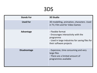
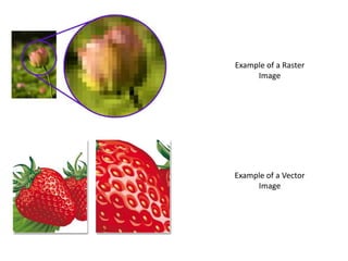
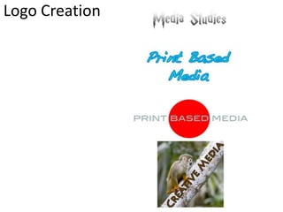
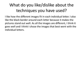
Digital Graphics
Emma Taylor
File Formats
Raster Graphics
Raster Graphics are made up of Bitmaps, which
are made up of millions of tiny pixels.
It has 3 file types; they are JPEG, TIFF and PSD.
1 megapixel = 1,000,000 pixels and the higher
amount of pixels, the more data is takes up
and the images also have a enhanced
resolution.
Vector Graphics
Vector Graphics are defined by a start and an
end, which can be
points, squares, triangles, curves and angles.
Vectors have 2 file types; they are AI and 3DS.
These files don’t lose the image quality when
resized, either larger or smaller.
They look better on devices because of the
higher resolution.
JPEG
Stands For Joint Photographic Expert Group
Used For Used on the internet, mainly for social
networking and for sending pictures in
general, can be used on most electronic
devices.
Advantage - You can send them to whoever,
wherever, through email, phones and
internet.
- Small, compact files so they don’t take up
much data
- Is quick to upload the file
Disadvantage - Loses the photo quality when
opened, edited or saved numerous times
due to compression and recompression
TIFF
Stands For Tagged Image File Format
Used For Saving multiple images to one single file,
compacts it together. Popular with Graphic
Designers.
Advantage -When open, edited or saved, the images
have lossless, which mean they don’t lose
the quality of the image.
-Can be sent easily to other users- flexible
format
Disadvantage - They are very large files, which means
they would take up a lot of data on the
system.
PSD
Stands For Photoshop Document
Used For Image Manipulation and editing, but only
on Photoshop
Advantage -They can be saved in layers, so you can
change certain parts of the image
- They are used for front covers of
magazines because of the layering
technique
Disadvantage - They are large files, and they can be only
used in Photoshop, so has to be changed
to JPEG to be sent to users without
Photoshop.
AI
Stands For Adobe Illustrator Art
Used For Logo creations
Advantage -They can be scaled to various sizes, from
business card to billboard, because of the
vector graphics as they won’t lose quality
or deteriorate.
- The programme has very similar tools to
Photoshop which makes it easy to use.
Disadvantage -Large files
- Very time consuming
- Small errors may become visible if image
is enlarged too much
3DS
Stands For 3D Studio
Used For 3D modelling, animation, characters. Used
in TV, Film and for Video Games
Advantage - Flexible format
- Encourages interactivity with the
programme
- Used in large industries for saving files for
their software projects
Disadvantage - Expensive, time consuming and very
large files
- There are a limited amount of
programmes available
Example of a Raster
Image
Example of a Vector
Image
Digital Graphics
Images
Shape Task
Evaluation
What did you like about your image?
I like the different shapes that make the
penguin, because its easy and circular.
What would you improve if you did it again?
I would make it neater because the face looks
very messy.
Rotoscope
Evaluation
What did you like about your image?
I like the detail on his face and jacket because it
makes it look more realistic.
What would you improve if you did it again?
I don’t know if I would change it because I really
like how it turned out.
Text Based
Evaluation
What did you like about your image?
I like how the colours go together and with the
clipping of the music notes within the word
‘music’. I also like how the word ‘pain’ is in a
different font and colour.
What would you improve if you did it again?
I think I would choose different colours because
I feel that they don’t go with the quote.
Logo Creation
Evaluation
What did you like about your image?
I think the monkey is the best one because it’s
different, whereas the rest are very plain and
simple.
What would you improve if you did it again?
I would make the logos better, maybe by using
different shapes to create them.
T-Shirt Designs
T-shirt Ideas
Film Quotes
Music
Cartoon
TV
Family
Guy
Simpsons
Comedy
YMAS
McFly
Vampire Weekend
People
Marilyn
Monroe
The
Beatles
Big Bang
Theory
Friends
Bob
Marley
Star Wars
Star Trek
Lord of the Rings
Batman
Celebrities
Animals
Sloth
Ca
t
Giraffe
Elephant
Meerkat
Rihanna
Proposal
Deadline
Friday 4th October 2013
Monday Tuesday Wednesday
Schedule
Audience
My target audience is 15-20 year olds. My idea includes Rihanna and possibly one
of her album names with it.
Proposal
Dimensions
2400 x 3200 Pixels
Content
My t-shirt design will be different photos of Rihanna within her name; the photos will
be of similar context. It will be plain and simple with no colour.
Export Format
PNG
Advantages; compatible with redbubble and also can save transparency and opacity
Disadvantages; larger file size
These images
will be within
the letters
indicated by
the black
arrows
Peer Evaluation
What are the strengths of the final image?
I think my final image is great because it’s neat
and all the images are individual within the
certain space.
What could be developed if the image was
repeated?
I would try out different techniques, and I
wouldn’t use her name so I would just have an
image.
T-Shirt Evaluation
Does your final product reflect your
original intentions?
My final product was on my mind map of ideas, although I don’t
think that it came through what I wanted to produce as my end
product. I had lots of different ideas at the beginning but I
managed to pick one idea in the end. I am really confident with
my final product, although once I had decided on putting
Rihanna on the t-shirt, I had different ideas which I tested out to
find the one I wanted.
Is your product suitable for your
audience?
I think my product is suitable for my target audience because
Rihanna is listened to by the age of my target audience. My
product doesn’t contain any violence or sexual references, so is
suitable for my audience. My target audience would also wear
this t-shirt if they are interested in her music.
What do you like/dislike about the
techniques you have used?
I like how the different images fit in each individual letter. I also
like the black border around each letter because it makes the
pictures stand out well. As all the images are different, I think it
goes well and I think I chose the images that best went with the
individual letters.
What do you like/dislike about how
your final product looks?
I like the overall look of my product because it fills across the t-
shirt nicely and it really stands out on the white t-shirt because
of the black border. I think there is a picture or two that could
have been placed better within the text, but overall I like the
product.
Why did you include the content you
used?
I used a very simple font so it would be easy to read when the
images where placed inside the text. I left the colour of the
text white so to see the images well, and the black border
makes everything stand out really nicely.
What style have you employed in your
products?
As I researched different t-shirts on Red Bubble, I ended up
choosing the music genre because I thought the t-shirts were
the best ones. After searching for different artists, I chose
Rihanna; although there were a lot of Rihanna t-shirts, I
thought my idea would be different to the rest of the
products.
What were the strengths and weaknesses
of the pre-production and planning
In the beginning I had lots of ideas which did make it difficult
to choose I final idea, but I did also have lots to time, so it
made it easier to consider my options. I particularly liked the
multi-coloured elephant and ‘The Weeknd’ t-shirt, although I
branched out and did something completely different. The
planning and research definitely helped me to come up and
produce my final product.
Analyse each of your final print products commenting
on the strengths, weaknesses and aspects you would
do differently if you were to repeat the project
For this Tweety Pie product I got a Google
image and I then Rota scoped it in
Photoshop. I added in the details from his
eyes to his chest feather so it looked more
like the real image. I made it into a
baby/child piece of clothing as this would
appeal to that audience more than it
would an older audience. I think that its
quite a good product and because it’s a
cartoon, it was a lot easier to Rota scope
than it is to do a human or a real animal.
I think that I could have been more careful
with the outline as there are a few white
patches around it, but that would be a
future development.
This is my Rihanna t-shirt design. I used a simple font because I wanted the writing to be
easy to read after I had inserted all of the images. It was difficult to get the images into the
different letters so that took me a while to do because I wanted to get them correct. This is
a t-shirt aimed at a target audience of 15-20 year olds because this the age where they
would listen to Rihanna's’ songs. The technique I used was a clipping mask which makes
the images fit into the text. I think it’s very effective in this situation because it turned out
very well. A few of the images could be placed a bit better because there are edges leaking
into another letter which I don’t want, so if I were to redo this product that is what I would
change about it.
For my Will Smith t-shirt design, I went to Google Images and got a picture of him, then I
went into Photoshop and Rota scoped him. This was more challenging than the Tweety Pie
t-shirt, but easier than the Rihanna one. The definition in his face was harder to enhance
because it wasn’t over his whole face so I had to blend it in some places to make it look
respectable. I think the blue background behind him brings something to the image
otherwise it would be very plain. I could have added more detail to his face to make him
look even more life-like so that would an improvement for the future. I could hav also
made it a bit neater by making the edges around everything rounder as there are some
square bits which make it look very un natural.
Peer Feedback
Feedback
– I like that there is a different image of Rihanna for every letter.
– It’s creative, unique and interesting
– You could maybe have put a different colour background
– You could have done something around the name and not just left it
blank
My Response to the Feedback
I agree that I could have put a different coloured background, I did not
experiment with different colours so that would have been a good idea to do
that.
I also agree that it looks good with the different images of Rihanna in the
name because it’s unique.
I disagree with the fact of designing something to go around the name; I feel
that it is good the way it is and I don’t think it would look better with things
added to it.

Digital Graphics Pro Forma

  • 1.
  • 2.
  • 3.
    Raster Graphics Raster Graphicsare made up of Bitmaps, which are made up of millions of tiny pixels. It has 3 file types; they are JPEG, TIFF and PSD. 1 megapixel = 1,000,000 pixels and the higher amount of pixels, the more data is takes up and the images also have a enhanced resolution.
  • 4.
    Vector Graphics Vector Graphicsare defined by a start and an end, which can be points, squares, triangles, curves and angles. Vectors have 2 file types; they are AI and 3DS. These files don’t lose the image quality when resized, either larger or smaller. They look better on devices because of the higher resolution.
  • 5.
    JPEG Stands For JointPhotographic Expert Group Used For Used on the internet, mainly for social networking and for sending pictures in general, can be used on most electronic devices. Advantage - You can send them to whoever, wherever, through email, phones and internet. - Small, compact files so they don’t take up much data - Is quick to upload the file Disadvantage - Loses the photo quality when opened, edited or saved numerous times due to compression and recompression
  • 6.
    TIFF Stands For TaggedImage File Format Used For Saving multiple images to one single file, compacts it together. Popular with Graphic Designers. Advantage -When open, edited or saved, the images have lossless, which mean they don’t lose the quality of the image. -Can be sent easily to other users- flexible format Disadvantage - They are very large files, which means they would take up a lot of data on the system.
  • 7.
    PSD Stands For PhotoshopDocument Used For Image Manipulation and editing, but only on Photoshop Advantage -They can be saved in layers, so you can change certain parts of the image - They are used for front covers of magazines because of the layering technique Disadvantage - They are large files, and they can be only used in Photoshop, so has to be changed to JPEG to be sent to users without Photoshop.
  • 8.
    AI Stands For AdobeIllustrator Art Used For Logo creations Advantage -They can be scaled to various sizes, from business card to billboard, because of the vector graphics as they won’t lose quality or deteriorate. - The programme has very similar tools to Photoshop which makes it easy to use. Disadvantage -Large files - Very time consuming - Small errors may become visible if image is enlarged too much
  • 9.
    3DS Stands For 3DStudio Used For 3D modelling, animation, characters. Used in TV, Film and for Video Games Advantage - Flexible format - Encourages interactivity with the programme - Used in large industries for saving files for their software projects Disadvantage - Expensive, time consuming and very large files - There are a limited amount of programmes available
  • 10.
    Example of aRaster Image Example of a Vector Image
  • 11.
  • 12.
  • 13.
    Evaluation What did youlike about your image? I like the different shapes that make the penguin, because its easy and circular. What would you improve if you did it again? I would make it neater because the face looks very messy.
  • 14.
  • 15.
    Evaluation What did youlike about your image? I like the detail on his face and jacket because it makes it look more realistic. What would you improve if you did it again? I don’t know if I would change it because I really like how it turned out.
  • 16.
  • 17.
    Evaluation What did youlike about your image? I like how the colours go together and with the clipping of the music notes within the word ‘music’. I also like how the word ‘pain’ is in a different font and colour. What would you improve if you did it again? I think I would choose different colours because I feel that they don’t go with the quote.
  • 18.
  • 19.
    Evaluation What did youlike about your image? I think the monkey is the best one because it’s different, whereas the rest are very plain and simple. What would you improve if you did it again? I would make the logos better, maybe by using different shapes to create them.
  • 20.
  • 23.
    T-shirt Ideas Film Quotes Music Cartoon TV Family Guy Simpsons Comedy YMAS McFly VampireWeekend People Marilyn Monroe The Beatles Big Bang Theory Friends Bob Marley Star Wars Star Trek Lord of the Rings Batman Celebrities Animals Sloth Ca t Giraffe Elephant Meerkat Rihanna
  • 25.
    Proposal Deadline Friday 4th October2013 Monday Tuesday Wednesday Schedule Audience My target audience is 15-20 year olds. My idea includes Rihanna and possibly one of her album names with it.
  • 26.
    Proposal Dimensions 2400 x 3200Pixels Content My t-shirt design will be different photos of Rihanna within her name; the photos will be of similar context. It will be plain and simple with no colour. Export Format PNG Advantages; compatible with redbubble and also can save transparency and opacity Disadvantages; larger file size
  • 27.
    These images will bewithin the letters indicated by the black arrows
  • 29.
    Peer Evaluation What arethe strengths of the final image? I think my final image is great because it’s neat and all the images are individual within the certain space. What could be developed if the image was repeated? I would try out different techniques, and I wouldn’t use her name so I would just have an image.
  • 30.
  • 31.
    Does your finalproduct reflect your original intentions? My final product was on my mind map of ideas, although I don’t think that it came through what I wanted to produce as my end product. I had lots of different ideas at the beginning but I managed to pick one idea in the end. I am really confident with my final product, although once I had decided on putting Rihanna on the t-shirt, I had different ideas which I tested out to find the one I wanted.
  • 32.
    Is your productsuitable for your audience? I think my product is suitable for my target audience because Rihanna is listened to by the age of my target audience. My product doesn’t contain any violence or sexual references, so is suitable for my audience. My target audience would also wear this t-shirt if they are interested in her music.
  • 33.
    What do youlike/dislike about the techniques you have used? I like how the different images fit in each individual letter. I also like the black border around each letter because it makes the pictures stand out well. As all the images are different, I think it goes well and I think I chose the images that best went with the individual letters.
  • 34.
    What do youlike/dislike about how your final product looks? I like the overall look of my product because it fills across the t- shirt nicely and it really stands out on the white t-shirt because of the black border. I think there is a picture or two that could have been placed better within the text, but overall I like the product.
  • 35.
    Why did youinclude the content you used? I used a very simple font so it would be easy to read when the images where placed inside the text. I left the colour of the text white so to see the images well, and the black border makes everything stand out really nicely.
  • 36.
    What style haveyou employed in your products? As I researched different t-shirts on Red Bubble, I ended up choosing the music genre because I thought the t-shirts were the best ones. After searching for different artists, I chose Rihanna; although there were a lot of Rihanna t-shirts, I thought my idea would be different to the rest of the products.
  • 37.
    What were thestrengths and weaknesses of the pre-production and planning In the beginning I had lots of ideas which did make it difficult to choose I final idea, but I did also have lots to time, so it made it easier to consider my options. I particularly liked the multi-coloured elephant and ‘The Weeknd’ t-shirt, although I branched out and did something completely different. The planning and research definitely helped me to come up and produce my final product.
  • 38.
    Analyse each ofyour final print products commenting on the strengths, weaknesses and aspects you would do differently if you were to repeat the project For this Tweety Pie product I got a Google image and I then Rota scoped it in Photoshop. I added in the details from his eyes to his chest feather so it looked more like the real image. I made it into a baby/child piece of clothing as this would appeal to that audience more than it would an older audience. I think that its quite a good product and because it’s a cartoon, it was a lot easier to Rota scope than it is to do a human or a real animal. I think that I could have been more careful with the outline as there are a few white patches around it, but that would be a future development.
  • 39.
    This is myRihanna t-shirt design. I used a simple font because I wanted the writing to be easy to read after I had inserted all of the images. It was difficult to get the images into the different letters so that took me a while to do because I wanted to get them correct. This is a t-shirt aimed at a target audience of 15-20 year olds because this the age where they would listen to Rihanna's’ songs. The technique I used was a clipping mask which makes the images fit into the text. I think it’s very effective in this situation because it turned out very well. A few of the images could be placed a bit better because there are edges leaking into another letter which I don’t want, so if I were to redo this product that is what I would change about it.
  • 40.
    For my WillSmith t-shirt design, I went to Google Images and got a picture of him, then I went into Photoshop and Rota scoped him. This was more challenging than the Tweety Pie t-shirt, but easier than the Rihanna one. The definition in his face was harder to enhance because it wasn’t over his whole face so I had to blend it in some places to make it look respectable. I think the blue background behind him brings something to the image otherwise it would be very plain. I could have added more detail to his face to make him look even more life-like so that would an improvement for the future. I could hav also made it a bit neater by making the edges around everything rounder as there are some square bits which make it look very un natural.
  • 41.
    Peer Feedback Feedback – Ilike that there is a different image of Rihanna for every letter. – It’s creative, unique and interesting – You could maybe have put a different colour background – You could have done something around the name and not just left it blank
  • 42.
    My Response tothe Feedback I agree that I could have put a different coloured background, I did not experiment with different colours so that would have been a good idea to do that. I also agree that it looks good with the different images of Rihanna in the name because it’s unique. I disagree with the fact of designing something to go around the name; I feel that it is good the way it is and I don’t think it would look better with things added to it.