Download to read offline
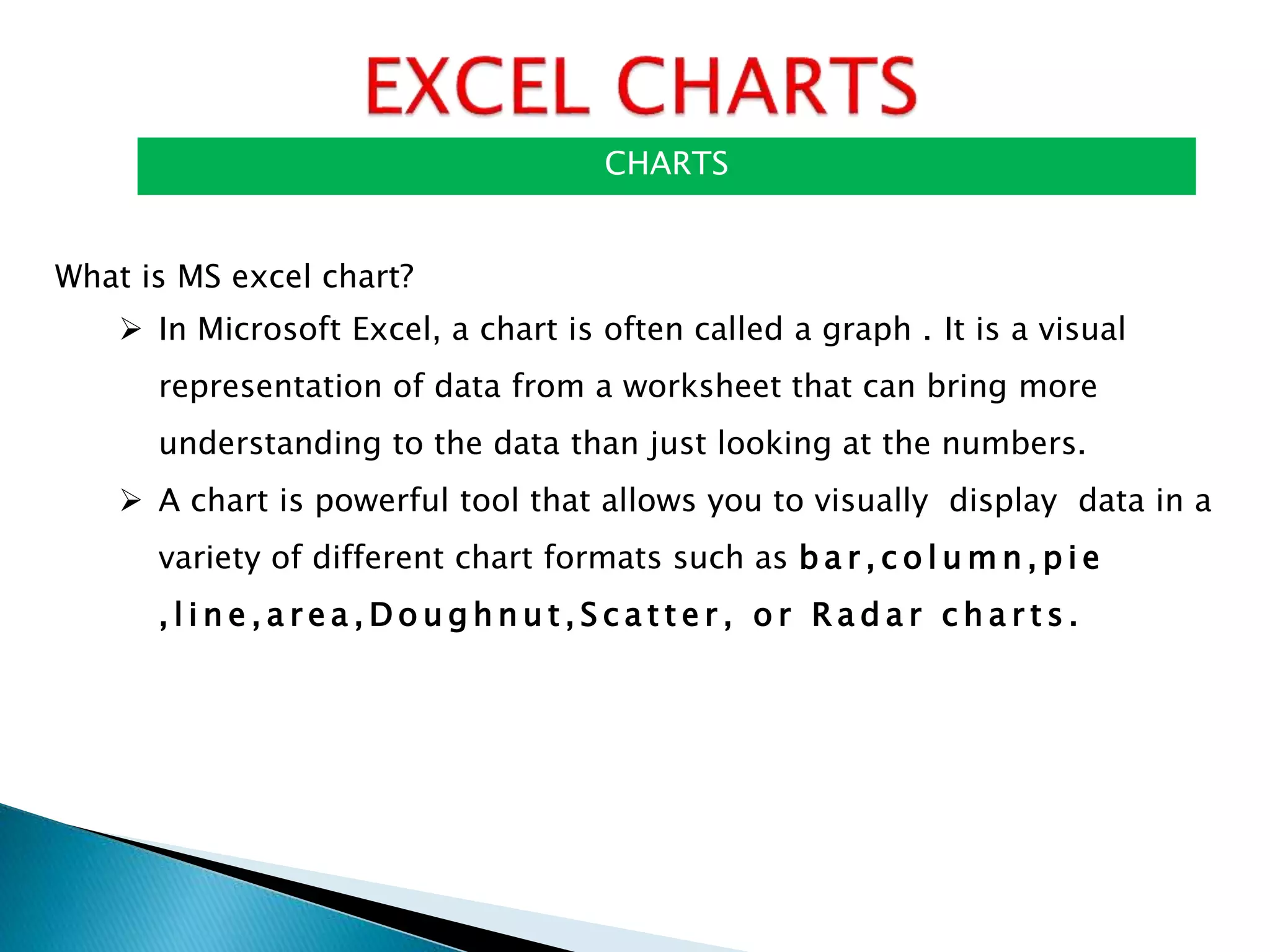


This document discusses different types of charts in Microsoft Excel including bar charts, pie charts, and line charts. It provides information on how to create, format, position and move these different chart types. Specifically, it outlines the steps to create bar charts and pie charts in Excel including selecting the data, choosing a chart type, and inserting the chart. It also describes how to position, resize, change the type of, and move charts between worksheets. The document serves as a guide for using basic charting features in Excel.