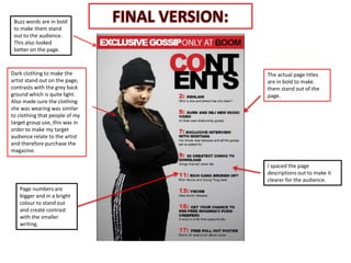
1. The actual page titles
are in bold to make
them stand out of the
page.
Page numbers are
bigger and in a bright
colour to stand out
and create contrast
with the smaller
writing.
Dark clothing to make the
artist stand out on the page,
contrasts with the grey back
ground which is quite light.
Also made sure the clothing
she was wearing was similar
to clothing that people of my
target group use, this was in
order to make my target
audience relate to the artist
and therefore purchase the
magazine.
I spaced the page
descriptions out to make it
clearer for the audience.
Buzz words are in bold
to make them stand
out to the audience.
This also looked
better on the page.