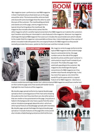
My magazine cover resembles a typical R&B magazine cover with bold colors that stand out and catch the eye. The text around the featured artist is bold and clear with some text larger than others. The masthead is big and bold. However, my magazine also includes social media icons indicating availability online, and shows what's included inside (a poster), which challenges conventions.
The content page layout is somewhat similar to typical R&B magazines with page numbers and "Contents" at the top. But it also challenges conventions with another text strip along the top and more free space not filled with words.
The double page spread conforms to conventions with a large main picture and smaller supporting images, a quote, and intro
1. My magazine cover conformstoa real R&B magazine
inthat it had boldcoloursthatctand out on the page
aroundthe artist.The textaroundthe artistare bold
and clearwithsome textbiggerthanthe otherto catch
the eyesof the customer.The mastheadbigand bold
and standsout onthe page,andmy magazine hasa
typical stripof writingabove the masthead.My
magazine alsoincludesotherartistsnameslike the
othermagazine whichisanothertypical conventionof anR&B magazine asit catchesthe customers
eye if anotherartisttheyare interestedinisalsofeaturedinthe magazine.How ever mymagazine
challengesthe typical R&Bmagazine froncoverasit includesthe social mediaiconswhichindicate
to the readerthat thismagazine isalsoavailable onthese sites.Italsochallengesasithas a pictue of
whatis includedinside (theposter) thisisntatypical feature of aR&B magazine astheywould
normallyjuststate there wasa posteron the frontcoer and theninclude itinside.
My magzine contentspage conformstothe
typical R&B magazine asthe contentspage
layoutissomewhatsimilar,the page
numbersare on the side of the paged
beside the artistsandthe word‘contents’is
contructedon toppf itsself insteadof just
one word.Thismakesthe page more
asteticallyapeallingtothe customer.My
magazine alsochallengesthe typical
conventionsof aR&B magazine asit has
anotherstipof words alongthe top,it also
has more free space as not a lotof the
wordsfill upthe space whichis a typical
feature of an R&B magazine. Ialsohave a
mixture smallertextandlargerboldertext where astyoical R&Bmagazineswuldhave smallertext
on theircontentspage anda frewwordswithboldertextto
highlightthe mainfeaturesof the magazine.
My double page spreadconformstoa typical double page
spreadas there isone bigpicture of the mainartistshowing
the audience the mainfocusbutthere are alsootherpicture
that are smallerorlesspromanantonthe page.(mypicture is
fadedinthe background) Ialso have a quote fromthe artist
and an introduturyparagraphaboutthe artist whichare
othertyoical featuresof doublepage spreadswithinterviews.
My double page spreadchallengesthe typical doublepage
spreadas it includesfeaturesonthe page (the circles) andit
alsoincludesafadedbackground picture behindthe text.