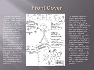
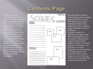
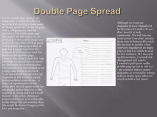
By Evan Williams
I am doing the Christmas
edition of ‘Scenes’ which will
appeal to a young audience
as Christmas is a popular
and exciting time for children
and younger teenagers. I
decided to use a large title as
this is an important feature of
the magazine. The title
should be quite bold and
striking to show that this is
the next big pop magazine.
The layout is also quite
cluttered in appearance
which is common to see and
there are plenty of cover lines
to show the gossipy style of
the magazine. I’ve included
snow flakes on the front
cover to show the wintery
style of this version of
‘Scenes’. The colours I am
using are reds, greens, and
some greys and blues to
create an festive yet wintery
atmosphere.
The posters in the bottom
right corner will help to
brighten up the page and
make sure there is a lot
happening on the page. A
young audience prefers lots of
pictures so this will attract
them to the magazine. The
language used on the front
cover is very informal
particularly on the cover lines
which emphasises the
Mainstreamer psychographic
intended for this magazine. I
have used Mainstream artists
on the cover lines for
example, One Direction, who
are a world famous boy band
therefore the typical
Mainstreamer audience will
be drawn to a magazine with
‘One Direction wrote on the
cover. Ultimately, this will
attract a mass audience that
will want to buy our
magazine.
The layout of my
contents page for the
Christmas edition should
look something similar to
this. I decided to put the
text on the left side of the
page as this is a usual
feature in a current pop
magazine. The inclusion
of the ‘Exclusive’ section
is also a typical feature
therefore it makes our my
magazine look more
professional. The colours
we use are going to be
similar to those used on
the front cover to show
we are persisting with the
Christmas theme
throughout.
We also want to include
some images on the contents
page but we are not sure
how many as we want a
variety of artists on the
page, but as it is a contents
page, it shouldn’t look too
cluttered.
Another reason for a
selection of images is that
this would appeal to our
young but ‘Mainstreamer’
audience because they
prefer a mixture of pictures
and text on the page. It is
vital that we make a
magazine that will appeal to
our target audience so
pictures on the contents
page are a ‘must’ from my
point of view, and the other
people in my team also.
For my double page spread I am
using quite a simple but effective
layout as I am putting a main image
of ‘Daniel Archibold’ on the left page
with a full quote and then the
interview/text on the right page.
This reason for this is that we can
produce just one quality image and
not two or three that aren’t as good.
A large image taking up a most of
page has a bigger impact on the
audience in making them read the
article on the opposite page.
I want to also make it clear that I am
following the typical stereotypes of
the characters on a pop magazine.
For example, it is stereotypical to see
young, male artists on the front
cover and indeed throughout a pop
magazine as this is what a young,
female audience wants to see. In
terms of representation of the
artists, they should appear to be fun
and playful rather than sexy as the
audience is young and it isn’t adult
themed. If the artists shown are
women and shown to be vulnerable
by the things they are wearing, then
this would be deemed inappropriate
for a pop magazine
Although we want our
magazine to look original and
for it to have it’s own style, we
don’t want it to look
amateurish. We feel this may
come across if we don’t include
these sorts of features.We made
the decision to put the whole
interview together on the right
page so that it is simple to read
for our audience. If it was split
up into sections, is would look
disorganised and scruffy.
I wanted a pull quote on the
double page spread as this is a
very common feature on any
magazine, so it would be wrong
to leave empty space when we
could include a pull quote.

Draft analysis

  • 1.
  • 2.
    I am doingthe Christmas edition of ‘Scenes’ which will appeal to a young audience as Christmas is a popular and exciting time for children and younger teenagers. I decided to use a large title as this is an important feature of the magazine. The title should be quite bold and striking to show that this is the next big pop magazine. The layout is also quite cluttered in appearance which is common to see and there are plenty of cover lines to show the gossipy style of the magazine. I’ve included snow flakes on the front cover to show the wintery style of this version of ‘Scenes’. The colours I am using are reds, greens, and some greys and blues to create an festive yet wintery atmosphere. The posters in the bottom right corner will help to brighten up the page and make sure there is a lot happening on the page. A young audience prefers lots of pictures so this will attract them to the magazine. The language used on the front cover is very informal particularly on the cover lines which emphasises the Mainstreamer psychographic intended for this magazine. I have used Mainstream artists on the cover lines for example, One Direction, who are a world famous boy band therefore the typical Mainstreamer audience will be drawn to a magazine with ‘One Direction wrote on the cover. Ultimately, this will attract a mass audience that will want to buy our magazine.
  • 3.
    The layout ofmy contents page for the Christmas edition should look something similar to this. I decided to put the text on the left side of the page as this is a usual feature in a current pop magazine. The inclusion of the ‘Exclusive’ section is also a typical feature therefore it makes our my magazine look more professional. The colours we use are going to be similar to those used on the front cover to show we are persisting with the Christmas theme throughout. We also want to include some images on the contents page but we are not sure how many as we want a variety of artists on the page, but as it is a contents page, it shouldn’t look too cluttered. Another reason for a selection of images is that this would appeal to our young but ‘Mainstreamer’ audience because they prefer a mixture of pictures and text on the page. It is vital that we make a magazine that will appeal to our target audience so pictures on the contents page are a ‘must’ from my point of view, and the other people in my team also.
  • 4.
    For my doublepage spread I am using quite a simple but effective layout as I am putting a main image of ‘Daniel Archibold’ on the left page with a full quote and then the interview/text on the right page. This reason for this is that we can produce just one quality image and not two or three that aren’t as good. A large image taking up a most of page has a bigger impact on the audience in making them read the article on the opposite page. I want to also make it clear that I am following the typical stereotypes of the characters on a pop magazine. For example, it is stereotypical to see young, male artists on the front cover and indeed throughout a pop magazine as this is what a young, female audience wants to see. In terms of representation of the artists, they should appear to be fun and playful rather than sexy as the audience is young and it isn’t adult themed. If the artists shown are women and shown to be vulnerable by the things they are wearing, then this would be deemed inappropriate for a pop magazine Although we want our magazine to look original and for it to have it’s own style, we don’t want it to look amateurish. We feel this may come across if we don’t include these sorts of features.We made the decision to put the whole interview together on the right page so that it is simple to read for our audience. If it was split up into sections, is would look disorganised and scruffy. I wanted a pull quote on the double page spread as this is a very common feature on any magazine, so it would be wrong to leave empty space when we could include a pull quote.