
Recommended
More Related Content
What's hot
What's hot (20)
Similar to Question 7
Similar to Question 7 (20)
More from sandraaa5229
More from sandraaa5229 (6)
Recently uploaded
Recently uploaded (20)
Question 7
- 1. LOOKING BACK AT YOUR PRELIMINARY TASK, WHAT DO YOU FEEL YOU HAVE LEARNT IN THE PROGRESSION FROM IT TO THE FULL PRODUCT?
- 2. ABOUT MY PRELIMINARY TASK My preliminary task was a school based magazine which involved producing a content and cover page. Before creating my preliminary task i searched on google images to have a rough idea on what i wanted my preliminary task to look like, After I went and took pictures of a school student which i uploaded and designed on my phone and then put the image on Microsoft Publisher. My preliminary magazine cover had a title, a picture, unnecessary text and some exclusive information. The picture on my front cover shows a young teenage girl who is ambitious and cares about her education which gives a presentation of Eastbrook School. The equipment that was used was a graduation outfit implying how education is the key to success, However the layout for my contents and front cover was not structured well it looks unprofessional but i think it would appeal the target audience Eastbrook School because it focuses on the school and i think there is way too much written on the content page but the layout and design looks good for a preliminary task. In addition to improve my preliminary task i would rearrange the text, the layout of the front cover and on the contents i would reduce the written and put at least on picture to make look for fascinating.
- 3. ABOUT MY MAIN MAGAZINE My main magazine was a music magazine and the genre i choose was R&B and a mix of HIP HOP, For my music magazine i created a front cover, contents and featured article. For my front cover, contents and featured article i took a picture of some year 11 students in my school wearing R&B costumes and the colour scheme for their costume was white, black and red. This is important because this gives a R&B appeal for my magazine and it would attract the target readers (VYBZ) to buy the magazine. I designed the pictures i took on Adobe Photoshop and then placed it on Adobe InDesing, This helped me on how to layout, create masthead, create coverline, san serif, bold text etc. The background is white and the colour scheme for the magazine is different shades of orange. In addition for my content page i took a picture from my sample pictures that was uploaded on my website photoshopped it and then placed in my adobe indesign used some media techniques etc. To add in order to create my music magazine i looked at other magazine such as NME and VIBE, i did a mixture of VIBE contents and NME contents to create my magazine contents page.
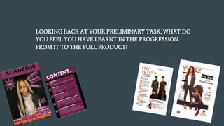
- 4. PRELIMINARY TASK MAIN MAGAZINE
- 5. COMPARISON:- FRONT COVER As you can see there is a massive difference between my preliminary task and my main magazine for example editing skills, quality of image, color scheme, front cover theme etc. Firstly my editing skills was amazing due to the use of photoshop for example cropping, whitening the background, taking out spots and the use of lighting and i think one of the main thing i really improved on was my photography skills in the school magazine i didn't really put much work into the picture for example i use my phone camera, there wasn’t a lot of time although there was a good background which wa good and because it was a school audience i didn't think of making my model look pretty like my main magazine although there was a costume used that suited the magazine but there wasn't a lot of thought used when creating my preliminary task whereas in the music magazine there was more use on time and taking the right angle for the picture on a real digital camera. The colour scheme for my i feel like the colours scheme that u used is eye catching and the white background contrast with the orange which matched very well with my genre whereas the text for my preliminary task are quite fitting. To conclude the layout for my preliminary task is unstructured, dull, simple etc. whereas for my main magazine it looked like a real magazine, I think the level of skills have developed massively between my preliminary task and main music magazine. I think my music magzine moved up to a better quality and looks very professional due to layout, photography, image, cover line and most importantly editing.
- 6. PRELIMINARY TASK MAIN MAGAZINE
- 7. COMPARISON:- CONTENTS There was no similarities between both my preliminary tasks content page and music magazine content page, As you can see my man music magazine content page was more in a detailed content, In comparison my preliminary task content page was in a good layout and was structure nicely but not like a real content page for example to improve it i would put an image, less writing, more colours etc. when doing my preliminary task content page knowledge did not extend i didn't really think of putting an image but because the target audience are school students i thought i wouldn’t need an image i believe my preliminary task was badly organised i didn't do much to it. For my preliminary task there was only use of two colours black, purple and white which i think is feminine it doesn't really relate to boys more for girls.
- 8. WHAT I HAVE LEARNT? When planning my preliminary task I have learnt to that if a magazine doesn’t appeal to your target audience then who will it appeal? Who would buy and look at it? This is why its important to take time and not rush things. My use of skills has develop greatly during the process of researching, when creating my preliminary task my main preliminary task was getting the information regarding the school magazine done and my photo which didn’t require editing however the photos were very important for my main task which I have learned form the mistakes I did for my preliminary task. Most important software such as InDesign, Photoshop, Fireworks. wasn’t used at all for my preliminary task which was a major improvement for my main task in terms of layout, editing, and creating my masthead were used through this software. I believe I developed my main task through creativity, understanding, researching, photography and most importantly editing for example for my photography I have learnt the ways in which to use low key lighting an high key lighting, to improve the images I used, in terms of understanding when creating my preliminary task I didn’t used a lot of conventions which I didn’t understanding and was to much on my front cover for example I used a lot of puffs which shows that I was just doing it without understnadi ng the methods on how to use it on a front cover.