1. 7. Looking back at your preliminary task, what do you feel you have learnt in
the progression from it to the full product?
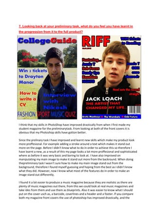
I think that my skills in PhotoShop have improved drastically from when I first made my
student magazine for the preliminarytask. From looking at both of the front covers it is
obvious that my Photoshop skills have gotton better.
Since the prelinary task I have improved and learnt new skills which make my product look
more proffesional. For example adding a stroke around a text which makes it stand out
more on the page. Before I didn’t know what to do in order to achieve this so therefore I
have learnt a new, as a result of this my page looks a lot more proffesional and sophisticated
where as before it was very basic and boring to look at. I have also improved on
manipulating my main image to make it stand out more from the backround. When doing
thepreliminary task I wasn’t sure how to make my main image stand out from the
background, therefore I found myself guessing and hoping from the best as I didn’t know
what they did. However, now I know what most of the features do in order to make an
image stand out differently.
I found it a lot easier to produce a music magazine because they are realistic as there are
plenty of music magazines out there, from this we could look at real music magazines and
take ides from them and use them as blueprints. Also it was easier to know what I should
put on the cover usch as, a barcode, coverlines and a header and a footer. If you compare
both my magazine front covers the use of photoshop has improved drastically, and the
2. music magazine looks a lot more proffesional and you can imagine it being on the
supermarket shelves up against real music magazines.
To make both my preliminary task contents page and my music contents mage I used the
software program InDesign, and with both of them I used a blue background. However there
are differences,for example my student magazine in mainly dominated my images, whereas
my music magazine is mainly dominated by text.
Compared to each other the music magazine contents page looks much more professional,
and actually looks like a real contents page as it fits the forms and conventions of one. On the
preliminary task the images are in a random order and don’t really have connotations of a
student magazine. Also there isn’t a lot of text which does not fit the forms and conventions
because on most contents pages they are all dominated by text. Therefore, the music
magazine looks a lot more professional because it is in a structured order which makes it
easier to follow and contains mainly text which shows that there is a lot of content. InDesign
has helped me to achieve this more professional look as I understood what the tools do,
whereas before I didn’t.
On the preliminary task I have failed to make it look professional because I haven’t used the
same font as I have used for the front cover masthead, whereas on my music magazine I have
used the same font throughout the front cover and contents page. I have also used sub
headings in my music magazine which makes it easier for the readers to follow, whereas in
the preliminary task I haven’t.