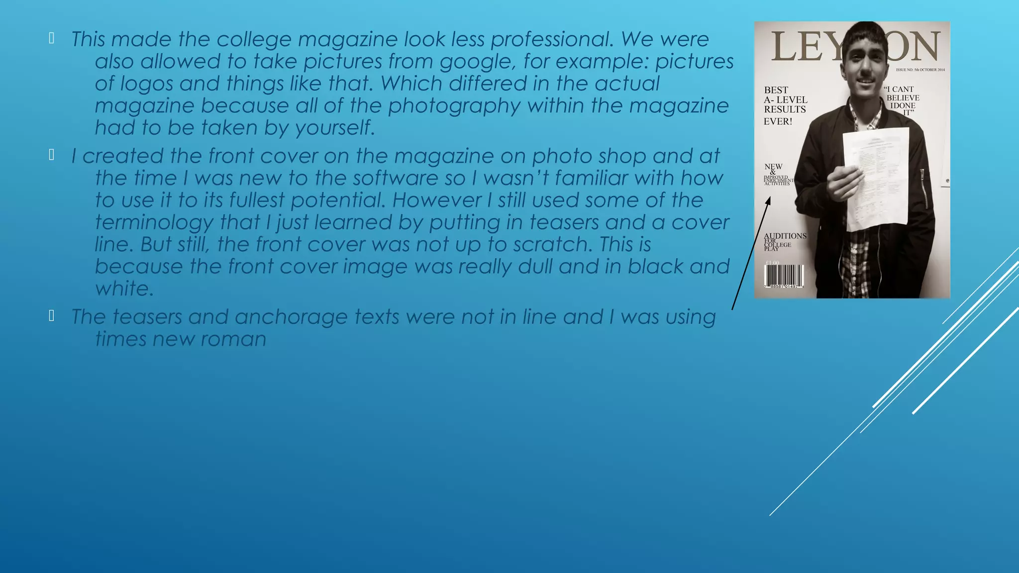
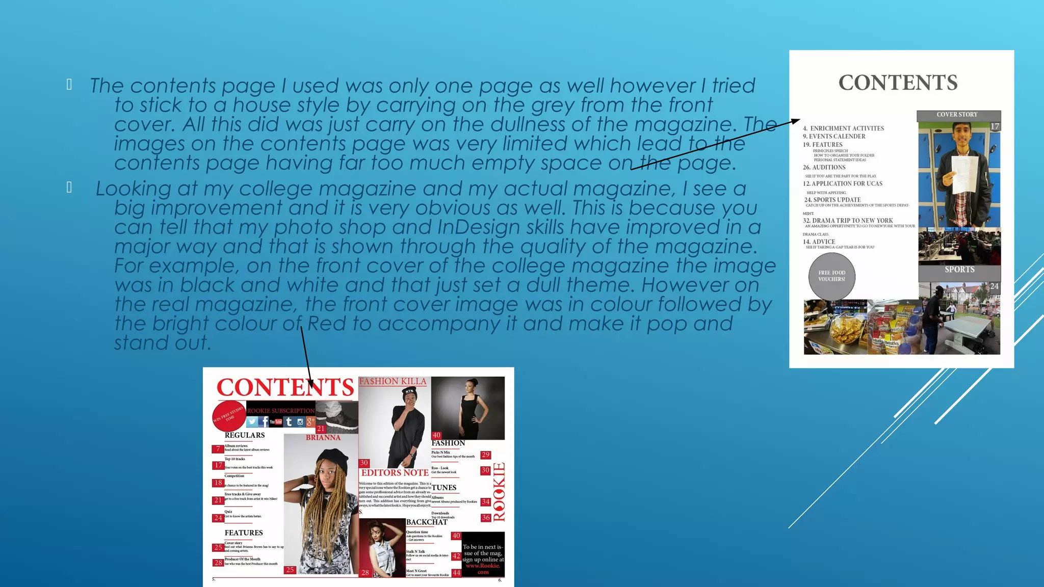
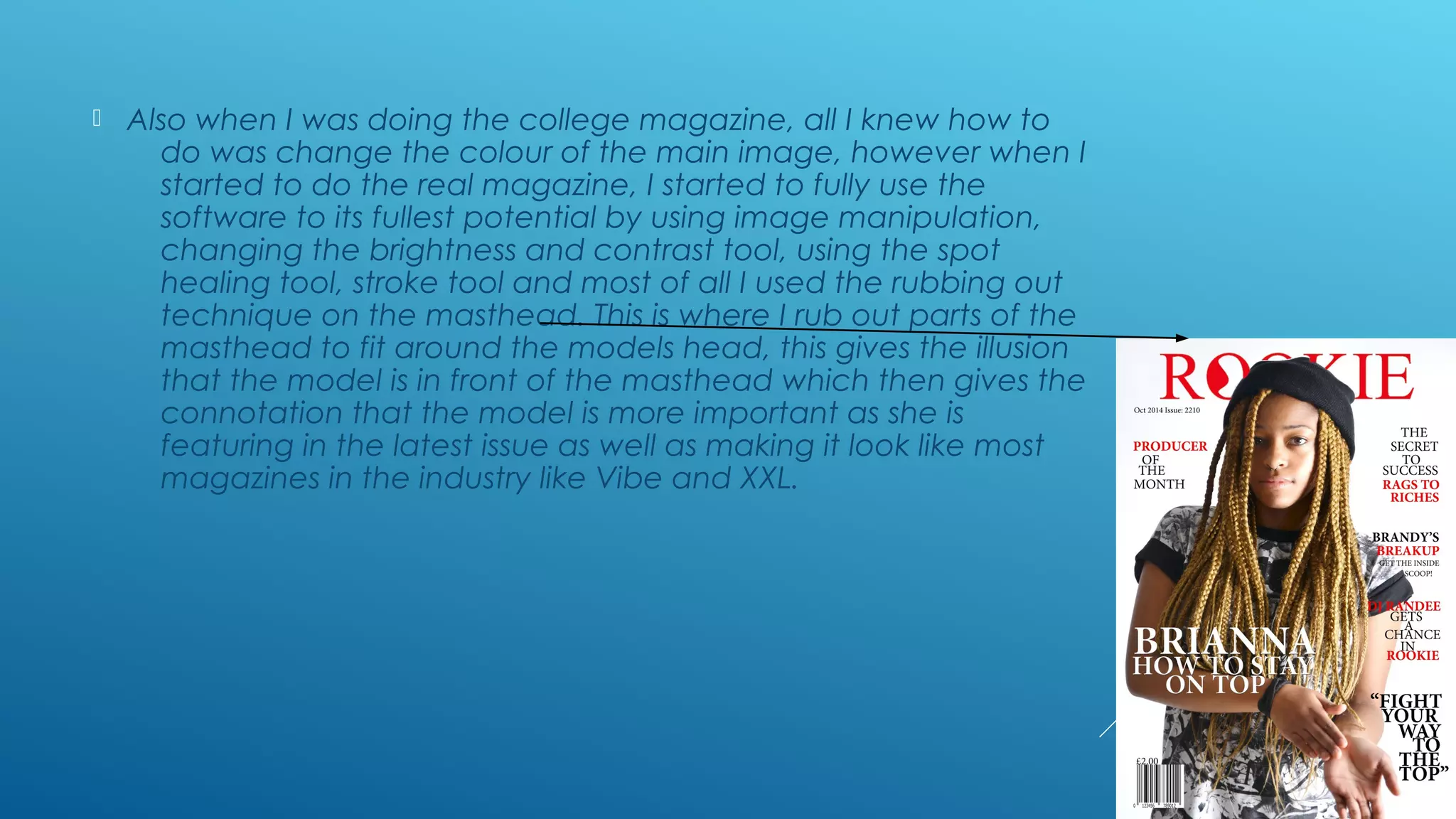
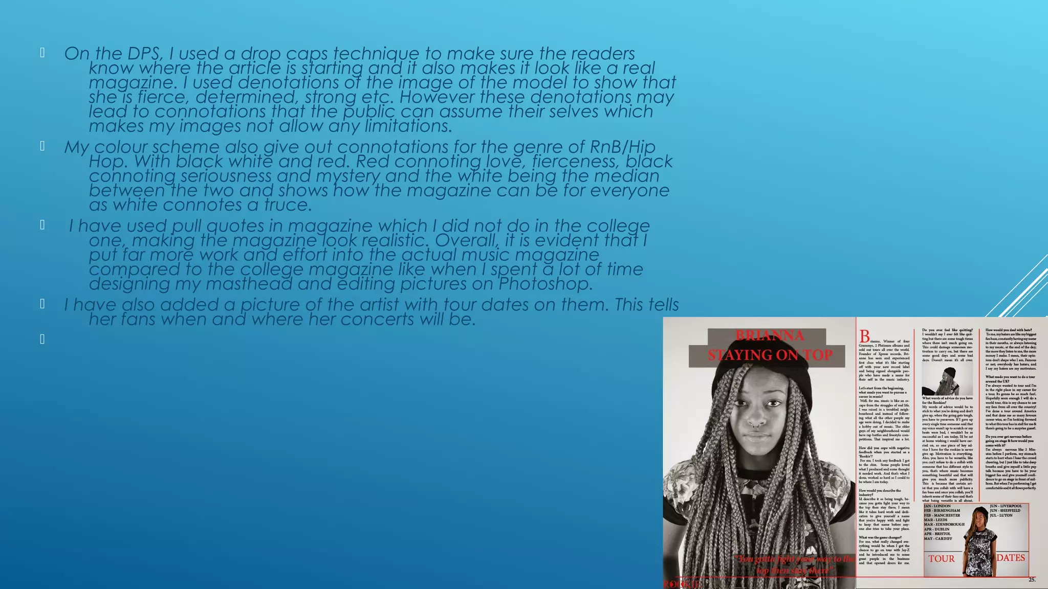
1. Looking back at your
preliminary task, what do you
feel you have learnt in the
progression from it to the full
product?
2. Throughout the process of making the magazine, I feel that I
have learnt a lot. This is because when we first started the
course, we were assigned a preliminary task where we had to
create a college magazine, I had no skills, I did not know how
to use photo shop or InDesign. I was also being taught a
variety of terminologies that accompany a magazine. For
example, Pull quotes, cover lines, denotation, connotation
Drop caps etc. for the college magazine, I was only assigned
to do a front cover and contents page. All of the pictures
taken were on my smartphone or a compact camera which
had very basic quality.
3. This made the college magazine look less professional. We were
also allowed to take pictures from google, for example: pictures
of logos and things like that. Which differed in the actual
magazine because all of the photography within the magazine
had to be taken by yourself.
I created the front cover on the magazine on photo shop and at
the time I was new to the software so I wasn’t familiar with how
to use it to its fullest potential. However I still used some of the
terminology that I just learned by putting in teasers and a cover
line. But still, the front cover was not up to scratch. This is
because the front cover image was really dull and in black and
white.
The teasers and anchorage texts were not in line and I was using
times new roman
4. The contents page I used was only one page as well however I tried
to stick to a house style by carrying on the grey from the front
cover. All this did was just carry on the dullness of the magazine. The
images on the contents page was very limited which lead to the
contents page having far too much empty space on the page.
Looking at my college magazine and my actual magazine, I see a
big improvement and it is very obvious as well. This is because you
can tell that my photo shop and InDesign skills have improved in a
major way and that is shown through the quality of the magazine.
For example, on the front cover of the college magazine the image
was in black and white and that just set a dull theme. However on
the real magazine, the front cover image was in colour followed by
the bright colour of Red to accompany it and make it pop and
stand out.
5. Also when I was doing the college magazine, all I knew how to
do was change the colour of the main image, however when I
started to do the real magazine, I started to fully use the
software to its fullest potential by using image manipulation,
changing the brightness and contrast tool, using the spot
healing tool, stroke tool and most of all I used the rubbing out
technique on the masthead. This is where I rub out parts of the
masthead to fit around the models head, this gives the illusion
that the model is in front of the masthead which then gives the
connotation that the model is more important as she is
featuring in the latest issue as well as making it look like most
magazines in the industry like Vibe and XXL.
6. On the DPS, I used a drop caps technique to make sure the readers
know where the article is starting and it also makes it look like a real
magazine. I used denotations of the image of the model to show that
she is fierce, determined, strong etc. However these denotations may
lead to connotations that the public can assume their selves which
makes my images not allow any limitations.
My colour scheme also give out connotations for the genre of RnB/Hip
Hop. With black white and red. Red connoting love, fierceness, black
connoting seriousness and mystery and the white being the median
between the two and shows how the magazine can be for everyone
as white connotes a truce.
I have used pull quotes in magazine which I did not do in the college
one, making the magazine look realistic. Overall, it is evident that I
put far more work and effort into the actual music magazine
compared to the college magazine like when I spent a lot of time
designing my masthead and editing pictures on Photoshop.
I have also added a picture of the artist with tour dates on them. This tells
her fans when and where her concerts will be.
7. This developed my understanding of these software’s which then
made it easier for me to navigate around the page and use all
the tools. This is shown through feedback because on my
college magazine, I was told that it looked too bland and the
colour scheme was really dull. But on my music magazine, the
feedback was very positive and the choice of colour was
praised, however I was told to change a few things such as
the cover line and then I went back and addressed this.