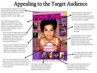
1. By promoting the magazine to the target
audience this shows that this magazine
is worth buying and has been voted by
the public as Britain’s No.1 pop
magazine which is a huge achievement.
By addressing the target audience
directly, this makes them feel
involved with the magazine as if they
know the writers etc. this appeals to
my target audience strongly.
The masthead and name of the
magazine is appealing to my target
audience because it is in pink which
appeals to my target gender and it is
sans serif which connotes a relaxed
and informal feel.
This cover line appeals strongly to
my target audience because of the
strong interest girls have in fashion
and what current pop stars are
wearing.
This cover line strongly appeals to my
target audience because it has the name
of a girl band -this band is aimed at
young girls because of the name,
therefore only girls are going to be
interested in this feature.
The main image connotes a happy
and friendly feel because she is
smiling which also makes the target
audience feel welcomed by the
magazine. She is holding a heart
which connotes love and friendliness.
This cover line along the left third is for
girls because it is a fashion article based
on what a pop star is wearing. This
appeals to young girls as they like to
idolise what celebrities are wearing.
The cover story intrigues the reader because
they want to know what her heartache was
and how she rose to fame. It is clear to read
because it is against the white heart creates
a route of the eye.
The images of pop stars smiling
make the target audience feel
welcome and connote a happy,
friendly feel.
This image connotes happiness and
friendship and makes the target
audience feel connected with the
magazine and the other readers.
This image shows the pop star dressed
up to appear as the target audiences
friend and wearing appropriate
clothing etc. as their role model too.
2. This is the title for the
content page. It gives the
magazine brand identity and
keeps the informal, relaxed
feeling consistent.
This is the content box for the
articles/ features in this issue. The
first bullet point is the cover
story. This allows those who have
purchased the magazine for the
cover story to see exactly where it
is immediately.
Images make it more
interesting for my target
audience because of their
young age. The images also
reveal what this article is
about.
By titling the content boxes, it
allows easier browsing for the
reader, allowing them to find
what they want easily.
The use of numbers on the images
allow the reader to be directed
straight to this page and this
makes it easier for my target
audience.
This image is appealing to my
target audience because it is of a
girl group that are all smiling
which connotes happiness and
are dressed to appeal to the target
audience as their friends and
idols.
There are explanations underneath
each subtitle which gives the reader
more of an idea as to what this
magazine contains and for my target
audience, this is helpful because
they can see what each page
contains.
The house style colours are consistent throughout and match
the cover page. This is brand identity and represents that this
is a feminine pop magazine.
3. The main image used here is
appealing to the target audience.
This is because it is a fun and
informal image, with the star
laughing and kneeling on a bed,
which connotes a relaxed feeling.
The way the star is dressed shows
that she is a good role model as she
is dressed appropriately and she is
laughing which makes the readers
feel as though she is a friend.
This pull quote is made to make
the reader feel intrigued as to what
she is talking about. This is
appealing because it shows the star
has been through trouble and
therefore it makes the audience
want to read it to find out.
The title of the DPS is actually a
pull quote, but I thought this
would be appealing to my target
audience. This is interesting as
the audience want to know
immediately what she is talking
about.
The stand first is in bold and in a
larger font which makes it stand out.
This is like an introduction which
usually will determine whether the
reader will continue reading. This is
a quick summary of what the feature
contains and what is going to be
addressed during this interview. This
is written in an informal tone and
written as though the writer knows
the reader which makes the reader
feel involved and will make them
want to read on.
This is another pull
quote which is also
appealing to the
audience because it
makes them want to
know why there was
‘pressure’ and what was
‘crazy’. It draws them
into reading the entire
feature.
This smaller image is appealing to
the target audience because of its
bright colours and the fun and silly
vibe it has. The star is mirroring the
actions of a younger person which
makes the reader feel as though this
image relates to them. It is captioned
to make out she has been
interviewed by other magazines
which shows her fame and shows
how she is a role model.
This image shows how she is
having a joke with someone in
the camera crew which shows
that the photography session
was not serious, which
reflects off the magazine
showing that it is fun and
relaxed and gives it an
informal vibe.